Fantastic Four #643 Review: Barreling Toward a Conclusion
02/27/2015 08:07 am EST
If Fantastic Four as a series has to be ending at least for a while, I'm really happy that writer James Robinson, artist Leonard Kirk, inker Karl Kesel, and colorist Jesus Aburtov are manning this metaphorical ship. Issue after issue has been a joy to read and this latest entry is no exception.
There have been a number of times in this run where I've read through an issue multiple times and found it to be a perfect, little gem of a book. What I mean by that is that there hasn't been anything in the book that has stuck out as particularly wrong or problematic. More than that though, there is energy, effort, and artistry that truly impresses me. The kind of experience I'm talking about comes about when the characters, story, and art just all fall into place in a wonderfully compelling way that leaves you beaming once you've finished it.
I'm slightly concerned that it just sounds like I'm gushing at this point and I really don't want you to think that my praise for this book is undeserved. Admittedly, I may get slightly more from the experience of reading this comic and this run as a whole than someone less knowledgeable about and/or invested in the characters. Still in some ways, I'm harder to please. Early in the run, I was jarred out of the reading experience a bit by what I perceived to be a few questionable dialogue choices that didn't quite capture the voices of the characters. At this point though, I don't find that happening at all.
Anyway, let's jump into some of the reasons why I recommend this issue so highly. First off, there are three very attractive covers to pick from. The main cover by Leonard Kirk and Jesus Aburtov is very striking, beautifully rendered, and while it isn't perfectly reflective of the content of the issue, it's still closely related. It's intriguingly structured and nicely symmetrical. Michael Golden's "Connecting Variant" is also lovely, Kirby's art style and showcasing a number of classic FF villains, including Doctor Doom, the Mad Thinker, the Wingless Wizard, Quasimodo, and Giganto (the subterranean one). Finally, Chris Samnee and Matt Wilson's cover featuring Reed Richards is a lot of fun and as always Samnee does great work in his timeless style.
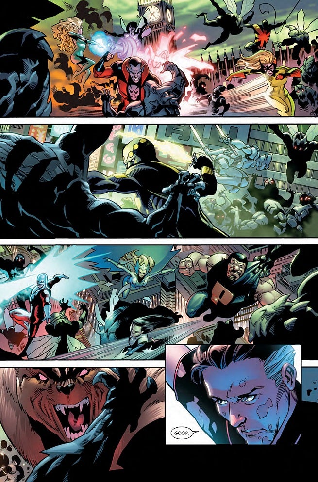
Digging into the content of the book itself, I'd like to start by calling out the artwork. It is gorgeous and it obviously took a lot of work. Absolutely no corners were cut with the art in this book. This issue features a full-scale attack on earth from the Franklinverse where all of earth's heroes are struggling to deal with a massive horde of violent creatures. This fight is massive and feels massive. Pages are given over to depicting multiple scenes of the battle with numerous figures and heroes rendered in fairly great detail. No space is wasted and this book is just plain jampacked with wonderful touches.
Often when you read a comic you can point to where an artist might have saved some time by resorting to some shoddy anatomy or leaving a lot of negative space between panels. Here that is most certainly NOT the case. Some pages feel full to the point of spilling over and that's exactly what you want from a worldwide catastrophe of this scale. Kirk, Kesel, and Aburtov should really be commended for going the extra mile with this comic.
All of Kirk's talents are at play here. There are plenty of expressive faces, panel layouts are engaging, fight scenes are sprawling, anatomy is rendered perfectly from various angles, and his creature work is quite good as well. In the midst of everything he has even takes the time to add some little touches that show he really cares. He thinks to give Wyatt Wingfoot his own unique number on the power armor in which he suits up. I also choose to believe that the hamfisted way he cuts off Franklinverse Captain America's foot with mist is a deliberate nod to Rob Liefeld who drew this character back in the 90s. Why? Because if you are a devoted comic fan, then you know Liefeld's aversion to drawing feet. Oh, and I can't forget Namor's disgusted face in one key scene.
Once again, I have to make the caveat that I cannot be sure how much inker Karl Kesel has influenced the look of the book as I have no way of knowing what the pencils would have looked like prior to being inked. Still, I have to say that all of the linework is crisp, clean, and polished.
Colorist Jesus Aburtov is also at the top of his game. He too is going above and beyond the call of duty to add to the detail and richness of the artwork. Simply examining the amount of detail he used in shading the Invisible Woman's uniform or in adding a vein to Namor's bicep through his color work is impressive and makes clear that he is here to rock this book. Nothing is flat in this book and Aburtov goes out of his way to add shading and light sources to background that could otherwise be single-color voids lacking in detail. Throughout this run, Aburtov has consistently demonstrated that he has some serious coloring chops and he's cemented himself in my own personal selection of favorite color artists.
Before I leave the subject of artwork, it would only be fair for me to call out one page that really didn't work for me. The very first page of this issue showcases a Franklinverse creature diving at the reader and taking up most of the page. Really though, we only see half of the creature because the spine of the comic seems to cut off the other half of him. Unfortunately, this first page is a left-hand page and the right hand page is an advertisement. This makes it feel as though this first page was originally part of a two-page spread and the advertisement is somehow intruding. There's something about seeing almost exactly half of the creature's face bumping up against the spine that leave one with a nagging sensation that art is missing from a hypothetical opposing page. Compositionally, this was an odd choice, at least for me.
Turning to the writing, we're getting toward the end of this run so I'm hesitant to give away too much information in the form of spoilers. What I will say is that Robinson is packing a lot into these books now and juggling it beautifully. I already said that characters are written perfectly in terms of using their own recognizable voices and there are plenty of great moments here. We get to see Reed as the smartest guy in the room once again, Ben Grimm and "Doc Green" get to exchange a couple of fun lines, the introduction of Sleepwalker remains an fascinating touch that I cannot wait to see developed further, and there are some legitimately heartwarming moments.
Perhaps my favorite moment is the one shared by Bentley and his father the Wingless Wizard. Again, I don't want to spoil it but this feels like it's been a while coming and it really nicely brings some tentative closure to their odd relationship. I don't know that I've ever seen the Wizard in this light and it kind of tugs at the heartstrings. Taking the time for character development and a beautifully quiet and emotional moment in the midst of all the potentially world-ending brouhaha is just a wonderful touch that helps to elevate this comic in my eyes.
And aside from once again stating just how awesome this comic is, that's all I want to give away about the writing.
That's just about all I have to say with regard to this comic. Another excellent entry in an excellent run of Fantastic Four, the World's Greatest Comic Magazine. Pick up a copy for yourself and get in on the action. There are only a couple more issues until the series is cancelled and I'm excited to see Robinson, Kirk, and Co. stick the landing.
Disclosure: ComicBook is owned by CBS Interactive, a division of Paramount. Sign up for Paramount+ by clicking here.
-
Spider-Man 4 Development, Deadpool & Wolverine, X-Men '97 Ep. 7 | Phase Zero
-
Summer Movie Guide 2024: From Deadpool to Alien, Here's the Must-See Movies to Watch For
-
Madame Web: Spider-Man Spinoff Gets Netflix Premiere Date
-
Deadpool & Wolverine Photo Offers Best Look Yet at New Costumes
-
Deadpool & Wolverine Post Has Fantastic Four Fans Shook