Flash Gordon #2 Review: A Bit More Miraculous
You know, it’s refreshing to read a comic that feels like it could have been written [...]
You know, it's refreshing to read a comic that feels like it could have been written specifically for you. What I mean by that is that this book has a number of things going for it that make it a series that really appeals me. First, it's a revival of an older property that, while I never really got into previously, I have been aware of for my entire life and have had at least a passing interest in. Second, it's got a creative team (Jeff Parker of Batman '66 writing and Evan "Doc" Shaner of the "Only Child" issue(s) of The Adventures of Superman on art duties) that I love. And third, it employs a design aesthetic that is charmingly retro. I'm the kind of guy who appreciates good, honest fun and has an affection for the pop culture and design choices of ages past. This book has all of that in spades. It's a largely well-written series with beautiful artwork bolstered by excellent color work from Jordie Bellaire of Pretty Deadly and a slew of other titles. This issue even starts to address the major problem that I had with the first issue. Having said that, let's jump into the breakdown… SPOILERS!!!

The Good: When I reviewed this series' first issue, I complained that we were starting in medias res and introducing tons of Flash-related ideas and concepts with little to no context or explanation. That was compounded by the fact that this series was kicked off by a miniseries entitled Kings Watch that immediately preceded the actions depicted in that first issue. I honestly don't mind jumping into the action straightaway as a storytelling device but I did feel that it put readers unfamiliar with Flash and who didn't read Kings Watch at a disadvantage. What's good about this issue is that we start to fill in more of that backstory and I can see what Parker is doing by telling this story in the manner he's telling it. Rather than start off with a text-heavy exposition-dump or characters rehashing information they should already know to each other, details about the Flash universe and the status quo of this story are being revealed organically as we move forward. One other advantage is that it also helps to make this series feel like its own entity rather than a spinoff tied to other material. I still maintain that the first issue was a bit off-putting by choosing to approach it in this manner, but in the context of the series I can see how it works. I'm not sure if this is entirely intentional, but it's interesting that the reader is learning along with Prince Barin as well as Flash Gordon, Dale Arden, and Dr. Zarkov about the failed Mongo invasion of Earth and about the workings of Mongo and its colonies respectively. Given that this issue ends with Barin discovering that Flash is wanted by Mongo, I imagine that the next issue will fill in even more of the backstory as the Flash crew needs to deal with the newly enlightened Arborian Prince. Sticking with the writing, I'm really enjoying the character interactions and am getting a good sense of their individual personalities. This is bolstered by the very expressive faces, but I'll deal with the art later. Additionally, I appreciate the universe-building elements here with the introduction of Arborian sport and the defining of the Arborian relation to Mongo and technology. As it stands, Mongo and Emperor Ming withhold advanced technology from the Arborians as a means of helping to keep them subservient and the only such technology on the planet is a "Forge" that transforms Arborian men offered as tributes into "beast men." That's right. In this series, the "beast men" are now genetically and technologically altered Arborians (and possibly people of other races that we have yet to see) rather than naturally occurring species or set of species. This is a change from the original Flash Gordon source material, but one that doesn't bother me personally. Really, the idea of Mongo having beast men that mirror Earth species otherwise nonexistent on Mongo is screwy whatever the explanation, so I don't mind seeing one that fits more with modern narrative/storytelling conventions. On the art side, I'm loving this book. Doc Shaner is great at producing work that is engaging and thoroughly modern but while also capturing a classic look and feel. Part of this comes in the rendering of characters and settings and part of it comes in his panel layouts. I really do appreciate the paneling here as it sticks true enough to traditional rigid layouts to feel comic-y while still allowing for experimentation and playfulness. One of the easier to miss touches is the fact that the panel outlines look hand-drawn and have a certain personality to them that is missing in a great deal of modern comics. It helps to give the whole package a feeling that loving, personal attention went into its creation. I also want to call out one specific moment when the panel edge is broken up by leaf shapes pushing the border into the panel itself and produces quite a nice effect. Another point that I'll mention, is that as near as I can tell it appears that Doc is doing his own sound effects. This might be fairly minor, but it's something I personally really appreciate. Often, you can tell that an artist isn't doing his own sound effects and as a result they stick out like sore thumbs, ending up poorly integrated into the art that they are supposed to be supporting. Here though, the sound effects feel like they are part of the art and as a result more effectively complement the action. I'll particularly call out the "Twhoonng" or Flash loosing an arrow and the "Ba-Whoom" of a rather large explosion as two examples of where the sound effects are particularly well-crafted and worked into the art. Honestly, why don't more artists do this? I praised Doc's work with facial expressions extensively in the last issue and I'll just reiterate here that he does an excellent job of making his characters very expressive. It really helps to sell the lines that they are being given to speak and goes a long way toward establishing their personalities. Dale's expressions are a treat, Zarkov is a hoot, and Flash seems to be a man of great emotional extremes, something I'll get to later… Another slightly rehashed praise is just how much I appreciate the design work on the Arborian outfits. They still have that Errol Flynn-ish quality that I love and the occasional integration of plant-based elements and motifs is inspired. An added bit of design loveliness is in the robots operating the Forge. They have a look that is reminiscent of robot design from the fiction of the 1930s and 1940s and I just dig that sort of stuff. I'd also like to compliment colorist Jordie Bellaire. Unfortunately, it's hard to put into words on just how excellent her work is. The texture and subtle shading she is producing gives this book a look that further sets it apart and gives it a visual richness that I haven't often seen. An excellent example of this is when the Flash crew is flying through the air with the Arborians on a wooden ship supported by giant birds. The background is largely empty except for clouds and a hint of horizon, but Jordie's shading of what appears to be a softly dawning sunrise is just lovely and fills the page beautifully. Words fail me in trying to convey to you the quality of the work she is doing. All I can say is to pick up a copy of this book and see for yourself.

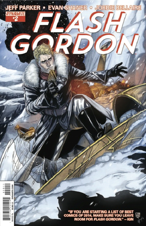
The Bad: Of course, into each life some rain must fall and I cannot call this issue an unmitigated success. Oddly, the weak point of this series so far appears to be Flash Gordon himself. Aside from "thrill-seeker," I would be hard pressed to define his character. So far, all the series has established is that he is in fact a thrill-seeking son of a wealthy somebody who can fly a jet plane and doesn't really think much before jumping into action. That's enough to characterize a cardboard-cutout adventurer stereotype but compared to the feisty and intelligent Dale Arden and Zarkov's boozy, smooth-talking genius Flash just feels like a bit of a cipher. I mentioned earlier that I love the expressions that Doc is crafting for Flash but right now all I'm getting is a sense that this is a man ruled by his emotions. He leaps without thinking into an alien sport he knows nothing about because it looks like fun, he unthinkingly fires an arrow into exploding fruit he knows nothing about and causes an explosion that could conceivably have killed or injured him, and then he just decides to try stopping the "beast man conversion" process in the Forge without a plan or seemingly a single rational thought in his head. I applaud his desire to halt injustice and cruelty but what does he think he's going to accomplish by jumping into action in the middle of what amounts to a city full of mechanized minions of Ming? Oddly enough, I'm reminded of the Hulk more than almost any other character at this point. Just point your hero in front of the problem and hope he smashes it. It's still early in this series and this Flash seems to be new to the hero-ing business so I'm willing to cut it some slack but it would be nice to see a more fleshed-out Flash in the very near future. So far, he hasn't had enough to say or do that really gives me insight into who he is as a person. On the art front, there are two relatively minor issues that I want to mention. First, when Flash jumps into the Arborian bug-sport, there is a shot of Flash landing on one of the "pulpers" that is inset into a panel of Barin, Dale, and Zarkov watching the action. I can see what Doc was trying to do but this really didn't work for me. Perhaps it is because the group is looking away from the inset, but the intent here is not clear enough. Also, I can't quite explain why but on the two-page spread where the "beast man conversion" process is depicted, the reading order is unclear for me. For some reason, I want to read the left page and then the right page rather than reading page to page in three horizontal rows as was intended. This may be because there is no image or panel that strongly straddles the two pages and unites them into single unified layout. The Questionable: Where we talk about things that are neither good nor necessarily bad, but at least are a little head-scratching. So, we've got three distinct covers and none of them has anything to do with the content of this issue. Why is that? I mean, none of the covers are what I'd call bad and the 80th Anniversary and "Li'l Flash" covers are serving distinct purposes. However, what's up with the main cover showing Flash in what appears to be the frozen land of Frigia when this entire issue takes place in the wooded Arboria? This isn't a problem unique to this book or series as many comics seem to have covers only tangentially related to their content but that won't stop me from complaining about this here. Shouldn't covers tease the content? Shouldn't they reflect what's happening inside in order to get me to want to purchase the book? This seems so self-evident that I wonder why this is a conversation that needs to be had and why comics mess this up so often. Finally, this book still has the T+ rating on it. Why? There is nothing, absolutely nothing in the content that would justify this rating. I'm going to go out on a limb here and suggest once again that it has to do with the advertising that Dynamite has included in this issue. The reader is once again treated to a Vampirella ad showing a decent amount of skin, there is a Lady Zorro advertisement where she's suggestively treated but mostly covered up, and some images from The Blood Queen with more exposed cleavage are included but are mercifully small. The thing that really gets my goat and likely contributed to the rating though is the back cover. It's advertising a series called Chastity and features a scantily clad vampiric goth woman licking blood off of a knife… You stay classy, Dymanite! Honestly, if it's the advertising that's resulting in the rating, then it needs to be excised and replaced with anything else. This rating is entirely inappropriate for the content of this book and it's unfairly limiting the series' potential audience. This is frustrating in the extreme and annoys the heck out of me as it should be annoying the creative team. In Conclusion: I highly recommend this book. It's stunningly beautiful and fun. The quibbles I have are relatively minor and I hope to see Flash develop more as the series progresses. I know that I'm definitely looking forward to future issues.
0comments