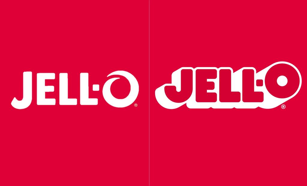
For the first time in 10 years, Jell-O has a new logo. Thursday, the Kraft Heinz-owned dessert maker unveiled a new brand, one that will soon be added to all the company’s packaging and marketing efforts. As has become the new norm in design, the new look is both simplified and vintage-inspired.
Videos by ComicBook.com
The new logo, which continues to put the emphasis on the “O” in Jell-O while retaining its scarlet hues, will start appearing on all products in the coming months. That means both the pre-made, cupped versions and gelatin mixes with both be part of the overhaul.
“As ‘America’s Most Famous Dessert’, we aim to transcend generations and want to continue bringing our customers on a never-ending flavor journey,” Kristina Hannat, associate director of desserts at Kraft Heinz says of the design. “After 10 years, it was time to take a look at our packaging and bring Jell-O into the future in a bold, playful, wonder-filled way.”
The company worked with Brand Opus on the overhaul, a creative firm that’s recently worked on re-designs for Oscar Mayer, Miller Genuine Draft, and Panera amongst others.
“With the Jell-O renovation, we’re bringing back the jiggly fun and harnessing the wonder that the brand brings to adults and kids alike,” Brand Opus creative boss Rebecca Williams adds. “Working with the team at Kraft Heinz, we’ve loved taking on the task of reimagining and reinvigorating the brand for the next generation of parents by creating an imaginative and playful brand world that invites them to see their everyday in inspiringly wonderful ways. We’re excited for the possibilities that the new equities and iconic logo will unlock for the brand to propel it into the future.”
The Jell-O rebrand is the 18th redesign Kraft Heinz has ordered on its brands over the past three years.