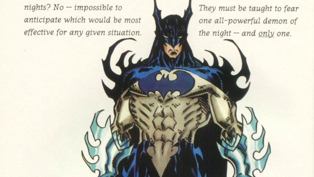
Batman is one of the most iconic superheroes ever created, and that is in no small part due to his spectacular design. It’s at once simple and powerful, with the single most recognizable outline of any comic book character. The Dark Knight’s design changes often enough, but at the end of the day, almost all redesigns circle the original concept on some level; he’s a man with a dark cape, a bat-themed cowl, with a symbol on his chest and a utility belt around his waist. These are the core aspects that go into every great Batman design, and even though the costume itself might change, the style remains relatively the same. However, that’s not to say every costume has been a winner.
Videos by ComicBook.com
Being as popular as he is, Batman has worn an awful lot of suits over the years. Sometimes, like the Rebirth suit Matt Fraction’s new blue and grey look, these new costumes are great and beloved by fans. Sometimes, however, they miss the mark completely. Others just slap you in the face. So today we’re going to look at seven of the worst Batman costumes that the Dark Knight has ever worn. Get ready to wash your eyeballs, because some of these are just gross to look at.
7) Batman Beyond Rebirth
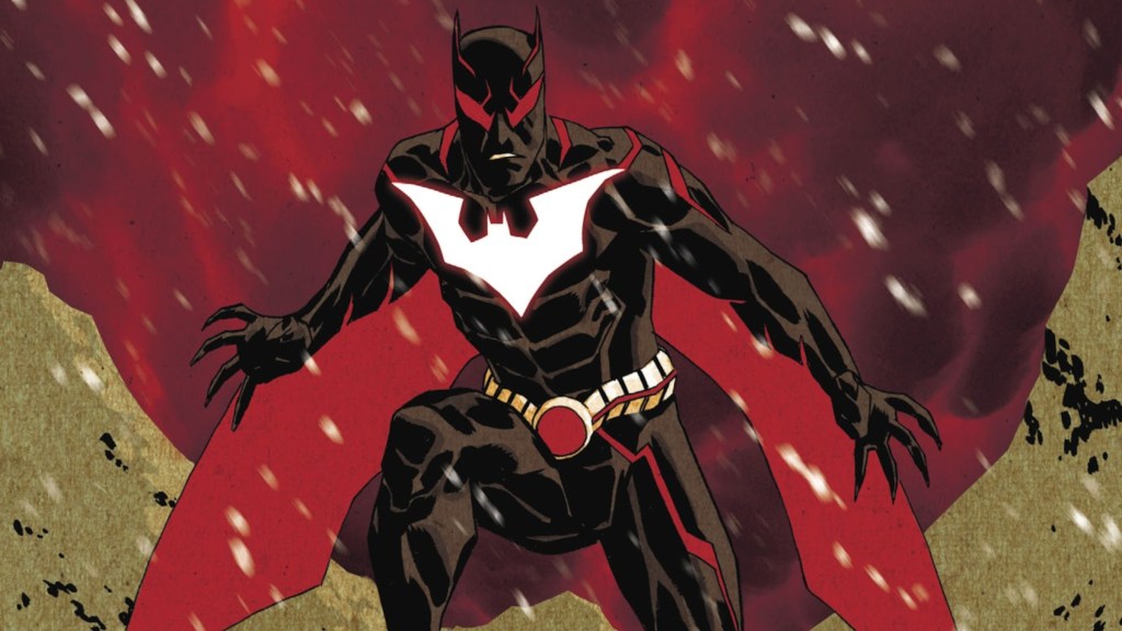
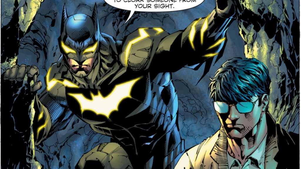
When Terry retook the mantle of Batman for his 2016 Rebirth series, his old Bat Suit was torn up in a scuffle. Thankfully, he found the prototype version that was even stronger than his original. Unfortunately, it looked like this. I can work with the giant, glowing Bat Symbol, but there’s just too much going on over the rest of it. The red lines at random places all over the suit are really distracting, and the eyes are just uncomfortably big. It’s like someone blended Batman and Spider-Man’s eyes together and dipped them in blood, which is not a great look. Where the usual Batman Beyond design is elegant in its simplicity, this one is deafeningly loud. This new-old suit takes everything that made Terry’s original suit great and throws it in the gutter, which makes this one look even worse in comparison.
6) Azrael Bat Armor

When Azrael briefly took the mantle of Batman after the “Knightfall” storyline, one of his first orders of business was replacing the normal suit with an edgy armored version. Admittedly, that design was still pretty cool, and given that the writers behind this switch intended this to be a near-parody of the ‘90s trope of replacing classic heroes with gritty anti-heroes, they decided to up the ante. As Azrael’s mental state deteriorated, he upgraded from an armored costume to an actual suit of armor, complete with an entire arsenal inside. We’ve got a huge amount of gaudy gold, a Power Rangers-style mask, and wing cape that looks like he’s dragging the entire scaled-up wingspan of an actual bat around. That’s not even mentioning the giant claw-gauntlets, which have both a Bat Shuriken gun and flamethrower inside, both of which he used liberally. This costume is purposefully over the top to the extreme, and only gets more so with its red paint job later on. It’s meant to embody the extreme nature of comics in the ‘90s, and boy does it ever.
5) Jim Gordon’s Bat Suit

After Bruce’s supposed death in the “Endgame” storyline, the Caped Crusader was actually briefly replaced by none other than his chainsmoking buddy Jim Gordon. He was given a pretty awesome robot battlesuit, but we’re focusing on his actual Bat Suit, which was less cool. It’s too basic and not stylish enough, which is a deplorable combo. The spandex is so tight we can see the outline of his ear, which is something I’ve never wanted to say about Jim Gordon. Beyond that, the black space in his unique Bat Symbol just makes his whole chest feel empty, and the random yellow on only one shoulder doesn’t work. Instead of a utility belt, we have holsters, which look a bit out of place on the otherwise very sleek design. But the worst part of all is the lack of mustache. Jim Gordon is defined by that stache, and taking it away is a travesty. He already looks weird as Batman, so let the man at least look like himself too.
4) KnightGallery
Batman: KnightGallery was an Elseworlds one-shot from the ‘90s that was presented as historians having found Bruce Wayne’s journal ten years after Batman’s last disappearance, in which he detailed several designs for Batman, Robin, and the Batmobile. Most of these designs are a lot, to say the least, with the entry before this one being totally red and having a Doctor Strange-looking cape that was way too big, but out of all of the potential Bat Suits, this one stuck out to me as the most insane. Every single inch of this Bat Suit is spikey. I do not say this lightly, but every available inch is jagged edges, with massive gauntlets with spikes as long as his forearms. This is utterly insane to imagine, and it’s pretty clear why this one remained solely in the design phase.
3) Zebra Batman
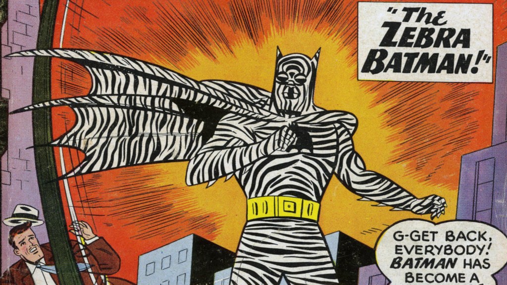
Way back in Detective Comics #275, Batman fought the dastardly Zebra-Man, whose machine accidentally hit Batman and transformed his costume into the zebra-print version, also infusing him with magnetic abilities he couldn’t control. Ignoring why a zebra-themed supervillain would have magnetism as his powerset, changing Batman’s wardrobe to this is easily his worst crime. I think this suit would be perfectly fine, if not a tad loud, if just the costume was given the black and white design, but the fact that this also affected his face makes this suit actually hard to look at. You can’t make out anything of what’s going on because of the weird pattern, and it just exhausts your eyes to fight for the details of Batman’s expression. Also, despite affecting Batman’s face, for some reason his utility belt is still just yellow. I’m not saying this suit would look better without the belt to break up the pattern, but if you’re going to commit to something, at least fully commit to it.
2) Stealth Suit
Debuting in Superman Unchained #2, this special Bat Suit was designed to make Bruce perfectly invisible across every known spectrum of light, even hiding him from Superman’s Kryptonian senses. That’s really great, because it means that nobody should ever have to look at this fashion atrocity. This suit looks like it has no idea what it wants to be, and it’s making it everyone else’s problem. It’s equal parts bulky and sleek, juxtaposing bits of armor with smooth material. Then we have the bright strips of yellow against the grey design, which just don’t look very pleasing. The eyes, much like the earlier Batman Beyond Suit, are just too large and spikey, which is way too distracting, even with the bright yellow Bat Symbol right below them. This suit is way too loud for a stealth suit design, but please, turn it invisible again right now.
1) Injustice 2

And the winner for ugliest Batman suit so far is, of course, the Injustice 2 suit. The Injustice games and comics are notorious for their horrendous costumes, but this Batman suit is something special in the worst way. I don’t even know where to begin here. There’s this weird skin-tight material that looks like chainmail, though that could just be the shading, and the rest of it is pure armor. Batman is meant to be an agile fighter, but here the Dark Knight is decked out in more metal than an actual knight, and none of it looks practical. The Bat Symbol is weirdly elongated and way too high up, practically on his collarbone, and the cowl looks like it’s entirely made of metal, so good luck turning your head in any direction, Bruce. And why does the cape have a short collar like that? The blue eyes are as unnerving as always, and as much as I want to rag on the lack of undies making this whole thing look like a onesie, easily the strangest part is the plate of armor only covering his abs. Like, why? Why are we only covering Batman’s gut here? Why is it disconnected from all the other armor? Why does it have a random line on it that goes into the fabric underneath it? This entire thing is confusing, weird, and most of all, ugly.
Want to stay up to date on the biggest geek entertainment news? Add us as a prefer source in Google – HERE.
Most Viewed
-

Official art by Bastien Lecouffe-Deharme -
Image Courtesy of MAPPA -
Image Courtesy of DC Comics