Comic book series are just not cool anymore. Standard attrition rates in comics sales show that without major promotional bumps, the standard monthly serial will just bleed readers over the long haul into unprofitability.
Videos by ComicBook.com
The easiest fix is a new #1 issue, and we get those in spades now.
Following the math, this means we also get lots of #2 issues. Everyone talks about the first issues. I’m here to buck the trend. Let’s talk about the second issues of three new series. Two of the three are coming out this week.
No spoilers below, unless you’re particulalry sensitive.(If so, no hard feelings.)
“Seven to Eternity” #2
It’s a beautiful book, without a doubt. Jerome Opena’s artwork, as colored by Matt Hollingsworth, is amongst the most jaw-dropping work you can see in comics today. And it truly is the combination of the artist and colorist here to create the whole image for the series that cannot be overlooked.
Opena is drawing on another level here, like he’s putting together a 48 page album for a French publisher, but instead running 20-some-odd pages for months at a stretch, or so the plan goes. (There will be breaks between arcs, I’d bet, to give them time to bank some pages/issues.) The amount of detail and fine line work that he puts into every pages is deserving of a “Seven to Eternity” coloring book, just so we can see it bigger and in black and white, without the lettering blocking anything.
There’s something about Hollingsworth’s colors that really set the tone on this title. Colors are generally muted and dirty looking, but then the powers come into play and you get contrasting bright greens and reds to offset specific things. The textures used throughout the pages are subtle, but add a lot to the feel of the series.
Rick Remender’s story is unrelenting. He’s not giving Opena a break, nor his readers. I like that. This is not a breezy book to read through. You have a lot of storytelling going on here, with panel-packed pages and characters making big decisions frequently. So early in the series, there are still a lot of pieces to place on the game board, so to speak, which takes even more space.
There’s so much text in the issue to fit into the relatively smaller panels, that I wonder if letterer Rus Wooton didn’t use a font size 1 or 2 pixels smaller from the norm to fit it all in.I don’t mean to say that it’s a wordy issue, but that there’s a lot happening on each page with very dense panels.There’s no room for silent panels.
I also wonder if Opena isn’t working twice up or at some other larger page format. He squeezes a lot in.
That sometimes works against him. There’s a big drop of backstory in the front half of this issue. The story, itself, isn’t too complicated, but it’s necessary to get it out then and there so it can be paid off at the end of the issue. But it’s also a lot of alien names to keep track of and remember. That kind of stuff drives me nuts. It’s a personal failing yes, but I can’t absorb too many new alien names at once. They all blend together.
I had to read the issue twice to puts the pieces together from the front to the back. I’m glad I did, because it’s a very big reveal. Remender knows how to end on a cliffhanger or a super dramatic moment to get you coming back. This issue is no exception to that.
I’ve been saying for a couple of years now that Remender writes the best first issue is comics these days. (Go read “Black Science” #1 on its own, for starters.) He can also take those lessons and apply them to the second issue, as well. That just makes every issue interesting, which is a good thing. Assuming this is a six issue story arc, we’re moving next into the middle of the story where things can often sag a little. Let’s see how he keeps this up next month.
“Reborn” #2
After the events of last issue — Bonnie dies and is “reborn” in a fantasy world as a teenager/early-20-something young woman — this issue is devoted to establishing the new fantasy world and its rules. Bonnie’s father shows her around, and we meet the big bad guy of the series.
It’s a beautiful looking issue. Unleashing Greg Capullo in a fantasy world like this is a wonderful idea. He takes several opportunities in the issue to dazzle the reader with imaginative architecture and landscaping, mixing an almost Hobbiton country side in front of a more international and futuristic cityscape.
Mark Millar’s script, though, leaves out just enough detail to clue you into what some of the big revelations of the series are going to be. In fact, I wouldn’t be surprised at all if the entire series gets spun on its head in another issue or two, when we learn that everything we know is wrong, and the good guys maybe aren’t so good or aren’t who they pretend to be. Millar creates a wondrous world that seems almost too good to be true in some ways, and we know how much he likes to pull the rug out from under his readers.
Or I’m just very cynical and suspicious. That’s quite possible, too. I have some theories, but they verge into spoiler territory, so that’s a no go here.
It’ll take another issue or two, but I’m sure we’ll see that Bonnie’s questions about her new world will be answered in a not-all-together pleasant fashion.
Bonus credit goes to colorist FCO Plascencia, whose bright colors are easy to read and never too busy. Plascencia uses very subtle gradients and occasional textures to tell the story cleanly. Things can be dark when they need to be, but the vast majority of this issue shows off Capullo’s artwork without fighting it. I wish more colorists would do the same. Textures and fancy shadows and shading effects are cool, but all too often muddy up the art. The art in this series so far couldn’t be clearer.
“Reborn” #2 is out this week in comic shops everywhere.
“Moonshine” #2
I’m torn on this series. “Dangerous Prohibition-era backwoods Southern hicks” is not my normal cup of tea, genre-wise, but I do enjoy it when paired with the New York City slick suit-and-tie guy who comes up against it and isn’t all completely put together about it. I’m all for stories about dangerous business, crime syndicates, and moonshine. I like when the star of the series is just a little inept, perhaps.
The problem is, there’s also a werewolf in this series, which seems to be one element too many for me. There’s enough potential drama without also adding in an “X-Files” bit.
I’m willing to see how it plays out, though, because the rest of Brian Azzarello’s script is so captivating, and Eduardo Risso always knows how to tell a story. I love his spare style, with its bold images and strong sense of shadows and lighting.
As a bonus, Risso gets primary coloring credits here, so you can see the coloring explicitly as another part of the art. I like how he can cut in shadows to define anatomy in one panel, but then leave a more establishing shot mostly flat so you pay attention to the larger shapes and not the finer details.
Risso’s color scheme is interesting, too. It’s slightly desaturated, giving the book its slightly old-timey feel, amidst the flat colored areas which are purposefully not detailed.
The story in this second issue — again, without giving anything away — pushes off into a new direction. At the end of the first issue, Lou Pirlo was kind of stuck. He talked to the moonshine owner and couldn’t get a deal done, then found himself partying with some locals.
Where do you go from there? You bring in new characters who operate in conflict with the moonshine operator and see if that brings Pirlo any closer. It does. Kinda.
As a story, it definitely works. It strengthens the power of the moonshiner while giving Pirlo a new angle to work and a new lease on his own life. He knows letting down the boss would be a dangerous thing to do, so he’s busy playing any angle he can find in a limited amount of time. There’s nothing better for drama than time and pressure. Azzarello is starting to pour those on with this issue here.
“Moonshine” #2 is out, again, this week through Image Comics.
PipelineComics.com|| Twitter || Instagram || E-mail
More Comicbook
-

Image Courtesy of Storm King Comics -

A Nintendo Switch and PlaySTation 4 on a Winner's Platform with a ? representing the winner. -

Image Courtesy of Image Comics -
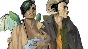
Image Courtesy of Image Comics -

Image Courtesy of Top Shelf Productions