“Hadrian’s Wall” as 80s Sci-Fi Murder Mystery
I knew nothing going into “Hadrian’s Wall” #1 and wound up pleasantly surprised by it.
Videos by ComicBook.com
The first issue is all set up: a man dies, another man is drafted into investigating the death, and everyone is at odds along the way.
The entertainment is two fold in the details.
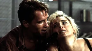
First, the lead character, Simon, isn’t perfect. He’s quick to anger.He might be slightly unhinged. He might be hooked on prescription drugs.But he also has a very good reason for all of that, which writers Kyle Higgins and Alec Siegel lay out for you in this issue.
I’m being purposefully vague. I want you to read it the way I did, in which case I’ve already gone too far.But the character relationships — including our lead’s ex, who makes the comic particularly tense and occasionally nasty — give this story a real skip to its step.Everyone is walking on egg shells, throwing out enough tension to keep you interested in what fireworks might fly when you turn the page next.
The second part is something I didn’t know in advance and was proud to figure out before Higgins spells it out in the text page at the end.The book has a strong 80s vibe to it. When we meet Simon’s ex in the second half of the issue, she’s stunningly beautiful and dressed and coiffed in a way that looks like it comes straight out of an 80s sci-fi movie crossed with a Nagel painting.It’s pretty awesome.
The computer screen glow in green with text written out like an alarm clock from the 80s with the combination of eight or so bars making up each letter and number.There’s a lot of analog buttons and switches attached to those computers.
The men’s hairstyles have a slight throwback feel to them (early 80s, I’d say), though I admit at first I didn’t think much of it. Too many creators draw the future (this book is set in 2085) to look exactly like today, with a slight twist. To me, it’s more futuristic to have everything in this book look like something from thirty years ago.Everything comes full circle, especially fashion.That would fit with a future book.
After I realized that, I was able to look at the issue, as a whole, and see how it feels a little 80s in a few ways, mostly in the world building where the book is set 100 years after nuclear war happened in 1986. It’s like the world stopped after that traumatic event, even as humanity successfully colonized space, moving to new worlds.And that’s where the “80s noir sci fi” vibe really starts to kick in.
Though I have to admit I laughed a little bit with the umbrellas people wore on their shoulders in the city of the future in the second scene. Those came straight out of Shark Tank.(Google for “Nubrella.”)
The Look and Feel
The art in the book is digitally painted by Rod Reis.It’s impressive. Mix in a fair amount of Phil Noto with some 80s Bill Sienkiewicz touches and flare, and you’ll get a good sense of what the book looks like. It does hit a bit of the uncanny valley, and some of the figure work looks stiff. There needs to be a way to paint a comic book sem-realistically while still maintaining a bit of the exaggeration and stretch that current comic artists of this ilk miss.It’s nowhere near as bad as the webcomics that are build in Poser, though.Reis has some good skills underneath the glossy shine, particularly with the subtle facial expressions.
The best trick Reis pulls in the issue, though, is aging Annabelle, Simon’s ex.There’s no doubt that she’s the same person in the one flashback scene as she is in the current timeline.The face is identical, but aged a bunch. The hair is angular and green, a similar style but different enough to indicate time has changed.
The storytelling is strong.I never had so much as a questionable moment as to what was going on in this issue.The issue is a lot of talking heads, but the conversations flow naturally.The opening three pages, which shows us the astronaut’s death that kicks off the storyline, is cinematic.I can hear the small cracking sound from his space mask in the move theaters speakers whistling through from the emptiness of space.I know that’s not how sound works, but it’s the Movie Reality that feels dramatic.
Troy Peteri uses a new font for this series, which I like.It fits right in.I don’t know what makes it “feel” like an 80s font, exactly, aside from the feeling that it belongs on the outside of a Trapper Keeper. It just perfectly suits the comic, like lettering over a painted 80s graphic novel might have had.
The “E” letters really stick out.The three horizontal lines are so close together and the letter is less tall than the rest. There’s also a general unevenness about the lettering that doesn’t bother me, but is obvious. It helps give it a little of that imperfect hand-crafted look.Look at the way the “T” crosses over the “H” when they’re together, or how the “O” appears to start just over the lower line.
(Update: The font comes from Nate Piekos’ Blambot collection. You can buy it here, if you like it.)
Final Verdict
At the end of the first issue, we’re just starting the story.The death inquiry is about to begin, but lots of questions are already being raised, and a shadowy person on the last page is starting to pay off the opening scene, as far as plot complications go.Admittedly, it’s a plot point I saw coming, but I’m glad they put it on the table earlier rather than later.
I’m glad I went into this series blind.I think we pre-judge things all too much.I think our natural preferences might blind us from an entertaining read.But, most of all, it’s nice to have some surprises.As much as I want to quote the one line of dialogue that would sell this one to you the hardest, I’m avoiding spoilers completely.Just trust me, it’s right there on the 12th page. You’ll know it when it runs you over like a truck.
There are lot of preview pages from early in the issue on the Image Comics web page for the series, and I’ll be listening to the interview with Higgins on Image’s “The i Word” podcast next.I’m sold on this one.
The first issue is out on store shelves now for $3.99.Originally, it was solicited as part 1 of 8.The fourth issue is now touted as the end of the first arc, with a second arc set to begin in early 2017.
Most Viewed
-

Image Courtesy of A-1 Pictures -

Courtesy of TOHO Animation -
Image Courtesy of Marvel Comics