There’s no era of life riper for drama than youth. When you’re young, everything feels like a matter of life or death. But that’s actually the case in some of this week’s comics. Ranging from the silliness of (a superheroic) childhood, to the struggles of adolescence in a school for assassins, to the legacy of a teen superhero in the future, each of these stories address the time before adulthood and the drama fueling it all.
Videos by ComicBook.com
Giant Size Little Marvel AvX #3
Written and Drawn by Skottie Young
Colors by Jean-Francois Beaulieu
Like the best Secret Wars tie-ins so far, Giant Size Little Marvel couldn’t care less about what’s happening outside of its own little corner Battleworld. Skottie Young’s little Marvel heroes aren’t just a visual delight, they bring out a lot of the humor inherent to superhero comics to create a delightful read.
The loose plot of Avengers and X-Men struggling to capture the affection of twins who are new to town is an excuse for Young to make as many jokes as quickly as he can. This premise allows him to jump between clubhouses before launching into a whole new group of characters. Jokes are delivered on several different levels ranging from slapstick (which Young always nails) to references about Marvel’s history (which may sail over some heads). The quantity of material allows reads to skim past any jokes that don’t work though and enjoy those that do.
Young also recognizes the value of a sight gag. His backgrounds encourage readers to slow down and look for the jokes. Easter eggs like a brief appearance by Kitty and Lockheed (shown above) add value to following the slight central narrative. Young shows a lot of appreciation for his source material throughout the issue. He injects some fun cameos into a Danger Room spread, but never allows these to overwhelm the issue’s pacing.
Giant Size Little Marvel AvX #3 is exactly what it needs to be, a whole lot of fun. Not all of the gags land, but there are enough of them that the issue can rack up consistent chuckles and smiles. Its lighthearted nature is just the sort of palette cleanser superhero fans need against all of the Strum und Drang of events.
Grade: B
Deadly Class #15
Written by Rick Remender
Art by Wes Craig
Colors by Jordan Boyd
Things have gotten bad for Marcus over the past couple issues of Deadly Class and #15 continues to see just how far down this dark, ugly rabbit hole he will go. After losing Maria and most of his friends, Marcus has begun to indulge his addictions and ignore continuously mounting problems. Rick Remender and Wes Craig dig into Marcus’ descent here in a collection of sequences that focus on both the roots and problems created by addiction.
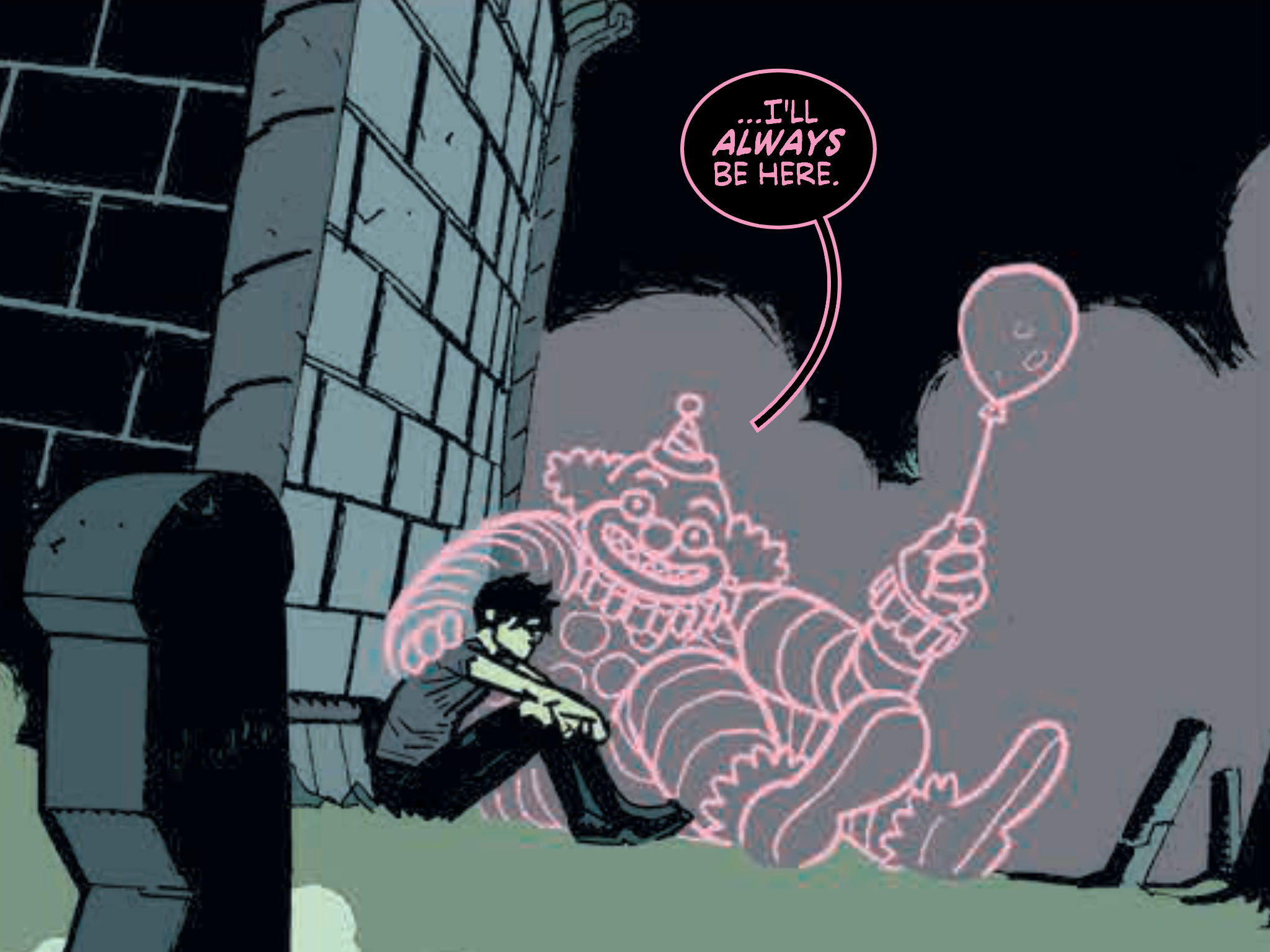
Each scene in the middle of Deadly Class #15 shows Marcus engaging with a different drug as an alternative to confronting his problems. Weed, coke, and ‘shrooms all receive a unique presentation. ‘Shrooms are highlighted by another psychedelic sequence that’s not quite as wild as Deadly Class #4, but still enthralling. Marcus’ spins between panels and Craig’s style changes with each new substance. The sequences featuring weed and coke are not as flashy, but also do an excellent job of simulating Marcus’ experience. Jordan Boyd’s colors bring both elements of life and death. The clown that comes along with the ecstatic high of coke is neon-lit, but hollow. The ‘shrooms trip reveals a rainbow, while Marcus’ own color becomes ever more pallid, even reflecting a stage-like, sickly green of death at one point.
Remender shows both the potential pleasures of drug experimentation, but also the hurt and distress caused when they become a crutch to avoid reality. Here he tackles that second perspective head-on, and it is painful to read. While the story never leaves Marcus’ perspective, every other person on the page is realized and sympathetic. Even from a few choice moments, it’s possible to see how Marcus is making his world a worse place, and sympathize with his own, self-obsessed spiral.
Deadly Class continues to be one of the best comics hitting store shelves month-after-month. Remender and Craig are delivering a world populated with fully realized characters commenting on social troubles through incredibly exciting sequences filled with action, drugs, and mayhem. No series is better at combining the ludicrous with the deeply human than Deadly Class.
Grade: A-
Batman Beyond #3
Written by Dan Jurgens
Art by Bernard Chang
Colors by Marcelo Maiolo
Following the events of Future’s End, Tim Drake has voyaged to an apocalyptic future dominated by the all-seeing Brother Eye in Batman Beyond. Things have not gotten better since Drake’s arrival, and he now finds himself being interrogated inside an internment camp. This particular angle on a Batman Beyond comic squanders much of the title’s potential, and replaces it with a grim-dark vision lacking merit.
This harsh future wouldn’t be so easy to dismiss if it provided any sort of hook to make us care about the cast or setting. Unfortunately, it seems Dan Jurgens assumes that readers should just care about IP attached to the issue instead of what’s actually happening within it. Tim Drake, Barbara Gordon, and others are all recognizable, but they have as much character as an empty cubicle. They are merely plot vehicles, doing and saying what they must to push the story forward. Jurgens’ dialogue makes many pages a chore to read. People speak in exposition, often with little inflection or personality. The robotic dialects of Brother Eye and Alfred are unbearable. Eye’s constant puns and Alfred’s broken language are a struggle to read after a few pages, and only serve to take readers out of the story.
Bernard Chang illustrates this very busy issue with clarity, tracking a wide variety of elements in a coherent fashion. Action sequences flow best when taking advantage of the page’s width rather than the stilted choreography found in some packed, vertical panels. Chang’s figures are sometimes stiff when in motion and assume forms that appear sculpted and unnatural. But his backgrounds are always full of detail and enrich the world. Colorist Marcelo Maiolo samples certain panels in a secondary color scheme. White backgrounds play against only a few bold colors in order to highlight select moments of action or decision. These work well in action sequences, like bolded words in a speech balloon, but don’t deliver the same impact in expository sequences.
Batman Beyond #3 is functional. It delivers plot and action so for a basic understanding, but it never really matters. Rather than a tale written in the present about the future, it reads like a relic of the past. Overscripted and serviceably presented, Batman Beyond is part of a workmanlike tradition in comics that has no place in the future.
Grade: C-
What did you think of this week’s comics? Sound off in the comments below.


