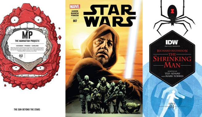
Artists can do literally anything they want–within comics. The medium enables the realization of the wildest sci-fi, fantasy, and super concepts out there. Want to draw an absurd alien space heist done? Done. Want to draw lightsaber duels on Tatooine? Easy. Want to draw a man slowly shrinking into nothing? Got it. Comics represent possibility without limits, so this week we’re looking at titles that display this sort of weird science, and whether the ideas are as good in execution as in theory.
Videos by ComicBook.com
Manhattan Projects: The Sun Beyond the Stars #2
Written by Jonathan Hickman
Art by Nick Pitarra
Colors by Michael Garland
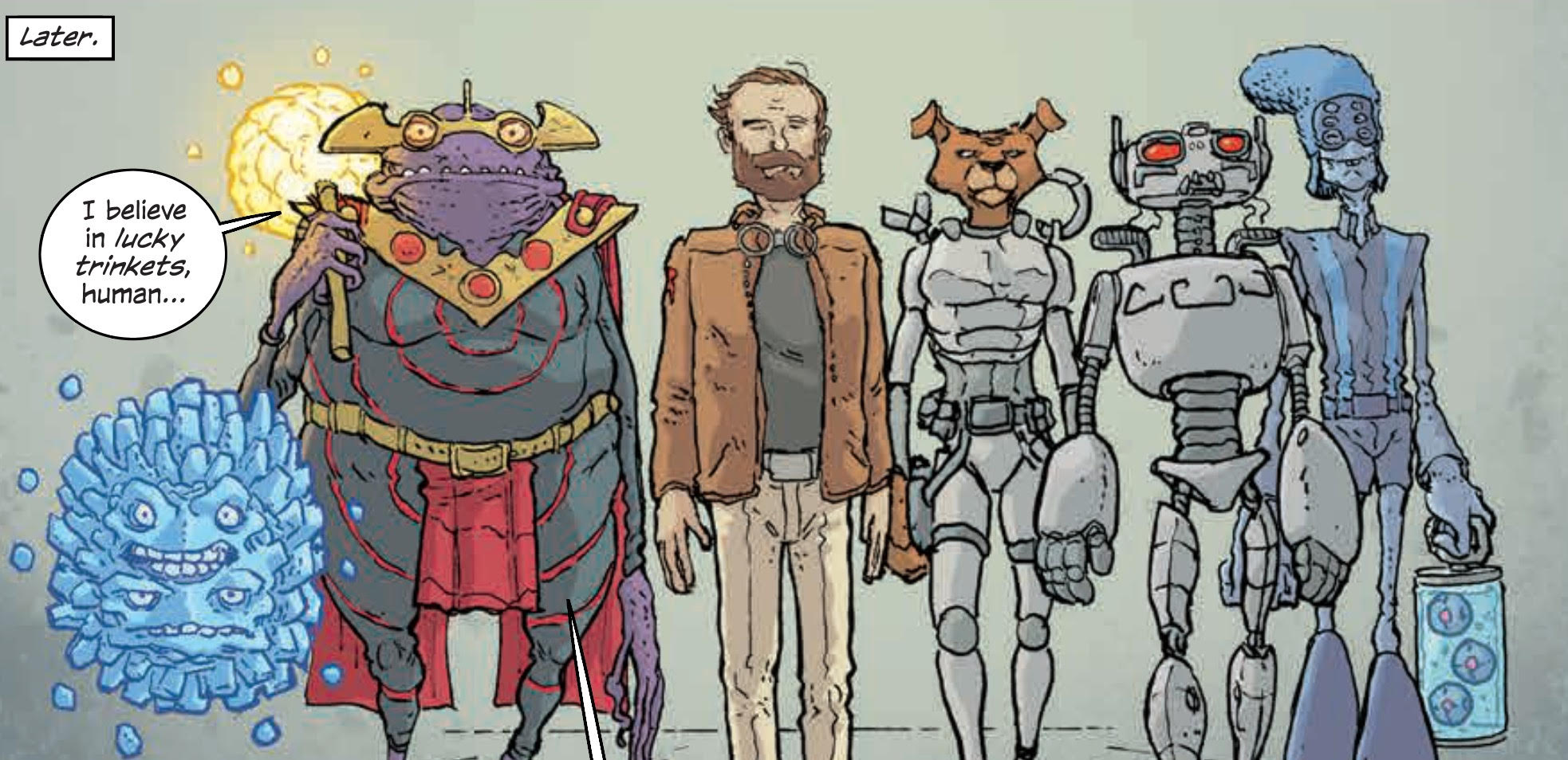
After relaunching The Manhattan Projects, Jonathan Hickman and Nick Pitarra have the freedom to make anything they want. The series has transformed from a historical, science-fiction farce into a jailhouse comedy and now, in the second issue, a heist. Yuri Gagarin and Laika have been reunited, and now aim to steal a McGuffin along with a motley crew of aliens.
Pitarra has always been the star of this series, infusing backgrounds with plenty of visual gags and inventing striking new creations in each issue. The separation of this story from earth and any recognizable form of history allows him to bring even more power to each page. An alien bar is stuffed with oddities that will encourage the eye to stay awhile and wander. His designs for both the slave and master classes of the Sionnu. Their architecture, dress, and coloring by Michael Garland all add new layers. So much of the story is contained in design and visual elements. To only read speech balloons would be to miss more than half of the narrative. Rys, the spiky blue ball, is capable of providing a surprising level of characterization and intent despite only shouting “Blarg!”
Hickman’s scripting for both issues of The Sun Beyond the Stars show an incredible level of control. They function as chapters in a larger story and singular arcs. The heist that occurs here manages to introduce the premise, team, and play out the complete event in a standard-sized issue without ever feeling rushed. Dialogue is never unnecessarily expository (given the medium), and the result is a comic that really rewards readers for having picked it up as a single installment instead of waiting for a collection.
The Manhattan Projects: The Sun Beyond the Stars #2 shows that this is a book worth waiting for. From the broad strokes of an intergalactic heist down to the smallest details in Pitarra’s backgrounds, this issue is a delight to read and re-read. Moving beyond the Cold War setting has allowed it to embrace the most bizarre elements of the series. The result is something that feels both fresh and familiar, but always like damn good comics.
Grade: A-
Star Wars #7
Written by Jason Aaron
Art by Simone Bianchi
Colors by Justin Ponsor
Star Wars #7 takes a break from the ongoing battle in-between Episodes IV and V,to visit Obi-Wan Kenobi’s time on Tatooine before Luke Skywalker was itching to visit the Tosche Station. The issue is framed as an entry from Old Ben’s journal, recovered by Luke earlier in the series. It’s essentially a quickly crafted one-shot issue that reads well by itself while also fitting into the larger series.
Simone Bianchi takes over art duties from John Cassaday, and makes this issue unique by bringing his own style to bear. That style is an excellent fit for this saddening period on a barren desert planet. Inks course through Bianchi’s figures, dressing them in darkness and a visual pathos. When Kenobi sits inside his hut, you sit beside him and feel the darkness weighing down his soul. But those same inks also give momentum to action sequences in a way that we haven’t seen in Star Wars yet. They streak across panels with a rough quality that is only enhanced by Justin Ponsor’s dark night-time colors. Those same colors come to life during the day with lush oranges and reds decorating the planet’s dueling suns.
While Bianchi’s artwork provides Star Wars #7 with a vibrant atmosphere, Jason Aaron’s narrative is not as consistent. Kenobi’s internal struggle, narrated by his journal, is very effective, and illuminates an unrevealed journey that seems perfectly obvious in retrospect. The transition from dashing Jedi general to hermit is a difficult one, and Kenobi’s isolation makes for a strong focus. That same context makes Luke Skywalker’s inclusion read falsely, however. The presentationcontradicts Luke’s characterization as a sheltered farm boy, inexperienced and yearning for adventure, and fails to add anything of value to Kenobi’s own story. And since Star Wars #7 relies on an understanding of the source material, it becomes a very real flaw.
Despite the unnecessary fan service towards Luke Skywalker, Star Wars #7 is still a strong entry in the series. Bianchi’s art turns the into a unique comics experience, rather than a recreation of a trip to the movies. He evokes a strong, isolating mood that pairs beautifully with the most significant elements of Aaron’s story for what will hopefully be only the first of many chapters in Obi-Wan Kenobi’s journal.
Grade: B-
Richard Matheson’s The Shrinking Man #1
Written by Ted Adams
Art by Mark Torres
Colors by Tomi Varga
Ted Adams and Mark Torres are adapting one of Richard Matheson’s best known prose works The Shrinking Man. The story features Scott, a family man in the 1950s, who after being exposed to a strange mist finds he is shrinking 1/7 of an inch each day. Matheson’s story is a fascinating examination of masculinity’s changing role in American life, but the adaptation leaves something to be desired.
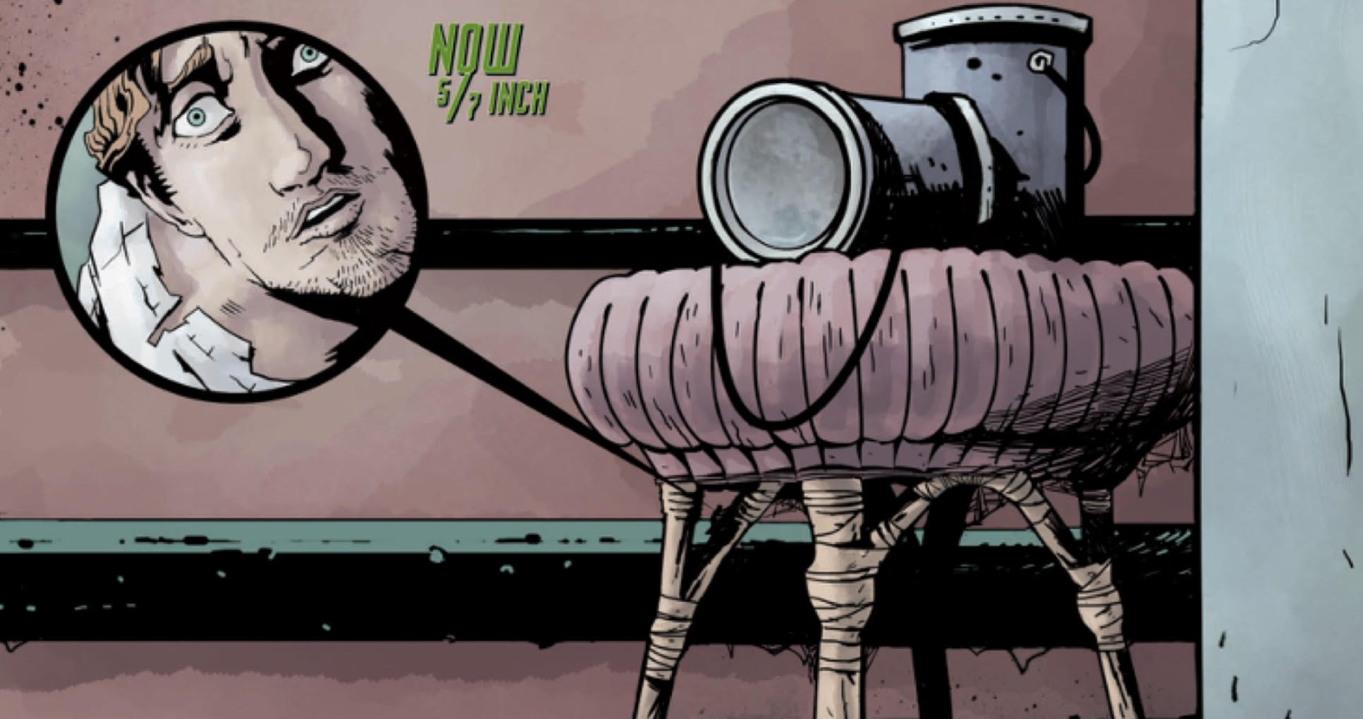
Torres presents Scott in two distinct timelines, one where he is struggling with the slow presence of shrinking in front of his wife and daughter and another where is only 5/7″ fighting to survive in a dank basement. Actions and scenes are typically translated as plainly as possibly. Scott’s battle with a black widow fails to raise any sense of excitement. While Torres does use bubbles to point to the difference in scale in this locale, the stiff acting of his figures leaves something to be desired. Scott’s size-based emasculation and struggles as both a provider and sexual being are even more interesting, but the changing difference between him and his family is sometimes difficult to discern in consistently spaced, mid-range panels. The narrative is clear, but far too simple for the subject matter.
That lack of experimentation or adjustment is also seen in Adams scripting. He is devoted to the source material, a clear fan of Matheson’s work. This results in shifts between scenes and dialogue that read as if they are written for prose rather than comics. Scenes are stiff and lack any range of motion in the present. Characters state exactly what they are feeling and why. Even in the future, when Scott is constantly in mortal danger, he is sure to explain his goals, emotions, and plans despite having no one around to listen.
Matheson’s story is still a classic piece of horror prose, but Adams and Torres’ adaptation fails to make a case for its own existence. The advantages of the comics form, to show off scale and play with visual metaphors, are barely utilized. Instead The Shrinking Man does its best to translate prose into comics as plainly as possible. While this may make it more accessible to younger readers, it hardly makes for great comics.
Grade: C
What did you think of this week’s comics? Sound off in the comments below.

