Last week Image Comics held another Expo at the Yerba Buena Center in San Francisco, announcing a wide line of upcoming titles. A lot of exciting new ideas from talented artists and writers were unveiled, leaving many of us chomping at the bit for more. But before these comicscome out later in 2015, it’s worth looking at how the darlings from last year’s Expo are faring. With that in mind, this week’s feedback is all Image, exploring recent launches including Starve, Descender, and Injection. See how each series is faring below.
Videos by ComicBook.com
Starve #2
Written by Brian Wood
Art by Danijel Zezelj
Colors by Dave Stewart
Starve #1 introduced a dystopian world defined by cooking shows and income inequality in one of the boldest debuts of 2015. Starve #2 shifts focus and presents a concise character study of it’s (anti-)hero Gavin Cruikshank. The issue tells the complete story of Cruikshank’s first challenge in the Starve finals, and it is a dynamo of story economy and presentation.
Artist Danijel Zezelj continues to build his pages as stanzas in a larger poem. They are almost all dominated by a main panel which spreads beneath everything else. He alternates between wide open shots of the city with only 3-4 panels to tense cooking scenes filled with many more. This rhythm helps break the issue into small chapters, and focuses reader’s attention on why the change is being made. The dense cooking sequences are rendered so well that any fan of steak or seafood will have saliva filling their mouth as they read. Dave Stewart’s coloring displays every page as a unique unit as well, spun together by his disparate palettes for each setting.
The presentation of Starve #2 allows writer Brian Wood to accelerate the story, propelling both Gavin and readers forward and only allowing them to breathe at the end. There’s still a lot to learn about this world and Gavin’s internal monologue helps provide necessary exposition. Wood plays the monologue against images and dialogue on the page to better integrate the thoughts into the story as a whole. Gavin’s actions and the responses of those around him are what best define him here though. By the end of Starve #2, it is clear who this man is and what he is willing to do based on what has been shown, not what has been told.
Starve may not have received the most attention at the previous Image Expo in January, but after two issues it seems that it should have. Each installment so far has provided a complete narrative arc with all of Wood’s typical flair for character and politics. Furthermore, it is some of both Zezelj and Stewart’s best work to date, moody and dynamic. Starve #2 is a truly outstanding comic book.
Grade: A-
Injection #3
Written by Warren Ellis
Art by Declan Shalvey
Colors by Jordie Bellaire
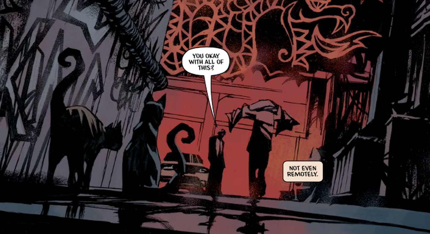
Injection continues its descent into an increasingly strange new world this month as the central cast of characters begin to reveal their current and past roles more clearly. Maria continues to investigate the disappearance of three men and indoor eruption of a mushroom king, while other interact with these oddities to varying degrees. It is another beautiful issue that relies heavily on the reader to assemble this puzzle of oddities.
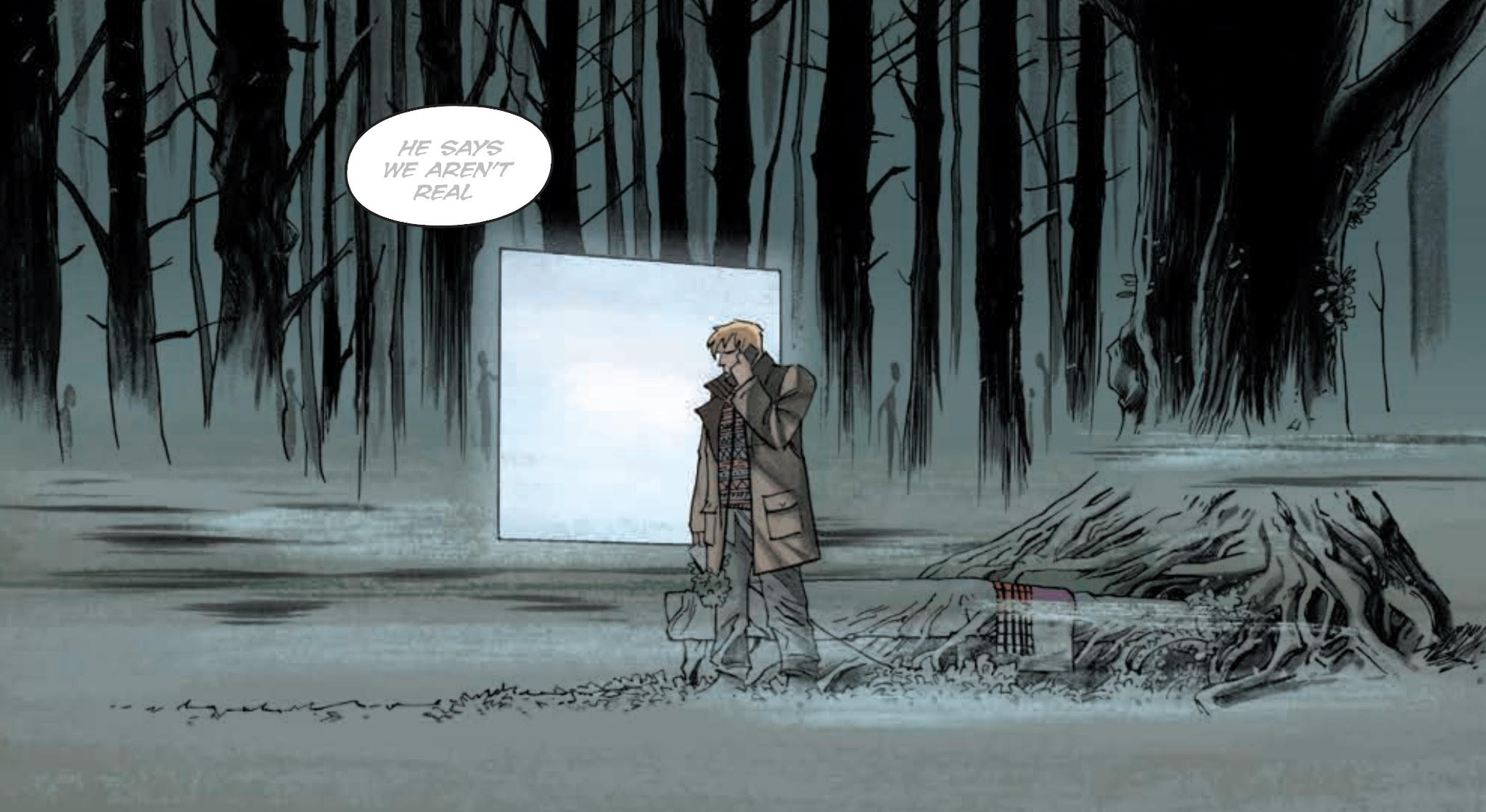
The quality of artist Declan Shalvey and colorist Jordie Bellaire’s work should not be understated. They may have made their big splash with Warren Ellis on Moon Knight, but what they are doing in Injection is next level. An early sequence featuring Robin Morel on the phone depicts a subtle transformation of setting. Bellaire evokes a very eerie mood both through the slow adjustment of light and addition of barely noticeable shades in distance. Shalvey’s ability to capture motion and design new creatures at the end of this scene is simply masterful. There is a lot of exposition and dialogue in the series, especially this issue, but careful attention to backgrounds and both facial and body language makes even the most text-heavy sequences visually engaging.
Extended collections of word balloons present a double-edged blade for Injection #3. They present some much needed context for a story that started readers in a dark room and has only given them a few matches since that point. Gaining a grasp of exactly what these characters can do is helpful, but the quantity of words on the page distracts from the real driving force of the comic: the art. Ellis continues to defer characterization for the future. He’s happy to present what these five people are, but has not yet defined the who of the matter. That information is slowly coming forward, but is more evident in the art than any speechifying.
Injection is one of the most beautiful comics being published by Image today. The story is impeccably told, which makes its obfuscation of character and plot easier to accept on a month-by-month basis. It’s still unclear where this is heading or if it will reward reader’s patience, but watching the journey unfold is its own prize for now.
Grade: B-
Descender #5
Written by Jeff Lemire
Illustrated by Dustin Nguyen
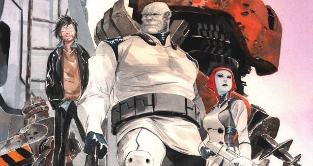
Descender has displayed an astonishing level of brutality, opening on a scene of mass genocide and constantly moving its characters between various frying pans and fries. Yet in Descender #5, it seems that things can get no worse. Jeff Lemire and Dustin Nguyen expand the universe by introducing the cruel, anti-robot Knishians in an issue filled with shocks and frights, rendered in beautiful watercolors.
The most notable aspect of Descender #5 is how Nguyen incorporates violence and gore into his soft watercolor work. It is not the first time that biological characters have been hurt or killed on the page, but it has never been emphasized as clearly as it is here. Nguyen sets reds against significantly cooler colors in order to highlight the terror and pain connected to the blood in these panels. In scenes without gore, he packs the page with characters and creates a strong sense of pressure as violence threatens to break out. These techniques result in two of the most nerve-wracking scenes in the series so far.
The introduction of Knishians pulls attention away from the central cast of Descender, making an understanding of the politics and universal power structure very important. The United Galactic Council includes some interesting new designs and details, but is defined by speaking exactly what readers must know in order to move the story further. The relationship between the UGC and Knish is also not made entirely clear, whether they are actually at war or just handling increasing tensions.
Descender #5 is a beautiful comic, that’s art makes the pain of the story seem all the more potent. While Lemire struggles some in creating a compelling political system, the core story of the series is compelling as ever. The characters are well-realized, and their pain is easily shared with the reader, for better or worse.
Grade: B
What did you think of this week’s comics? Sound off in the comments below.


