The Fade Out #4 opens with a dedication to Eduardo Navarro Lopez. Lopez was Elizabeth Breitweiser’s color flatting assistant on comics like Fatale, Velvet, and The Fade Out and he passed away on November 27, 2014. As a color flatter, Lopez would digitally prepare pages after they pencilled and inked by selecting the various objects and elements and filling each with a single “flat” color. It is a time consuming process and an integral part of modern coloring in comics. Flatting is what allows colorists like Breitweiser to work on as many different projects as they do.
Videos by ComicBook.com
This dedication serves as a reminder of the many people who contribute to the comics we read. Although writers and artists tend to receive the lion’s share of attention, many publications are only fully realized through the hard work of colorists, flatters, inkers, editors, and many other talented individuals. Seeing Lopez’s name placed at the front of this issue before even Ed Brubaker and Sean Phillips’ ought to draw all of our attention to his and Breitweiser’s contributions. Together they are illuminating Phillips’ pages and bringing Brubaker’s plot to life. The Fade Out #4 is is some of the best art of Lopez and Breitweiser’s career and an excellent dedication to his work in comics.
A lot occurs in The Fade Out #4 as the first act of the series draws to a close. Brubaker’s script includes a diversity of images and tones including blurred memories, flashbacks, photographs, and the distortions of alcohol and fire. The story was already a finely layered construction in its first issue and the complexities only increase here. Phillips, Breitweiser, and Lopez’s work serve to bring each of weave all of the elements at play together and tell the tale with perfect clarity (or ambiguity as is so often the case).
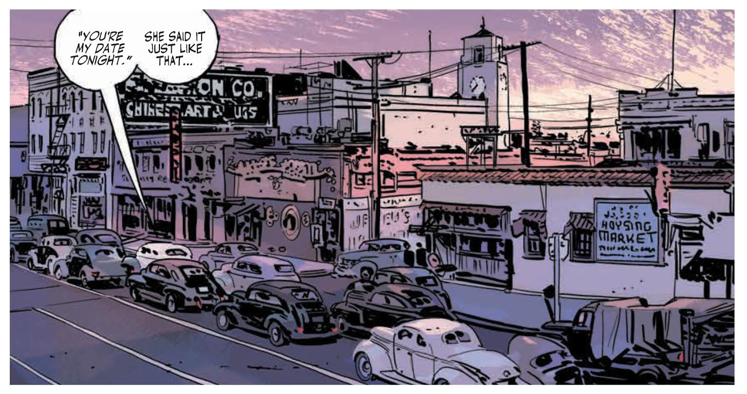
The opening page reveals Charlie Parish and Earl Rath driving through Los Angeles at dusk. Time and place are instantly recognizable with violet and pink hues casting themselves sideways through the clouds and across the city. Choice of palette here is key because of how unique it is from everything else in this issue and all of The Fade Out thus far. The yellows and oranges commonly associated with sunset are too similar to the streetlamps and club lighting found in the series many late night scenes. Instead, these more vibrant hues mark the natural lighting as something special, a California sunset that cannot be replicated.
Color choices like this occur on every page in The Fade Out. There are no accidents or shortcuts in this comic. Whether a sequence takes place in a dingy alley or an overly bright movie set, every bit of scenery, wardrobe, and lighting is carefully considered. It’s possible to dissect the choices made in each distinct scene in The Fade Out #4 and discover multiple items worthy of admiration.
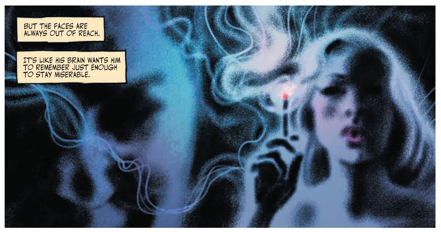
The highlight of Breitweiser and Lopez’s work in this issue are the opportunities when the story demands something unique in order to form a new perspective, shift the time period, or allude to the narrator’s state of mind. Charlie continues to filter through his memories of the night of the murder in The Fade Out #4 and the shape of his recollections are shown in several panels. They are a blurry haze composed of vague forms and drifting lines. The colors in these panels glow with a smoky effervescence. Although Phillips’ art challenges both Charlie and the reader to understand what is happening, it is not an unpleasant visual. There is a sense of mystery within the shifting cool colors themselves.
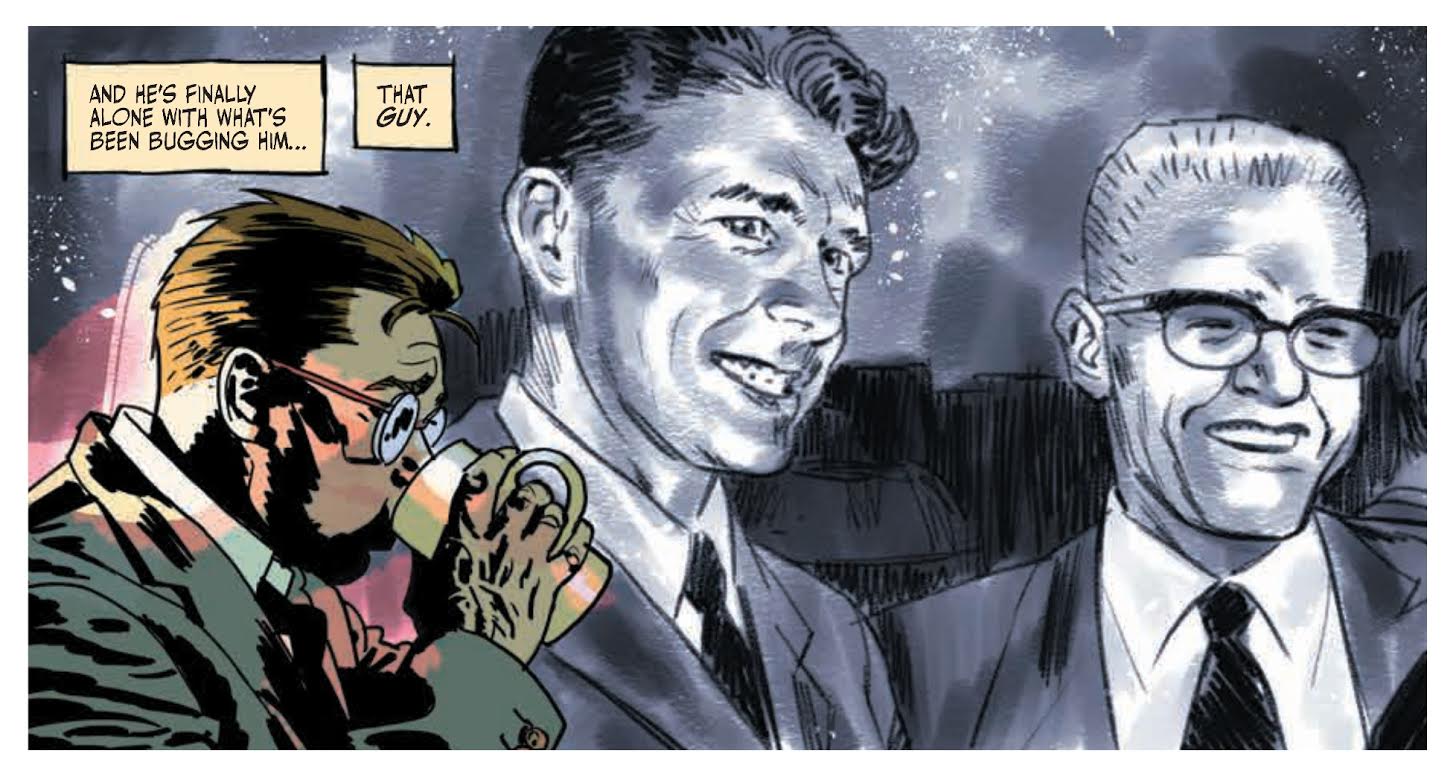
There are other flashbacks of memory later in the issue when Charlie recalls his time in World War II. His thoughts of the war are much more clear though; they appear like photographs from the period. Although there is some haziness to the images, forms and faces are easily distinguishable and the lighting within each shot is natural and easy to discern. Phillips’ positioning of many of these panels questions whether they are a memory or a photo stored in some shoebox.
Even when Charlie is in the present his depiction is not always clear. Breitweiser depicts him in a drunken state by distorting the art. Although Charlie’s face and clothing is colored normally, there are splotches of color over him. In the panel above an unnatural pink blob spotlights Charlie. It is similar to Matthew Wilson’s work in Wytches, but here the color spotting is much less intrusive serving to distort but never overwhelm Phillips’ art. The effect is unbalancing without interfering with the clarity of the story.
Breitweiser and Lopez blend the various effects they create throughout the issue into a seamless narrative. Whether transitioning between Charlie’s memory to the current narrative or juxtaposing his memories behind his place at the bar, The Fade Out #4 never lacks coherency. Every issue of the series thus far has delivered one of the best complete packages in serialized comics, and the fourth installment is no exception.
Phillips’ artwork in this issue is outstanding as always. His compositions are as clear as ever selecting the best possible moments to tell the story, portraying them in proper size and detail, and combining them into pages that each serve the narrative perfectly. It is difficult to find a more skilled artist working in comics than Sean Phillips and he is only improving in The Fade Out.
One of the most surprising elements of this issue is Phillips’ depiction of stars from the golden age of cinema. Multiple famous faces make appearances including an older Clark Gable. Phillips blends them into the store naturally. Gable and others are recognizable, but made to look no more special than any other character occupying the story. There is no attempt to wink at the reader; this is simply the way the world is.
Brubaker’s script itself is outstanding. He draws together the many layers of The Fade Out thus far, adds several more, and then provides a final twist that decisively ends the first act of the series. It’s clear that there is a long road ahead of Charlie Parish, but where it may lead is no more clear and the path itself looks all the more dangerous. As the curtain closes on the introduction of this series, it already appears to be one of Brubaker and Phillips’ best collaborations to date.
It’s important to remember that The Fade Out is not Brubaker and Phillips’ work alone. It is the work of Breitweiser as colorist, Lopez as flatter, and many others who helped bring it to publication. When admiring The Fade Out #4, it’s worth lingering a little while longer on each panel and examining how colors bring this story to life. The Fade Out is one of the best looking comics being published today and that’s an accomplishment shared by everyone involved.
Grade: A


