This week for Fastball Feedback, we’re examining a set of comics that all focus on corruption. Whether it comes in the form of a horrifying tale of supernatural power, political machinations in Chicago, or something far more epic: each of these stories contain individuals, organizations, and places that have lost their way.
Videos by ComicBook.com

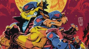
Harrow County #1
Written by Cullen Bunn
Art and Colors by Tyler Crook
Harrow County #1 introduces a new horror concept from a publisher with the absolute best lineup of scary comics. It tells the tale of a small town with a dark secret. Many years ago, the people of Harrow County discovered their neighbor Hester Beck was a witch. So, they stabbed, shot, hung, and burned her. But even decades later, Beck threatens to reemerge for her vengeance, and her new form appears to be a sweet 17 year old girl: Emma.
Crook’s art fits the setting of Harrow County extraordinarily well. His blend of soft linework and water colors looks like a ghost story told over a campfire sounds. There’s a warmth and handcrafted quality to each panel. Scenes set on the farm in the light of day are cast in a mellow palette clearly concocted by someone who was raised in the Midwest. It establishes rural credentials and a baseline for the darker elements to play against. A four panel progression early in the story, revealing the horrors committed by Hester Beck, creeps from the light of day to darkest night. The subtle ugliness in the first panel becomes something twisted and consumed by shadows at the end. It is the most promising page of the first issue, and acts as a fine thesis for the story.
Bunn’s script contains many of those same familiar elements that makes Harrow County feel like a genuine ghost story with plenty of creepy details woven into the narrative. The foreshadowing surrounding Hester’s curse and the re-surfacing of her power is blunt, but the ways in which it is revealed are genuinely disturbing. These details will hang with readers when they turn off the lights. This homespun quality works against it to some degree. Those details are much more captivating than the story itself. Emmy reads like a model for reader’s to project themselves (or at least teenage versions of themselves) onto.
These detractions are hardly enough to ruin Harrow County#1. It is a very promising introduction, and something that reads differently from all of Dark Horse’s other excellent horror offerings. Crook and Bunn are sowing seeds for a very dark tale, one that will easily be enjoyed on a cold October night after it’s completed.
Grade: B

C.O.W.L. #10
Written by Kyle Higgins and Alec Siegel
Art and Colors by Rod Reis
C.O.W.L. #10 is the penultimate chapter of a story that didn’t sound like it should work, but absolutely does: a union drama set in 1960s Chicago. The many, disparate plot threads running through the series are brought to the precipice with some shocking and inevitable twists. It’s a reminder of how many different stories have been introduced in only nine issues, but one that promises a satisfying finale as they come together.
Kyle Higgins and Alec Siegel have made union politics exciting and accessible like nothing else has since season two of The Wire. The backroom deals, treachery, and ideologies presented here are all easily understood because they are all conveyed through characters. Every significant person in C.O.W.L. has reached a crucial moment when they are forced to make defining decisions. The drama surrounding the moments before the finale is tense. It’s easy to imagine a version of the series without the superhero elements because the story is captivating based on emotional arcs alone.
But without the superheroics, Rod Reis would not have been able to show off the stunning line and color work that have hooked so many readers. In C.O.W.L. #10 his sharp compositions emphasize divides present within both organizations and relationships. His work is a wild juxtaposition of intense emotions and the surreal genre elements. Anger and fear come through beautifully in all of these faces with eyes and chins taut. Intense, glowing colors highlight more fantastic elements of the story, bursting out of panels.
The most disappointing element of C.O.W.L. #10 comes in the letters column, with the announcement that the series will not continue past #11. Yet this issue feels like the set up to a proper conclusion. It arranges all of its characters into significant positions, and then leaves them teetering on a precipice, ready to define themselves and readers’ perceptions of this comic.
Grade: A-

Darth Vader #5
Written by Kieron Gillen
Art by Salvador Larroca
Colors by Edgar Delgado
Darth Vader #5 does exactly what it needed to: introduce some original concepts. So far, the series has only riffed on the original films or other blockbuster icons–for proof, just consider the Alien mother from issue #4. Thankfully, Gillen and Larroca open this issue with something that feels entirely new to the Star Wars Universe in the form of techno-organic, whale-like spaceships. They’re weird as hell and fulfill the notion of an expanded universe that’s actually expanding. There’s another new idea, one that’s much more impactful, at the issue’s end as well. While worth saving from spoilers, it’s a brilliant concept that plays into characters, themes, and plot perfectly. In these final pages, it feels like Darth Vader understands what it wants to be.
Gillen still includes several scenes and snippets of dialogues with a heavy reliance on outside references. The best moment comes in a two page sequence that inverts the opening of Star Wars when Vader breaches a Rebel transport. Anyone who has seen the film (meaning everyone) will recognize the visuals instantly thanks to Larocca’s composition. But the writing’s self-aware nature bogs down any new ideas that Vader attempts to explore. Where one or two jokes may be funny, Gillen can hardly remove his tongue from his cheek.
Larocca’s work continues to stagger at key moments. There’s a particular panel of Vader, when he breaches that ship, that is almost impossible to understand. It halts the momentum of this exciting sequence and leaves readers to puzzle out the panel’s intention. Figures continue to look posed, appearing to rely heavily on reference, and the sense of depth is off. Scale and distances are lost in the jumble of inconsistent figures.
Darth Vader #5 still seems to snap into place towards its end, making a compelling argument to continue reading. So much of the series has relied on style and wit so far, but Gillen may have found a new idea worth mining for an extremely long time. It’s an exciting final few pages filled with invention and excitement, and it’s the best moment in all of Darth Vader so far.
Grade: C+
What did you think of this week’s comics? Sound off in the comments below.
Most Viewed
-

Image courtesy of Netflix -

Image Courtesy of Netflix