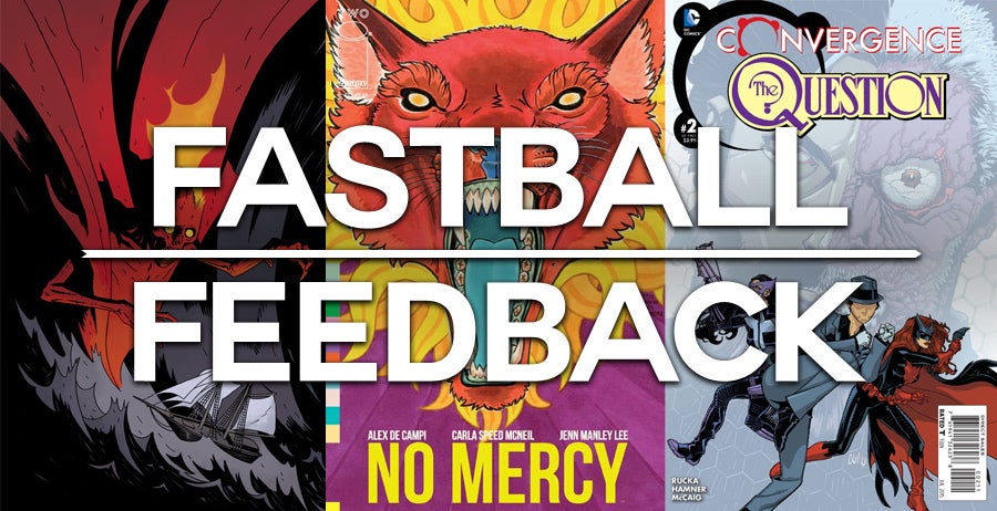
This week for Fastball Feedback we’re taking a look at a bunch of new series and miniseries with only two issues or less so far. It’s always interesting to consider at how creators introduce their stories in order to hook readers. Whether it’s a superhero mega-epic, a historical horror story, or a small-scale modern tragedy, each of these comics has something new to offer.
Videos by ComicBook.com
Convergence: The Question #2
Written by Greg Rucka
Art by Cully Hamner
Colors by Dave McCaig
Rucka’s return to Renee Montoya and Harvey Dent was anticipated with good reason. Ed Brubaker, Michael Lark, and his story “Half A Life” in Gotham Central is a definitive milestone for both characters. Convergence: The Question #2 isn’t here to redefine this odd couple though; it’s here to say goodbye and does so in a way that new and old fans alike ought to appreciate.
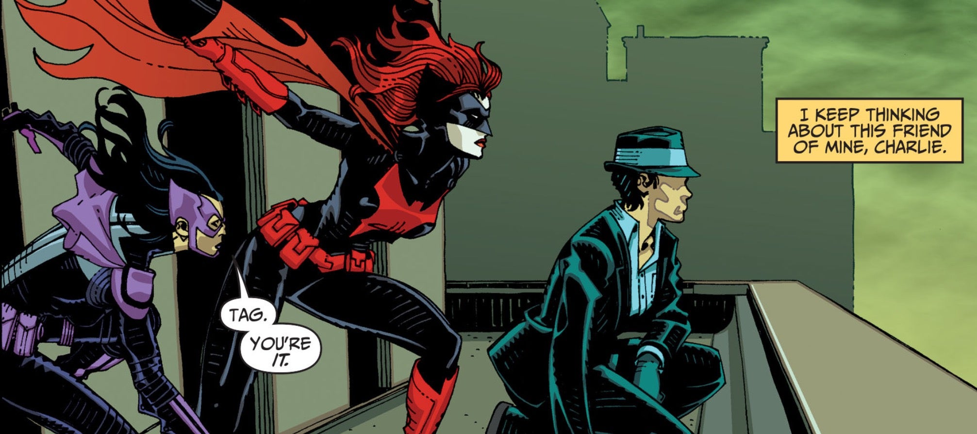
Both characters still struggle with the internal conflicts that defined them in Gotham Central. Renee is unsure of where exactly she belongs and Harvey doesn’t believe he can return to his good side. Neither of them are entirely heroic or villainous; just complicated, well written human beings. There’s still plenty of big action and multiversal struggles, but they are backdrop to thematically larger story about two individuals striving to belong.
This isn’t to dismiss the action. Cully Hamner embeds several thrilling fights into the meat of the issue. There is a silent two-page sequence where Renee takes down a couple of armed goons with so much style, your jaw may ache like the goons’. All of the action is grounded in athleticism rather than gadgetry, avoiding the ridiculous in favor of a very human story. This is furthered by Hamner’s depiction of the cast’s faces and bodies, which all appear well-defined instead of idealized.
Ultimately, Rucka and Hamner deliver one of Convergence’s best stories, focusing on character over spectacle.Rucka restates his affection for both characters and allows them neat, peaceful, resolutions. The conclusion feels true to both characters, while also reflecting a nostalgic urge to provide a happy ending.
Grade: B
No Mercy #2
Written by Alex de Campi
Art by Carla Speed McNeil
Colors by Jenn Manley Lee
No Mercy #1 took its extensive cast of recent high school graduates just over the edge of disaster. Now De Campi and McNeil are following them into the terrible aftermath of a bus crash far from rescuers or cell phone service. It’s an exciting premise primed with drama, tension, and a batch of emotionally unstable characters. This issue is every bit as scattered and confused as those survivors though.
No Mercy #2 spends some time with each cast member establishing individual traumas and follies. The overlap between these scenes is minimal, and results in something that reads more like a collection of very brief updates. De Campi writes the disaster area as if these people only have to interact by choice. Events are not connected directly to one another, but are placed side-by-side leaving the first 2/3’s of the issue with almost no narrative propulsion. This odd flow does provide McNeil with the opportunity to present each character in a unique manner. The slow motion shouting of instructions and exhibition of a completely avoidable new disaster are both very effective. Other experiments in this issue are nowhere near as successful.
Perhaps the most questionable artistic decision comes in devoting a two-page spread to a song Tiffani sings to calm herself. The spread pops with bright pastels depicting the cartoon from which the song originates, filled with chibi kittens. It creates a sense of tonal whiplash that, while certainly intentional, doesn’t accomplish much else. The following page in which a small speech bubble depicts the same image surrounded by the darkness of the scene is vastly more effective. McNeil opts to use three pages when only one was needed in order to achieve the same narrative and emotional goals.
Odd choices like this make No Mercy #2 a discordant reading experience. Some sections soar while others drag, but they never cohere until the issues conclusion. De Campi and McNeil are managing a lot of moving pieces, but that’s not an excuse for a narrative that takes place in a 100 foot radius to feel so fractured. It is only when a shared threat appears at the end that all of these different elements begin to feel like they are sharing the same setting and story.
Grade: C+
Baltimore: Cult of the Red King #1
Written by Mike Mignola
Art by Peter Bergting
Colors by Dave Stewart
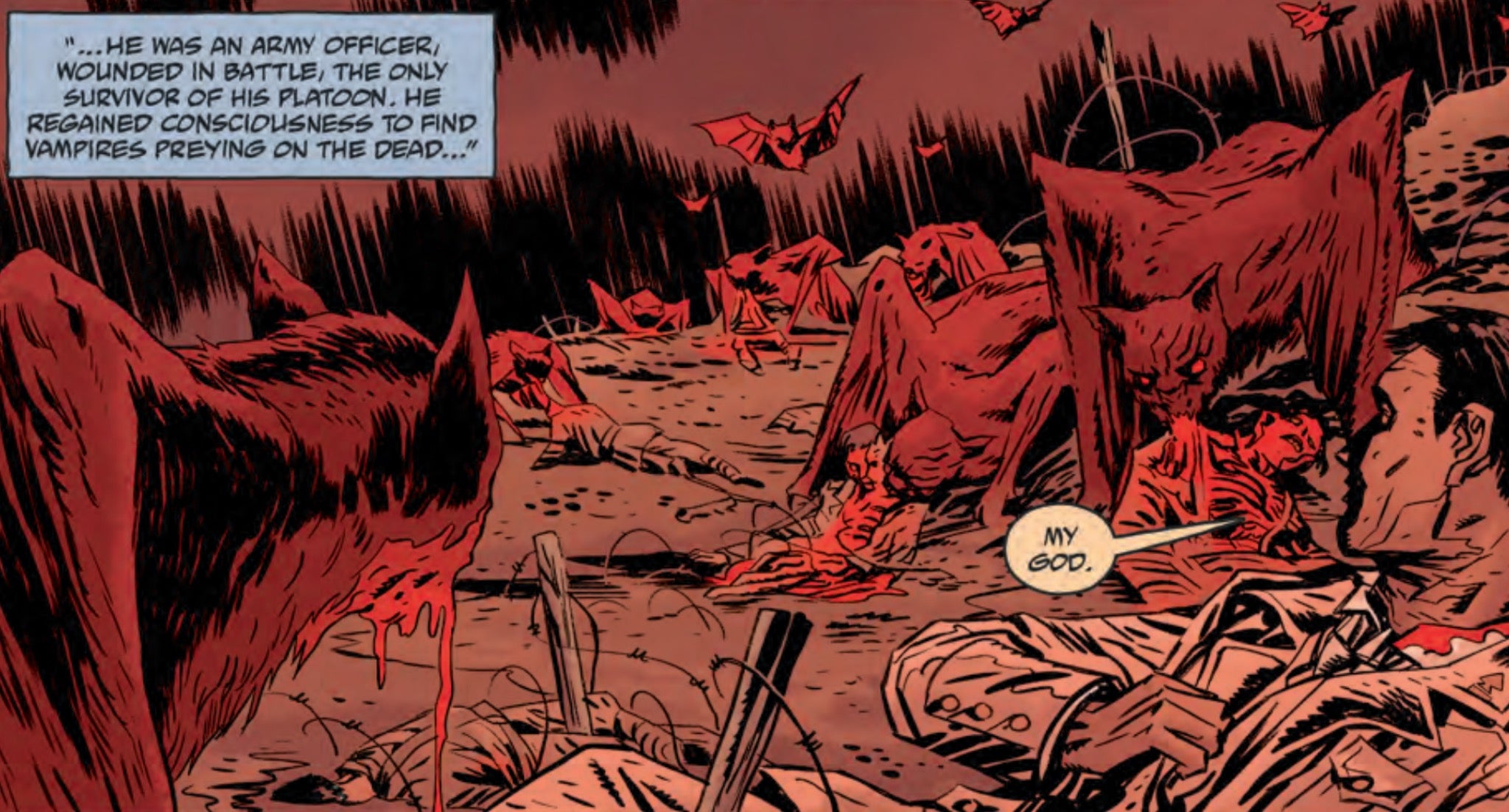
Lord Baltimore returns to his monster-hunting quest for vengeance in a new mini-series this week. He has collected an eclectic array of similarly haunted men and women who are prepared to sail North with him in search of the origin of the monstrous plague that has consumed Europe. While Mike Mignola may be best known for his work on Hellboy and B.P.R.D., Baltimore continues to create an impeccable mood of darkness. Monsters and shadows permeate this comic and should please fans of horror and Mignola’s comics alike.
Bergting and Stewart are responsible for evoking the comic’s poignant, creeping mood. Bergting evokes character in a subtle fashion. The characters in Baltimore are reserved, but their body language and relative positions provide ample information. His monster designs on the other hand are almost entirely alien, making their distance all the more terrifying. When it is not mirroring the icy blues of the Baltic Sea, Stewart’s colors are infused with the spirit of an old amber-tinged photograph embedding the story in history. This tonal work is all the more important to the reading experience because of the first issue’s lack of action sequences or significant plot twists. The subtle world-building and slowly mounting tension found in the art allows Mignola to take his time crafting a narrative foundation without ever losing interest.
Mignola provides an introduction to the world of Lord Baltimore midway through the story. A conversation between Baltimore’s companions will be a welcome aid for new readers, but also reads awkwardly as obvious exposition. It is a recap that could have been placed before the story rather than being embedded into the script. There are plenty of other cues within the story that help to inform readers, old and new, about who these characters are and what their world is like. A discussion about safety on the high seas (or lack thereof) reads much more naturally, while still serving the needs of exposition.
Issue one ends abruptly, almost as if it were cut off mid-sentence. The story appears to be written as a whole that was only broken into installments after being completed. However, this first chapter provides plenty to invest readers and drive the narrative forward. Baltimore: Cult of the Red King #1 doesn’t rush to the action, but takes time to carefully describe its cast, as well as their world and mission. It is a tonal overture that promises a horrifying story to come.
Grade: B+


