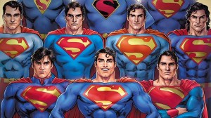
Superman’s S-crest is one of the most instantly recognizable logos ever created. The S in the shield has spread all over the world, and is a symbol associated with truth, justice, and one of the world’s greatest superheroes. Still, just because this logo is so universally known does not mean that it’s always stayed the same. There have actually been many, many different versions of Superman’s logo throughout his nearly ninety years of history, and today we’re going to be talking about and ranking them all. Now, before we do we need to set some ground rules. We’re only counting the mainline Clark Kent/Superman, so no alternate versions like Kingdom Come Superman, and we’re only counting major changes to his symbol in the present time, so no flashback arcs. If we discussed every little difference to his logo then we’d be here until the next Superman movie comes out.
Videos by ComicBook.com
13) Stylized S, Red Outline
Most of the changes to Superman’s logo came early on in his career, when his design was in flux and he was penned primarily as a newspaper strip character. It debuted in Superman #14. This symbol is actually the first one to feature the red outline. It’s really cool to see that incorporated, but I’ve just never been a fan of this S. It’s too sharp and condensed, making it look squished inside the triangle shield. This is the design that bridges the earliest shield designs to the more classic versions we know today, but in doing so definitely shows the growing pains. A massively important logo, but not one that stands best on its own.
12) Godfall Logo

This red and silver variant of the logo was featured in the “Godfall” storyline, which saw an amnesiac Superman living in the Bottle City of Kandor with his fake wife Lyla. This logo only lasted until Superman regained his memories, but it definitely stood out in how different it was from all the other variants. The normally red portions had been recolored silver, and the negative space turned red. It’s a striking image, and definitely fits well with the regal nature of the Kryptonian world Superman woke up inside of.
11) First Black Symbol
This logo is especially important, because it’s the first time that one of Superman’s symbols incorporated the color black. Superman’s classic triangle shield was usually totally yellow, but this one incorporated black into the negative space, and while this design is good, it really set the stage for future classic logos. Most notably, this look would inspire the near universally beloved Fleischer Superman cartoons. This one has plenty of potential, but unfortunately only lasted for the single issue it premiered in with Superman #4.
10) Recovery Suit
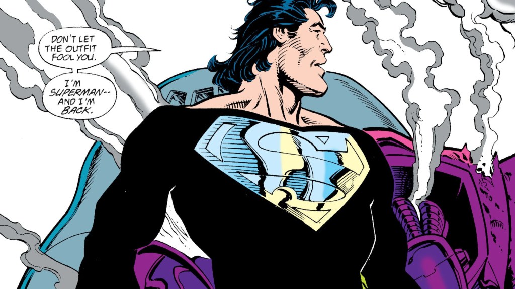
After his miraculous resurrection following the Death of Superman event, Superman donned an all black suit to absorb as much sunlight as he could, needing to heal up to stand against imposters like Cyborg Superman. This logo has the same shape and style as the classic Superman one, but has entirely been colored silver. You’d think this would be too bright or make it hard to see the details, but against the full black suit it actually works really well. This logo is pure simplistic style, doing so much with just a single color and the strong base of its shape. It’s always been a fan-favorite, and they always love to see it show back up when Clark wears his incredibly fashionable black suit.
9) Electric Blue/Red
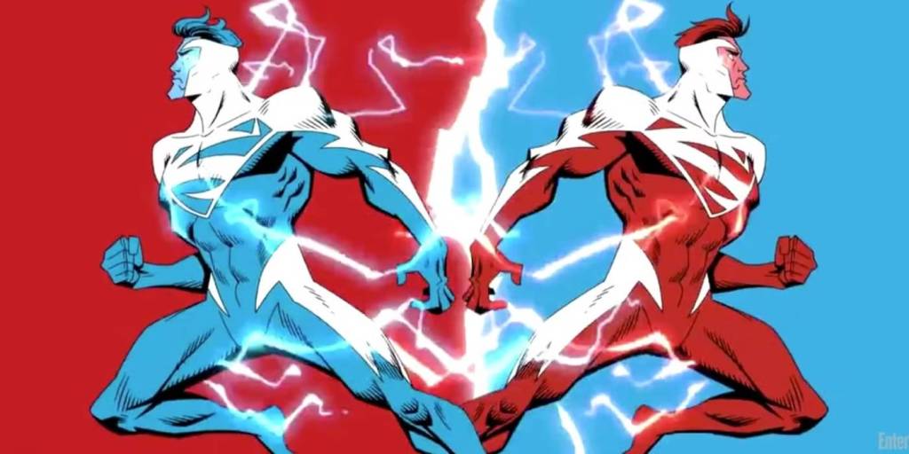
While these are technically two different symbols, the only difference is their colors, and frankly it’s just best to talk about them together. While many people have some understandable complaints with this costume, the symbols are actually very cool. To go alongside Superman’s new energy-based powers, the classic S was redesigned to be sharper, like a bolt of lightning. The blue symbol appeared first in Superman (1987) #123, and Superman Red made his debut when Clark was split into two in Superman Red / Superman Blue. Both logos are iconic in their shape and bold new direction, although I personally like the blue a bit more than the harsh red, but both deserve their chops. Definitely not symbols I’d like to stay as the main one forever, but ones that should be regarded as great ones.
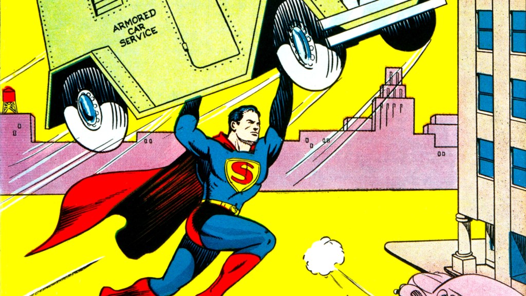
8) Classic Triangle

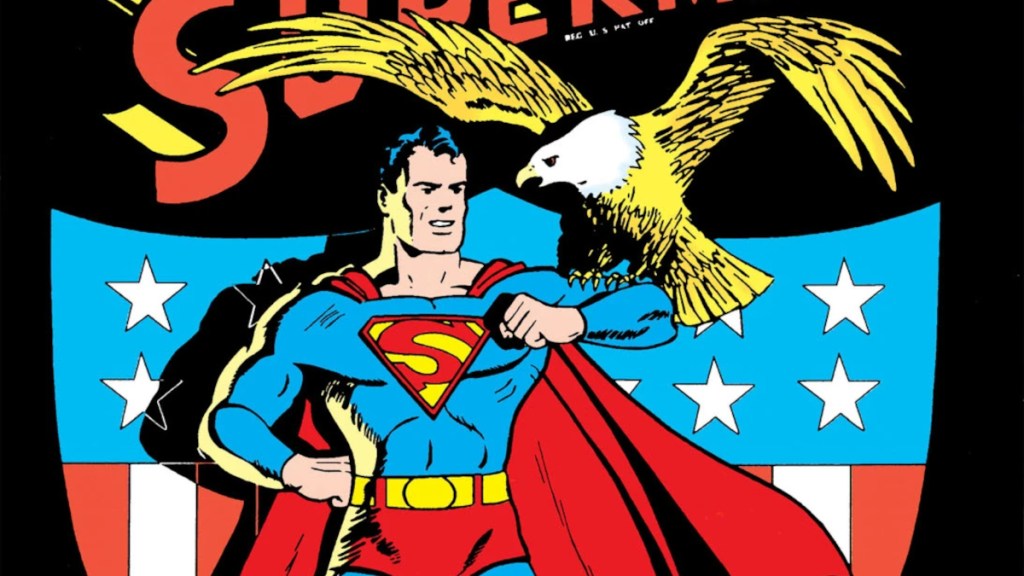
This is the definitive Golden Age logo, debuting as a part of the design in the very first Superman #1’s cover, and the interior pages of the first Action Comics issues. The large red S inside the yellow triangle shield is such a simple look, but it is so iconic. It is the original look that lasted for the longest time in the Golden Age, before being taken over by the more standardized versions later in the era. This design is the one most referenced when making Golden Age homages and comics set in that era, and is easily one of Superman’s most classic logos.
7) Original Shield

Superman’s first ever logo, this one actually technically never appeared in the pages of the comics. The only place you can really see it is in the cover to the first Action Comics issue, and the above image, which is the oldest known sketch of Superman by Joe Shuster, drawn even before Action Comics was released. This logo is very different from all that come after it, being a large shield that resembles a heraldic crest and captures the gladiatorial aspects of Superman’s first design. Superman’s earliest appearances were drawn simply in newspaper comic format, so this logo was too large and complex to appear in the actual pages, so while this is the first ever design, it can really only be studied from sketches and the cover. This is a really cool logo that I personally feel should be drawn more in stories referencing the oldest comics, and totally unique among all the rest.
6) Wide Yellow Shield
While most of Superman’s earliest logos were condensed and looked more like triangles than actual shields, this one widened the symbol to look more like the shield design we know today. The S got much taller and wasn’t so scrunched, but unlike later logos, it didn’t take up the entirety of the negative space. The original version of this logo debuted on the cover of Superman #7, but it was miscolored with the red and yellow portions swapped. The correct version would show up on Action Comics #33’s cover, showing the S sort of floating in the large yellow portion surrounding it. This is super important for expanding the width of the shield, and although I prefer a bigger S, this one is very calming to look at, like a still lake.
5) New 52
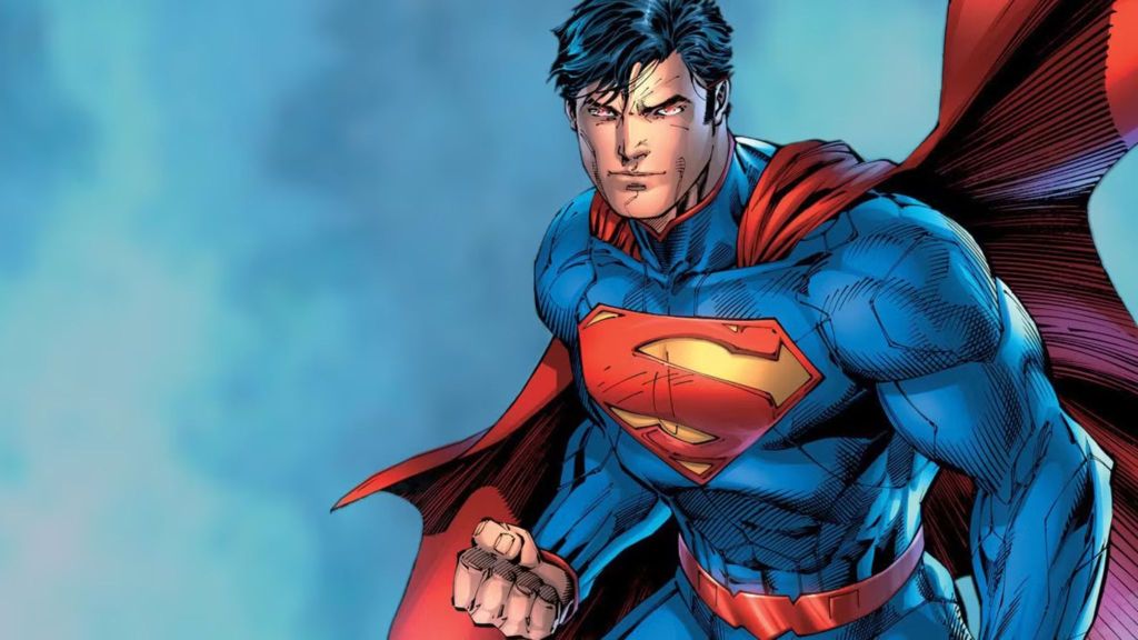
The New 52 reboot saw major redesigns for every character, and Superman was no different. While there are plenty of things to like and dislike about the armor-like costume Clark wore, the symbol on his chest was one of his best. The S was turned far blockier, meant to resemble an alien crest rather than an English letter. There aren’t many major changes, but the thick lettering gives it a very distinct look that makes it stand out amongst its peers. The lopsided sizing between the left and right turns some people off, but I think it’s pretty darn cool.
4) Black and Red
Not many people know this, but Superman actually briefly changed his logo to be entirely red and black back in 2001, specifically in Adventures of Superman #596. Superman changed his symbol to this darker, somber look after the tragic events of the “Our Worlds at War” storyline to pay respects to the countless lives lost. Ignoring its tragic origins, however, this logo is very cool. The black in the negative space creates a deep canvas, and the bright red contrasts it perfectly to make a beautiful and elegant symbol. The red and black give a mature energy that evokes the phenomenal Kingdom Come design, but still keeps the classic S style. It’s a top tier design that definitely deserves a top spot, even though it was only worn in the wake of tragedy.
3) Red, Black, and Yellow

The “Truth” storyline saw the New 52 Superman have his identity revealed to the world and be massively depowered, closer to his original level in the Golden Age. Alongside that, he ditched his Kryptonian supersuit for a down to Earth Superman t-shirt and jeans. The costume remains massively controversial among fans, with them either loving or hating it, but regardless of how you feel about the rest of the costume, the logo it gave us is one of the best there’s ever been. It has all of the style and perks of the previous black and red logo, but the added yellow border makes everything pop beautifully. This is definitely my favorite take on altering the classic logo, and it is a darn shame we only had it for such a short time. I’d love to see this logo come back, even if the rest of the suit should probably stay away.
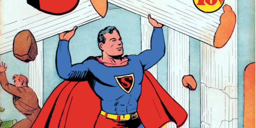
2) Original Standard
This is the defining Superman logo for the first half of his existence. It’s the symbol Superman wore from its debut in Superman #26 up until the massive multiversal reset in Crisis on Infinite Earths. There were some alterations here and there, but this logo is the one Superman wore when he became an international sensation, and when he was trademarked way back when. Interestingly, the proto-version of this shield didn’t first appear in the comics, but in the first ever known painting of Superman, created by H.J. Ward. The symbol as we know it was perfected for widespread use by the legendary Curt Swan, who is probably Superman’s most influential artist that isn’t Joe Shuster. This symbol is the classic red, blue, and yellow that everyone associates with Superman, and stood as the de facto symbol for over forty years.
1) Post-Crisis Standard
Without a doubt, this is the definitive Superman logo. Introduced fully in John Byrne’s Man of Steel, this logo takes all of the strengths of the previous standard and builds upon them. This symbol is a bit larger than the previous, and the S inside of it was far more bulbous and rounded. Byrne once said that when he was younger he saw Superman’s symbol as two yellow fish swimming towards each other, and this mentality carried over into how he drew the logo. Beyond that, the shield’s lines are straighter and taller, with the central portion of the S being much thicker than the previous age’s. What can I say about this symbol other than that it is synonymous with Superman, one of the world’s greatest heroes? This is the logo people use when they mention him, the one that most people see in their minds when they picture the Man of Tomorrow. This is one of the most recognizable symbols in the world, and immediately brings out the inner child of anyone who sees it. A ten out of ten, easily.
So there we have all of Superman’s logos throughout the years, ranked from best to worst. Superman has definitely updated his shield plenty of times over the years, but which one is your favorite? Let us know in the comments below!
Most Viewed
-

Image Courtesy of Madhouse -

Image Courtesy of The WB -

Crunchyroll / Sony Pictures Entertainment -

Image Courtesy of Studio Bind, Inc.