Videos by ComicBook.com
And this being the Internet, it’s our obligation to make something big out of a number of little details. Why?
Well, becuase the Superman costume is incredibly iconic, and the fact that Man of Steel was the first truly major alteration done to it in live action and on the big screen in years means a lot of fans were unhappy, or at least had feedback. Some fo that feedback hasn’t been taken into account here, obviously, although our first look indicates that some of it has.
So here are the things that we noticed have changed from the previous version to this one.
For the sake of ease of editing, we’re going to have the Batman v Superman images on the left and the Man of Steel images on the right, even though that’s the reverse of the “before and after” dynamic one might expect for the story.
Also — yes, we’re aware that his hair is different and that he’s bigger, bulkier, buffer, however you want to say it. Those aren’t really part of the costume, though, except in the sense that it distinguishes him from Clark Kent.
(We’ll just assume, by the way, that there’s some logical explanation to how Superman alters his Kryptonian ceremonial garb without access to his Scout Ship/Fortress of Solitude which fell into government hands at the end of Man of Steel.)
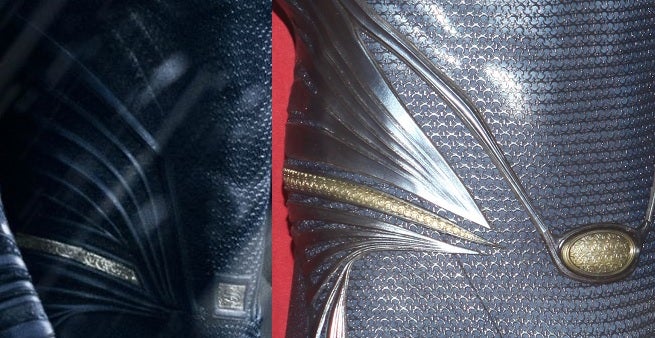
Superman’s “belt” (not really a belt, but that’s kind of what it looks like so we’re rolling with it) now features a rectangular, instead of circular, “belt buckle” with what appears to be a second stylized “S” added to center — but different stylization than the one his chest, at least as far as we can tell.
The thicker, more rectangular belt seems to have inscriptions on it — but even in the high-resolution look included above, we can’t really see what they might be.
The striations on the side of the costume’s body and ribs, that lead to the belt, have also had their pattern noticeably altered.
The sleeves/gauntlets
The cuff area around Superman’s wrists and lower arms features a different design than seen the first time. It seems to have removed much of the gray/silver/black elements in favor of something that looks more like blue silicone.

Superman’s “S” emblem appears slightly different; there appears to be a line going through it. That’s in keeping with the branding that they did for the film: the textural “swooshes” that run through all of the Kryptonian sigils on the “steel”-looking t-shirts and other merchandising, for instance. In the original film, that didn’t carry through to the S as a practical design element, but it appears to do so now.
The “S” also appears smaller and more below the neckline, which is more in line with the conventional look for Superman, especially onscreen.While certain artists — notably John Byrne, Jon Bogdanove, Mike Mignola and others — have often featured a “S” that’s nearly the size of Superman’s entire chest, the one featured in Man of Steel is bigger than the Batman V Superman one…which is still somewhat larger than its most common presentation in the comics.
The colors
This one will have to be mentioned hand-in-hand with the logo: the colors seem to be richer and have more contrast in the new costume, particularly the yellow in the background of the Houe of El shield.
Depending on the viewer, some fans have said that the blue looks somewhat lighter and more blue, rather than navy/gray/black. That may be true, or it may simply be the lens the photo was taken with.
Remember, also, that depending on the promo shot for Man of Steel, the background for the “S” shield could be very different at different times.
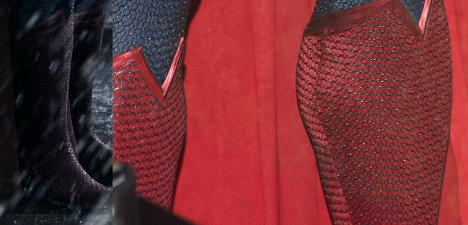
The tops of Superman’s boots are slightly different, with a more layered look. This may be a minor tweak to look more like the comics, where there is a clear double line. They had something like it in Man of Steel but the line/seam/whatever was so narrow that it almost looked like just a very thick seam rather than a design unto itself.
The “V” in the middle also goes down less; it looks (again) a bit more like it does in most depictions in the comics, versus the more swashbuckler-type look of the Man of Steel boots.
The neckline
The neckline looks slightly different — narrower and more contoured, and more monochromatic. Rather than black plastic that outlines the blue, it looks like it’s the same blue (it may appear somewhat darker, but I think only because it’s a different material and shows up differently in the light).

