Viva la 1990s!
Videos by ComicBook.com
Despite the pain and anguish the bursting of the comic book speculator bubble caused the industry in the 1990s, over the past few months the “gimmick cover” – comics adorned with foil, chromium, die-cut images, polybag, etc. – has made a major comeback.
Throughout the month of June, Valiant released five special edition chromium variant covers as part of its “Armor Hunters” event. As a result, Armor Hunters #1, Unity #8, X-O Manowar #26, Armor Hunters: Bloodshot #1 and Armor Hunters: Harbinger #1 all sported the metallic-looking covers, a clear homage to Valiant’s Bloodshot #1, which was the industry’s first chromium cover when it was published in 1993.
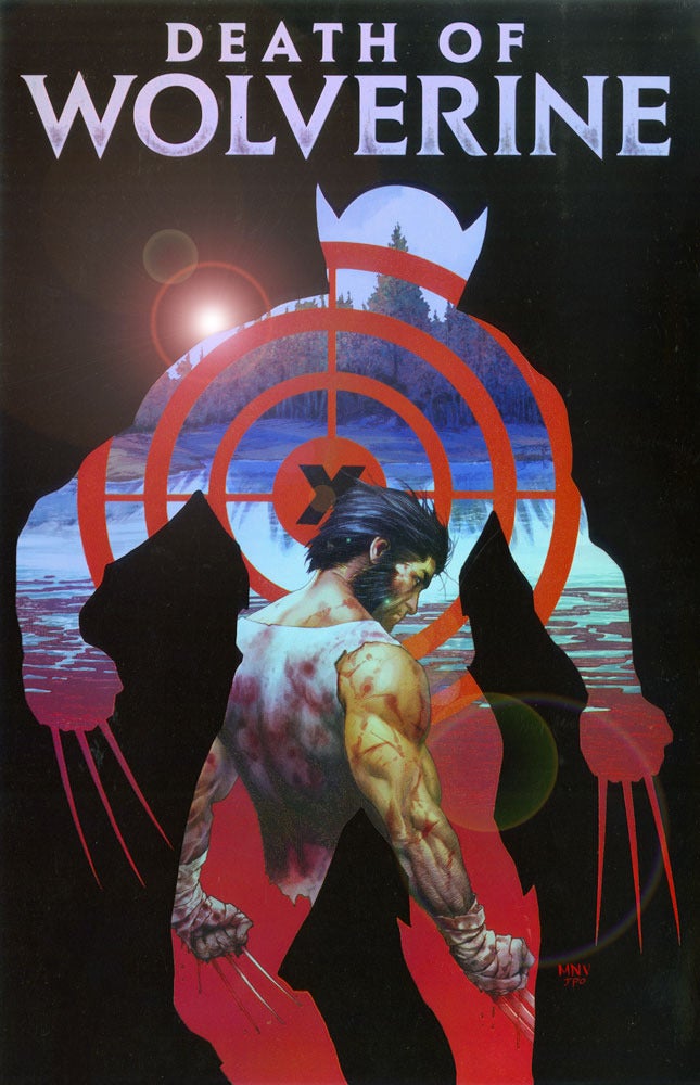
Come September, DC and Marvel will both release special event books with some funky, 90s-esque covers. After the popularity of the “Forever Evil” lenticular/3D covers last year, DC will produce another wave of 3D covers as part of its “The New 52: Futures End” crossover. Marvel, meanwhile, will celebrate/mourn the death of everyone’s favorite “Canucklehead” Wolverine with four “weapon etched holo foil” covers for its Death of Wolverine miniseries. Good luck guessing exactly what that gimmick will look like.
Gimmick covers first became a “thing” in the comic book industry in the early 90s, when comics like X-Men #1, which featured multiple interlocking covers, and Superman #75, the “Death of Superman” issue which was released in a special edition black polybag, set the world on fire and broke records by selling millions of copies. Speculators hoarded these special comics with hopes that they would increase in value exponentially. But once the gimmick comics became too commonplace, sales declined and the industry almost collapsed under the weight of all the speculation.
To that point, here are 10 of the sillier gimmick covers from the 90s. Shockingly some of the comics on this list still managed to sell more than a million copies, but that doesn’t change the fact that the gimmicks they used are still of the head-scratching variety years later.
10. Protectors #5
Published: January 1993 by Malibu
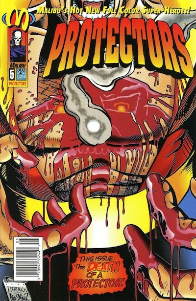
Arguably one of the most famous gimmick covers from the 1990s, Malibu’s Protectors #5 provocatively depicted the blood-soaked chest with a bullet hole in the middle. The bullet hole effect was actually on every single page of this comics, which featured a story that concludes with – naturally – someone getting shot with a bullet.
Protectors #5 was not actually shot with a real bullet – though one 90s comic actually managed to pull that trick off. Copies of JAB #3, published by indie label Adhesive comics, was actually shot with a small pellet gun to create a hole. The creators of Protectors were far more passive and just used good old-fashioned die-cut technology to create the gimmick.
In either case, customers were reading a comic with a big hole in the middle. The fact that neither issue is remembered for its actual story speaks volumes about the quality of the comics.
9. Megalith #3
Published: August 1993 by Continuity
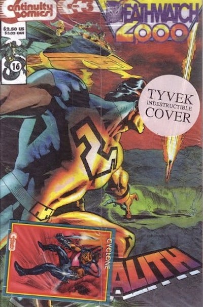
Launched by longtime artist Neal Adams in 1984, independent publisher Continuity Comics got very experimental with its gimmick covers in the 1990s. For the third issue of Continuity’s sci-fi superhero book Megalith, the comic featured a special edition Tyvek cover. Tyvek is a synthetic material that is a registered trademark of DuPont. It is promoted as being nearly impossible to bend or tear (though it can be easily cut with a pair of scissors).
There’s something to be said about producing a so-called “collectible” out of a material that will ultimately protect it from the casual damage a comic sustains when being read or stored in a protective bag. But all the same, what did Continuity think collectors were doing with their comics that they needed them to be printed on a funny feeling synthetic material (and charge an extra $1 for it)? To paraphrase the great Ian Malcom, it appeared that Continuity was so preoccupied with whether or not a comic could be printed with Tyvek, that no one stopped to think if they should.
8. Tribe #1
Published: March 1993 by Image
The saga of the short-lived Todd Johnson/Larry Stroman series Tribe is one of the more fascinating stories from the early 90s “Image Revolution.” The debut issue of the series sold more than one million copies and is the best selling comic by African American creators in industry history. But missed deadlines and creative strife between Johnson and Stroman derailed the series before it could ever take off. After its first issue, the second and third installments were published more than six months later by Axis Comics. Axis then went bankrupt and Good Comics published a final issue more than three years after the Image debut.
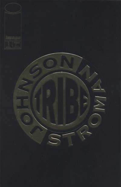
Beyond the editorial delays and drama the first issue had a somwhat odd and intentionally vague gimmick cover. Rather than use an actual image or character from the comic to promote what was inside, the front was adorned with a gold stamp “Tribe” logo. It was clearly successful enough to attract nearly one million buyers, but considering the comic’s behind-the-scenes drama, one has to wonder if Johnson/Stroman/Image ran out of time before they could develop a cover that tied-in to the book in a more visual ways.
7. Crazyman #1
Published: May 1993 by Continuity
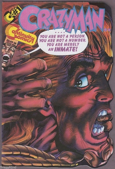
Similar to Protectors #5, Continuity’s Crazyman #1 deployed a die-cut gimmick throughout the duration of the entire issue. But unlike Protectors, Crazyman’s gimmick really had nothing to do with comic’s plot, nor did it provide any visual intrigue or appeal to the issue.
Instead, Crazyman – a series that was an offbeat homage to the 60s British television series “The Prisoner” – die-cuts the profile of the titular character’s face. So, the right edge of every page has an irregular shape caused by the die-cut gimmick. Fortunately, outside of some publishing information on the comic’s opening page, the gimmick doesn’t impact any of Crazyman #1’s content, but one has to question what the point of the entire exercise is besides the fact that Continuity just wanted to do something different with one of its comics, and the company was fresh out of Tyvek.
6. Robin III: Cry of the Huntress (miniseries)
Published: December 1992-March 1993 by DC
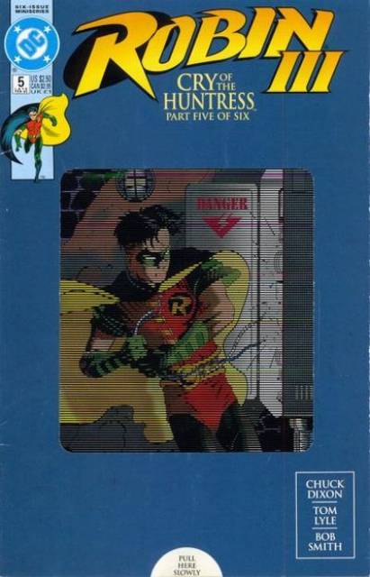
Third Robin, Tim Drake was the star of his very own miniseries in 1992-93. Each comic sported special edition covers promoting “slide motion.” The motion effect was actually created by combining multiple cover gimmicks – lenticular holograms and “moving panels” that could be moved back and forth by pulling on a tab at the bottom of the comic.
But here’s the kicker: every slide motion comic in the series was packaged in a protectable polybag. This raised an even bigger quandary for readers who were obsessed with the collectability of comics in the 90s – do you risk devaluing the comic by removing it from the polybag in order to play with all those other gimmick enhancements that make up the motion cover? Fortunately, it’s all moot and the bulk of the series can be found in a local comic book shop’s back issue bin for less than $1.
5. Eclipso: The Darkness Within #1
Published: July 1992 by DC
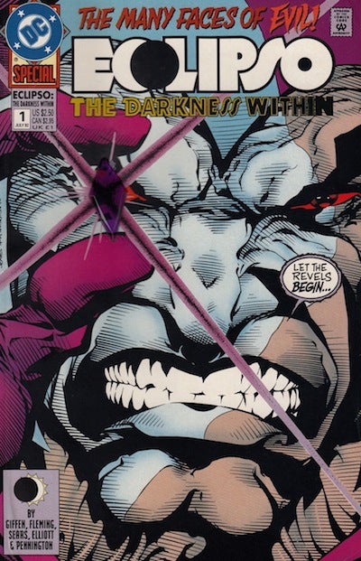
The mega-event/crossover, “Eclipso: The Darkness Within,” saw the DC Universe take on the supervillain Eclipso, who had taken possession of various heroes using the powers of a black diamond. For the first installment of the storyline, DC published a standalone issue that sported a cover with a plastic diamond attached where Eclipso’s right eye should be.
While the gimmick might seem somewhat appropriate given the role of Eclipso’s black diamond in this miniseries, there were some other, non-storyline related flaws to this concept. When stored in a long or shortbox, Eclipso’s little plastic protrusion had a habit of making an indentation on whatever was being stored directly in front of it, thereby reducing the value of the neighboring comic. So if you weren’t careful with how you stored your “special collector’s edition” of Eclipso: The Darkness Within #1, complete with plastic diamond on the front, you ran the risk of decreasing the value of other comics in your collection.
Imagine the horror of a person finding their black polybagged copy of Superman #75 with an Eclipso diamond indent on the back!
4. Amazing Spider-Man #400
Published: April 1995 by Marvel
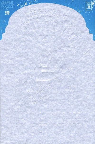
Amazing Spider-Man #400 is the unfortunate case of an absolutely amazing comic being sullied by an absolutely terrible looking cover. On the interior, “The Gift,” by J.M. DeMatteis and Mark Bagley, which depicts the very emotional death of Aunt May, the matriarch of the Spider-Man universe (the death was later retconned but that’s a story for another day), is considered by many long-term fans to be one of the greatest Spidey tales of all time. But the front … even Bagley and DeMatteis have joked about its silliness.
As a teaser for May’s death, Marvel published ASM #400 with a hideously ugly white embossed tombstone overlay. The tombstone has an almost indecipherable illustration of Spider-Man on the front (good look finding it in all of that white). In hindsight, the tombstone just came across as being corny and insensitive when compared to the tender, wistful tone of the comic itself. It also had a habit of pending and pulling whenever the comic was placed in or removed from a protective bag.

3. X-Force #1
Published: August 1991 by Marvel
No, this is not going to be another unprovoked slam of notorious comic book industry firebrand Rob Liefeld’s inability to draw feet, but instead just a straightforward criticism of a totally greedy marketing ploy by Marvel in the early 90s. For the debut issue of its X-Force series, the comic was packaged in a clear polybag with one of five different Marvel trading cards.
Here’s where things get cynical: consumers were encouraged to collect all five cards, but there was nothing different about the comic itself inside the polybag – no variant cover, no special back-up story, no additional chromium or foil stamp. Just X-Force #1 times five.
Of course, the comic sold more than a million issues and was one of Marvel’s hottest books until the interlocking covers of X-Men #1 (likely helped by people chasing after those cards). So I guess Gordon Gekko was onto something when he said “greed is good.”
2. Superman: The Man of Steel #30
Published: February 1994 by DC
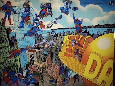
Rather than have its creative talent design a striking visual depicting a battle between Superman and Logo for the cover of Superman: The Man of Steel #30, DC instead decided to rely on its readership to choose their own cover image. This comic was issued in a polybag filled with “vinyl clings” of Superman and Lobo which could then be adhered anywhere the customer wanted on the Jon Bogdanove and Dennis Janke Metropolis skyline image.
Of course anyone who was a child over the past 60 years would recognize the “vinyl clings” as a poor man’s imitation of Colorforms, one of the most iconic toys of the 20th century. And as anyone who played with Colorforms can tell you, no great scene sticks around forever. So one can only imagine how long a lot of those “make your own” Superman/Lobo covers lasted. Instead, what most readers were left with was a bland cover of Metropolis, and a bunch of random “vinyl clings” in a longbox somewhere.
1. Bloodstrike #1
Published: April 1993 by Image
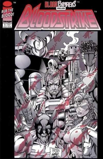
OK, show of hands. Who here hasn’t wanted to fulfill a fantasy of rubbing the blood?
Well, that’s exactly what Image Comics delivered to blood-fetishists in 1993 with this “extreme” comic from the minds of Rob Liefeld, Eric Stephenson, Dan Fraga, and Danny Miki. Using a “thermal ink” on the cover that responded to the heat of a human touch, a reader could actually rub their fingers on the front and reveal red “blood.”
“Rub the Blood” is actually the quintessential cover gimmick demonstrating the creative, almost anarchist nature of early 90s Image. There’s a reason why so many of these comics outsold their “big two” competitors – they wanted to be bold and different and edgy in a way that Marvel and DC weren’t. But this is a comic that’s entire premise is marketed around rubbing your fingers on the cover and making red splotches appear. If that’s not silly, what is?


