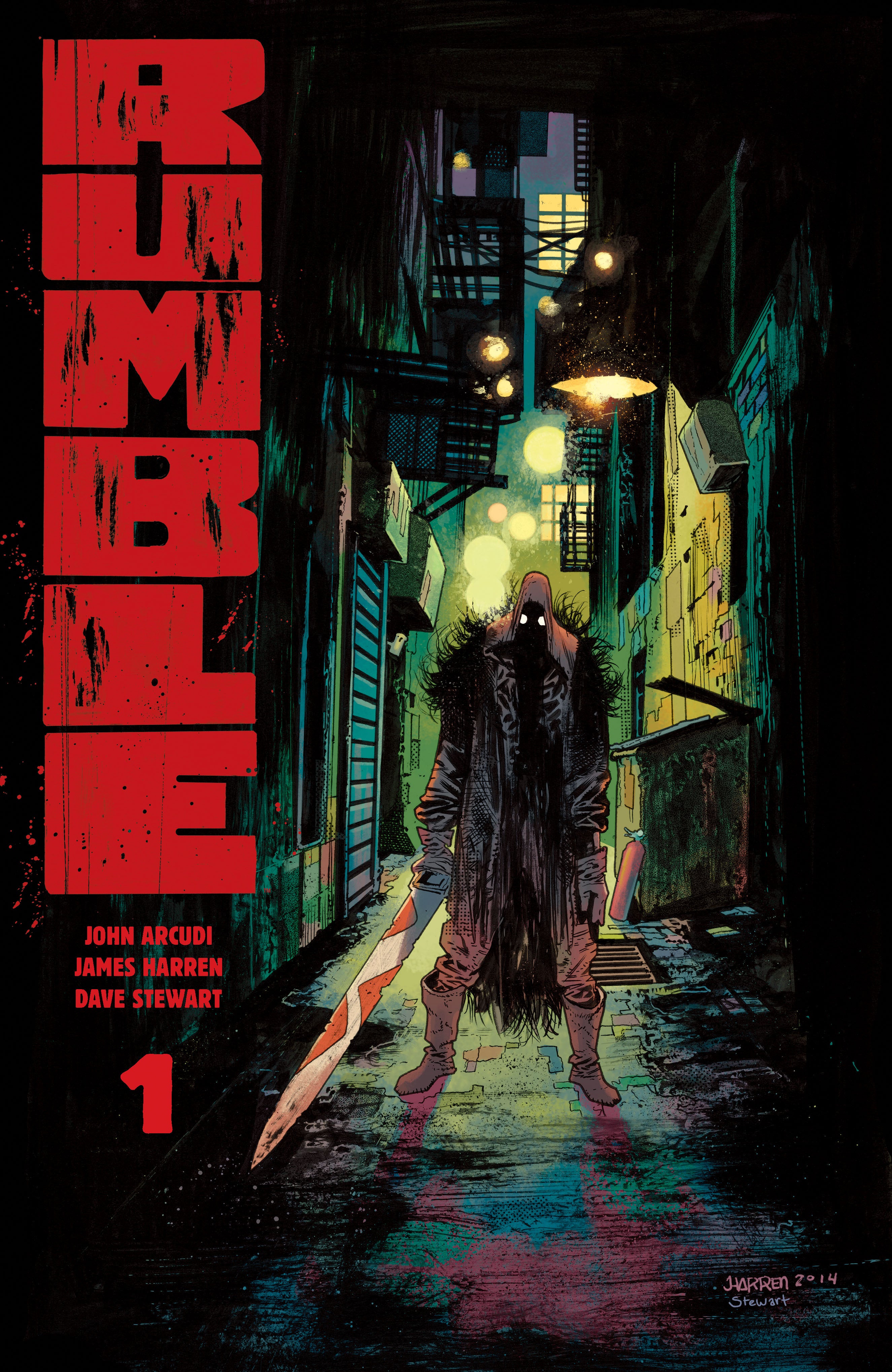
John Arcudi and James Harren’s work at Dark Horse Comics on B.P.R.D.: Hell On Earth and Abe Sapien: The Devil Does Not Jest has established them as a powerful pairing. Arcudi’s scripts and Harren’s pencils and inks have blended together to capture the fraught mood of these stories perfectly and infused the action and characters with vitality. They have taken those skills and applied them to a new concept at Image called Rumble; the result is their best collaboration to date.
Videos by ComicBook.com
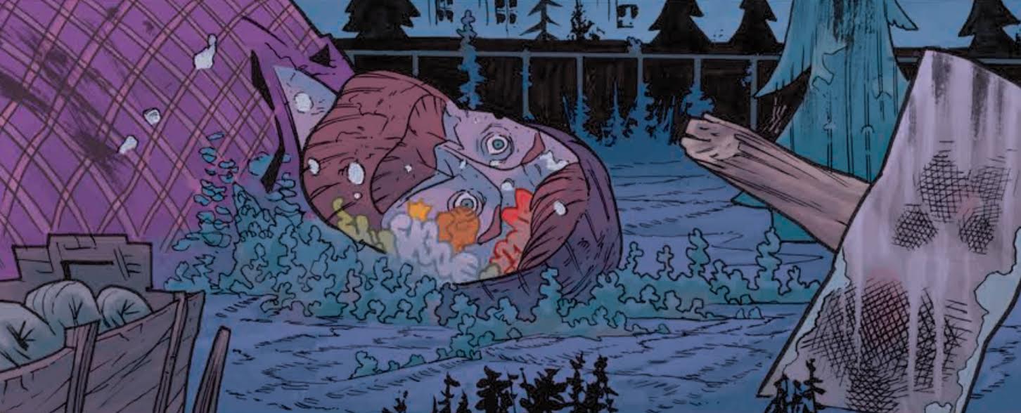
The world of Rumble is introduced in a brief pair of glimpses into two very different settings. It begins with a lonely, broken spire of a mountain. It is rising up into the clouds with a mysterious figure perched on its cliffs. Then an amusement park that has fallen into disarray is revealed. Paul Bunyan Land is covered in graffiti, its windows broken and gates almost toppled. On one hand there is epic fantasy, steeped in silent foreboding. Darkness and panel composition conceal the bulky figures who inhabit this landscape providing a sense of mystery. On the other hand there is a caricature of the modern world inundated by refuse. It’s a trashed and sullen heap of American achievement. These two settings are revealed without context. They simply exist, forming a dichotomy between the mundane and the fantastical that informs the rest of the issue.
That introduction establishes what this comic is. These twenty-two pages are all about the feeling and experience. Rumble #1 establishes its tone quickly with striking design work. Every element on the page aids in making you feel something, informing the nature of the story and expanding it horizons, instead of constructing barriers to restrain it. There’s an electricity in the air, the rumble of an approaching storm, nearing this shattered urban landscape with fantastical figures walking its streets. It’s not clear where the series is going and that’s a good thing. Exposition be damned, Arcudi and Harren are too busy moving you to bother slowing down.
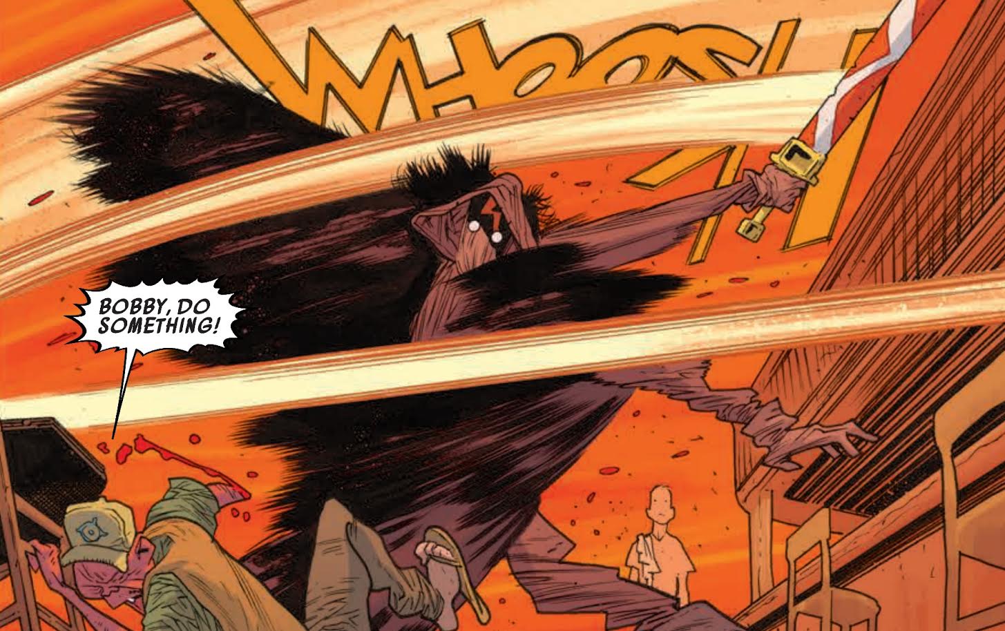
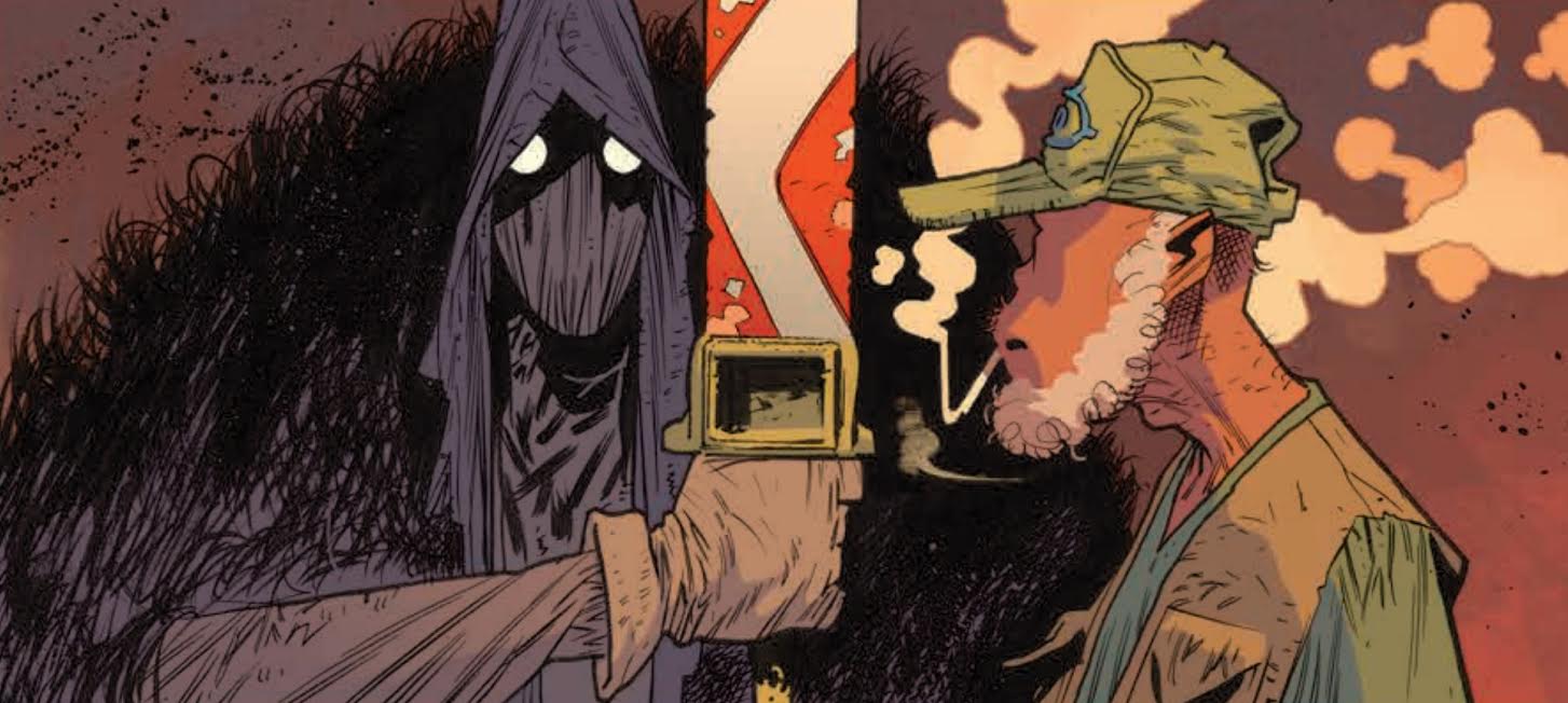
Excitement is palpable from the very first few pages, but the hook is set in an action sequence that begins on page six. The first narrative to emerge is between a down on his luck bartender, Bobby, and his grizzled patron, Rufus. When Rufus leaves the bar and encounters an enormous scarecrow with an even bigger sword, Rumble‘s pacing switches from a brisk walk to an open sprint.
Harren is a master of action comics; the sequence in the bar is about as good as fight scenes get in this medium. Forms streak across each panel. There is no space for rest or time to slow down. Every running body and swinging sword is moving at full speed, blurring the air around them and drenching panels in motion lines. It’s a style that elegantly conveys movement without becoming too busy.
Even more significant than Harren’s refined style and masterful use of visual effects is his keen eye for storytelling. The key to any good action sequence is a clear chain of cause and effect. Harren understands this and composes his pages to tell the story as quickly and clearly as possible, shearing every ounce of fat from the meat. Each action has a distinct reaction or consequence. Panel composition helps speed your eye through each page, maintaining momentum and propelling you forward. The events of the sequence crackle with energy and move like Danny Zuko’s Thunderbird. It’s masterful storytelling that doesn’t just depict a fight, but captures the intensity and feeling of each action.
The impact of Dave Stewart’s colors in this sequence (and throughout the issue) cannot be understated. He not only helps to define Harren’s inks, but emboldens them, emphasizing the motion lines. He cranks the heat up on the backgrounds providing the violence the feel of a scorching blaze, fast and painful. Stewart’s colors blur into the actions of the characters and place them at the forefront of each panel. These reds and oranges also highlight the inking and make it clear that the smoke hovering in the bar has assumed the appearance of storm clouds rolling forward.
You can locate the exact moment when Rumble becomes something special; this is it. Arcudi is composing an epic poem to violence and Harren and Stewart are transforming it into a high velocity experience. The comic looks simply incredible, taking fascinatingly weird premises and exploiting them for the biggest possible effect. It’s Conan the Barbarian on crank stuffed into a Chuck Palahniuk novel that has been lit on fire.
And this occurs before the halfway point of Rumble #1.
Arcudi continues to flesh out the world of Rumble with additional vignettes before returning to Bobby at the bar. The issue dips into the lives of a cat-loving apartment dweller and swamp folk as well. He reveals a gratifying sense of humor in these instances. These characters’ behavior is reminiscent of the supporting cast on The Simpsons. They are instantly defined in action and appearance, both of which are equally outlandish. Harren’s designs inform their personalities every bit as much as what they do and say. The cat lady is bent over with age, dressed in sweatpants and slippers with glasses so thick they obfuscate her eyes. Ignoring any additional context, it’s easy to tell that she’s a shut in who is casually (and hilariously) oblivious to the world around her.
Clarity of design is present in the scarecrow, Bobby, and other characters who do not fall into the realm of caricature as well. Bobby’s speech and appearance both define him as a slacker. His clothing is draped loosely over his form and nothing about him could be described as “groomed”. The scarecrow evokes a similarly haphazard appearance, but instead of being defined by weakness, it is defined by strength. The mass of straw beneath its rags along with a constantly darkened face and wide, unflinching eyes make for a terrifying appearance. Then there are the demons who walk a tightrope between grotesquerie and comic relief, slipping easily into either role as the scene demands. The characters in Rumble are every bit as well-defined and striking as the environment found at the start of the comic.
The truth is I have no idea what to expect next in Rumble. There’s no clear way forward for this story because it has the ability to go almost anywhere. Every character introduced in Rumble #1 could be killed in Rumble #2 and the series would be able to move forward with ease. It is a landscape made for exploring where each aspect of can be relished in its depiction. This is a comic that loves being a comic. Arcudi, Harren, and Stewart aren’t trying to create a storyboard to be picked up for television or movies; they’re just making the best damn comic book that they can. They are invested in making the most of their chosen medium in order to create something unique. Rumble is kinetic, visceral and impactful, a pure comics experience.
Grade: A-

