We’re just a matter of weeks away from Dying Inside, a new graphic novel co-written by Fall Out Boy’s Pete Wentz and writer-director Hannah Klein with art by Witchblood and Squad‘s Lisa Sterle. A part of Vault’s new Headshell imprint, which collaborates with real-life recording artists on a series of graphic novels, Dying Inside has already wowed fans thanks to early looks revealed at this year’s Free Comic Book Day.
Videos by ComicBook.com
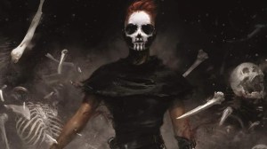
In Dying Inside, today is Ash’s big finale. And by finale, she means exiting the stage permanently. Ash is a sixteen-year-old girl with more angst than Ian Curtis and Elliott Smith combined (her two idols). She’s apathetic and therefore believes death is the easiest route to relief. But nothing is more embarrassing than a lame death. Unfortunately, her meticulous plans are all ruined when the beautiful knife she buys off a webstore turns out to be charmed with a protection spell. Now, Ash has to track down the witch who transformed her clocking out attempt into the worst gift imaginable: immortality. Turns out, the witch responsible is another sixteen-year-old-girl named (get this) Liv. The two vow to undo the charm together and fight for Ash’s death…even as things get increasingly entangled with a strange new antidepressant called Somnia and her mom’s gross boyfriend, Greg.
In anticipation of Dying Inside‘s debut, ComicBook spoke with Sterle via email about her approach to Ash’s world, and some of the fun aesthetic elements that fans can expect in the full graphic novel.
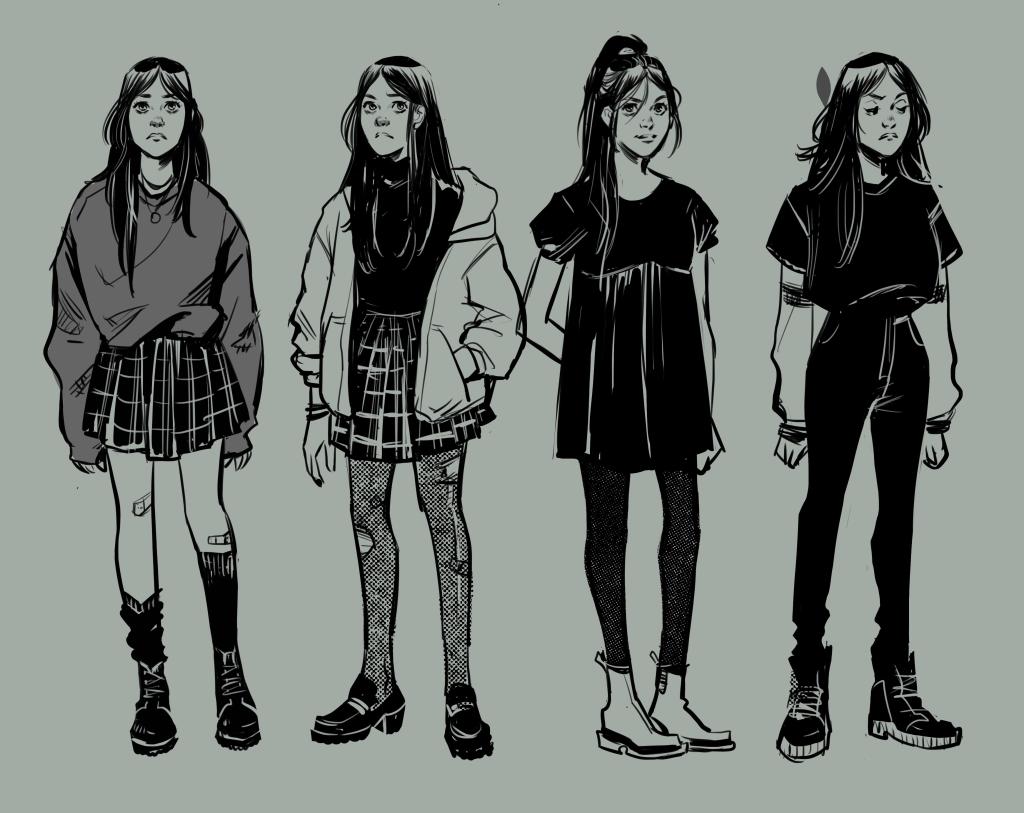
ComicBook: Did the minimal/monochromatic color palette of Dying Inside impact how you approached the aesthetic and outfits?
Lisa Sterle: I wouldn’t say it made a huge impact, as it was a natural extension of my usual comic making process. As I generally don’t color my own comics, I’m used to thinking in literal black and white as far as design goes. And that applies to the panel/page design as well as the character and outfit design. Color wasn’t on my mind at that stage, but it fell very naturally into place after the inks were done.
When we spoke previously, you talked about becoming endeared to Ash and Liv as you worked on the book. What were you most excited to tackle when bringing their dynamic to life?
I love to illustrate the small, quiet moments, and Ash and Liv’s blossoming friendship was full of these. Dialogue is of course, crucial to understanding our characters in comics, but I love to put what isn’t said in words on ythe panel. Whether that’s through a sideways glance, a squeeze of the hand, a summer light casting soft shadows. I really strived to make Ash and Liv feel as real and full of feeling as possible.
Do you have a favorite Easter egg that you added into the art?
Ooo I love this question! I think The Royal Tenenbaums poster in Ash’s room is an especially appropriate one, as the film portrays a suicide attempt set to an Elliott Smith song. It felt like it would naturally be favorite of Ash’s. I also enjoyed slipping in the album cover for Heatmiser’s Mic City Sons. Because of course Ash would be into ALL of Elliott’s Smith’s music. And that’s a great album. Clearly, I too, am a big Elliott Smith fan. It was one of the things that instantly made me click with this story when I first read the script.
Without getting into specific spoilers, are there any scenes or elements of Dying Inside that you are especially proud of?
There’s an action sequence that spans multiple pages that I literally sat down and thumbnailed like a pro-wrestling match. Like, oh, would a German duplex look good here? What about a spinebuster? That was super fun to layout and draw.
***
Dying Inside will be released wherever comics are sold on Tuesday, September 17th.
Most Viewed
-
Courtesy of Studio Trigger -
Images courtesy of Fox -

Courtesy of TOHO Animation -

Image Courtesy of A-1 Pictures