A great extraction shooter lives and dies by clarity. When every footstep could signal a squad closing in and every second spent looting leaves you exposed, players need to understand their environment instantly. Unfortunately, that is exactly where the upcoming extraction shooter, Marathon, begins to falter.
Videos by ComicBook.com
After spending time in the ongoing Server Slam for Marathon, it is clear that the core gameplay loop delivers tension and reward in equal measure, with gunfights that feel impactful and movement that carries weight. The problem lies in the interface, which struggles to keep pace with the action on multiple levels. In general, loot is difficult to read, icons do not communicate their function at a glance, and discovering what each item actually does requires hovering over it repeatedly, which slows the natural flow of play and forces players to adapt in ways that feel more like work than learning.
While you will eventually internalize the patterns after multiple matches, the initial friction is significant, and without serious refinement before launch, the UI risks undermining the game’s long-term potential, especially when compared to Arc Raiders, which presents information in a clean and intuitive way.
Loot Readability Is Marathon’s Biggest Immediate Problem
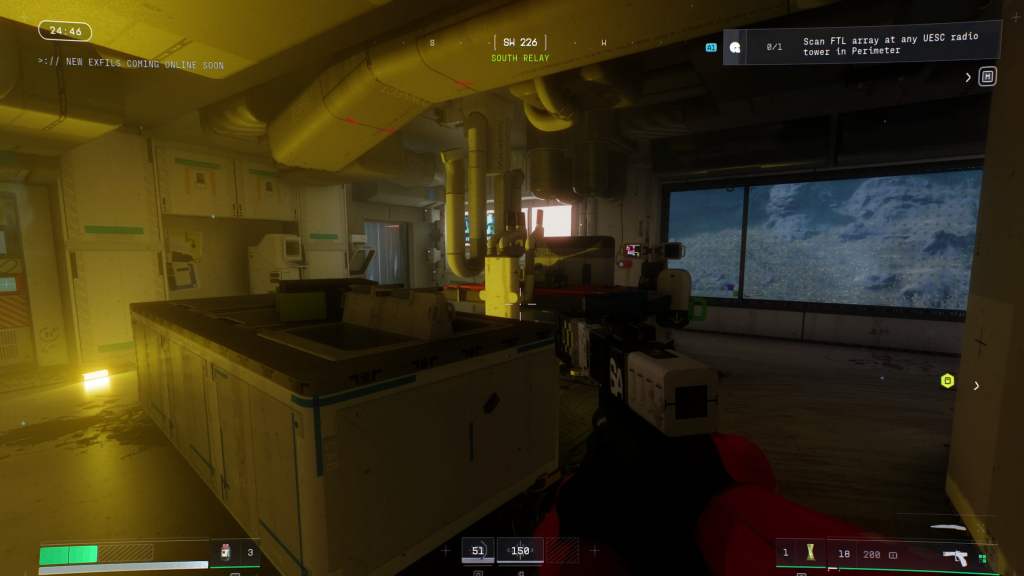
Loot readability as a problem becomes apparent the moment players start interacting with the environment, because items that are critical to progression do not consistently stand out from the background. Containers, dropped gear, and pickups blend into the scenery in numerous ways that make it difficult to determine what can actually be collected. That hesitation can throw off the pacing of a match, turning what should be a tense, strategic decision into a moment of awkward uncertainty that undercuts the game’s momentum.
As you play, you’ll gradually begin to recognize subtle visual cues after repeated runs, but that learning process feels like a penalty rather than a reward. In contrast, Arc Raiders presents loot in a way that is immediately understandable, allowing players to assess value and make decisions instinctively. Marathon, by comparison, forces constant second-guessing, which can diminish the intensity of encounters that are otherwise engaging and carefully balanced.

This friction is particularly concerning because first impressions carry extra weight in competitive extraction shooters. If new players are slowed down or confused by unclear loot, the excitement of discovery is replaced by frustration, and that frustration can linger even after patterns become clear. The core gameplay is strong, but the inability to quickly read the environment risks overshadowing the fun during critical early matches when the game should be hooking its audience.
Item Icons Lack At-a-Glance Clarity, Forcing Unnecessary Friction
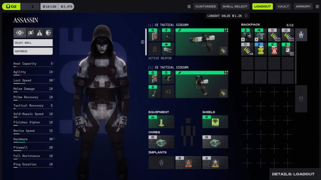
The inventory screen continues the same trend, as item icons rarely provide immediate clarity about their purpose. Many icons share similar shapes, muted colors, and abstract symbols that fail to distinguish weapon mods from consumables or crafting materials, and players are forced to spend extra time hovering over each item to confirm what they are looking at. This additional cognitive load pulls attention away from tactical decision-making and hampers the action.
Over time, players will memorize the iconography, but that memorization feels more like a workaround than a natural understanding of the interface. In a game that already demands awareness of positioning, enemy movement, and squad coordination, adding extra mental effort to simply interpret items creates unnecessary friction. Arc Raiders, in contrast, provides an inventory system that communicates information instantly and clearly, allowing players to focus on gameplay rather than deciphering the UI for what’s what.
Marathon is also entering a space where perception and expectation are heightened, especially given Bungie’s complicated history with fans who are cautious after years of uneven decisions and support. The interface cannot rely on goodwill to carry it, and when placed alongside Arc Raiders, it feels sluggish and opaque. The gameplay is compelling, and the tension works well enough, but if Marathon hopes to live up to its potential or compete with Arc Raiders on any remarkable level, the UI requires serious attention before launch, or the weakest aspect of the experience risks defining the conversation on day one.
What do you think? Leave a comment below and join the conversation now in the ComicBook Forum!