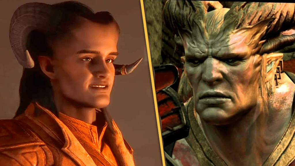
With each Dragon Age game, BioWare modifies the art style and direction of the series. One design in particular that has undergone many changes is the design of the Qunari. In each and every game so far, the Qunari have looked different. What is odd about this is that every Dragon Age fan agrees the design peaked with Dragon Age 2. Yet BioWare changed their design in Dragon Age: Inquisition, and now again in Dragon Age: The Veilguard. In the process, it has ruined the Qunari, taking away from fans a unique design that was very fitting for the series’ foreign race and replaced it with a generic, humanized design that looks more like Qunari cosplay with an Instagram filter on than anything else. The Qunari on the right in the picture above is the embodiment of the iron-fisted, all-conquering, dogmatic, stoic giants we’ve learned about in games and lore. The Qunari on the left looks like a villain out of Shrek.
Videos by ComicBook.com
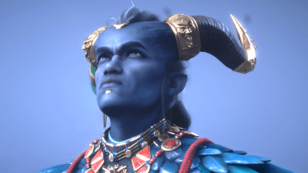
The design of the Qunari has been the talk of Dragon Age twitter after some new gameplay footage featuring a player-created Qunari Rook surfaced online. A screenshot of this footage, which can be seen below, shows what simply looks like a human with an elongated forehead and horns. It is a very humanized design and consistent with the other Qunari we have seen so far, including Taash, one of the game’s seven companions. In isolation, it is a pretty soulless, generic design. With context its get worse though. It looks nothing like the Qunari we’ve seen in previous games. It would be one thing if it was radically different and an upgrade, but it is radically different and a downgrade. In defense, it is sometimes rolled out that a change in art style is a part of the Dragon Age series, as if it is a foundational aspect of the series that is crucial to the success of it. Obviously, this is not the case.
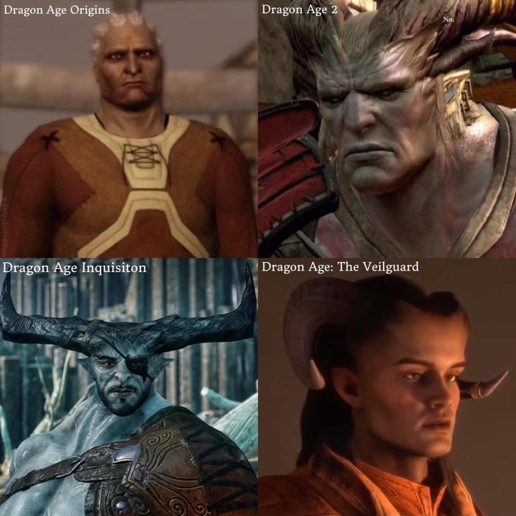
In Dragon Age: Origins, the Qunari didn’t have horns because of a technical limitation. In Dragon Age 2, this was rectified. Everyone loved the design in Dragon Age 2, yet in Dragon Age: Inquisition, BioWare made further tweaks to the detriment of the design. Despite this, the final design in Dragon Age: Inquisition was still familiar enough. Yet, apparently the design was not tweaked enough because the direction the design was going in with Dragon Age: Inquisition has been extended with Dragon Age: The Veilguard. The final product is now a Qunari design that doesn’t even look like it is from the same game.
Unfortunately, the Qunari aren’t the only example of this. The design of the Darkspawn also gets worse with every game. It’s a bewildering phenomena. The art direction and designs of Dragon Age: Origins were indeed a little generic. It was dark fantasy to a T. With Dragon Age 2, the art direction, designs, and style evolved to something a bit more unique. Then with Dragon Age: Inquisition, the series evoked high fantasy more than dark fantasy. Not every fan was receptive to this, but the series still maintained a level of uniqueness and a through line. With the fourth installment, the series has regressed.
The starting point was generic dark fantasy, and somehow we have gotten to generic high fantasy over the course of three games. Not only does Dragon Age: The Veilguard still look fairly generic, accomplishing nothing, but it also now looks unfamiliar on top of that.
Most Viewed
-

Courtesy of Eight-Bit -

Courtesy of Kadokawa / Shosetsuka ni Naro -

Image courtesy of 20th Century Studios -

Photo by Jesse Grant/Variety via Getty Images -

Courtesy of Lionhead Studios