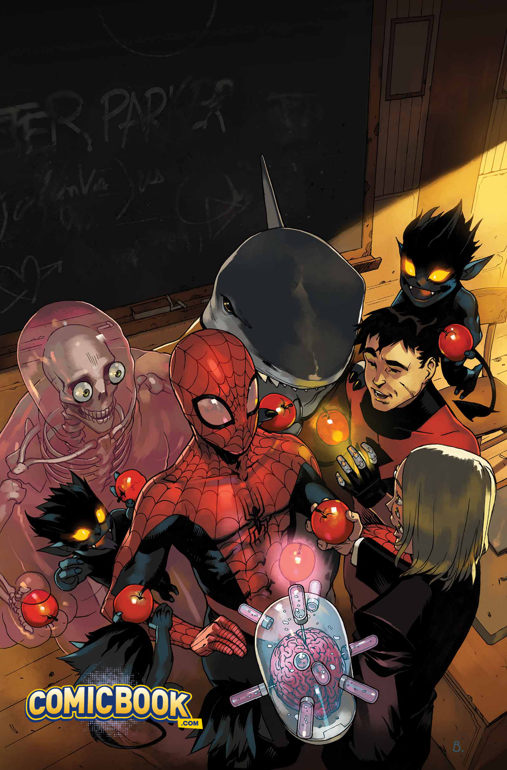
With Wolverine encased in adamantium for the foreseeable future, the cancellation of Wolverine and the X-Men was inevitable. However, the fan favorite series has found new life with a slight (okay… major) change in its lead character. Spider-Man has arrived to assume Wolverine’s role as a special guidance counselor at the Jean Grey School. The premise places everyone’s favorite webslinger in a whole new sandbox and writer Elliott Kalan and artist Marco Failla waste no time taking advantage of this change in scenery.
Videos by ComicBook.com
Not a single inch of space in Spider-Man and the X-Men #1 is wasted. Kalan and Failla attempt to include as many heroes, villains, and settings as coherently possible in 20 pages. The plotting and pacing resembles Bronze Age comics at Marvel. Conversations occur mid-action and characters are never left at rest for more than a few panels. Kalan’s mind is revealed to be a lockbox of Marvel lore as a veritable who’s who of D-list antagonists appear or are referenced. This comic is certainly not lacking for content.
All of that content makes for a kinetic, fast-paced comic book. Readers never have the opportunity to ask themselves “What next?” because it’s already unfolding on the page. Over the course of the first four pages alone, Spidey moves from his semi-antagonistic relationship with the X-Men to battling a favorite D-list villain to adapting to campus life. Every story beat is significant in some way (no matter how minor). In the tradition of the best Bronze Age comics, Kalan includes a wide variety of conflicts in order to create a blend of minor and ongoing stories that’s ideal for episodic storytelling. There is a sequence in the Danger Room that is resolved in only a few pages, a battle in New York that leads to a cliffhanger, and a long-term mystery set up in the issue’s opening pages.
Kalan’s script is very heavy on dialogue. His panels are often packed with word balloons and those balloons are stuffed with words. This characterizes the large cast of characters (Spider-Man plus eight students) very well and works naturally in a classroom setting, but when the action shifts to the Danger Room or Manhattan, it slows the pacing considerably. During these sequences, they begin to detract from the energy of what is actually occurring. Letterer Clayton Cowles provides excellent work in making these bubbles fit within Failla’s artwork. Despite their occasional density, they never manage to overwhelm a panel or crowd out characters.
Failla manages to track all of this action surprisingly well. Even when provided with a monthly schedule, he avoids leaning on shortcuts like excessive close ups and generic backgrounds. The massive cast and wide variety of settings are consistently maintained between pages. Even with eight distinct figures (not counting any antagonists), Failla keeps track of Spidey and his students in resting and action sequences alike. When they go on a field trip, the museum and its centerpiece are never lost or ignored. Without well composed and detailed artwork, the exceedingly busy Spider-Man and the X-Men would fall apart; it never does.
There are two exceptions to Failla’s consistent draftsmanship. Early in the issue the school grounds are barely distinguishable in the background during a fight sequence. At the very end most of the class becomes lost somewhere outside of the panels during another brawl. These are exceptions though. Failla’s work here surpasses that of his peers on highly publicized titles like Secret Six and Axis, reflecting a real concern for continuity and depth.
Spider-Man and the X-Men #1 is a busy first issue, but never succumbs to the weight of its many characters and heaps of action. Instead, it maintains a quick pace and sense of fun that makes it a very enjoyable read. Despite some bumps, Kalan and Failla are proving themselves to both be competent creators with a clear understanding of the medium and genre they are working in. These are two names to watch out for at Marvel Comics.
Grade: B


