The Five Worst Costume Changes of the New 52

Since the DC Comics “New 52” relaunch has effectively reinvented a number of their characters [...]

Since the DC Comics "New 52" relaunch has effectively reinvented a number of their characters from the ground up, the redesigns of their costumes was in many cases a prelude of things to come. When someone has basically zero backstory, what they look like can be a powerful clue as to who they're going to be—especially on team books, where the writer has to worry about establishing identities for multiple characters. As such, I figure this is as good a time as any to look at the costumes I thought were the five worst redesigns of the new DC Universe. Clearly, this is the kind of topic where not everyone will be in agreement, so feel free to chime in at the bottom of the page—but do try to keep it civil. 5. Batman I know, I know. Batman?! He looks almost exactly the same! Well, yeah. That's kind of my point. Certain characters (such as Batman, The Flash and Green Lantern) feel like they were redesigned just for the sake of redesigning them. Some, such as Wonder Woman, were actually redesigned by Jim Lee shortly after having been recently, ahem, redesigned by Jim Lee. Creating a new look for Batman that casual fans won't be able to tell apart from the previous incarnation begs the question: Why bother with a redesign? Surely that time and energy could have been better spent somewhere else, like making sure Justice League ships on time. Is his look terrible? No. He's Batman; his look is iconic, and it's pretty hard to make him look terrible. [caption id="attachment_8424" align="aligncenter" width="300" caption="Most of the time."]

[/caption] Still, it was a senseless redesign indicative of many of the more pointless redesigns that seem to be change for change's sake (I'm looking at YOU, Wonder Woman and Booster Gold!), and add nothing much to the character. 4. Firestorm

Those of us who read Ron Marz's long, popular run on Green Lantern in the 1990s may remember Effigy. He was Kyle Rayner's most memorable original villain (with the possible exception of Fatality, who now appears alongside Kyle in Green Lantern: New Warriors). The flame-headed villain was the bad penny that kept coming back over and over again, reinventing himself and his powers, hassling Kyle in new and creative ways and working on behalf of The Controllers, who were kind of the same as Green Lantern's Guardians of the Universe but with a different philosophy. He so defined the era that he was, in fact, brought back as the villain in Marz and Darryl Banks's recent Green Lantern RetroActive: The '90s special. That said, he always kind of looked like a poor man's Firestorm. There's no way around it when you've got the flaming hair and the skull-stocking thing that really doesn't look good on almost anyone (I give a pass to Booster Gold and some of the X-Men characters). Firestorm had been a fashion tragedy throughout the years though, and so it's arguable that Effigy actually looked better. So I guess I can understand why, when they were redesigning Firestorm, they'd basically create a costume that looked just like Effigy's. That still doesn't explain the hideous yellow one they have Jason wearing, and it doesn't excuse the fact that while Sinclair's art is perfectly capable on the title, Van Sciver has made one of George P rez's classic mistakes: Designing a character who only looks good when you draw it. Except that in the case of Firestorm it just looks BETTER--still not actually good, per se--under Van Sciver's capable draftsmanship. 3. Black Canary

Here's one that didn't look so terrible on first glance...but after reading an entire issue of it, I can't shake the feeling that it often looks like she's fighting crime in her jammies. Yes, that can be said of many superheroes--but Black Canary's most recent pre-relaunch costume worked well for her and even if it was, granted, a bit silly, hypersexualized and impractical for combat. Still, it looked good in motion. The real-world, practical, bodysock approach that DC has taken to costuming with the relaunch (foregoing boots in many cases, and in this case giving Dinah little slipper-looking things like you might see at a karate dojo makes logical sense, but when so much of comics is about the suspension of disbelief, and things look good on the printed page that could NEVER work in a movie, it seems to me a better strategy to go with what looks best. That's working within your medium. Also, and I'm sure this has already been said elsewhere but I haven't seen it yet so I'll put it out there--if you're going to hand Dinah over to Jesus Saiz, who is very good at drawing women who look beautiful and sexy and graceful even if they're wearing leather or body armor or have their foot in the face of the reader--why the fishnets? Is it an iconic part of Dinah's look? Yes. But for a while, so was that hideous headpiece and flowing sleeves from the Justice League International days. And nobody is looking to bring that back! 2. Hawkman

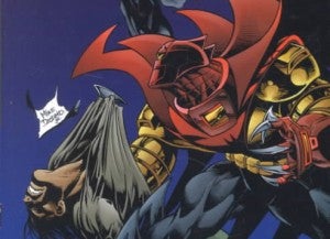
I see the need to reimagine Hawkman's look. It seemed a bit dated even by comic book standards, and featured the bare-chested "X" thing that DC management has been said to hate so much on Martian Manhunter. Still, this look just doesn't work for me. Seriously, look at that cover. It's like Azrael's Batman costume (the red one above) mated with something from a GWAR video. Certainly it conveys the "savage" thing, which is a good thing because in-story, it's more important than most that we get that feel. again, I compare this version of Hawkman to somebody like Venom, where the suit seems to have its own personality and agenda. He should get coffee with Blue Beetle sometime. But in the context of a modern-day superhero story that's told in the present in the US (not in the past or on a jungle island or something), it seems a little silly. And the fact that it doesn't look like any of the many, many previous incarnations just raises unwanted questions among the hardcore fans about which origin(s) we're working from here and how much of his bizarre, incomprehensible mythology even counts in the new DC Universe. Hawkman, a character whose recent history has talked about his constant reincarnations since the days of ancient Egypt, almost seems to me like he would have been a perfect candidate to appear in Demon Knights, as a savage and brutal combatant of the 16h Century. There, I think, the big-ass shoulder pads and the battleaxe and the hairy chest would have worked out just fine for him. 1. Harley Quinn

This one was, of course, the most obvious. Everyone started in on this costume change the moment they saw the first cover and it really hasn't gotten any better with age, or context. In the first issue of Suicide Squad, she had the best line (the one DC used to promote the book), and frankly came off pretty likable. That's something, since I never cared for the character before. As a non-fan of hers, I'm also not invested in her old look at all. That said, even lacking any fondness for the character or the costume, this one still looks pretty preposterous no matter how you slice it. You might be able to make a convincing argument that looking like a clown-obsessed prostitute makes sense for someone who turned evil because they were in love with/obsessed with Joker, but it seems likely that any attempt to explain away this terrible costume in that manner would just draw the ire of those already mad with the bubble-headed, oversexed way some feel many of DC's women are being portrayed. Fixing a problem with a bigger problem simply wouldn't fly. What do you think, readers? What's the worst one I missed?

0comments