Comic book readers who have visited their local shops this month have probably noticed an influx of 1990s-inspired gimmicks adorning the covers of a number of comics. Similar to what transpired last year during its Forever Evil event, all month DC is publishing dozens of New 52: Future’s End comics with 3D lenticular covers. From the other half of the “big two,” all four issues of Marvel’s Death of Wolverine series will all feature “weapon-etched holofoil” upfront.
Videos by ComicBook.com
It’s become commonplace for readers and critics to dismiss any throwbacks to the 90s as a cynical marketing ploy by publishers. While the copious amounts of foil, chromium and glow-in-the-dark effects did become excessive as the decade wore in (only a few months ago we took a look at some of the sillier gimmick covers from the 90s), there were also a number of artistically or commercially meritorious gimmick covers that are still worth celebrating years later.
So let’s take a look at some of the good gimmick covers from the 1990s:
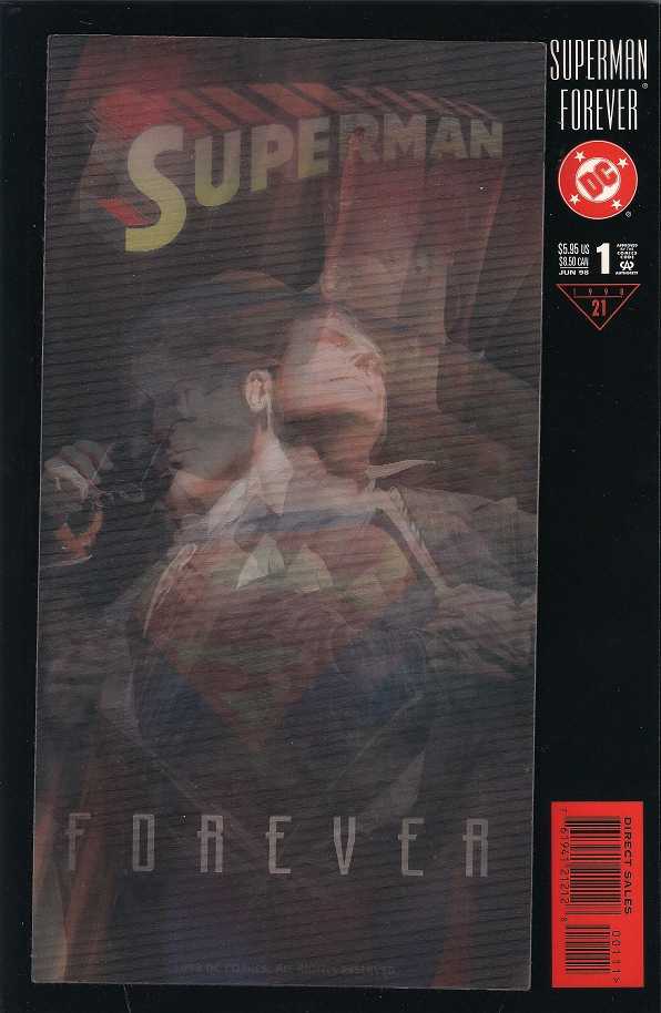
10. Superman Forever
Holograms and comic books were a bad mix in the 1990s, as publishers really couldn’t get the effect to work in an attractive way. By the mid-point of the decade, holograms gave way to a “lenticular” moving image effect, which was slightly more appealing to look at, but still a bit sloppy and low budget when compared to what publishers are pulling off with the technology now. But by 1998, DC produced the decade’s best-looking lenticular cover with its Superman Forever one-shot. The quality of the cover is helped considerably by the iconic Superman image courtesy of industry all-star Alex Ross. But the actual moving image – which depicted Clark Kent removing his glasses and ripping open his dress shirt to reveal the legendary Superman logo underneath – is well done considering what had been done with lenticular graphics before it. Plus, when you also take into the account the stark black border around the central image, you are left with a really nice-looking gimmick cover.
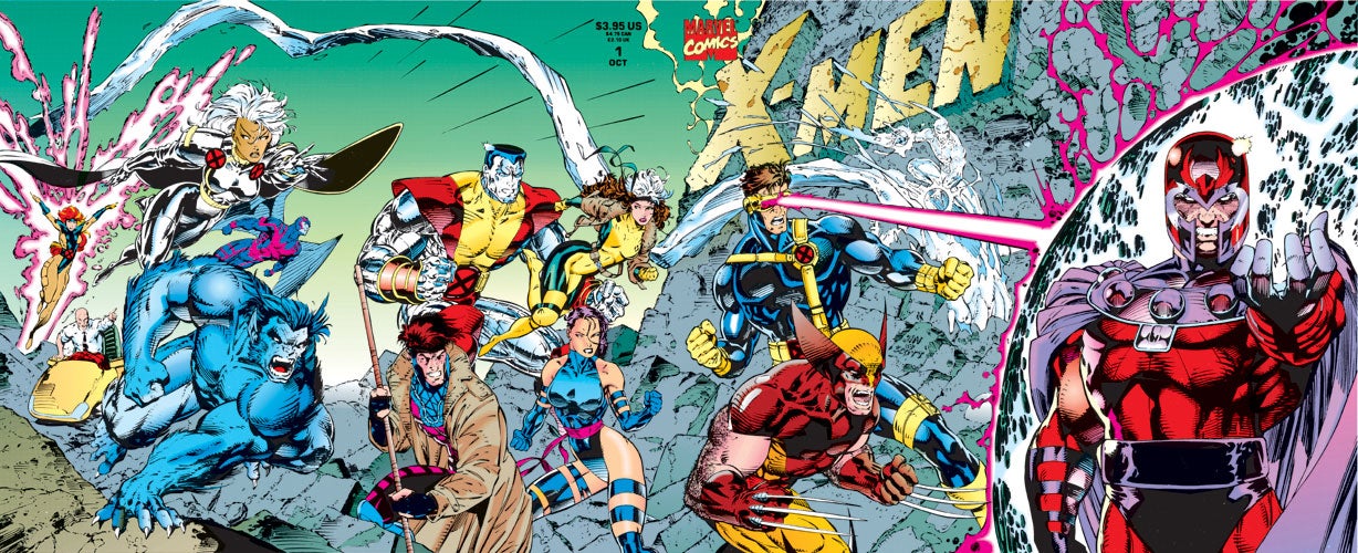
9. X-Men #1
One of the biggest selling comic books of all time, more than 8 million copies of X-Men #1 were snatched up in the 90s, primarily because of the gimmick – five variant covers that interlocked to create a beautiful Jim Lee-illustrated landscape of the X-Men fighting Magneto (there was also a special edition gatefold version of the comic which contained the entire image). Sure, needing to buy five copies of the same comic in order to see Lee’s entire image was annoying and an inefficient use of funds, but the iconography of this issue and its gimmick cannot be denied. Plus, in terms of its historical significance, this was the comic that cemented Lee as one of the industry’s best young artists, which of course led to the “Image Revolution” in 1992 of which Lee was one of the core founding member of the company (alongside Todd McFarlane, Rob Liefeld and Erik Larsen).
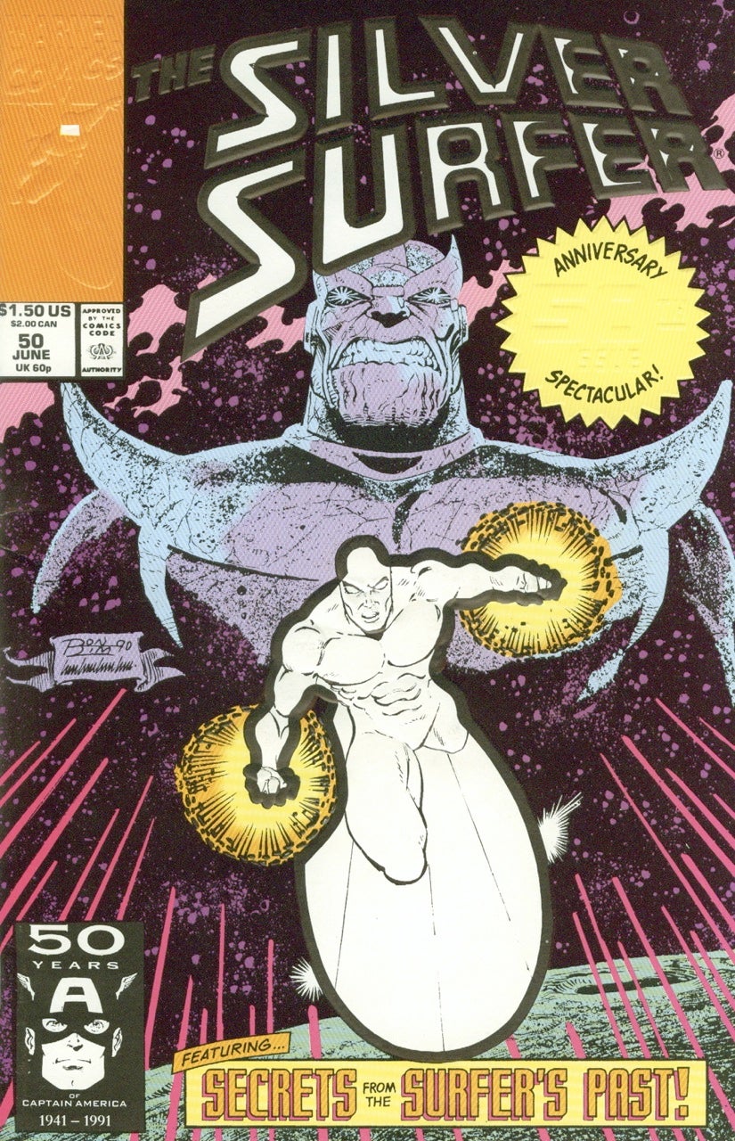
8. Silver Surfer #50
It’s not the world’s most exciting cover, but 1991’s Silver Surfer #50 gets the nod for being the first comic in industry history to feature the chromium embossed effect, and for how it utilizes the gimmick in a sensible manner.
As the 90s chugged along, publishers were seemingly embossing every other comic without much rhyme or reason. But Silver Surfer #50 adds the embossing to the Mr. Radd himself. And that makes sense since the character’s name is “Silver Surfer” – so some silver chromium embossing is neither excessive nor inappropriate. Yes, I understand that I’m essentially awarding points here for lack of excess, but considering we’re talking about the 90s here, why not applaud Marvel’s show of restraint.
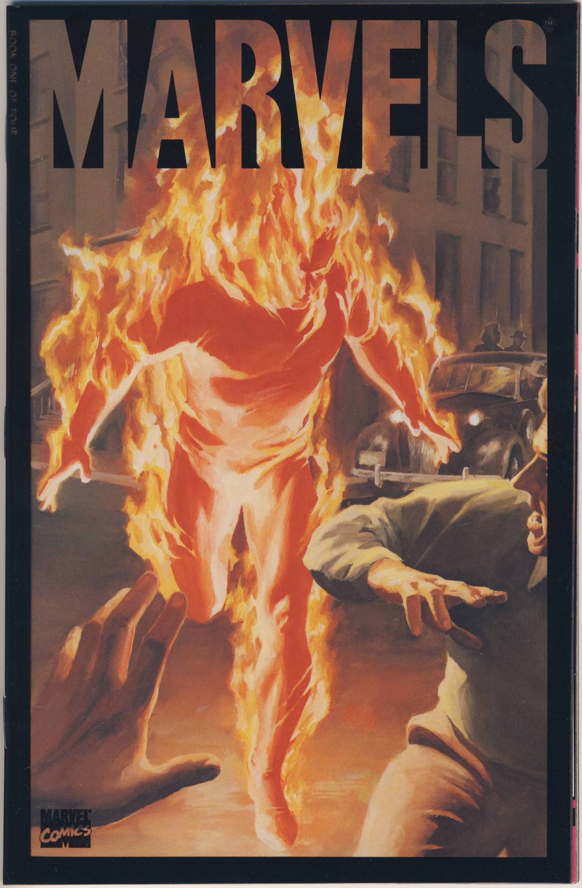
7. Marvels
Everything about the 1994’s four-part miniseries Marvels is beautiful: Kurt Busiek’s reverential script which waxes nostalgic about the Golden and Silver Age of Marvel Comics; and Alex Ross’s genre-changing painted artwork which transformed the artist into an industry superstar. Such a beautiful looking (and reading) book required some very attractive packaging, which is why it was entirely appropriate for Marvel to unveil an outer acetate protective cover for all four issues of the Marvels series.
The acetate produces an almost shimmering effect for the comic, giving Marvels an extra layer of specialness and eye appeal. When you stumbled upon these books in the store, between Ross’s artwork and the acetate, the comics almost looked like museum displays.
Conversely, it was fairly easy to scuff these covers up, so hopefully after absorbing this great story one or two times in the 90s, the owner invested in a collected edition of the series for repeated viewings.
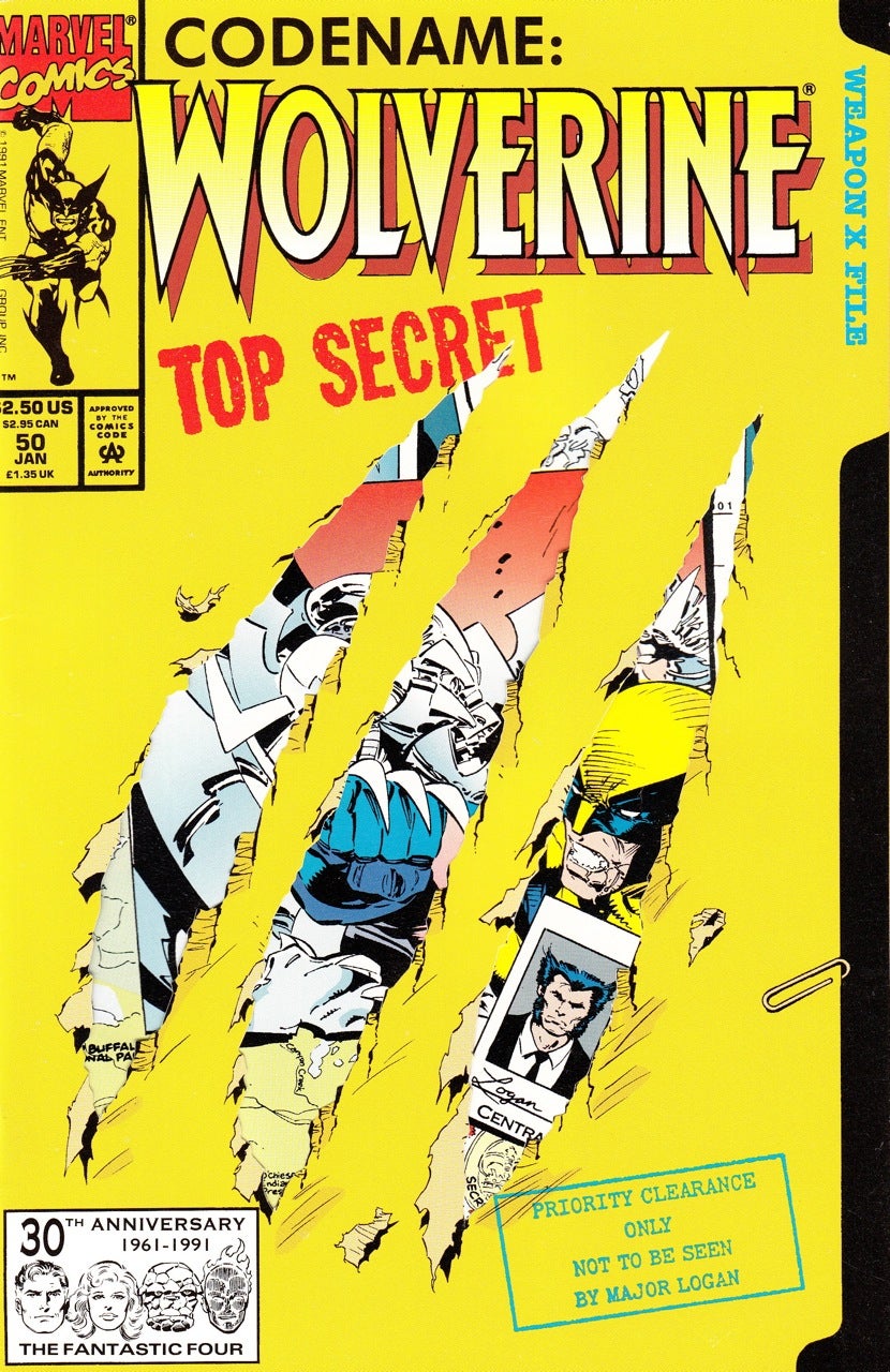
6. Wolverine #50
Many publishers struggled to produce attractive and functional die-cut covers during the 90s gimmick boom, but Marvel actually utilized the effect quite well with 1992’s Wolverine #50. While die-cut covers often yielded ugly overlays (see the tombstone on Amazing Spider-Man #400), or cover extensions that just folded out and did nothing else (Batman #500), the “claw marks” cutting through a confidential file folder on Wolverine #50 were a cool visual that also played into the comic’s storyline.
The issue is the third part of “The Shiva Scenario” storyline, and functions as an unofficial sequel to the celebrated “Weapon X” arc. In “The Shiva Scenario,” Wolverine continues to dig for more information about his past, which explains the claw marks on the folder, and underneath the die-cut overlay, there’s a Marc Silvestri illustration of the Wolverine/Shiva robot showdown from inside the comic. And that’s how you get an attractive and narratively functional die-cut cover.
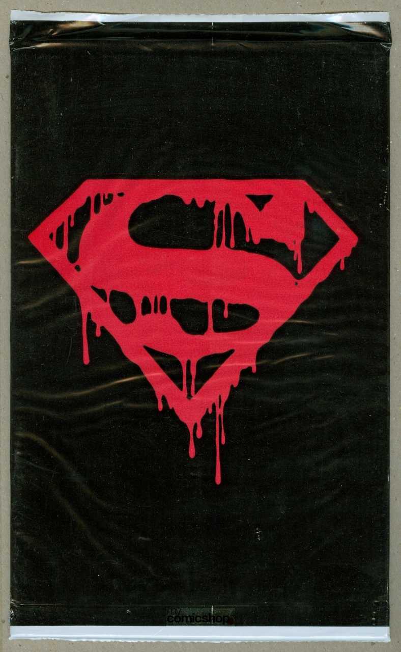
5. Superman #75
While this comic book never became the collectible some speculators thought it would be when “The Death of Superman” was published in 1993 (nobody told you to spend $50 or more for this issue back in the day), a polybag chock full of goodies is a pretty sweet gimmick, even by 90s standards.
If you dared to open the polybag and thus “devalue” the comic, you would have found a trading card, a Superman Daily Planet obituary, a black armband, and other assorted stuff. Compare that to what other publishers were doing with the polybag – usually inserting just one lousy trading card (or today’s publishers, who primarily use polybags to either prevent spoilers or to hide mature content) – and you can see why one might think they got what they paid for in Superman #75 (just disregard that speculator bubble bursting which has since relegated this issue to the dollar bin at most comic book shops).

4. Daredevil #321
It’s rare for a glow-in-the-dark gimmick cover to actually tie-in with the story being featured in the comic, but Marvel hit upon that formula in Daredevil #321, the second chapter of the somewhat reviled “Fall From Grace” arc. The story is best known for its introduction of a new Daredevil costume and the return/resurrection of Elektra. But what made Daredevil #321’s cover so cool was the fact that it was designed in a way that the featured villain on the front – Hellspawn – would be blacked out while the rest of the comic glowed. This effect linked directly with the comic’s story, which depicted Daredevil fighting a villain who was capable of blocking out the Man Without Fear’s patented radar sense.
Yes, the story on the inside is a chore to get through, and Daredevil’s new shoulder pad-ified gray costume has been moced for years. But at least the cover is clever.
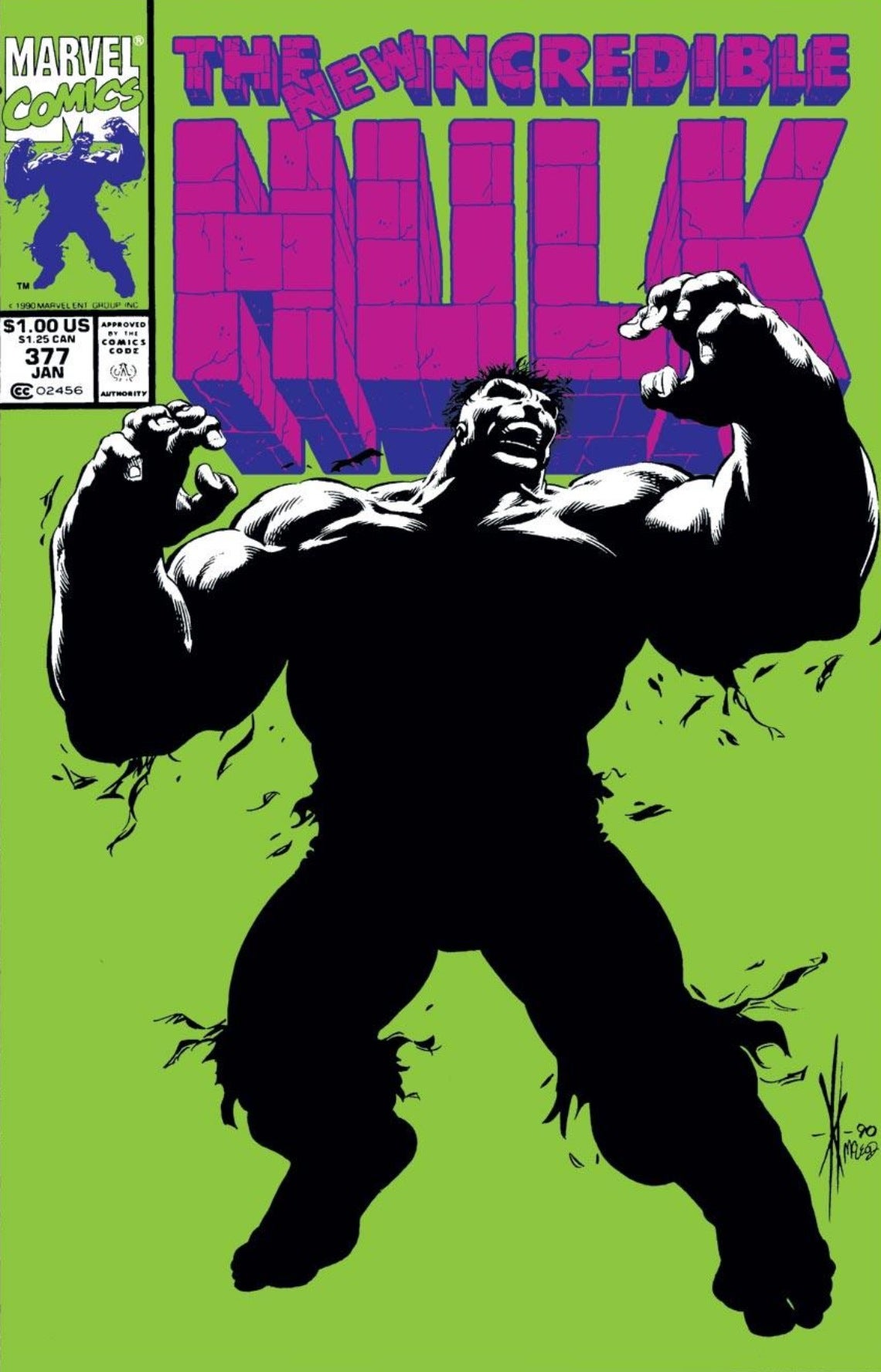
3. Incredible Hulk #377
Not a traditional cover gimmick when compared to many of the other comics on this list, during the peak of the early-90s neon/fluorescent color fad in the United States, Incredible Hulk #377 utilized something dubbed “green-glo” ink on the front cover. Thanks to the ink, the cover (intentional or not) emits a pseudo glow-in-the-dark effect in dim lighting.
In addition to being a sorta, kinda, glow-in-the-dark cover, this dramatically different color scheme (the fifth color added to the cover bucked traditional printing methods) certainly helped this comic stand out on the comic book rack when it was published in 1991. Which was a very good thing considering its contents. Incredible Hulk #377 is considered by most fans and critics to be the pinnacle of the first half of Peter David’s long-tenured and much-ballyhooed run on the book.
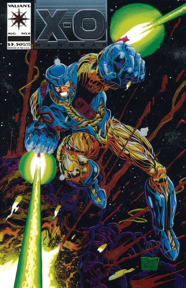
2. X-O Manowar #0
While Marvel and DC (and to a lesser extent, Image) utilized cover gimmicks extensively in the 1990s, some of the most creative and attractive gimmick covers were produced by independent publisher Valiant. Valiant’s Bloodshot #1 is considered by many comic historians to be the first foil cover in industry history, while 1993’s X-O Manowar #0 features a beautiful painted chromium wraparound cover that is also an early piece of artwork from Joe Quesada and Jimmy Palmiotti.
X-O Manowar is arguably the finest representative of the chromium effect from the decade. And readers purchased more than a million copies of the issue – not too shabby from the era’s fourth most-popular publisher.
Earlier this year, Valiant paid homage to its chromium when it released a number of comics (including the new X-O Manowar) with enhanced gimmick covers as part of its “Armor Wars” event.
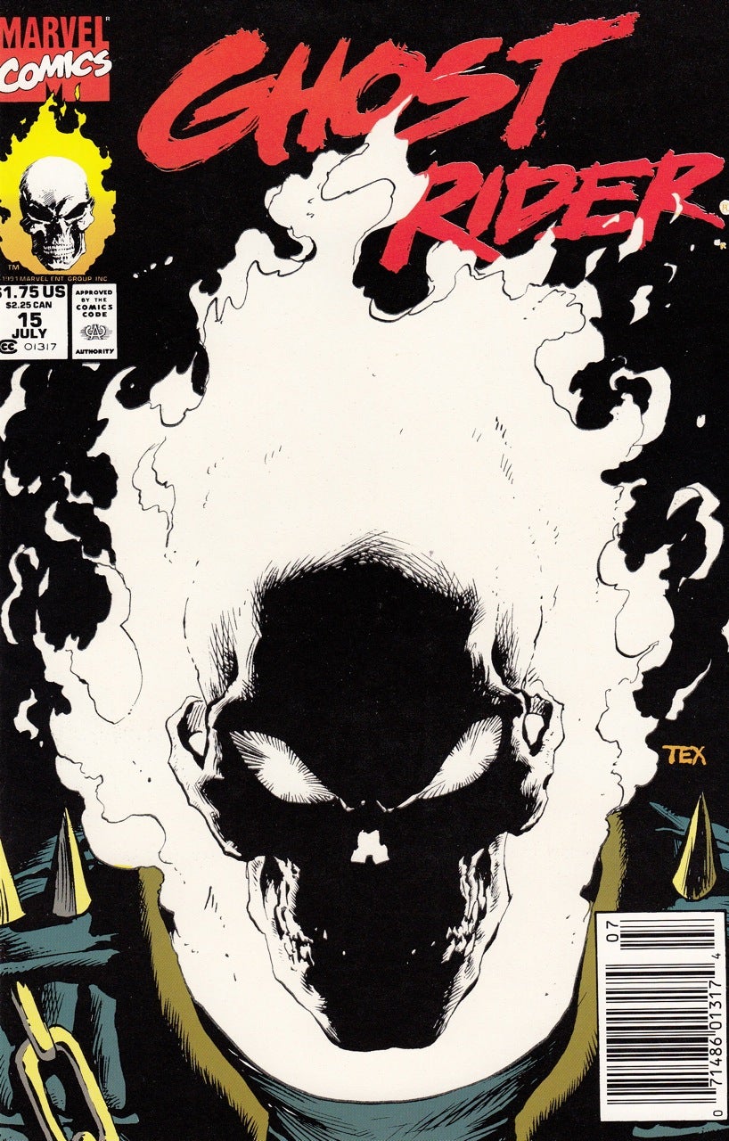
1. Ghost Rider #15
Spoiler alert: the ranking of this list is tabulated entirely by the opinion of one person (the author). However, if there was any kind of point system allotted to these selections, the glow-in-the-dark cover to 1991’s Ghost Rider #15 would win in a landslide – there really is no contest when it comes to declaring the most attractive and engaging 90s gimmick cover.
The awesomeness of this cover starts with the visually striking flaming skull Ghost Rider image from Mark Texeira, who provided pencils and inks during an incredibly popular era for the Ghost Rider series. As a result of the book’s popularity, this cover image from this comic was everywhere during the 1990s – t-shirts, posters, etc. Additionally, Ghost Rider #15 is a standout as being Marvel’s first foray into the glow-in-the-dark gimmick (Vertigo’s Sandman Special beat this issue to the punch in using glow-in-the-dark effects by a few months). The uniqueness of the gimmick (for the time) only added to this book’s legacy.
So when you combine a legendary image with an (almost) first-of-a-kind cover effect, you’re left with the greatest gimmick cover of all time. ‘Nuff said.
Most Viewed
-

Image Courtesy of A-1 Pictures -
Image Courtesy of Marvel Comics -

Image Courtesy of Madhouse -

Image Courtesy of DreamWorks, United Artists, Warner Bros