Amazing Spider-Man Almost Changed the Costume--Dramatically

Last night, ComicBook.com talked a little bit about the deleted scenes that appear to have been [...]

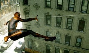
Last night, ComicBook.com talked a little bit about the deleted scenes that appear to have been cut from Sony's The Amazing Spider-Man at the last possible moment, either by director Marc Webb or by the studio, probably in service of the larger franchise. It's clear that, even as the movie was in production and post-production, changes were being made. Well, even before the camera went before the cameras, the studio was apparently considering a much more radical reinvention of the Spider-Man film franchise than we eventually got. While fans would likely have flipped their lids, one has to wonder if it would have satisfied critics who claimed there was no point in rebooting a film that felt too much like Raimi's anyway. Critics, of course, who include Raimi's main villain, Willem Dafoe. Throughout the weekend, a number of sites (including Comics X-Aminer and Bleeding Cool) have been collecting up concept art for the film, which has started to flow on the Web now that production artists are likely more able to talk. With the film in theaters, there's little chance of something being spoiled by designers showing off what they did on the Internet, and so it's likely not a coincidence it's all hitting at once.

Aaron Sims

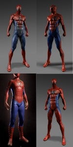
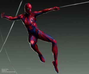
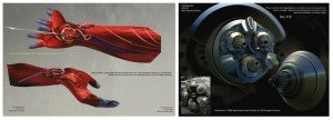
, for example, has a series of shots beginning with actor Chris Cooper (of The Muppets and American Beauty) and ending with a very different look for The Lizard. It's an intriguing transformation, and the character retains much of Cooper's character, in the same way that the (admittedly underwhelming) take Webb eventually went with does retain a lot of the personality of Rhys Ifans. There's no part of me that doesn't like this better than what we eventually got; in addition to the fact that Chris Cooper is one of the finest actors currently working in Hollywood, the Lizard here might not look any better, objectively speaking, than the version we got in the movie--but he does look SCARIER. This version of the character would create a much more credible, palpable threat and would make some of the more horror-tinged scenes (like the one with Gwen Stacy in the vent) work better. That said, there's no real suggestion to me that Cooper was necessarily a candidate for the role, although it's entirely possible. Instead I would wager that this is a very early proof of concept, and that the artist may have chosen from available headshots or from an actor whose face worked particularly well for his idea of the character. Ed Natividad, meanwhile, was apparently charged with creating webshooters for the film. It's a unique challenge, in that no Spider-Man film had yet featured them, with Raimi's films choosing to integrate the skill into his power set rather than use the super-science of the comics. He generated a ton of images, which can be seen both above and then again in the gallery below, that examined how the webshooters might look and operate. An earlier iteration of the webshooters would have seen Peter assembling the apparatus from common household items, showing off his mad science skills through the fine art of taking pieces of junk from the neighborhood and turning them into bona fide superhero weaponry. The images below show bicycle parts, leather gloves and bracelets, watches and rubber hose being recycled into crimefighting gear. Natividad's images also seem to show--if you look closely enough--some kind of holster or pouch on Spider-Man's hip, which perhaps is where the web is carried since his designs suggest that it might be housed elsewhere on the body and carried to the hands via the rubber tubing. The last, and of course most controversial, thing that the studio almost did was to radically alter the costume. There are not one or two but a half-dozen looks for Spider-Man that were considered and then rejected, ranging from essentially the Raimi version all the way to something that makes Spider-Man 2099 look pretty tame on the other side of the spectrum. Where the final version (like Raimi's) used dark blues and reds to create a more realistic take on the character that played down the more flamboyant aspects of superhero costuming, some of these are flares of bright blues and reds that were never really likely to hit the screen. In addiiton to Natividad, some of these designs came from Sims, George Hill and Eddie Yang. There seems to be a theme running through most of them that the spider icon on the character's chest needed to be played up somewhat more than it was in the comics, the Raimi films or even the final version of The Amazing Spider-Man's own costume. There are two of them that feature it played at an angle on the left breast and two more that have it huge in the middle of the character's chest. That's a design aesthetic that's been tried a lot in the comics, from the Scarlet Spider, "black costume" and Spider-Man 2099 designs to more traditional looks like the Dan Jurgens redesign of the mid-'90s. Another familiar character design element that makes an appearance in one of these images is the armpit webs. A controversial touch that both artists and fans either love or loathe, the webs are forever being dropped into character redesigns for Spider-Man, probably because on principle they seem like a cool idea. They're hard to pull off, though, and as Bleeding Cool points out, it's probably unlikely we'll ever really see them onscreen in a mainstream Hollywood film. if we do, it's more likely to be part of an intentional redesign in mid-franchise, like the black costume in Spider-Man 3.

The eyes are also an area that got a lot of attention. Excepting the version that looks basically just like the classic, Raimi costume, every draft seems to have something odd going on with Spider-Man's eyes, usually something that gives the costume a much more alien look. Only the Navidad art looks as though it was created with the movie's script in mind, having the reflective, golden-tinted look that the eyes do in the final fim and the same basic texture to the costume that we saw in the final version. the changes made in most of his designs are much more conservative, as well, although the one that's far and away the most radical is also one of his. What do you think? Would you have preferred to see a little more difference and distance between the Raimi version and The Amazing Spider-Man, or was sticking reasonably close to the traditional look a good move for Marc Webb?

0comments