Miracleman #2 Review: A Book of Contradictions
After reviewing the excellent story and package that was Marvel’s Miracleman issue one, I have [...]
 After reviewing
the excellent story and package that was Marvel's Miracleman issue one, I have to admit that I have incredibly mixed feelings about the second issue. Part of me wants to love it despite its flaws and as a historically significant piece of classic Alan Moore writing. However, to do so would be a disservice to honest discourse and critique. That being said, it is with trepidation that I approach what will likely be a mixed to somewhat negative review of this portion of an iconic work. To start with, I'd like to address the ancillary material contained in this issue. While not as extensive as that contained in issue one, it is still well-chosen and complements the story perfectly. The "Miracleman: Behind the Scenes" material from Garry Leach is a welcome look into the artistic process of this extremely talented individual. Preliminary roughs, pages of original artwork, and the original cover to Miracleman issue 2 from October of 1985 all directly relate to the story material contained in this issue and provide insight into Leach's work as well as the packaging of this story in past volumes. Next, we have two more reprints of original black-and-white Marvelman comics. Specifically, we are given the first telling of Marvelman's origin from Marvelman issue 65 by Mick Anglo and the first appearance of Kid Marvelman from Marvelman issue 102 with story by Mick Anglo and art by Don Lawrence. Given the content of this issue, as will be discussed below, these reprints are perfectly selected. There is little that needs to be said of these works as they are more-or-less what one expects from the Late-Golden/Early-Silver Age of comics.

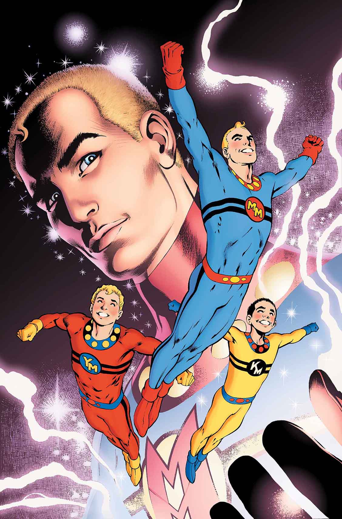
Still, it is still worth noting that Kid Marvelman's first depicted act is to hinder the activities of a policeman for making an honest mistake. Of course, he is redeemed when he assists the policeman in capturing a criminal, but in the context of Moore and Leach's work perhaps this can be taken as unintentional foreshadowing. The most disappointing element of this reprint is that it is never explained precisely how Marvelman grants powers to Kid Marvelman. Considering how charmingly cornball Marvelman's own origin is though, it might be better that way. While Marvelman was supposedly a "scientific" version of DC's Captain Marvel, the pseudoscience of his origin is so sketchy and ill-defined that it might as well be labeled magic or fantasy. This isn't intended as a criticism considering the style of the period, but I do find it hilarious that at the end of the story Marvelman's creator, the astrophysicist Guntag Barghelt, "departs to some abode he has prepared on an asteroid in outer space" by rising into the air on a cloud while wearing what appear to be robes in the style of a distinctly Judeo-Christian representation of God. Turning to the cover, when I say that it is drawn by the great Alan Davis, that information alone should be enough to convey its excellence. The depiction of the Miracleman Family flying over the palm of a larger Miracleman looking down proudly from the background is beautifully rendered and the bright colors are certainly eye-catching. Its unabashedly optimistic and uplifting nature is arguably ill-chosen considering the content of this issue, but perhaps it was deliberately chosen to illustrate what is lost or perverted in this issue. Is it necessary to declare "SPOILERS" at this point when dealing with a roughly 30-year-old story? I should think not, but just in case I'm wrong I would like to state up front that many, if not all, of the plot elements of this issue will be discussed below. As of this moment, you've been warned. When considering the story proper with writing by Alan Moore and art by Garry Leach, I'm struck by a number of contradictions. On the one hand, I appreciate reading a more compressed comic narrative as the modern penchant for decompressed stories has begun to grate on me. On the other, I find that too much is happening in this issue over too short a space for the reader to be drawn into the action. We start with Miracleman Michael Moran in bed with his wife Liz after what is suggested to have been an "active" night. Immediately, they receive a phone call from Johnny Bates (the former Kid Miracleman) revealing that he is still alive and inviting the pair to his office. Immediately we cut to the office building where Johnny claims to have lost his powers. The very next page has Michael revealing that he can somehow tell that John is not in fact powerless. Practically in the very next breath, Michael pushes John off a ledge to test his hypothesis which is tragically proved to be all too correct. What follows is a fight scene where John explains that he revels in his power and has been living in his super-powered form for years. He also makes it clear that far from shying away from the slaughter of innocent women and children, he enjoys it immensely. We end on Miracleman seemingly dead and John ecstatic. Really, this plot is perfectly serviceable but the fact that all of the action previously described takes place over a scant 12 pages means that it is nothing but plot point after plot point in rapid succession with no development, breathing room, or space for the reader to draw their own conclusions. This leads to the committing of one of the cardinal sins in storytelling, the failure to "show, don't tell." Rather than seeing Michael come to the conclusion that John is still Kid Miracleman as well as evil, and being given the same clues that Michael has to work with, the reader is simply told that Michael can feel it after chatting with him for what appears to have been an hour or two at the most. This frankly isn't good storytelling. I also take issue with Michael's logic as to what would happen if John had kept his powers. He asserts that if John had remained Kid Miracleman in the absence of the rest of the Miracleman Family and as the strongest being on the planet, he would have become "remorseless, unstoppable, and totally corrupt." I realize that "power corrupts and absolute power corrupts absolutely" is a truism, but that doesn't make it a certainty. As a reader, I'm not only insulted that Michael can make this leap with the conviction necessary to then throw John off a ledge, but by the fact that he is proven right. In the last issue, I praised Moore's almost poetic narrative captions and was looking forward to them here. I think that they appealed to me in part because of the wistful Golden/Silver-Age nature of much of what was being described in the first issue. Here however we're firmly planted in realism and the narration has started to come off as overblown. It doesn't help that the narrator is engaged throughout in clumsy foreshadowing and metaphor. Throughout the first main story the reader is treated to clouds gathering around John's office building symbolizing the coming fight which would be fine, if a bit simplistic, if it was restricted to the art. That could have been subtle. As it stands, Moore felt the need to reinforce the symbolism in the narration with dogged persistence to the comic's detriment. Unfortunately, we are also treated to John being metaphorically being referred to as a tiger which is intermixed with the storm and subsequent dragon imagery to the point that I'm tempted to accuse Moore of mixing his metaphors though this might not strictly speaking be correct. I get the sense that Moore realized he was trying to fit ten pounds of story into a five-pound bag and was trying to compensate with the narration, but ended up overshooting the mark. This brings me to the next metaphor and the first place where I find fault with the colorization. On page seven, we are treated to the title of chapter two, "Dragons." Recognizing that this is an incredibly minor gripe, the fact that this incredibly dark and serious chapter is introduced by a green cartoon dragon spelling out the word "dragons" with his body is confusing. Its cartoonish appearance is distinctly at odds with the dark tone of the narrative and its green color is jarring against the otherwise predominantly yellow, orange, and red colors of the page. The dragon metaphor, with knightly heroes representing superheroes and dragons representing monsters and villains, is once again somewhat simplistic but serviceable. It is a bit off-putting though that Moore chooses to mix the aforementioned tiger and dragon imagery moving forward. For instance, in the same narrative caption Moore refers to John's "dragon eyes" and "tiger smile." It all comes off a bit forced. That being said, I would never call this segment of the overarching narrative "bad," I would simply suggest that the execution falls short of the story's potential. There are certainly elements here that I quite enjoy and the art is spectacular. Speaking of the visuals, Leach is an artist who I've never had the pleasure of encountering before. This is unfortunate as his work really is excellent. If I devote less space here to describing his contribution to this series, it is only because I am not as well equipped to effectively analyze and convey the quality of his artwork. His panel layouts are effective and engaging, characters are wonderfully expressive, and the fight scene is well-choreographed and thrilling. Overall, I don't really have a bad thing to say about the art with the possible exception of that dragon… This brings me to what might be considered a back-up story for this issue called "The Yesterday Gambit" with art by Steve Dillon, Alan Davis, and Paul Neary. The plot essentially consists of Miracleman and a character called Warpsmith, who resembles a futuristic robot samurai, traveling into the past so that Miracleman can fight past incarnations of himself. They are doing this so Warpsmith can collect energy expelled in these fights to then be used against a foe eventually revealed to be Kid Miracleman. Kid now resembles the Miracleman villain Young Nastyman and appears to be just as psychotic as in the main story. There are a number of positive elements this particular entry. It features excellent art depicting a number of well-constructed fight scenes between Miracleman and past incarnations of himself and the Miracleman Family. It's also worth noting that Moore's heightened narrative rhetoric is toned down to a level where it is engaging and somewhat baroque, but not frustratingly so. It is quite interesting that this story takes place in the future relative to the events of the main narrative but also explores Miracleman's past. Overall, it's an excellent read and highly recommended. It's also worth noting that this particular story has never been reprinted until now. As such, it makes this issue and future trade paperbacks even more attractive to Moore and Miracleman enthusiasts. In the final analysis, this comic is still very much worth your time and attention. The story while not perfectly executed is still engaging and I am still excited to see where it goes from here. As for Marvel's job repackaging it, I am still very much impressed by their care and respect for the property. The back matter, cover, and coloring are almost everything one could ask for in such a reprint. If I had one minor gripe, it would be that it would be nice if for this series Marvel could use better paper stock for the covers rather than simply using interior stock. Despite everything I've said I'm still excited to read this important work and look forward to where the ride takes me.
0comments