Fantastic Four #5 Review: There Is a Fantastic Amount of Awesome In This Book
Once again writer James Robinson and artist Leonard Kirk deliver a spectacular issue of The [...]
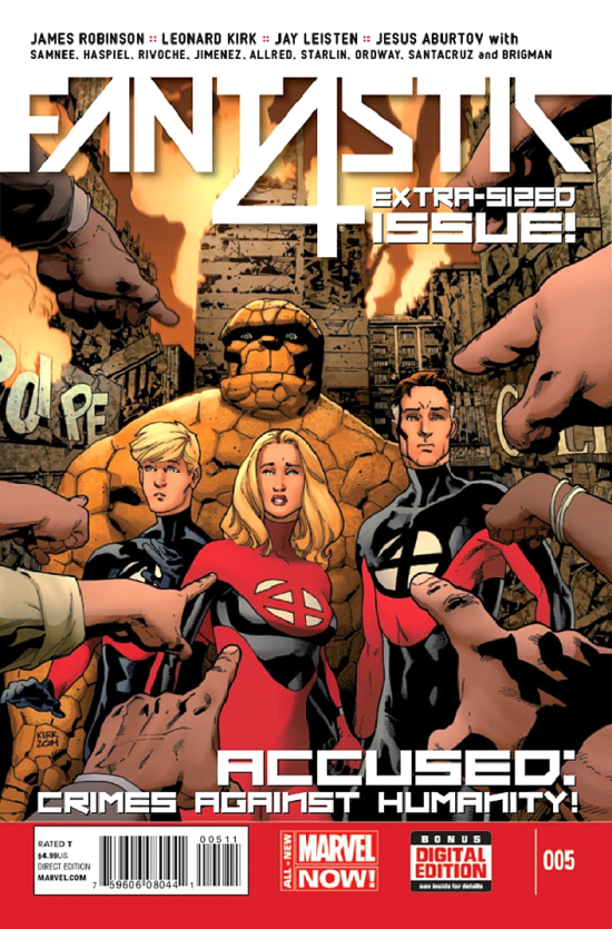
Once again writer James Robinson and artist Leonard Kirk deliver a spectacular issue of The World's Greatest Comic Magazine. This time though, they brought along a veritable smorgasbord of guest artists. Jerry Ordway, Jim Starlin, Chris Samnee, Mike Allred, and more? It can't be Christmas because it isn't December and yet Marvel and the creative team have given fans of the Fantastic Four a wonderful gift in the form of this issue. Heck, I'm not even mad about the increased prize ($4.99), as it comes with added pages and some excellent artwork. I have to say that Robinson keeps providing reason after reason for readers to think that he knows, appreciates, and is intent on honoring the FF's long and mostly illustrious history. In this issue, he uses the opportunity of the FF's day in court to revisit important moments in the team's past through his writing and through the contributions of the various guest artists. His attention to detail and seeming familiarity with the team is admirable and this issue qualifies as the best kind of continuity porn, rewarding longtime readers while not alienating newer ones. I'm getting ahead of myself though. First a brief summation of the issue followed by the usually breakdown. So… SPOILERS!!!

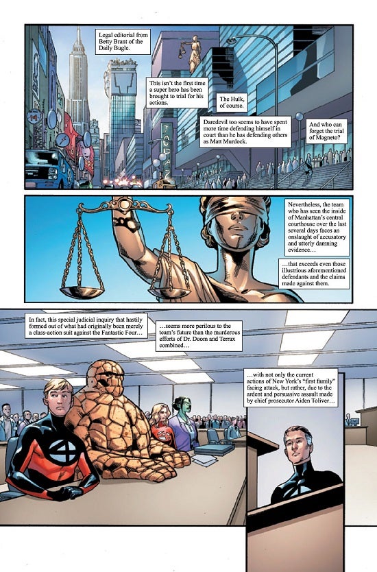
In order to properly review this issue, it will be helpful to give a sense of its structure and plot. In the previous entry in the series, the Fantastic Four were ordered to appear in court by S.H.I.E.L.D. Agent Maria Hill as a result of the alien bug horde that wreaked havoc on New York City having emerged from a portal in the Baxter Building. This issue basically depicts that court case. The Fantastic Four in their costumes are being represented by Jennifer "She-Hulk" Walters as prosecutor Aiden Toliver proceeds to examine and eviscerate their entire history. The art for the courtroom scenes is provided by regular series artist Leonard Kirk while the flashbacks to the FF's various past experiences that occur as different subjects and/or characters come up in questioning are handled by guest artists. By the end of the trial, the FF have lost and in addition to whatever other currently unnamed fines and/or punishments they have incurred, the children of the Future Foundation (including Franklin Richards) have been taken away to a S.H.I.E.L.D. facility formerly known as Camp Hammond and under the leadership of the android Human Torch, Jim Hammond. The reader is also treated to a brief scene of Valeria Richards and Doctor Doom doing good by defeating the villainous Count Nefaria and liberating a region of which he had been in control. The scene with the Future Foundation kids and the scene with Val and Doom are handled by two additional artist teams. So, the breakdown… The Good:

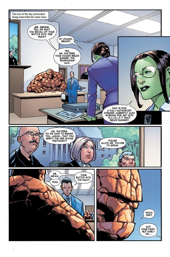
Robinson really knows how to scratch my fanboy itch. I can't tell you how much of a thrill it is to read an issue like this that puts the Fantastic Four into an interesting situation like a courtroom scenario and then uses it as an opportunity to go traipsing through past continuity. It isn't gratuitous either as Robinson chooses moments from the FF's past that legitimately make sense for prosecutor Toliver to bring up in the course of making his case. Some arguments that he makes are honestly surprising and intriguing. For instance, I never would have expected him to delve all the way back to the events of The Fantastic Four #1 to question the team's rampage to get to Reed after he fired that first fateful flare bringing them together to confront the Mole Man. Additionally, he points out that the Hulk often leaves an area without harming it if unprovoked, thereby questioning whether the Thing did more harm than good in tussling with old Jade Jaws. He also hits one major nail on the head by calling Reed out on his hubris, which tends to be his major and defining flaw. Robinson writes excellent dialogue here with all of the characters' individual voices coming across and the exchanges are smart and realistic. I particularly enjoyed his treatment of a witness whose testimony brought attention to the unintended consequences of one of the Thing's temper tantrums. You can feel the emotion from the witness as well as from Ben Grimm supported and in Ben's case coming entirely from Kirk's artwork. To the best of my knowledge, he also did a good job in depicting courtroom procedure, what there was of it to depict at any rate. Usually, I'll have something negative or at least questioning to say about the writing but here I don't think I do. The references to past continuity all hold up to the best of my knowledge and there is enough context provided through the dialogue that readers unfamiliar with them should still follow the legal jousting perfectly well. Also, while Child Protective Services in a past story arc once attempted to take away Franklin and Valeria Richards, it did not bother me that the Future Foundation kids were removed in this issue. This was done through a different process and in a different context. Additionally, the only way Reed and Sue were able to keep their kids on that past occasion was by demonstrating that if they were placed in a normal home, they would become a target for the FF's villains and lack the protection afforded by the FF and the Baxter Building's defenses. Here though, the FF and their home have been legally proven to be unsafe in a very public setting and the kids are being moved to a secure S.H.I.E.L.D. facility as opposed to a civilian residence. Kudos to Robinson for avoiding what could have been narrative stumbling blocks and delivering a solid entry in this evolving narrative.
There is quite a lot that could be said about the art what with this being an "Extra-Sized Issue" with the all these guest artists. Overall, this is a beautiful book. Taken individually, Kirk's contributions are strong and most of the guest artists do great work. I'm not going to go through everything but let me just call out a few particularly well-executed moments. Mike and Laura Allred's depiction of the first appearance of Galactus is gorgeous, filling the page with life and energy. Paul Rivoche and Felix Serrano's depiction of the Sub-Mariner attaching New York is wonderfully detailed and epic. Chris Samnee and Matt Wilson's scenes have a great style to them and a sense of fun. Samnee's depiction of the FF's first appearance was also great for its classic look and style. Finally, Jim Starlin, Andy Smith, and Nolan Woodward's depiction of Annihilus and Blastaar was beautifully done. I do have to say that the art team of Jerry Ordway and Jim Charalampidis managed to do something that I thought would have been impossible. Perhaps it just took the talent of an artistic giant like Ordway but somehow this book referenced Susan Richards' alter ego of Malice and it didn't make me want to immediately burn the thing. Sure, the reference makes complete sense in context and Robinson writes it well… but I despise Malice. It is the single element of the FF's history that I would expunge from the memory of all humanity and destroy every reference to it if I ever had the opportunity. Maybe it's the horrendous BDSM costume, maybe it's the fact that Reed had to slap Sue to shake her out of the mental manipulation that caused her to become Malice, maybe it's the goofy way that Malice was brought back as a distinct personality kicking around in Sue's head in the 1990s, but whatever the reason I can't stand Malice. Still, Ordway is a wonderful artist who really fills a page well in great detail and captures the feeling of the issue in which Malice appears perfectly. Combine Robinson's treatment of the reference with Ordway's impeccable art and even this dubious memory becomes bearable. The Bad:

While I said that Leonard Kirk's artwork was strong in this book, it doesn't feel quite as crisp and polished as in past issues. If I had to guess, I'd chalk it up to having a different inking team this time around. Whereas Karl Kesel was on past issues, his name is not attached to this one. Rather, we have the team of Jay Leisten and Rick Magyar. Leisten apparently inked a portion of the last issue with Kesel but I did not notice any change in quality in that installment. Regardless of precisely where the blame lies, I'm just not seeing the same level of quality here. It's hard to put into words exactly what's lacking here, but there are several examples where facial expressions feel "off." Early in the comic when Reed is being questioned his eyebrows are uneven, his eyes looking in different directions, and overall his face just feels a bit misshapen. Also, there are two different instances at the very end of Kirk's portion of this issue where Susan Richards' expressions feel poorly rendered. In particular, the final panel shows her as extremely distraught and while she does appear appropriately distressed, there's something indefinably wrong with the way she is rendered. More importantly, the art of June Brigman, Roy Richardson, and Vero Gandini, who handled the final portion of this book dealing with the Future Foundation kids, really isn't sitting well with me. Perhaps the part that bothers me the most is the near complete lack of any kind of detailed backgrounds for many of the panels. Most of the time characters are just floating in a shapeless void of gradient color. Perhaps this is a misconception on my part but when I see work like this the first thing I think is that it was produced in this manner because of laziness on the part of the artist. Beyond that complaint, the art here just appears a bit less polished and professional. Also, the coloring is a bit questionable, mixing gradient blues and reds in a rather unpleasant palette.

There is just one other minor point that I want to mention in connection with the art. While colorist Jesus Aburtov does uniformly great work on the Kirk portions of this comic, he does once accidentally color Reed Richards eyes blue when they ought to be brown and are in the rest of the issue. I know it's nitpicking but that doesn't make it any less of a mistake. The Questionable: Where we talk about things that are neither good nor necessarily bad, but are at least a little head-scratching. As much as I enjoy Chris Samnee's art and appreciate the flashback portions, I question why he depicted the normal rocky version of the Thing in the flashback to The Fantastic Four issue one. It's a minor point but it would have made me even more thrilled to see the Thing depicted in his original "lumpy" form. More than just Kirby refining the Thing's look over time, it's been made part of continuity that the Thing actually was "lumpy" at first and his appearance gradually refined into his classic rocky appearance with well-defined and angular "scales" covering his body. This has been canon going back at least to 1982's issues 238 and 239 in the John Byrne run when the Thing was temporarily reverted to his lumpy look by one of Reed Richards' failed attempts to turn him human again. I know this is a minor point but it would have made this issue just a little more perfect. Why are the Fantastic Four in uniform when they go to court? I realize that more often than not they wear their costumes when superhero-ing but wouldn't it be beneficial to their case to portray themselves as normal individuals to whatever degree possible in a court scenario of this nature? Beyond that, they do own and wear normal clothes when in civilian situations which this very likely would qualify as. It makes an interesting visual to have them stick out in the courtroom by virtue of their colorful getups but isn't that precisely why they wouldn't actually wear them? It isn't as though She-Hulk is in a superhero outfit while she represents them. This is another minor point but one that I thought worth mentioning.
Finally, referring again to the art, in the "Doom and Val" portion of this issue by Derlis Santacruz and Israel Silva, Val looks a touch older than she ought to be. It isn't anything too significant, maybe a handful of years at most but she does look as though she has gained a few years relative to her brother Franklin. Conclusion: There is a fantastic amount of awesome in this book. It does wallow in continuity a bit so if that isn't your thing, then you might not enjoy this particular issue. If you're like me though and you know and love the Fantastic Four or are open to learning more about them, then you'll likely love this outing as much as I did. And for those of you who got a little lost in all the references, you can look forward to a follow-up article laying those out for you. While this issue didn't advance a lot of the ongoing mysteries that have been set up so far, it is valuable and enjoyable in its own way. The writing this time around was darned near perfect and sufficient to overcome the occasional shortcoming in the art. In particular, the reveal of Jim Hammond was enough to redeem the Future Foundation section despite it being somewhat telegraphed by the name of the camp. In short, read this book.