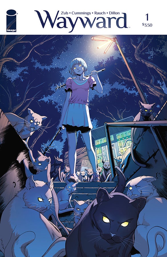
Tokyo is an easy city to caricature, especially from a Western perspective. It has a reputation for being an eccentric city. Although different from other major metropolises like New York and London, it is still a city filled with people trying to survive and enjoy life. It’s a very real place, not a cartoon. In Wayward, Jim Zub (words), Steve Cummings (pictures), and John Rauch (colors) work together to establish readers in Tokyo as it really is.
Videos by ComicBook.com
Rather than send Rori, the hero of Wayward, to Shinjuku (the neon lit tourist hotspot typically associated with the city), she first goes to Ikebukuro (a shopping district). Cummings’ renderings of this area and its surrounding neighborhoods are true to life and will be recognizable to readers familiar with the city. The fronts of shopping centers, the side streets, and even the interior of an apartment all capture the truth of living in Tokyo. The setting manages to be distinctive and revealing, but avoids being obvious or cliched.
That purposeful and precise sense of creation comes through in other aspects of the comic as well. The first issue covers the course of a single day, opening with the light of dawn pouring through a plane window (with the kanji for “Japan” inscribed in condensation) and closing near midnight. Rauch’s colors are what bear this natural transition between times of day and allow it to affect the changing mood of the issue. His blues shift as the day moves from morning to afternoon, altering from an aquamarine tinged with purple to richer sea blues. As night approaches, the sky is cast in burnt oranges before revealing a black sky. The change is something that is not obvious because of how naturally it occurs. Yet upon second and third readings, it becomes clear that this transition is purposeful both structurally and thematically.
As the lights of day fade away, the first supernatural elements appear. Tokyo is transformed from the modern city Cummings and Rauch first present to a place filled with magic. This turning point highlights the value of creating a clear sense of place both spatially and temporally. Darkness acts as a transformative force that alters the world and allows the creative team to introduce a thrilling action sequence. Minor elements from earlier in the comic, like a recurring cat and Rori’s special ability, are shown to be important and allow the story to dramatically change its tone without being disruptive. Cummings and Rauch explain Rori’s ability visually, taking full advantage of the medium and earning a very exciting moment at the end of the comic.
No matter how well the mood, setting, and art functioned, Wayward #1 would not be a success without its protagonist and guide, Rori. Rori is presented as a fully developed character from the very first page. Raised the child of an Irish father and Japanese mother, she is moving into a new culture for the first time in her life. It provides a sympathetic hook into the life of a teenage girl. Although it’s not a life I am familiar with, Rori remains relatable and her cautious optimism about exploring a new country is a familiar experience for globetrotters, veterans, and anyone else who has moved between countries. The challenges of entering a new country, joining a new school, and discovering new abilities reflect fears that we all face when confronting change.
From start to finish, it’s clear that the creative team of Wayward has complete control over their story. They understand what is important and bring their craft to bear in order to translate those ideas clearly. In creating vivid, believable representations of Rori and Tokyo, they have discovered fertile ground in which to explore the magic of their story. Wayward is a beautifully told introduction to a brand new world that I cannot wait to explore.


