This week in Fastball Feedback, we’re touching on some debuts and finales that comprise one of the most exciting weeks in comics this year. These may not be the biggest issues hitting the stands, but they’re definitely all important titles that are worth a glance… even if it’s a fast one.
Videos by ComicBook.com
Secret Avengers #15
Written by Ales Kot
Art by Michael Walsh
Colors by Matthew Wilson
Avengers #44 and New Avengers #33 will receivie most of the attention this week as the big finale of Hickman’s epic before Secret Wars. However, the best Avengers comic (and one of the absolute best comics in general) this week is Secret Avengers #15. Ales Kot and Michael Walsh’s meta-fictional spy odyssey has been one of the most endearing, imaginative, and intelligent comics of the past 15 months, and its ending is every bit as good as the rest of the series.
All of these Avengers finales make for an interesting contrast. While the others carry massive repercussions on the Marvel universe with worlds ending and characters dying, Kot has opted for much more subtle consequences. In Secret Avengers #15, he openly acknowledges that these apocalyptic events can never permanently alter the Marvel Universe. Instead, he focuses on the journey of this singular story and its characters. The result is far more resonating with a series of endings that focus on catharsis and emotional climaxes.
The excitement behind these final interactions of characters, all of whom exist on a very small scale, rely on Walsh’s skill as a draftsman. He has brought abundant energy and a perfectly expressed, wide range of emotions to all of the characters in Secret Avengers. In his and Matthew Wilson’s pencils, quieter moments like the blossoming of a new friendship can feel every bit as engaging as the explosive battle of Secret Avengers #14.
Kot, Walsh, and Wilson weren’t interested in universal consequences or heroes and villains. They were interested in empathy, people, and the small changes we all undergo as we try to grow into better people (even if they come through battles with fictional realities). Secret Avengers was entertaining because of its superhero antics, but it was great because of its focus on the humanity beneath the story. This may not have been one of the best-selling series at Marvel, but it was certainly one of the best.
Grade: A-
Pisces #1
Written by Kurtis Wiebe
Art by Johnnie Christmas
Colors by Tamra Bonvillain
Writer Kurtis Wiebe (Rat Queens, Peter Panzerfaust) and artist Johnnie Christmas (Sheltered) have a proven track record of creating great comics at Image, which makes the debacle that is Pisces #1 all the more befuddling. From beginning to end, it is a series debut that never makes its story, tone, or intent clear. Instead, it lurches between a series of non sequiturs before coming to a final page that is neither cliffhanger nor conclusion.
Christmas’s art lacks much of the grit and raw emotionality that made Sheltered such a thrilling read. A brutal sequence of discovery and torture evokes some of this power, but it is refined and less meaningful than in earlier works. There are fundamental errors early in the issue that distract from Christmas’s style and create issues with basic craft. He uses a three panel sequence twice, in which two panels on the left are stacked to the same height of a single panel on the right. It is a challenging composition to begin with, confusing reader’s as to whether they should shift down or right. It’s only made only worse by the poor placement of word balloons and an unclear flow. Other minor flaws like a flying droplet of blood that appears flat on the page like a clown’s nose provide continual distractions throughout the issue.
But the real problems lie at the comic’s core. No matter how well executed it could have been, the script is almost entirely without merit. Pisces #1 is divided into two distinct scenes: a modern drama and a Vietnam war story. They are fused together by trippy, space-based sequences that show Christmas at his best. There is nothing inherently interesting about either of these stories or their characters, though. They both rely on cliches (the former more so than the latter) and expect the present volume and confusion to hook reader’s interest. Yet there is nothing of interest here like the dense meta-fictional comics of someone like Ales Kot. Any sense of mystery is not extracted from narrative devices, but the lack of narrative or craft.
Pisces #1 is riddled with problems that range from the skeleton of its storytelling to the manner of its execution. Readers looking for an excuse to not pick up a new series will have no trouble finding one here. The comic’s greatest flaw, however, does not lie in its character work or compositions. The biggest problem here is that in 24 pages, there isn’t a single reason to want to read whatever may come next.
Grade: D+
Conan Red Sonja #4 (Dark Horse Comics)
Written by Gail Simone and Jim Zub
Art by Randy Green and Rick Ketcham
Colors by Dave Stewart
It’s safe to assume that both Gail Simone and Jim Zub hold some affection for the barbarian genre of comics. Not only have both writers produced their own barbarian-inspired series like Red Sonja and Skullkickers (respectively), but this smash up of two classic characters has shown nothing but love for their flesh-baring and -rending antics. Conan Red Sonja has been, from start to finish, a love letter to rough and rowdy barbarian comics.
That fondness helps both Simone and Zub nail the tropes, action, and dialogue associated with these characters. Conan Red Sonja never reads like a comic that favors either character or dislikes its source material. It’s authentic. However, there are already decades of authentic comics about these characters. The world is not lacking for solid stories about the Barbarian or She-Devil, and the cross-over never offers anything to make it more than just another solid installment.
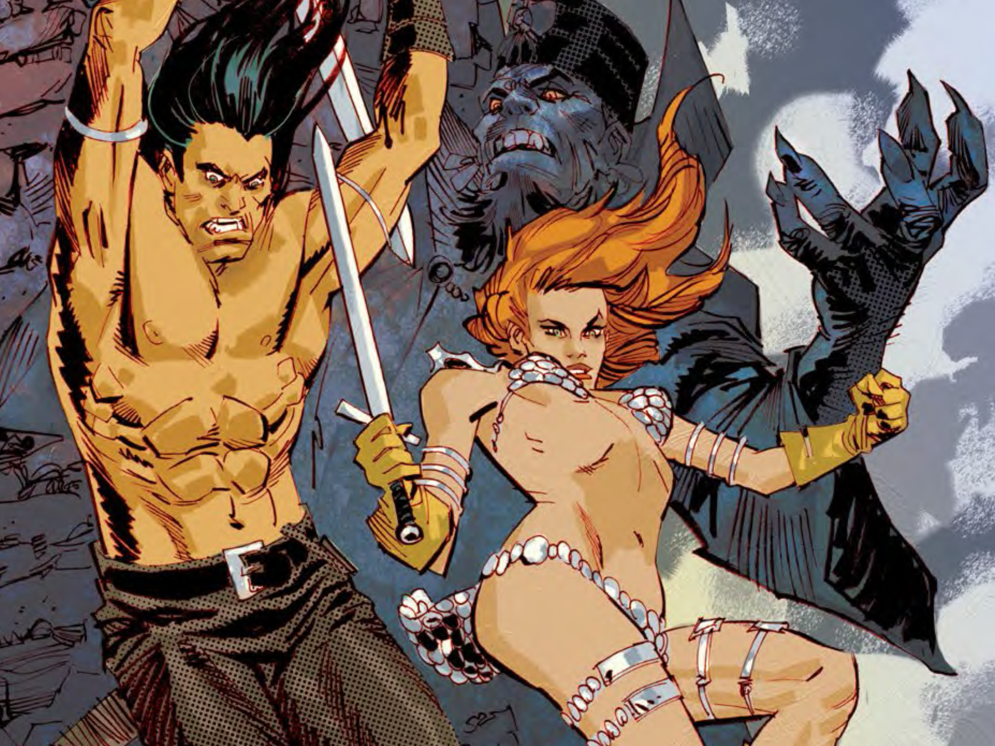
Randy Green’s pencils haven’t elevated the work either. His forms are flat and compositions are uncluttered, while Rick Ketcham’s inking adds little to no depth. It’s clear storytelling, but never manages to inspire the sort of visceral response that this sort of story requires. The uncomplicated narrative never allows for anything to be extra violent, sexy, or horrific. While each moment clearly try to draw a certain response, they never fully achieve that goal. Even in several large panels of monsters, magic, and mayhem meant to evoke an epic tone, Green cannot muster much beyond standard imagery and compositions (at least for a comic set in the Hyborian Age). The cover by Dan Panosian (featured above) is the artistic highlight of Conan Red Sonja #4 casting the intense mood and imagery that make barbarian comics pop on the comics page.
This is by no means a bad comic. It’s bound to appeal to fans of Conan, Red Sonja, and the genre which they’re most comfortable in. It’s written and drawn with admiration for the concepts, but fails to deliver anything beyond that admiration. The result is an entertaining diversion, but nothing memorable.
Grade: B-
What did you think of this week’s comics? Let us know below!


