One benefit of working in comics is that creators can present exactly what they see in their head to readers. Scale is not something that must be guessed. Instead of just knowing that Moby Dick is big, you can be shown just how great that wall of white flesh is. That ability to go big is being shown off in a variety of comics today that all center on different sorts of giants. From Godzilla to mysterious aliens to every other sort of kaiju, artists are showing just how big comics can be.
Videos by ComicBook.com
Godzilla in Hell #1
Story and Art by James Stokoe
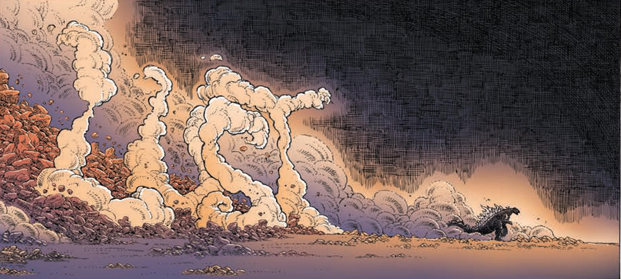
James Stokoe already created the best Godzilla comic ever, The Half-Century War, so it should be no surprise whatsoever that his return to the lofty lizard is fantastic. As a cartoonist, Stokoe is a true auteur and he brings everything he has to offer to Godzilla in Hell #1. The issue is a complete package; it’s capable of being read entirely on its own and presents top-notch visual craftsmanship on every level.
Comics fans who pace their reading based upon text are going to miss out on a lot here. Stokoe presents the story without a single speech bubble or narrative caption. The only letters to be found are embedded in the setting. There’s no need for exposition though. Godzilla in Hell #1 begins with Godzilla falling into hell and everything you need to know is exposed in his tumble. Both motivation and action are shown to readers with surprising precision. Godzilla’s scaled face opens up to display anger, confusion, frustration, and horniness in surprisingly natural fashions. As excellent as these smaller visual narratives are, they can’t hope to compare to monster smackdowns. The action is enthralling to read, sweeping across panels in large arcs with every action discovering its reaction in the next panel. This fusion of moments big and small are so well woven it is impossible to put the issue down until it’s over.
Stokoe does exactly one thing here: shows Godzilla fighting monsters in Hell. But he does that one thing so very well. There’s not much to mine here beyond the visceral experience, and there’s nothing wrong with that. It reads like the best of Rafael Grampá or Geof Darrow’s work, throwing readers headlong into the action and dropping jaws ever lower with each subsequent page.
Godzilla in Hell #1 delivers on exactly what is promised in the title. It’s big, dynamic, violent, and oddly soulful. Stokoe is a consummate cartoonist of spectacle, paying exacting attention to every panel and consistently delivering big moments. This comic is a delight to read and read again.
Grade: A
Trees #11
Written by Warren Ellis
Art and Colors by Jason Howard
Trees reads like a game of roulette from issue-to-issue. Your eyes bounce like the white orbs they are between political thrillers, deeply-human dramas, scientific wonkery, and a wide assortment of other tones and styles. When it hits, you feel like you’ve won a healthy pot of chips, but when it doesn’t you’re not out too much. This month the wheel came up short in Trees.
Ellis focuses on Dr. Jo Creasy, a scientist studying “Trees” in Scotland, and Vincent, the mayor elect of half-sunk New York City. Both of their installments are defined by a distinct lack of context. Despite taking up half of the issue, only a few details are revealed as to why Dr. Creasy is in Scotland. She is introduced to one more Scotsman and learns a little bit of local history with no immediate significance. Unlike Dr. Creasy, Vincent has not even managed to receive much characterization in the past. His goals and attitudes are unclear, and none of the machinations or conversations here reveal much more. Instead they exist in a tension-less vacuum.
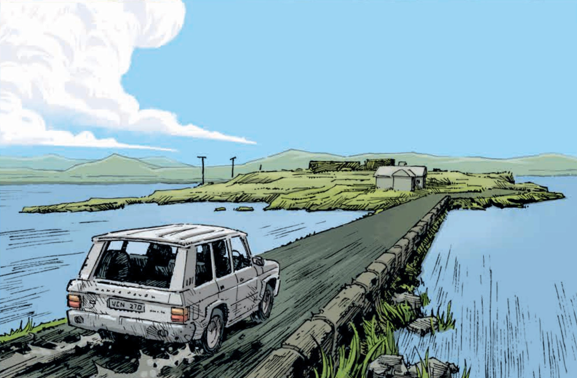
This issue is a miss, but it’s not a miss without merit. Jason Howard capitalizes on the meandering pace of this issue to show off the dichotomy of urban and rural landscapes in New York City and Orkney, Scotland. Both are revealed in wide panels that allow readers to take in the detail and depth of these setting. The sky in either place seems to go on forever, but the buildings of New York City encroach upon it like talons. The city is defined by steep angles pointing readers eyes up and down against the vanishing points of buildings. Meanwhile, rolling hills and curving brown roads make for a much more relaxed reading experience across the Atlantic. Howard also continues to refine his coloring work on the series, capturing the vibrant greens of Scotland beautifully and playing them against the harsh red hues that dominate post-landing New York City.
Trees #11 is possibly the single weakest installment of the series thus far. It plods forward like the sheep grazing in Orkney, unconcerned with the complete lack of tension or drama in this pair of vignettes. While these scenes may read better when collected alongside much important context in the future, here they are presented alone and only Howard’s art can keep them standing.
Grade: C-
Kaijumax #4
Story and Art by Zander Cannon
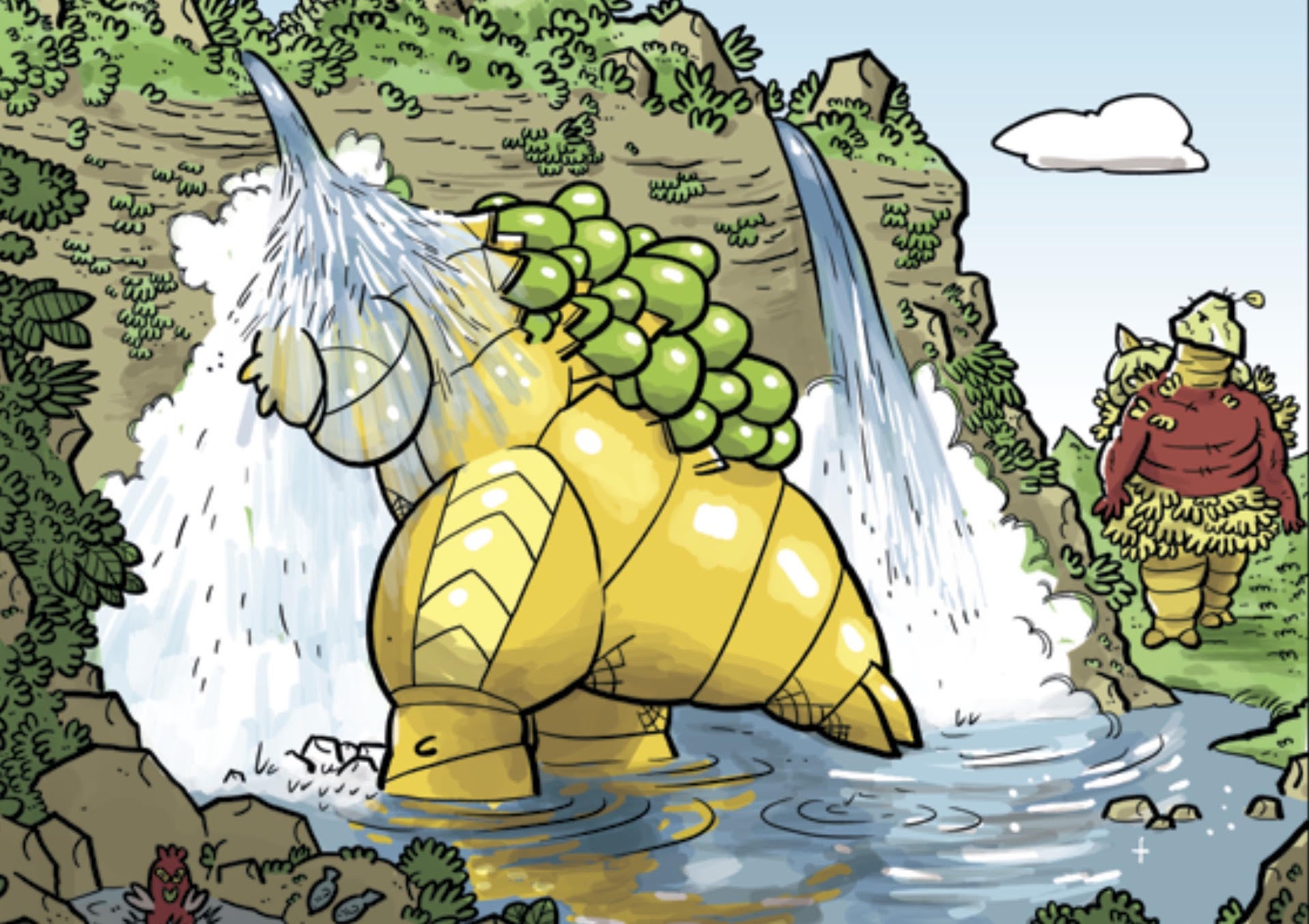
Zander Cannon continues to explore an island prison filled with enormous monsters, an analog of the American prison-industrial complex, in Kaijumax #4. It’s the biggest challenge of Cannon’s career, balancing pop cartooning, a deep cast of characters, and political concerns. With this many plates spinning it would be easy for this concept to descend into pandemonium, but there’s only some wavering in motion here. Cannon continues to prove he’s up to the challenge, introducing even more characters and darkening the mood, all in his curious, pastel-colored creations.
Kaijumax is certainly a busy comic, but it never feels too full. Cannon navigates between multiple plot threads like an hour long television drama, giving each a little time to breathe and move forward before going on. This results in A- and B-stories all with varying levels of effectiveness. The most cohesive element of #4 is the darkening mood of the series. There is a lot of violence on display, playing on all too common realities like prison beatings and police killings. A creepy child encouraging patricide seems downright delightful compared to much of what happens. This darkness veers into uncomfortable cliché with Dr. Zhang though.
The uncomfortable nature of this moment and tropes it plays into is obscured by Cannon’s art, which makes Zhang’s final panel play like a comedic beat. His bright, bold sense of design helps to make all of the pain present in Kaijumax more palatable. It presents a love of genre with designs that play extensively upon kaiju and sentai. Cannon still knows how to present the ugliest moments within his style though, and makes them hurt as intended. Those references are less endearing in dialogue as the series continues. A few choice replacements make for fun jokes, but their presence has grown to become a puzzle that turns reading dialogue into a stutter-step experience.
Kaijumax #4 veers between the sublime and troublesome, but it spends much more time with the former. In spite of the themes being explored, Cannon capably delivers laughs along with insight without ever cheapening characters or their experiences. It’s a truly odd fusion, but one that’s well suited to the imagination on display here. Kaijumax is one of the most interesting premises being explored today, and the execution of its style, themes, and tone is fascinating.
Grade: B-
What did you think of this week’s comics? Sound off in the comments below.


