Death is such a common part of American comics that they (they being the mysterious comics illuminati) have added a pre-approved line, much like the TSA. But that doesn’t mean death has lost its meaning. Rather, it’s just being explored in a lot of different and inventive ways. It’s so common, that the line between it and life often actually becomes blurred, resulting in characters and situations that reflect a bit of both. This week, Fastball Feedback looks at three comics who try their hand at death, and decides whether they transcend the clichés or belong in the quarter bin.
Videos by ComicBook.com
Frankenstein Underground #5
Written by Mike Mignola
Art by Ben Stenbeck
Colors by Dave Stewart
It wasn’t clear what place Frankenstein would hold within the Mignola-verse when Frankenstein Underground began, but at the end we can only hope he won’t stay buried for long. The series is woven from epic adventure, grandiose world building, and monstrous designs, and can now sit proudly besides the likes of Baltimore, Sledgehammer, and Lobster Johnson. Frankenstein Underground #5 comes to a close that both rests comfortably on its own and works within the larger context of the Mignola-verse.
There’s a temptation to compare Frankenstein to the many other great heroes among Mignola’s expansive line of comics, but he is a unique entity. Drawing from Mary Shelley’s fiction, Mignola and his collaborators have posed him as an epic hero who spans centuries coming into contact with tales even greater than his own. It’s an excellent way to frame Frankenstein Underground, allowing Frankenstein to function as a character, but not the center of these events. Instead, the conclusion exposes both something about this monster and his world that can be appreciated with or without additional context.
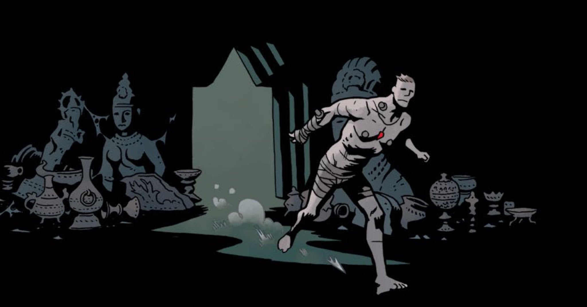
Perhaps the greatest joy of Frankenstein Underground comes in seeing Ben Stenbeck flex creative muscles not typically used in Baltimore. Both Frankenstein and the monsters he fights in #5 are all muscles, size, and physical endurance. They launch one another across rooms and tumble ancient artifacts with ease. Stenbeck’s sense of motion is clear and crisply communicated. Each punch and tumble draws the eye across the page. Dave Stewart’s consistent use of creeping darkness since Frankenstein’s descent in #1 also pays off with a beautiful effect at the series conclusion.
Frankenstein Underground, unsurprisingly, is another fine addition to the Mignola-verse. It walks the seemingly impossible line between character-focused introspection and bombastic monster fights that all of these series do so well. It’s visual storytelling and imagination are unlimited. Frankenstein holds a special place at Dark Horse comics and, while Frankenstein Underground gives him a proper conclusion, we can all still hope to see more someday.
Grade: B+
Book of Death: Fall of Bloodshot #1
Written by Jeff Lemire
Art by Doug Braithwaite
Colors by Brian Reber
The titular “Book of Death”, the centerpiece of Valiant’s newest event, contains the fates of every character in a potential, dystopian future. The Fall of Bloodshot #1 is the first of four one-shots detailing just how bad things get for some of the biggest characters in the universe. Bloodshot Reborn writer Jeff Lemire teams with Doug Braithwaite and Brian Reber to tell Bloodshot’s story. While it shows off some great ideas Lemire has for the character, but falls short as an actual narrative.
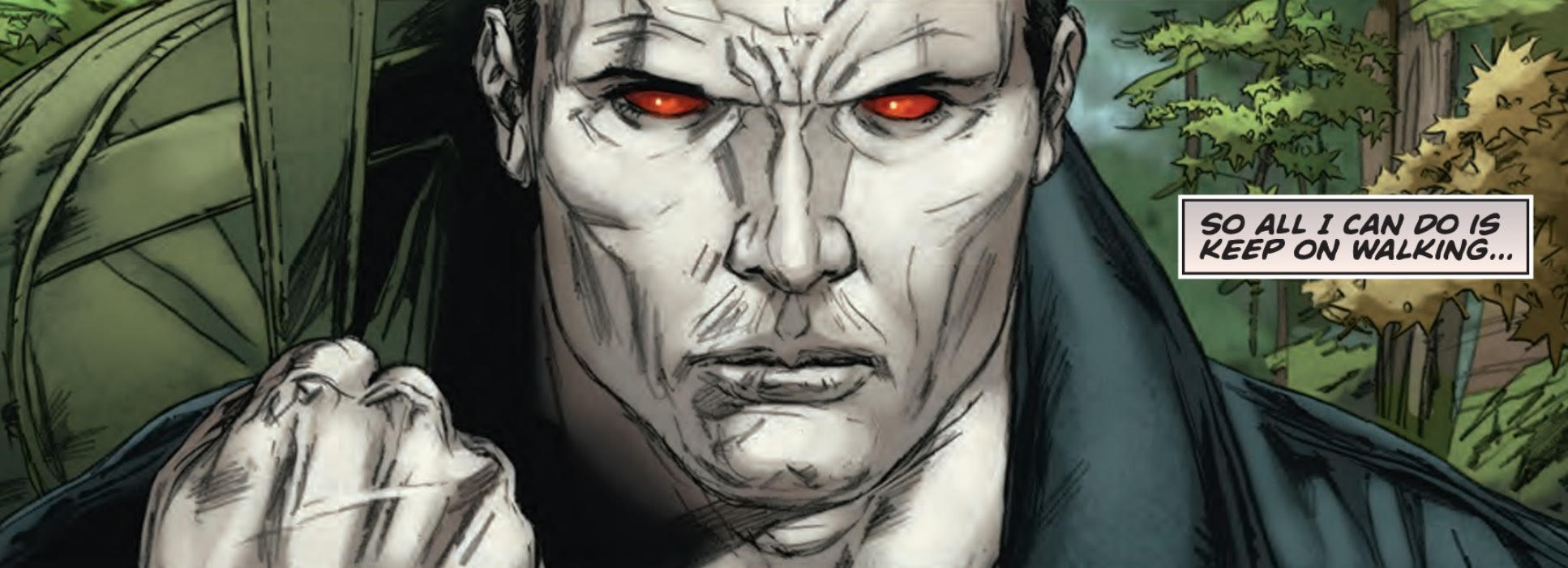
The comic really isn’t a story at all. It reads like a plot synopsis, a visual pitch for Lemire to continue writing Bloodshot in perpetuity. The issue opens on Bloodshot after he has regained his nanites and follows him through a series of increasingly bizarre adventures until he reaches his prophesied demise. Each of these adventures, filled with dinosaurs, robots, and pirates, looks like a great deal of fun, but you’re only shown enough to get a taste. Narrative captions state what Bloodshot’s story is about and why readers should care. While these reveal Lemire’s understanding of Bloodshot, they are the very essence of telling, not showing. The entire issue is summary that never bothers to let readers really invest in what’s happening on the page.
Braithwaite, who is also helping to draw The Book of Death, presents each of these concepts very well. He captures the fun of Pirate-shot, the serenity surrounding Eskimo-shot, and the wild odyssey discovered by Space-shot. His skilled hopscotch’ing between disparate tones makes for a story that is a lot more fun to look at than it is to read. There is some strain in his pencils as unnecessary lines become clutter on characters not in the foreground of panels. Compositions are always dynamic, but lingering on the visuals reveals line work that could have used more definition.
Fall of Bloodshot #1 is a bold pitch for future Bloodshot series, but it’s something that should have only been shown to Valiant editors. A great deal of effort is put into thinking of interesting new spins on the assassin, but there’s not nearly enough space to show any of them. This is a well drawn bird’s eye view of a potentially great comics.
Grade: C-
Marvel Zombies #2
Written by Simon Spurrier
Art by Kev Walker
Colors by GURU-eFX
Just like its undead cast, the dead horse called Marvel Zombies keeps standing back up to be beaten down again. After 5 mini-series, multiple one-shots, and tie-ins, they’re back in Battleworld. That new setting has lent Simon Spurrier and Kev Walker an opportunity to return a little bit of life to the concept though. Following Elsa Bloodstone (clearly modeled after her appearance in Nextwave) across this zombie-riddled landscape is more fun than it has any right to be here.
Spurrier riffing on Nextwave is a lot of fun. Marvel Zombies #2 isn’t as good as that source material, but literally no comic is. Elsa’s behavior is brash, bold, and cold to the point of absurdity. That over-the-top approach to characterization works in this setting and with these characters. It allows jokes about explodo and improperly touching a zombie to really function. That silliness also makes attempts at adding pathos with a child fall flat. It’s a tonal shift that never really connects, and Spurrier lacks the ability to make this mysterious kid connect. The little bald boy feels like a prop of plot rather than a person throughout the entire issue.
The bombed-out wasteland inhabited by the zombies doesn’t provide much visual flair. It’s a standard post-apocalyptic set of backgrounds that could be swapped out for Terminators or any other destructive force du jour. Walker’s depiction of the zombies though is much more fun. M.O.D.O.K. is always fun to see depicted in new ways, and Walker makes the enormous head simultaneously playful and gross. He also brings out Bloodstone’s bravado in well planned poses, although her age shifts occasionally between scenes.
Marvel Zombies isn’t a series that I expect to inspire inordinate amounts of enthusiasm or distinct memories. It’s a mini-series that grasps what it is, and plays to those strengths portraying a weird, funny romp in an increasingly absurd premise. There’s a lot of silliness to be found in Spurrier and Walker’s conception, and that is the absolute best thing they can do here.
Grade: C+
What did you think of this week’s comics? Sound off in the comments below.


