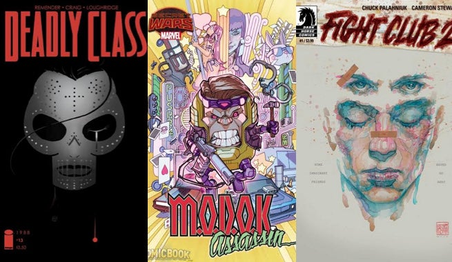
This week for Fastball Feedback, we’re taking a look at profitable careers in violence. There are three comics this week that are focused on violent men and women who make a killing (pun absolutely intended) with their skills. Whether it’s a group of students learning the art of assassination, a relapsed psychotic fighter, or a gigantic headhunting–err– head, all of these characters make for some interesting comics.
Videos by ComicBook.com
Deadly Class #13
Written by Rick Remender
Art by Wes Craig
Colors by Lee Loughridge
Deadly Class #13 brings an end to the sprawling fight sequence that began in Deadly Class #10. What started as a mission to kill Marcus’ rival F***face exploded into this much larger battle against Maria’s sponsors, a deadly Cartel family. Despite the fact that this battle has spanned four issues, the story never felt like it was dragging. Instead it has gripped readers with new cliffhangers and shocking moments that have all led to an incredibly satisfying conclusion.
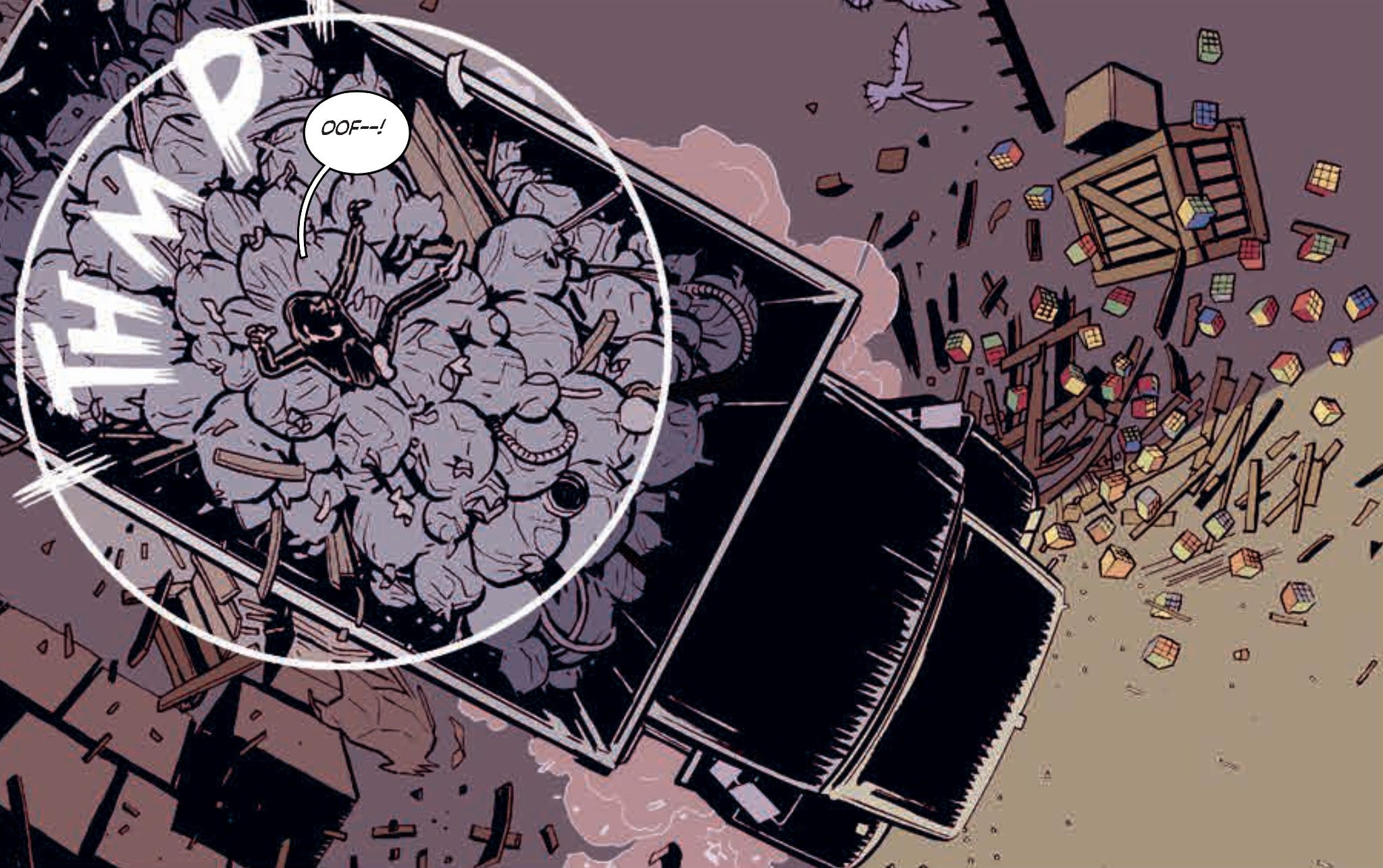
Wes Craig’s work has been a revelation on Deadly Class. He constructs chase and fight sequences with precision and panache. Everything from the tight framing of blows when Maria faces off against the priest to her teeth-gritting grimace is absolutely perfect. Pain, determination, and ferocity flow from her form and actions just as much as her words when she denounces the cartel for killing her family. Deadly Class has become a benchmark against which all other action comics can be compared, and Craig’s work here shows just why that is.
Deadly Class #13 may be dominated by a fight sequence, but Rick Remender is no slouch on the script. He uses action to illustrate character, rather having it fill gaps between conversations. Maria, Marcus, and everyone else involved in this battle are clearly changed by it, and reveal some essential bit of who they are in what they do. The fire and fury is every bit important as the dialogue that follows. It’s a perfect use of action in comics, recognizing that bullets and blades can illustrate ideas just as well as speech balloons.
And then there’s that ending, the penultimate page of the issue that will shred your heart. It’s a reminder that life doesn’t end, victories aren’t permanent, and danger never disappears. Remender has never let his characters off easily and he isn’t interested in happy endings. What he, Craig, and Loughridge are interested in in Deadly Class is something less cathartic, but more significant. It’s a tale that no matter how big and crazy it gets is always grounded by humanity. That’s why Deadly Class #13 hurts so good.
Grade: A
Fight Club 2 #1
Written by Chuck Palahniuk
Art by Cameron Stewart
Colors by Dave Stewart
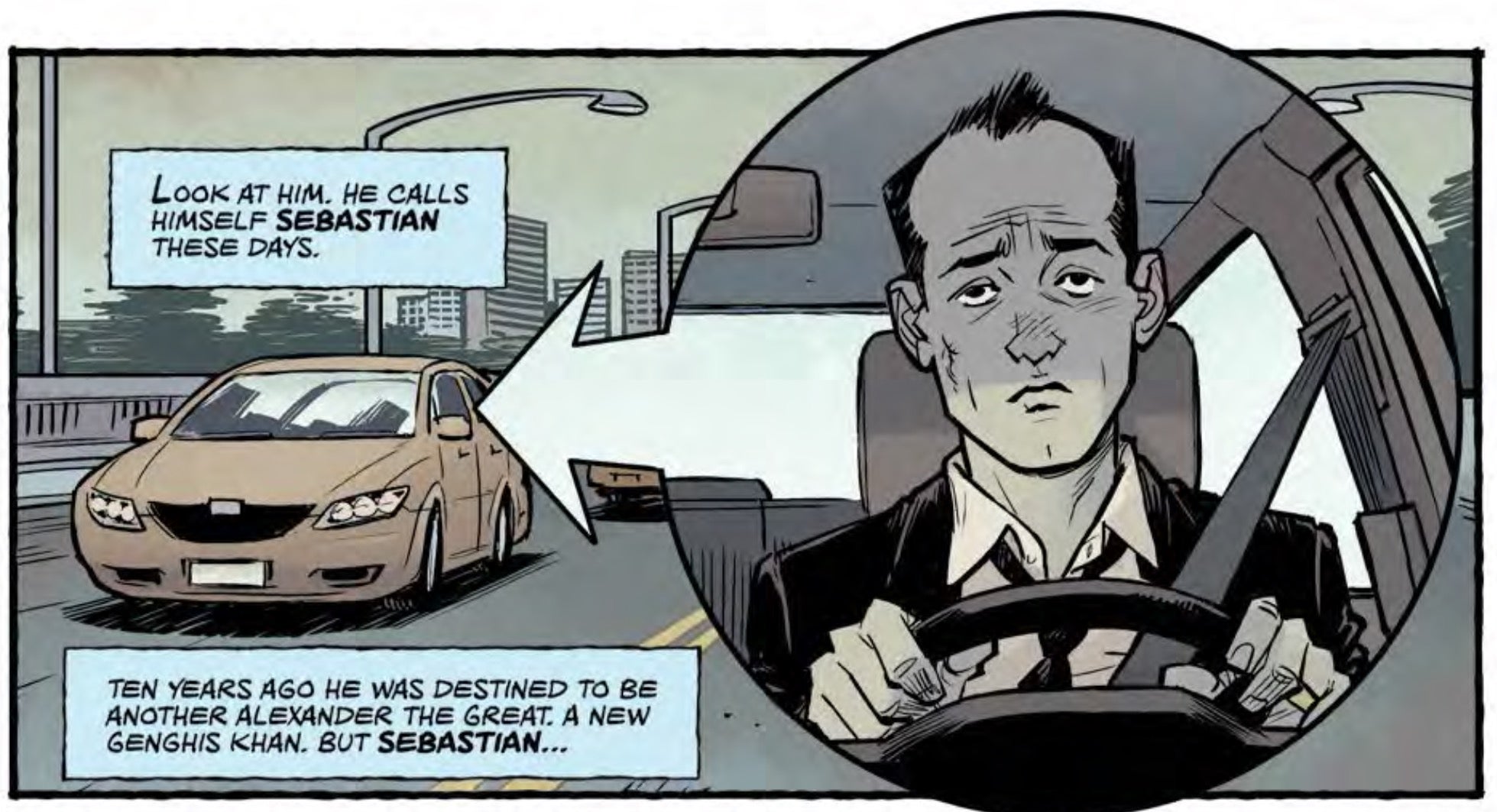
Some ideas are best left alone. No matter how popular or critically acclaimed they are, they ought to simply exist without prequel or sequel because there is nothing left to say. Fight Club 2 #1 makes it exceedingly clear that Fight Club is one of these ideas. Palahniuk has returned to his best-selling novel that spawned one of David Fincher’s most revered films to tell the story of Sebastian (the unnamed narrator of the original story) ten years after he killed his alter-ego, Tyler Durden.
Every element of the story reads as if it were copied and pasted from the original text. It is constructed like high school fan fiction, playing what readers enjoyed about the original on a loop. The characters and concepts in Fight Club 2 have all reverted to their origins in Fight Club. A marriage and child simply play out as new ways to display what a sadsack Sebastian has become. The ideas of the comic are sophomoric, revealing both this issue’s lack of depth, as well as problems in the original text. It spits in the eye of modern society in a manner that same fanfic writing high schooler might revel in, but lacks any real substance.
This is all the more disappointing considering the incredible talent Palahniuk has parlayed into bringing this story to life. Cameron Stewart and Dave Stewart are two of the best artistic talents working in American comics today, and it’s a shame to see those talents squandered on a story that reads like a cheap knockoff. Cameron Stewart’s page layouts are as packed as ever, fitting 15 panels and wild montages into a completely natural reading experience. His sense of geography in even simple scenes is exceedingly clear, and it’s only his pencils that make these characters feel the least bit human.
Even both Stewart’s contributions are occasionally buried under the inclusion of pills and flower petals that cover the page. It’s a “cute” idea that adds nothing of value to the pages nor any depth to the story in this first issue. That lack of value is endemic of Fight Club 2‘s entire debut. It is a work without substance or meaning, beautifully realized before being quickly and mercifully forgotten.
Grade: D
M.O.D.O.K. Assassin #1
Written by Christopher Yost
Art by Amilcar Pinna and Terry Pallot
Colors by Rachelle Rosenberg
M.O.D.O.K. Assassin #1 is set in Killsville, a section of Battleworld dominated by the meanest and ugliest villains of the Marvel Universe. While Baron Mordo may rule the land, M.O.D.O.K. runs amok doing only what he was designed to: Kill. Christopher Yost plays the premise for comedic value, but it’s never clear whether we should be laughing at M.O.D.O.K. or with him. There are two big action sequences that bookend the first issue, featuring M.O.D.O.K. taking down two very different foes. Neither really serve a purpose beyond creating havoc for M.O.D.O.K.’s amusement, but the titular character isn’t half as funny as he fancies himself.
M.O.D.O.K.’s humor is entirely based on sarcasm and an annoying level of confidence. After a few pages, it begins to grate and by the end of the issue it’s difficult not to root against the enormous head. His looks don’t help either, but that part is purposeful. Amilcar Pinna and Terry Pallot play up the ugliness of this character design, focusing on M.O.D.O.K.’s tightly stretched face, thin lips, and pug nose. It’s this presentation that manages to make him still feel like something of an underdog when facing off against the chiseled chins and sleek outfits of Bullseye and Baron Mordo.
The action sequences have a madcap sensibility to them as well, where M.O.D.O.K.is effective, but never cool. A spread at the beginning of the comic captures the weirdness Yost seems to be aiming for at its best. M.O.D.O.K.’s stilted internal monologue and juvenile sense of humor (think a sixth grader on Reddit) still drag the joy of rockets and mental blasts down. He’s at his best when he simply shuts up and gets the job done. There’s the seed of a fun idea here, but M.O.D.O.K. himself seems determined to kill it.
Grade: C-
What did you think of this week’s comics? Sound off in the comments below.


