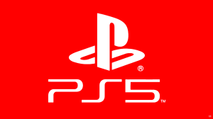
Last night at CES 2020, Sony Interactive Entertainment revealed our first look at the PlayStation 5 logo, which, well, looks exactly like you’d think it would. It’s literally the PS4 logo, but instead of a “4” there’s a “5.” Of course, no one would deny this is the way to go. The shorthand logos for PlayStation are iconic, , and hey, don’t fix something that isn’t broken. Marketing takes risks all the time, but there’s no reason to take a risk on a different logo when you have an incredible template already. That all said, PlayStation gamers are still taking the opportunity to poke fun at the logo.
Videos by ComicBook.com
Taking to Reddit, one user revealed “how” Sony designed the logo. Of course, the post is more of a dunk than actual criticism, but it points out that if you delete the “4” in PS4, and then take the “P,” flip it upside down and add one horizontal line to it, well you get the PS5 logo. As you would expect, the GIF shot to the top of the popular “gaming” Reddit page.
Again, there’s no denying the PS5 logo will be effective and is the right call, but it’s also so painfully predictable that you can’t help but have a good laugh at it.
Sony’s lead graphic designer coming up with the #PS5 logo#SonyCES pic.twitter.com/7xOJXBWHCF
— chris trenary (@bagel_chris) January 7, 2020
The PS5 Logo Font we deserve pic.twitter.com/p4SCG94oOI
— Pan-Pizza: Watch Seis Manos Netflix (@RebelTaxi) January 7, 2020
Jim Ryan only realised he had nothing to announce at CES minutes before the conference started, so he quickly googled “PS5 logo” and picked the first one.
— Mark Doherty (@dohertymark) January 7, 2020
People talking about how bad the PS5 logo is…but it…looks like how it always has…lol. pic.twitter.com/Z3JX0ShvNb
— Jade☄ (@Wildbergerrrr) January 7, 2020
The funniest part of the PS5 logo being identical to the PS4 logo is you *know* there were HOURS of meetings and discussions and notes and follow up calls and approvals for this design https://t.co/V9KLZCctbh
— Mike Drucker (@MikeDrucker) January 7, 2020
The PlayStation 5 is set to release sometime this holiday. For more news, rumors, leaks, media, and information on the console, be sure to peep all of our previous and extensive coverage of it by clicking right here.


