A movie poster, be it a teaser or the final one-sheet, essentially has one job, which is to sell the movie. Many studios have their posters just stuff as many big names on the artwork as possible, hoping their familiar names and faces will be enough to get the job done. But what really accomplishes this is a simple hook, one that conveys the gist of the plot and also stays in the memory either due to the unique nature of the image or a showy color pattern. Ghostbusters just needed the crew’s logo, Jaws just needed to contrast the size of the shark to the size of a swimmer, Back to the Future just needed to show Marty next to flaming tire tracks, and so on.
Videos by ComicBook.com
The following posters also accomplished their marketing mission. The only caveat was that they were released within the past two and a half decades.
*One entry below references both sexual assault and self-harm.
10) Promising Young Woman
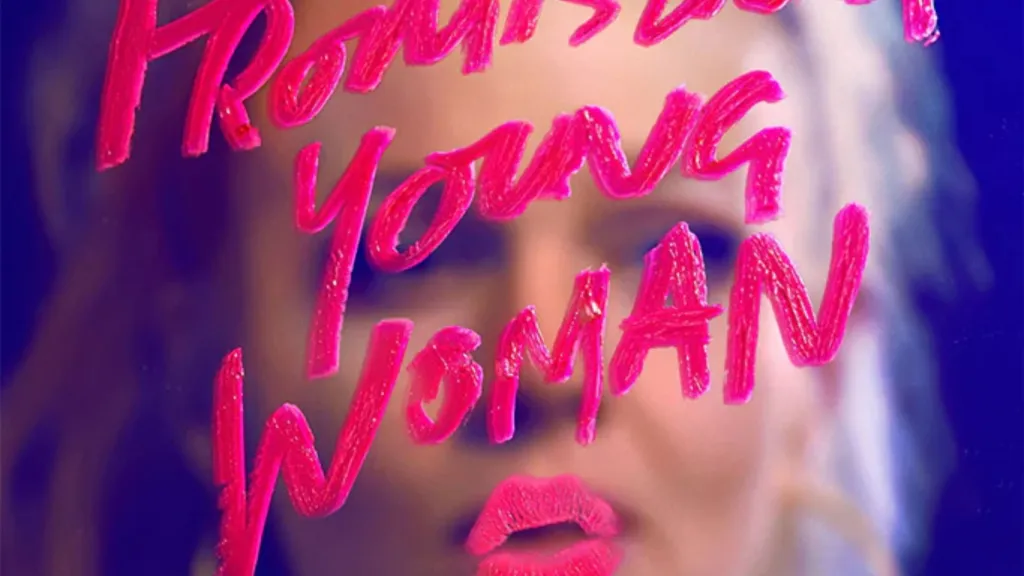
The poster for Promising Young Woman is fairly simplistic. It’s just Carey Mulligan’s Cassie Thomas standing in front of a fogged mirror, using her lipstick to write the title of the film on it.
This accomplishes two things, and they’re both related to how the movie’s plot is carried out. Thomas is carrying out revenge on her male college classmates who sexually assaulted her best friend, ultimately resulting in her taking her own life. To accomplish this, she’s relying on those male classmates not remembering her, which they don’t. The fogged imagery of her captures this anonymity. Secondly, she utilizes her sexuality to get within their circle so she can exact her revenge. The poster conveys this tactic, as well. It’s a memorable image, one that also sticks in the memory courtesy of its vibrant visual aesthetic.
Stream Promising Young Woman for free with ads on Prime Video.
9) Casino Royale
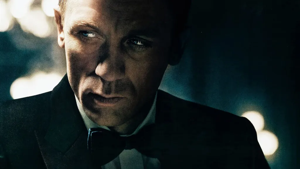
Looking at the Casino Royale poster, we know right off the bat that the movie is going for a more grounded tone. With a muted color tone, we get the sense that it’s actively trying to lose the bombast that ended up sinking the Pierce Brosnan era in silly installments like The World Is Not Enough and Die Another Day.
All that is shown is the sight of the new Bond sitting at a poker table. He’s looking to the side in a way that makes one think he’s on the lookout for someone about to stab him in the back as much as he’s guarding his hand from the lurking eye of any fellow players.
Stream Casino Royale on Prime Video.
8) The Lord of the Rings Trilogy
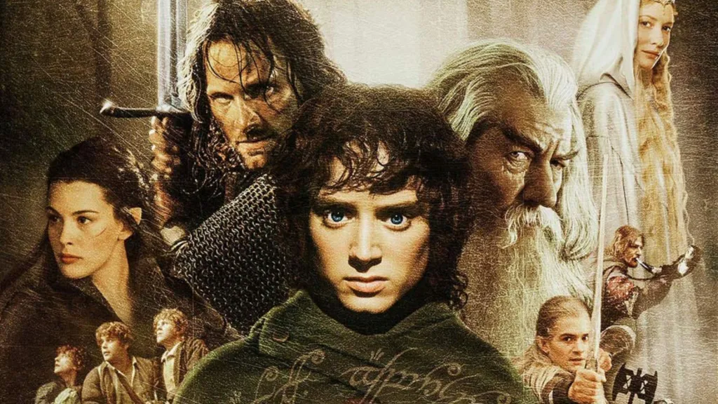
On one hand, the three The Lord of the Rings posters (each of which are pretty much equal to the other) are the blandest on this list. After all, it’s just a bunch of the characters sandwiched together.
But, on one hand, with such an expansive roster that was necessary. On the other hand, none of the posters seem particularly overcrowded. The posters also accurately convey the movies’ earthy visual palette in a way that’s hard to take your eyes off of.
Stream The Lord of the Rings Trilogy on HBO Max.
7) Guardians of the Galaxy Vol. 2
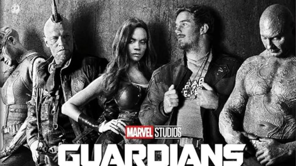
As mentioned, most of the MCU posters are entirely forgettable. They’re like the posters for The Lord of the Rings movies except the sandwiching of all the characters tends to look overwhelming. There are no real hooks to the poster, they all just blend together. Which, admittedly, some say about the MCU movies themselves.
But leave it to James Gunn’s Guardians of the Galaxy movies to stand apart a little bit. This is particularly true of the teaser poster for Guardians of the Galaxy Vol. 2. The final one-sheets for the three Guardians movies are all vibrant, and memorably so, but they face the same aforementioned crowding issue. With the Vol. 2 teaser poster we get a black-and-white image of its main characters nonchalantly leaning against a wall. They look like rebels, uncaring of the fact they’re being photographed. They also look like suspected criminals in a line-up, which also works for the characters. It’s an underrated MCU advertisement.
Stream Guardians of the Galaxy Vol. 2 on Disney+.
6) Get Out
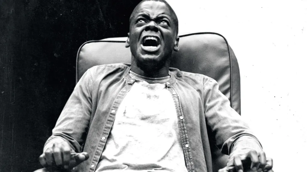
Given how the point of Get Out is to analyze modern day racism, it makes sense that the poster is divided in one black half and one white half. And at the center of those two halves is a screaming man. Why he’s screaming we don’t know. If we want to know, we have to buy a ticket.
Why is he in that chair? Why is he gripping the chair’s arms as if his life depended on it? Why is he looking up? Just how will the conflict between black and white conveyed by the one-sheet play out in the narrative? Those are all questions that can only be answered by watching the movie. The Get Out poster does exactly what a piece of marketing should do, and it does it with minimalist style.
Stream Get Out on HBO Max.
5) Harry Potter and the Sorcerer’s Stone
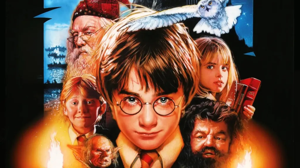
No one could craft a beautiful image like Drew Struzan, with his lifelike renderings of the films’ stars and organic balance of the colors that were prominent in the movies themselves. His work on the Star Wars movies, the Indiana Jones movies, the Back to the Future movies, they were all unrivaled.
Add his poster for Harry Potter and the Sorcerer’s Stone (or Philospher’s Stone, depending on where you live) to the list. It’s a fantastic addition to his oeuvre, and it’s unfortunate the films’ marketing switched to photo-based posters for the remainder of the series.
Stream Harry Potter and the Sorcerer’s Stone on HBO Max.
4) Spider-Man
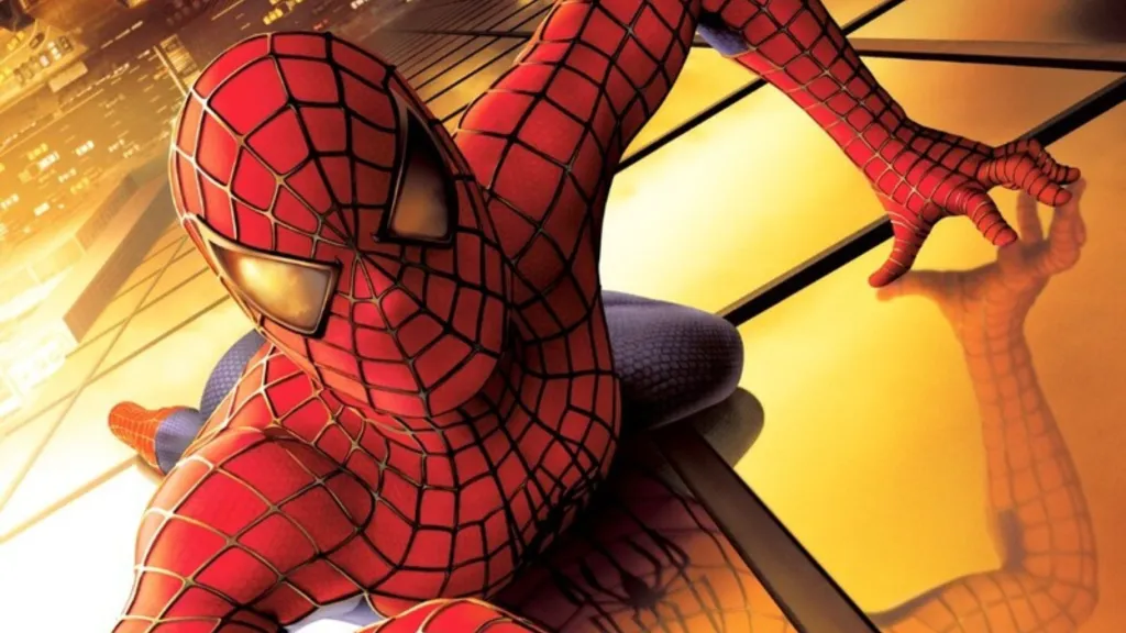
There were a couple great posters for Sam Raimi’s influential and beloved Spider-Man. Between the one pictured above to the one of Spidey swinging high above buildings and the one of him looking towards the World Trade Center (which was pulled for obvious reasons), they all accomplish one particular goal.
Specifically, they make Spider-Man feel like he’s king of the city. We’re down here on sidewalks and he’s hundreds of feet above them, swinging from building to building like he’s Tarzan with access to a forest full of trees.
Stream Spider-Man on Disney+.
3) Star Wars: The Force Awakens
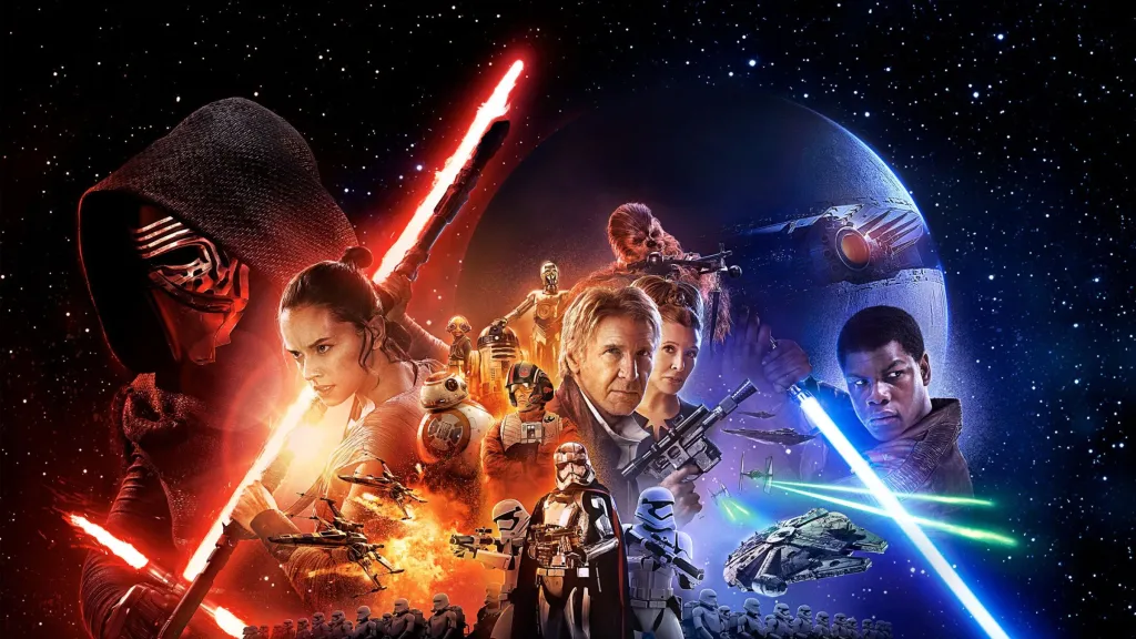
Here we are with our second and final Drew Struzan poster. Struzan retired in 2008 after making his poster for Indiana Jones and the Kingdom of the Crystal Skull (which, unsurprisingly, is much better than the movie itself), but he did come out of retirement for one particular movie. That would be Star Wars: The Force Awakens.
This ended up being Struzan’s last project before he passed in October 2025. It’s a gorgeous work, one that conveys the film’s epics scope with eye-catching color and attention to detail that was typical of him. It was only right that Struzan return to introduce the return of the original trilogy’s characters, considering he drew them for the original trilogy’s posters. The Force Awakens was an event, and the poster sells it as such even before the opening crawl begins.
Stream Star Wars: The Force Awakens on Disney+.
2) The Social Network
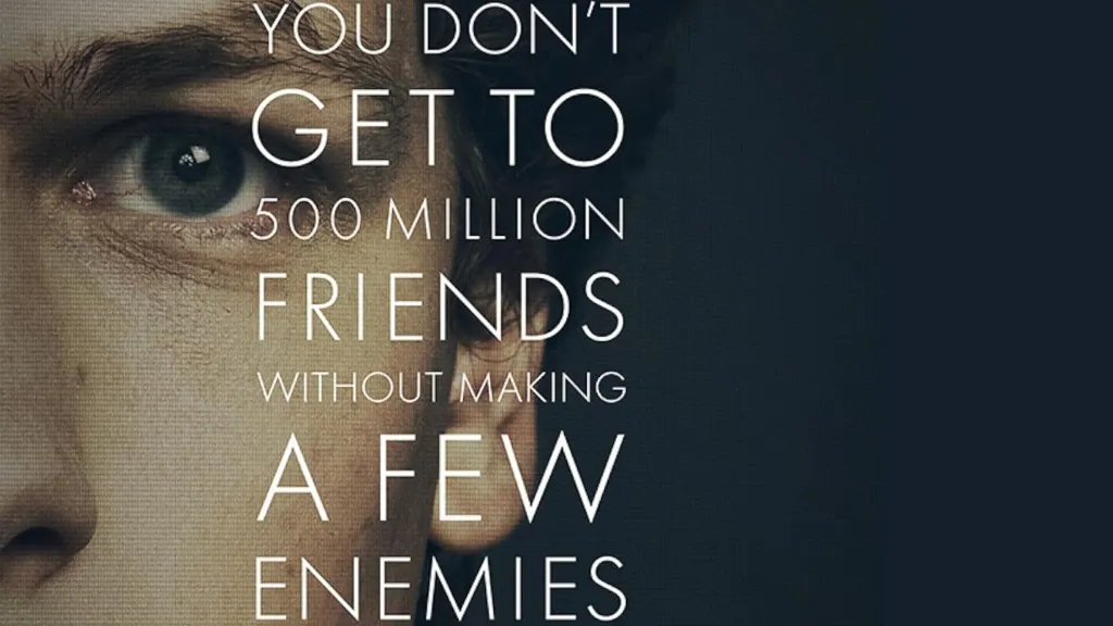
Neil Kellerhouse’s first theatrical poster for The Social Network does a sublime job of selling the focus of David Fincher’s movie. Well, focuses, considering it’s about the enemies Mark Zuckerberg made as much as it is about the man himself.
The tagline is also intriguing. “You don’t get to 500 million friends without making a few enemies” begs the question of just what a friend is. If you have 500 million of them, are they friends or clicks of a button? And, if you’re someone with that many people using your platform, did you have to lose some people who truly cared for you along the way? Does the face we see on the poster show a man who can live with that?
Stream The Social Network on The Criterion Channel.
1) The Dark Knight
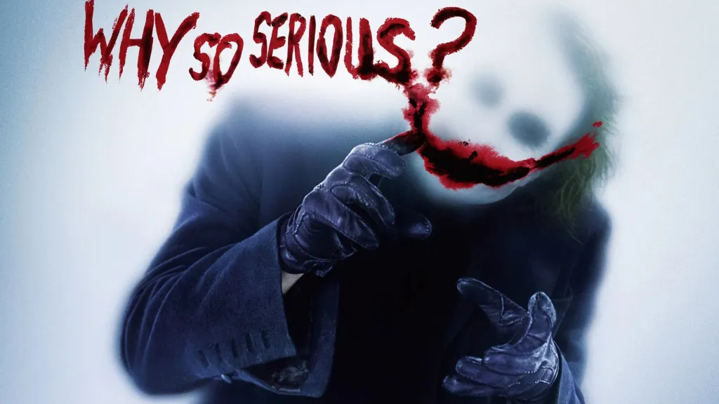
There were a few neat posters for The Dark Knight. The one with Joker on a Gotham street with his back turned towards the forefront of the poster. Batman standing in front of a building with a burning bat symbol in its side. Joker facing the forefront of the poster with a machine gun in hand and debris flying all around him. They all look very good and serve as a display of the movie’s fairly iconic grim blue color tone.
But the teaser poster with Joker writing “Why so serious?” on fogged glass is the best of the bunch, and it’s not even close. We have Joker facing us, but we don’t really see his face. We get a hint of his face and nothing more. That fits in perfectly with the character’s mysterious origin (and generally mysterious way of being). Not to mention, what a fantastic catch phrase. People had seen versions of Joker before, but this hint makes the newest take (rightly) seem like a true, menacing threat.
Stream The Dark Knight on HBO Max.


