Good vs. Evil. It’s a phrase so iconic that it has transcended cliché. If you read comics, it’s a conflict that’s impossible to avoid. Except evil doesn’t always make it easy for that confrontation to occur. Sometimes it’s better off avoiding the heroes of a story and continuing on its merry way, so the good guys have to hunt it down. All three of the comics in this week’s Feedback are set in vastly different settings from a post-apocalyptic wastelands to a culinary-influenced mystery-comedy to a vampire-ravaged Europe resting between World Wars. But all of them share one thing in common: good is hunting evil.
Videos by ComicBook.com

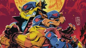
The Spire #1
Written by Simon Spurrier
Art by Jeff Stokely
Colors by Andre May
The Spire #1 cannot be faulted for a lack of ambition. The first issue introduces a fantastical, post-apocalyptic world filled with characters, history, and secrets. Most of the story is revealed through the perspective of Commander Sha, who guards the citizens of The Spire, a towering city in the middle of an expansive wasteland. There’s a lot happening in the first issue and no time to slow down.
Jeff Stokely’s depiction of this city and its inhabitants is fascinating. An early spread showing both the towering city and its barren surroundings is rich in texture and soaked in lines. He provides a visceral quality to the comic, with that same line work adding a layer of grit. The action in The Spire #1 streaks across the page. A chase scene at the beginning of the issue provides a sense of immediacy along with some inventive layouts. As Sha climbs a ladder after some thieves, Stokely merges three panels together so they can be read instantaneously and the effect will make readers cringe.
The speed in Stokely’s artwork keeps pace with the content-heavy script, although the latter is less effective in its aims. Simon Spurrier is introducing readers to the world on a micro and macro scale. The former focuses on Sha’s work as an officer of the law, while the latter deals largely with politics. These two narratives intersect, but only Sha’s story provides readers a reason to care. Details are abundant, including a variety of dialects shown in both speech and lettering. Unfortunately, this bit draws a lot of attention to itself and adds very little to the story, distracting readers rather than immersing them. Other items, like casual references to people with unique qualities called “skews” (a slur), help build the world naturally.
There is a lot to like about The Spire #1. The detail-rich artwork, slick action sequences, and captivating setting provide readers with a world they can lose themselves within. The introduction of so much in such a small amount of space is cluttered at times, but cannot remove the wonders that inhabit this strange, desert tower.
Grade: B-

Chew #50
Written by John Layman
Art and Colors by Rob Guillory
Ongoing series are based on an unspoken promise that every issue is leading to something bigger and better. When you’re 50 issues into a series, that promise becomes a hard one to keep. After hours hours of reading and over $100 in issues or collections (unless you pirate it, in which case you suck), Chew #50 acknowledges the promise of the 49 previous issues and proceeds to fully deliver upon it.
John Layman and Rob Guillory have been establishing the key elements and stakes in this issue for a very long time; clearly preparing for this moment. Two of the most iconic parts of Chew: Poyo and the death of Toni are used to create this climax and it delivers on the respective comedy and tragedy of those components. The Collector has served as the series villain for a long time, and the final showdown between him and Tony had to be big. Layman recognizes the size of the battle doesn’t come from scope, but from the emotional core of the series. It’s not important because of how much is at stake, but because of what Tony has lost and wants to protect. Every blow feels incredibly important because to Tony, this is the most important battle in the world.
Guillory delivers the best action sequence in the series so far. His fluid artwork lends an urgent sense of motion to every panel. It’s impossible to not fly through each page of the fight, with the action quickly guiding your eye. The only way Layman can slow the pace of this brawl is to use Chew‘s familiar time-hopping structure, giving readers a chance to breathe. Backgrounds are still peppered with jokes, including a great Jeff Goldblum call out, but they’re less common than usual. Guillory recognizes the significance of this issue and allows the drama to take the lead every page.
Chew #50 is a lot of things. It’s funny, action-packed, surprising, and a joy to read. But above all else, it’s just really bad ass.
Grade: A

Baltimore: Cult of the Red King #3
Written by Mike Mignola and Christopher Golden
Art by Peter Bergting
Colors by Dave Stewart
Baltimore is a dramatically different story now than when the comic began 5 years go in “The Plague Ships”. Lord Baltimore’s quest has grown larger, and with it the supporting cast and scope of his story. The midpoint of “The Cult of the Red King” shows just how far the story has expanded, and why it’s a good thing.
Mike Mignola and Christopher Golden have split the narrative between two groups, one in frozen St. Petersburg and the other in balmy Carthage. Issue three begins to sew these two distinct missions back together as the strength of the villains is revealed. The first 2 issues were used to set the stage and build tension, which is released to great dramatic effect here. Unlike many past antagonists, the cult in Carthage and witches of St. Petersburg are not individually threatening, but hold strength in numbers. Those multitudes are terrifying though, especially when set against only a few individuals. The fight at the end of the issue is shocking and painful to watch, making readers feel as powerless as the person attacked.
Peter Bergting has evolved along with the series since it began in 2010, and the subtle advancement of his craft is used to great effect here. A close up of Father Stanislas’ fractured glasses and a few minor lines highlights his loss of humanity in a striking manner, making him appear bug-like in appearance and thought. Bergting subtly brings out the humanity or lack thereof in all of these characters, illustrating a continuum central to the thematic core of the series. Dave Stewart does a beautiful job illustrating the balance between the two locations as well. His colors pull out the dichotomy between hot and cold, making that difference felt as much as seen.
Baltimore: Cult of the Red King #3 shows just how far the series has come in five years, and will leave readers stunned with its final sequence. The stakes are higher than ever, and Mignola and Golden have not lost track of the thematic core of the story. It is a comic about reflections and dualities: humanity and inhumanity, life and death, heat and cold. Even without this enormous cliffhanger, the issue gives readers every reason they might need to return for more.
Grade: B+
What did you think of this week’s comics? Sound off in the comments below.
Most Viewed
-

Image Courtesy of Netflix -
Courtesy of Crunchyroll / Sony Pictures