Videos by ComicBook.com
Published in 1991, X-Men #1 became the best-selling comic book of all time according to Guinness Book of World Records, in no small part thanks to the gotta-catch-’em-all nature of the interconnected variants by one of comics’ hottest artists.
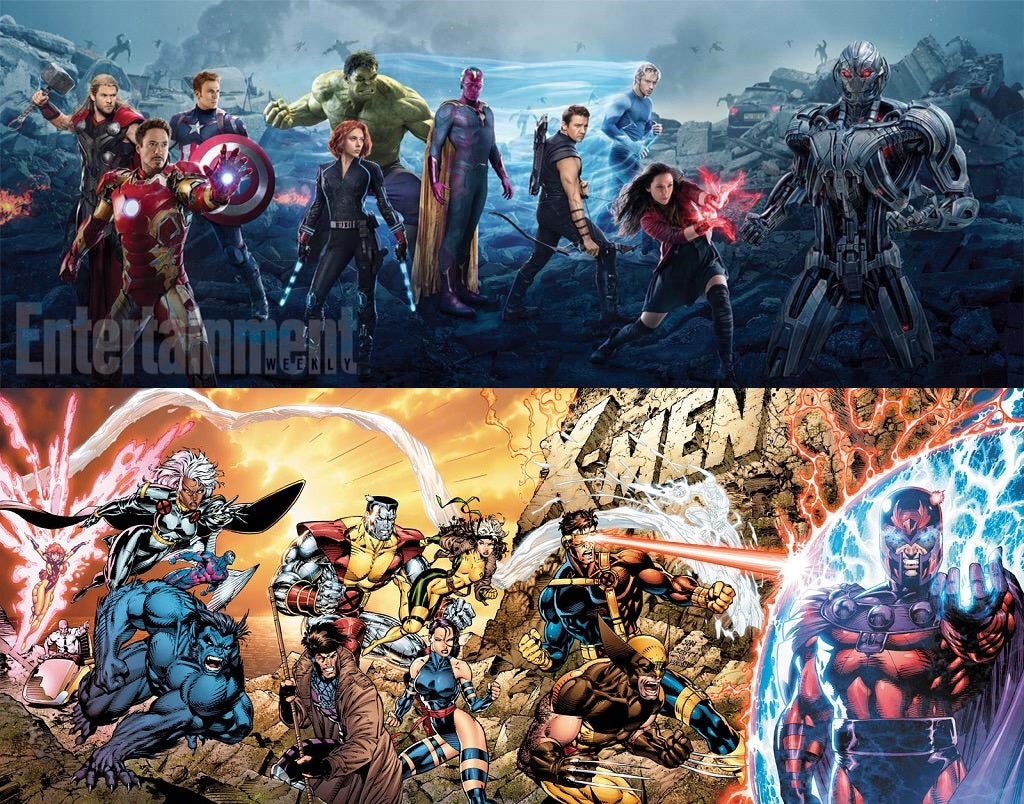
But just how similar are the two images, really? How much could Entertainment Weekly‘s covers have in common with Jim Lee’s?
Well, according to EW‘s Director of Design, quite a bit…
And obviously a Hulk-sized hat tip to @JimLee #themaster
— tim leong (@timleong) April 8, 2015…so let’s look at what we noticed!
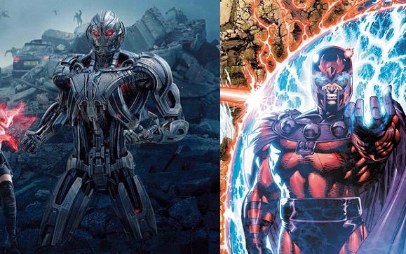
The first and most obvious thing is the way the villain is positioned. In a group fight scene where everyone is squaring off against a single threat, it’s often logical for that threat to be placed more or less in the center of the action. Instead, Ultron is to the far right, standing almost casually, but definitely posing. Like Magneto, he’s untouchable — both literally because of the force field and in the way he carries himself.
The blast
There’s also the energy that’s bouncing OFF said force field — but red and kind of “splashy,” even though it comes from different source (Cyclops in X-Men and Scarlet Witch in Avengers).
The background is a wrecked, smoldering tableau of basically nothing recognizable but destruction. There’s even a mound of rock/wreckage rising up behind the villain in both images.
Close quarters
There are, in both images, two people taking shots at the force field who are notable.
In X-Men, it’s Cyclops and Iceman, who were founding members of the X-Men and, therefore, had battled Magneto more times than almost anybody.
In Avengers, it’s Scarlet Witch and Quicksilver, who in the comics are Magneto’s children. Of course, they’re not contractually allowed to mention that in the movie.
You can also see, besides the red blast mentioned above, the trail of blue behind Quicksilver. Here, it’s his speed trail, related to the visual effects they use when he’s traveling using his powers. Similarly, there’s a bluish-white trail of ice that follows Iceman around on the cover of X-Men #1, and can be described the same way.
Hell, there’s even a cloud of smoke behind the Avengers that snakes up and then down again and then disappears behind Quicksilver’s aura…which seems to arc in the same way the ice bridge behind Iceman does.
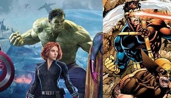
All the posing is pretty similar, but we’ve gotta say that The Hulk and Cyclops are pretty much dead on.
Composition
In both images, the central area of the image is fairly sparse, while the area furthest from the villain is bunched up with characters. Also, we get things like the “big guy” (Colossus/Hulk) being in roughly the same spot in the composition and Black Widow’s escrima sticks being similar to Gambit’s bo staff, when the two are in the same spot on the composition. Even the tall, thin Vision takes up roughly the same area in the image as do Psylocke and Rogue in the original, relative to the big guy and the group at the battlefront.
And, of course, the leaders are driving the attack from the rear, with both Captain America and Charles Xavier pretty far from the villain.
Most of the action in both images comes from those farther away (Thor and Iron Man with energy blasts in action while Storm and Beast are actually in motion) and close up (the batch of heroes attacking the force field), while the people in the center just strike dynamic poses while they stand at the ready.

