The word “monster” is used in a lot of different ways. There are literal monsters with horns and bulging eyes, designed to fill us with terror or awe. There are also those who are monstrous through their actions, losing their humanity and separating themselves from any attempt to empathize or understand. All of the comics in this week’s feedback have monsters in both appearance and behavior, whether they display horned heads, ghostly visages, or a complete disregard for others.
Videos by ComicBook.com
Hellboy in Hell #7
Written and Drawn by Mike Mignola
Colors by Dave Stewart
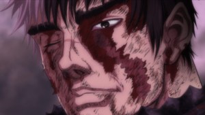
More than a year after it’s last issue, Mike Mignola’s Hellboy in Hell returns for the two-part story, “The Hounds of Pluto”. In the first issue, two doctors discover a decomposing Hellboy. They acknowledge that although Hellboy is dead, his trials have not yet come to an end. But before he can get their help in saving his soul, he is dragged into a fight that is bigger in the most literal sense.
Mignola pushes Hellboy through a wide variety of settings, starting in a dream of the world to come and concluding in an action-packed cliffhanger. The introduction is revealed in soft, lush brushstrokes, separating it from the harsh reality of hell and calming the mood. It is a beautiful scene, one that is truly unlike anything Mignola has delivered before. But when the story returns to hell, his hard-edged abstract style returns in full force. There is a density to this issue, from the anatomy of half-flayed corpses to tremendously well designed old world architecture. Even in its slowest moments, the issue pulls you in, before eventually delivering classic Hellboy action at its best.
Dave Stewart’s colors also play a dramatic role in this narrative. Hellboy’s continuing journey through hell reveals that his iconic bright red pigment has diminished to a pale gray. The consumption of his soul and attempts to recover are not just seen in Mignola’s depiction of his diminished form, but in fluctuations in his skin. This range from dull browns and grays to a glaring bright red also informs setting and action. Red only becomes prominent whencharacters and events figuratively heat up. Stewart also beautifully compliments the dreamscape at the start of the issue, using vibrant golds and greens to create a welcoming mood that does not exist throughout the rest of the issue.
It is always a joy to see a new art from Mignola, and Hellboy in Hell #7 proves that rule once again. From the evocative, soft dreams at the start of this issue to the big battle at the end, every page of this issue is a treat. Hellboy’s development as a character is mirrored by Mignola and Stewart’s as artists, all of them showing their souls here.
Grade: A
Gotham By Midnight #8
Written by Ray Fawkes
Art by Juan Ferreyra
Gotham By Midnight continues to explore the creepiest crevices of Gotham City. This month, the Midnight Shift investigates the cause behind pundit-generated riots erupting across the city. It’s a twisty, interesting idea, but one that falls flat on its face, lacking presentation or plotting that lives up to the promise.
The combination of punditry, two-party politics, and enraged viewership makes for fertile thematic ground, especially as election season looms. Unofrtunately, Ray Fawkes fails to make any of it engaging. The two newscasters are obvious stand-ins for generic right and left-wing talking points, who are shown to be equally bad mirrors in a banal statement that reads like a high school freshman’s favorite talking point. Beyond this, the members of the Night Shift are merely plot adjacent. They play no significant role in what happens during the riots or afterward. Instead, they provide exposition and watch the debacle resolve itself. The plot and characters simply run parallel, neither adding to the story or giving readers a reason to care.
Juan Ferreyra’s presentation of the violence and fury fails to add much tension or horror to the proceedings. Everything building to the finale has the feeling of a generic cop show. Even supernatural elements like the mysterious black flowers appear flat and uninteresting. Nothing separates these events outside of some well-lit, moody coloring. Ferreyra delivers on spectacle when the monster is revealed in a splash, but it is only played for a quick shock, elevating only the two pages in which it is revealed.
Gotham By Midnight #8 is clearly executed and easy to understand, but never manages to engage. From its broadest ideas to its most specific details, the issue rarely passes the bar of being passable. It is a quick horror story, with only a single stand out moment, that will be forgotten in less time than it takes to read.
Grade: C-
E is for Extinction #3
Written by Chris Burnham & Dennis Culver
Art by Ramon Villalobos
Colors by Ian Herring
The Battleworld tie-ins of Secret Wars find inspiration from a broad expanse of past Marvel events. Each series’ success varies, and is often related to its source material. So it’s no surprise that a comic riffing on Grant Morrison’s New X-Men is the best of the lot. E is for Extinction is packed with action, humor, and wonderfully weird ideas.
Ramon Villalobos is a worthy successor to Frank Quitely’s work on New X-Men. The dense action sequences that fill E is for Extinction #3 are lovingly crafted at every level. He never allows the foreground of a panel to remain simple. Punches and psychic attacks are conveyed with laughs, callbacks, and striking design elements. There is something about each action beat to pull readers into the story rather than simply process it. And fortunately, the lush backgrounds provide plenty of reasons to linger around. In a battle filled with almost infinite Beasts and an entire school of mutants, Villalobos packs as much as he can into this issue. The artwork has so much material to sift throgh, that an immediate second reading feels not only necessary, but also desirable.
Chris Burnham and Dennis Culver capitalize on the madcap energy and clarity of Villalobos’ artwork by taking a kitchen sink approach . E is for Extinction #3 is jam-packed with characters and ideas that makes it feel busy, but never overwhelming. From the Phoenix Egg to sentient viruses to the crisis of infinite Beasts (and even more), there’s a lot to consume here. Burnham and Culver present each new antagonist clearly however, and never over-complicate the plotting. Solutions are revealed just as evidently as their problems. And while an understanding of New X-Men may help with the issue’s enjoyment, it is not necessary. References to Battleworld and Doom are the only bits that slow this rocketship of a script at all, dropping out of nowhere before disappearing once more, all to minimal purpose.
E is for Extinction is not just one of best Battleworld miniseries so far, but one of the best X-Men comics published in years. Morrison may be the source for many of these ideas, but Burnham, Culver, and Villalobos are demonstrating a true mastery of the material. If we’re lucky, this won’t be the last time we see them all playing with the oddest superheroes in Marvel’s stable.
Grade: B+
What did you think of this week’s comics? Sound off in the comments below.
Most Viewed
-

Image Courtesy of Netflix -

Image courtesy of Netflix -

Image courtesy of 20th Century Studios