“We’re not international criminals. We’re not famous super-terrorists. It’s true we want to tear down everything you’ve created and replace it. But it’s not because we’re monsters. It’s because we’re young and it’s our right.”
Videos by ComicBook.com
- Quentin Quire, New X-Men #137 (written by Grant Morrison)
Why am I starting a review of Image Comics publisher Eric Stephenson and artist Simon Gane’s newest series They’re Not Like Us with a quote from the X-Men?
The series has drawn a lot of comparisons to the classic superhero comic created by Stan Lee and Jack Kirby from comics journalists and reviewers. Both stories share very similar premises. In They’re Not Like Us certain young adults receive a wide variety of powers for an unknown reason. These powers cause social and personal difficulties leading some to retreat from the world to their own mansion. They even make use of special code names that often reflect their abilities. Superficially, the two series bear a striking resemblance.
This isn’t an X-Men rip off or homage though, and making that broad comparison undermines the ideas presented by Stephenson and Gane. Thematically, there is only one notable X-Men story that is deserving of comparison: “Riot at Xavier’s” written by Grant Morrison and drawn by Frank Quitely. It is a story by two masters of the medium about youth in revolt, and the source of this quote. In it Quentin Quire leads a revolt against the older X-Men in order to seize the world for himself and his cohorts. He and other other students see a world that does not reflect the one in which they desire to live and seek to seize control and make it their own. That is not too different from They’re Not Like Us #1.
Stephenson and Gane are not focused on telling a superhero story or a story about mass discrimination and hysteria; they are focused on what it means to be young and to interact with a world that you do not want. Powers and code names provide a similar operatic flair, but this isn’t a comic about alienation or evolution; it’s a comic about revolution and youth.
The world of They’re Not Like Us is introduced through the eyes of Syd, a young telepath seen on the issue’s cover preparing to jump from a hospital roof to her death. Syd is unaware that the voices she hears are due to telepathy and has been treated as if she were insane instead, driving her to this moment. She is as much an outsider to what is different about this world as we are, making her point of view an easy one with which to empathize.
Syd’s lack of awareness also serves as a natural call for exposition. She receives a tour of this new world and all of its rules. The tour is just as much for the reader’s benefit as it is Syd’s. Stephenson’s dialogue reads naturally, but its primary purpose is self-evident. The entire second half of the comic is an opportunity to explain the series premise, cast, and setting while providing a bit of characterization for Syd and her tour guide. Some pages read in a perfunctory manner, like a guidebook. There is a nine panel grid that presents each of the cast members along with their name and ability. It is a useful reference tool to identify the large cast, but is a mindless storytelling device that borders on being a cliché.
Although the exposition provided in this debut is almost mechanical at times, the ideas it presents are fascinating. It is not the superpowers that make this concept interesting, but the very human response to having these powers. Stephenson and Gane capture the rebellious and self-righteous attitude of youth perfectly. It is one that simultaneously feels righteous and frightening. The rules and counter culture being created naturally follow its own logic, but the conclusions are challenging. No judgment is being rendered on these characters, no matter how troublesome some actions seem to be. They are presented as a means through which we can examine our society and the experience of youth (whether we’re still living it or just remembering). They’re Not Like Us #1 is a thesis statement for an ongoing series. It structures the basic elements and ideas in a clear manner so that it may explore their intricacies in more depth as it moves forward.
Gane’s style helps draw forth the rebellious attitude of the comic. Here he is a punk rock Frank Quitely with looser line work that is still carefully crafted. There is a free flowing quality to his compositions that provide the story with momentum. Detail is never lost in his quickly paced style though. Small scratches, bandages, and accessories are consistent throughout the story and help to maintain a realistic tone within this stylized world. Jordie Bellaire’s colors are essential to this effect as well. Her palette for the many characters and locations feels very natural.
The colors for the multi-ethnic cast may play naturally, but Gane’s character designs are all slightly exaggerated to perfect effect. The nine panel introduction page may be a mediocre story telling device, but the faces within each panel are far more interesting. There is more to be learned from the way in which each character holds their head, dresses, and grooms him or herself than can be found in their name and ability. With very little space, Gane provides a clear sense of personality and attitude for all of the young people populating this comic.
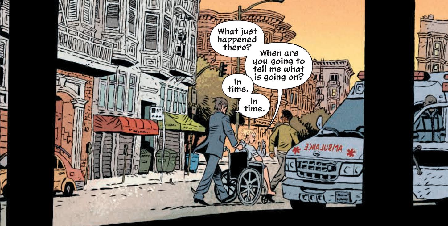
Gane’s ability to depict settings is outstanding as well. Whether characters are inside of a hospital or moving down the streets of San Francisco, both where they are and where they are going is clear. Backgrounds are only minimized or excluded in close ups and focused panels where they would distract from the composition. The depiction of San Francisco city streets in They’re Not Like Us #1 will feel natural and alive to anyone familiar with the city. Gane manages to capture the city’s essence without relying on classic landmarks.
Much like Stephenson’s previous Image series, They’re Not Like Us is exceedingly well designed. The issue actually begins on the cover with the very first panel presented between the title above and all other pertinent information below (e.g. credits, barcode, publisher). This choice not only looks slick but allows every page of the interior to focus on the story. Between the front and back cover, it’s comics and nothing else. Even the back cover is utilized to inform the look and feel of the story. The individual issues of the series will be worth picking up simply to admire the design and craft put into their creation.
You want to read They’re Not Like Us #1 for that precise look and feel as much as anything else. The ideas and design of this series are all locked in place and ready for presentation. It is cold in places, but that becomes a forgivable necessity. They’re Not Like Us #1 is a beautifully constructed introduction to a complex examination of youth in revolt.
Grade: B+


