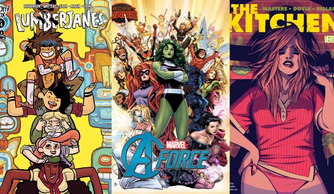
We’re very excited about A-Force #1 from Marvel Comics this week. It’s one of the most exciting concepts emerging from a wide variety of Secret Wars tie-ins, with a killer creative team attached. In honor of the series’ great premise, this week’s installment of Fastball Feedback is solely dedicated to comics with teams of powerful women. Whether they’re protectors on Battleworld, scouts exploring the mysteries of their camp, or newly minted kingpins of New York City, these ladies kick some serious @#$.
Videos by ComicBook.com
A-Force #1
Written by G. Willow Wilson and Marguerite Bennett
Art by Jorge Molina
Colors by Jim Cheung
A-Force #1 takes the same approach to Battleworld as Secret Wars #2, diving directly into the deep end. The issue only takes a few pages to introduce the island of Arcadia and the incredible heroines who populate it before diving into the action. The rules and hierarchy of Battleworld are all explained along the way, trusting the audience to enjoy the ride. It’s superhero adventure on an epic scale, as crazy, fun, and out-of-control as the best of past crossover.
That tone makes the rollercoaster ride of A-Force #1 as effective as it is. Subtlety is not needed, nor is it wanted. Relationships are stated in dialogue, all emotions are ratcheted to the highest level (even seriousness), and conflicts come in the form of gigantic sharks with lazer breath. This is not a slight; it’s what makes the book so much fun to read. Wilson and Bennett are clearly in love with the superhero genre and want to milk everything they can from its tropes here. The overall effect can be jarring at times as the story leaps between different plot points though.
Unfortunately Jorge Molina’s art is not always up to the task of presenting this action in a clear manner. The introductory action sequence is a minor mess. Proportions, movement, and distance are often confused between panels. The shark’s size and its relative distance to other objects often impossible to tell. This inconsistency leaks into faces later in the issue as well, undercutting the soap operatic drama. Jim Cheung’s colors flicker with the same inconsistency as well. While some pages, like the beautiful spread at the start, look fully developed, smaller panels often appear glossy and to have been barely moved past color flatting.
For readers excited about Secret Wars and the epic superhero tales promised, A-Force #1 is a mixed bag. The tone and story are consistent with big crossovers, but share some of their failings as well. Consistent presentation of those ideas is where the issue really has troubles though. If Molina and Cheung’s work improves, then A-Force may be one of the most fondly remembered series of this entire event.
Grade: C+
Lumberjanes #14
Written by Shannon Watters and Noelle Stevenson
Art by Brooke A. Allen
Colors by Maarta Laiho
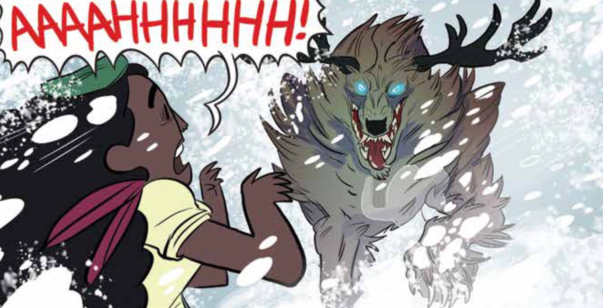
After featuring a series of guest artists and one-shot stories, Lumberjanes is back with a new four-issue story arc and original artist Brooke A. Allen. Lumberjanes #14 opens with all of the women gathered in the woods on a camping expedition designed to test their survival skills. Nothing goes as expected (as one might expect), and the cabin’s already dubious chances of surviving the night are blown away by a bizarre summertime snowstorm. Things go from bad to worse when new monsters and adults appear.
Allen and colorist Maarta Laiho define what Lumberjanes is. Their artwork is unmistakably sincere, engaged in every rough-edged panel, flourish of action, and exaggerated expression. They provide madcap action and humor, creating necessary momentum for this story to flow properly. Allen provides every action and reaction with gusto, making even simple smiles and winks shine in her panels. The energy moves the plot naturally between pun-filled dialogue and silliness into life-threatening situations. All of Lumberjanes is encompassed in her style, weaving the disparate parts into a more effective whole. Laiho’s bold colors stand out beautifully against the pure white expanses of the snowstorm. Here the Janes are stars dotting a bleak landscape with joy and ferocity.
Shannon Watters and Noelle Stevenson return to the formula of the first Lumberjanes story. There are plenty of mysteries introduced, and they provide lots for these characters to do and explore. The riddles of the camp aren’t the driver of the story though; that role still belongs to the characters. Every one of the women in Lumberjanes is exceedingly well defined, both in and of themselves and in how they connect. It’s still a joy to watch them interact and respond to new scenarios, and without them all of the snow monsters and secrets wouldn’t matter much.
Lumberjanes #14 reads in a familiar fashion, very much the series readers fell in love with just over a year ago. It incorporates recognizable structure, characters, and tropes, while providing new mysteries. The result is something that reads like the series’ debut with no need for exposition, much like the second or third novel in a series of novels for young adults. Lumberjanes #14 knows itself and its audience, creating a comfort zone in which it can continue to thrive.
Grade: B
The Kitchen #7
Written by Ollie Masters
Art by Ming Doyle
Colors by Jordie Bellaire
The Kitchen #7 is the penultimate chapter of Ollie Masters, Ming Doyle, and Jordie Bellaire’s 70s crime thriller featuring three women who conquer their husbands rackets when the men are sent to prison. The action has shifted from the ladies learning how to control the underworld to their struggle to maintain control after their husbands return. If you’ve been reading this series, it’s an exciting lead up to the climax, providing a clear thesis for the series. If you haven’t been, it’s time to catch up.
The juxtaposition of three women against one of the most male-dominated genres in fiction serves as the crux of The Kitchen. It has been fascinating to see how these three characters assert themselves, and in #7 Masters offers a quiet moment between Tommy and Raven that summarizes much of the series. Set to the New York City Blackout of 1977, they discuss their fathers and the world they were born into. It succinctly characterizes the decisions Raven has made as a necessary response, determined by those already shaping her community. It’s a fascinating look at the choices women face when trying to take power in a world dominated by men.
That understated summation of the series’ soul does not take away from the tension and action surrounding Raven’s power struggle, however. New York City is consumed by riots and fire, as she, Angie, and Kath overcome their final hurdle: hunting down Kath’s husband and children. Doyle and Bellaire distill the brutality of interrogations and chases into a tight one-page montage. Violence is presented in a realistic manner, every punch and kick landing with unexaggerated force. Bellaire’s colors are infused with a smoky quality, highlighting the resentment and rage that motivate all of this.
As it nears the end, The Kitchen continually gains momentum, helping to focus its ideas and art into the best issue of the series yet. It is both a rapid-fire crime drama and a powerful statement about how a patriarchal society can force women into violent roles. The nail biting cliffhanger lies on the tension set between that and the nurturing aspects of motherhood. It is an excellent build towards an unguessable climax, making The Kitchen one of the best new series from Vertigo Comics this year.
Grade: A-
What did you think of this week’s comics? Sound off in the comments below.


