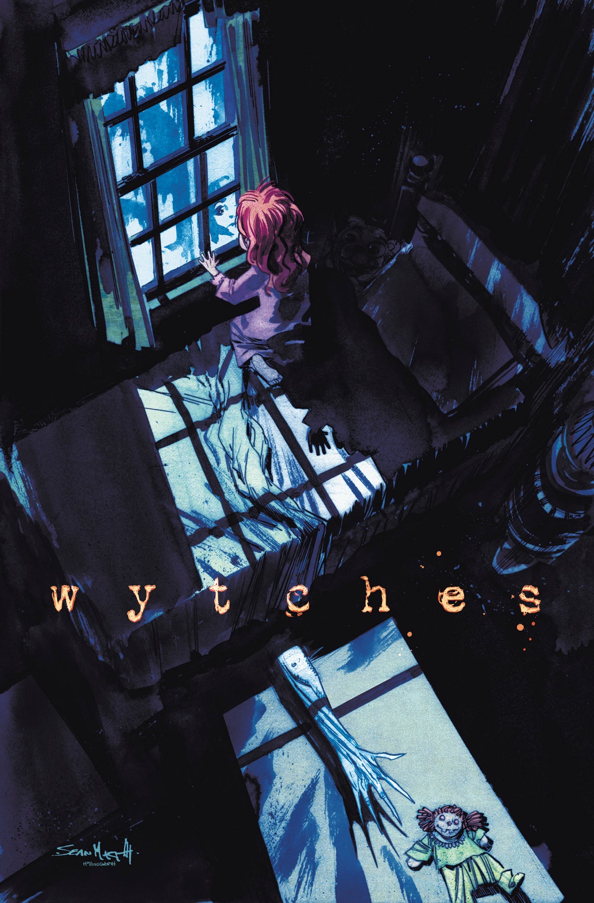
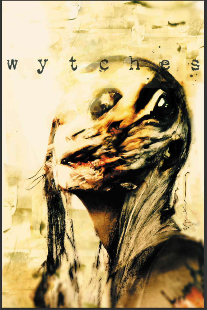
Just look at that this EXCLUSIVE Sean Murphy and Matt Hollingsworth variant cover for Scott Snyder and Jock’s Wytches #1. Gorgeously creepy.
Videos by ComicBook.com
As part of our continuing Wytches coverage, I sat down with the inimitable Jock to talk about his side of the project, from collaborating with Snyder, keeping his art process firmly in ink and paper, and designing the unsettling world and characters of Wytches.
How did you and Scott Snyder come to develop this project together? I know you two did some stellar work together over on Detective Comics for a while. Was this something you two have been developing for a while?
It was Scott that approached me for WYTCHES. We had talked a lot about working together again anyway – we had such a great collaboration on BATMAN: THE BLACK MIRROR – that when he called with the idea of creepy Wytch creatures that hide behind trees in the woods I was hooked. He’s such a great horror writer and this is his chance to really stretch himself into real terror. He’s developed such great characters… I really care for these guys and am very concerned about what’s going to happen to them! Early reviews have been very positive so we hope people will enjoy the book.
I’m curious about the collaboration between you two. Did you two hash out the story together? Does he write full scripts, or do you two work plot-first?
He’s very open to ideas and pointers, but the truth is, when you work with great writers you let them get on with it. I’ve found that over the years. I’ve been very lucky to work with great people, and although they’ve been open to ideas I normally prefer to let them to do their thing.
We did go back and forth about some of the core concepts of WYTCHES – whether there’d be ‘magic’ and spells for example, or whether it would be rooted in Natural Science, which is the route we’ve gone for. I always prefer horror that has that foot in reality. It makes the fear more palpable I think.
For a creator-owned project like this at Image where you’re building your own world from the ground up, how much preparation work did you do in terms of character and set design before you began working on the actual pages?
A lot! beyond the designs of the creatures themselves, the look of the characters and environments are very important. That’s when you put your ‘production designer’ head on… even though it’s set in the ‘real’ world, you have to approach it as a constructed place, relevant to the script, tone and story.

What is your process like for Wytches? Do you draw digitally or on paper?
Always on paper… I like ink too much, I can’t see I’d ever go fully digital. A lot of my favourite guys are starting to do ink digitally, but I just can’t see myself doing it. Saying that, some of the covers are digitally painted, but for story pages it’s still physical art.
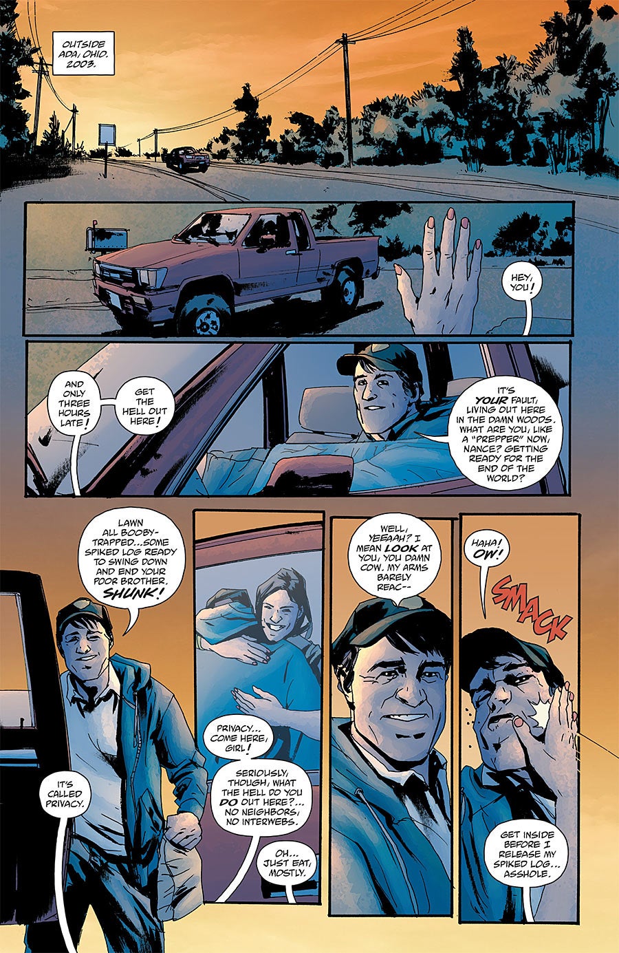
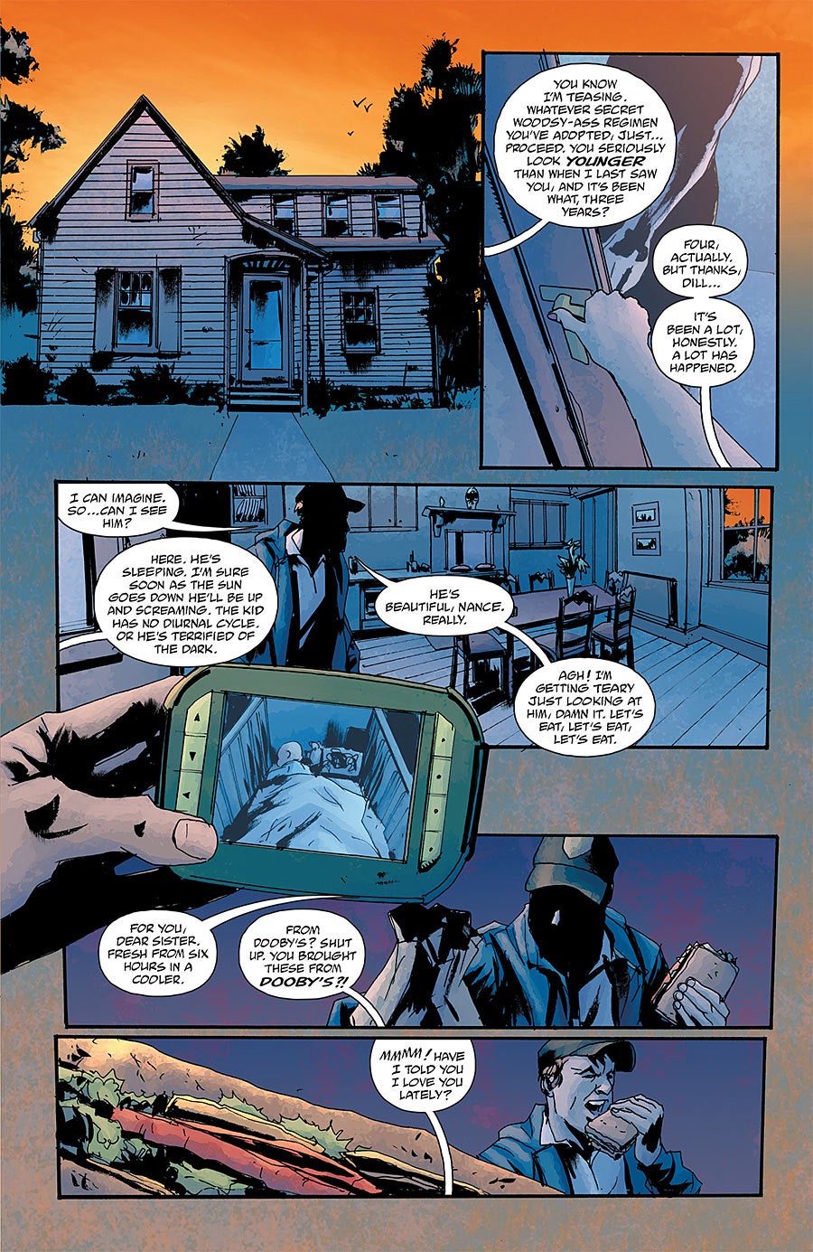
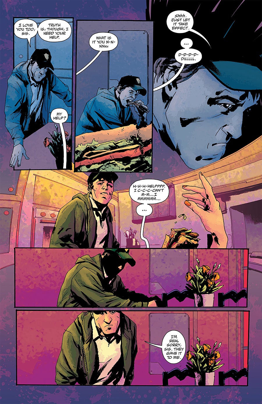
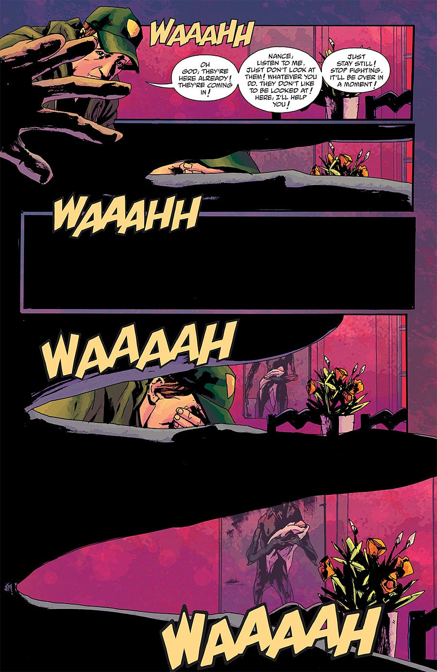
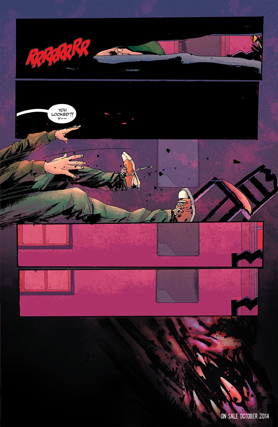
One thing I noticed in the Wytches teaser is that the colors are very vibrant, which is not something that’s typical of horror work. I’m curious what went behind the coloring choice?
In that teaser, it was because the character was basically hallucinating! We did it all from the POV of the main character, so when she was drugged, the colours started going little extreme.
We’ve approached the main book a little different, and Matt Hollingsworth’s colours have been just fantastic.
One of the things I’ve always loved about your work, especially on the horror projects you’ve done with Scott, is the sense of creepiness and unease that you’re work just exudes at those perfect moments. I’m curious, do you approach the construction of a page differently for a horror book like Wytches than you would on a different book like The Losers?
That’s a good question – I’ve learned to try not to think too much about style before starting on a book. You find that once you start thwart, the little nuances and differences that suit the script will come out. But I guess it is inevitable that I’m approaching this differently to say, The Losers.
More texture, more unease… more foreboding. I think good horror should be all about atmosphere, so that’s what I’m going for here.
Do you think your work is impacted at all by this being a creator-owned book? Do you find yourself wanting to take more time on pages or spend a little more time mapping things out?
Again, doing a lot of pages over the years means you find your own groove. It’s really important to find that. It’s like an optimum tempo that you can produce pages, where the pages flow well and the storytelling is clear and concise. thats the thing to aim for… sometimes having more time doesn’t help!
Who would you say are some artists that you’ve learned a lot from over the years? Are there people whose work or advice has really influenced and/or helped your work, particularly on Wytches?
I love guys that use ink well. For example Jorge Zaffino, Alberto Breccia, Sergio Toppi all seem able to draw great black and white comics that are LOADED with atmosphere and depth. That’s the A Standard for me. If you can do that, you can do a lot with a story to draw people in.
Do you have a Wytches playlist?
Ha, not really… my music taste probably doesn’t suit the book. Does Marvin Gaye WHAT’S GOING ON suit horror? Actually maybe it does….
You can pre-order Wytches from your local retailer with these Diamond codes:
Diamond Code for issue #1: AUG140523
Diamond Code for issue #2: SEP140768
Check out the teaser for the series:

