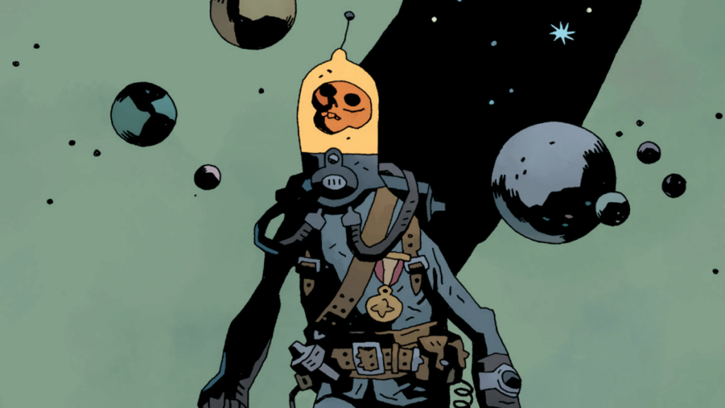
Going into a new comic series blind often has mixed results since you have limited expectations, if any, about what’s coming, but you often at least finish the first chapter with a decent idea of what’s going on. Radio Spaceman #1 from Mike Mignola takes a different approach, however, by reveling in missing context. It dodges the conundrum of throwing too much or too little at readers in the opening by not even bothering to explain things and instead expecting the audience simply to be hooked by its vagueness and a grungy protagonist. It’s an approach that’s working, too.
Videos by ComicBook.com
Radio Spaceman himself is unsurprisingly the perfect example of this phenomenon. The character consists of a skeleton in a spacesuit, and he’s drawn in a cartoonish way – consisting of a floating head within protective gear that’s adorned with everything from a medal and a sledgehammer to a utility belt and a lightbulb. Why does he wield both a primitive hammer and an advanced blaster? Is the man piloting the skeletal avatar also Radio Spaceman, or is that name reserved for the vessel alone? Is Radio Spaceman the hero, a villain, or something in between? We briefly see the gruesome remains of a skinless body presumed to be an up-close look at the spaceman, a stark contrast to the rest of the artwork. Perhaps that’s Radio Spaceman’s way of advising readers to avoid asking too many questions.
Dialogue is just as absent as context in some cases—Radio Spaceman isn’t exactly the talkative sort—so without those elements, we’re left with the artwork to tell the story. Radio Spaceman’s alien world is both by-the-books spacefaring with vivid colors and species that defy expectations, but it’s also a refreshing deviation in other ways. Space travels in stories often consist of sleek, minimal ships with doors that go “woosh” and hologram expected everywhere. Radio Spaceman’s ship mirrors the world around it – it’s rough, bleak, and looks like it’s just barely hanging on.
Another element sometimes overlooked but specifically deserving of praise in Radio Spaceman #1 are the sound effects that pop off nearly every page. These dangling onomatopoeias which are staples of most comics sometimes blend in with the background between quips, but in a story like this one that relies so much on environmental storytelling, they carry a lot of weight. One scene of combat and another showing the spaceman tracking someone with a device perfectly match expectations of what that kind of tech would sound like and manage to say a lot without saying very much at all.
By the end of the first chapter, we still don’t know a ton about Radio Spaceman himself, but we know it’s a good thing he’s around both in the context of this story and in general, too. A particularly captivating panel towards the end shows our protagonist armed with only his hammer against a horde of aliens, not as a hardened combatant but instead with a “here we go again” stance. Radio Spaceman is, for lack of a more encapsulating phrase, very cool, and perhaps that’s all he needs to be.
Published by Dark Horse Comics
On March 2, 2022
Written by Mike Mignola
Art by Greg Hinkle
Colors by Dave Stewart
Letters by Clem Robins
Cover by Mike Mignola and Dave Stewart


