Welcome to Fastball Feedback, the place at ComicBook.Com where I review three of this week’s newest comics releases. From major releases to small press, premieres to final issues, superheroes, science fiction, and everything else, I’ll look at the best, worst, and everything in between that comics offered each week.
Videos by ComicBook.com

Bloodshot Reborn #1 (Valiant Entertainment)
Written by Jeff Lemire
Art by Mico Suayan with Jeff Lemire
Colors by David Baron
The Valiant was a refreshing reminder that comics could produce entertaining, concise, and incredibly well-produced superhero events. Thankfully, Bloodshot Reborn #1 follows up on one of The Valiant’s biggest changes, the depowering of Bloodshot, and provides that same exciting level of quality for event spin-offs.
Jeff Lemire opens the plot with Bloodshot coping (rather poorly) with the many atrocities he has committed as a cybernetic assassin. The events of the first issue strike a very different tone from previous Bloodshot stories. This isn’t a story about epic adventure and chaotic carnage; it’s a tale about one man dealing with trauma. The consequences of murder, amnesia, and loves lost all take a toll on a person’s mind and soul, which Lemire is deftly explores throughout.
Bloodshot Reborn #1 doesn’t lack for excitement, though. The thrills of this story just come in different forms. Flashbacks and dream sequences replace shoot outs and fisticuffs. Readers are allowed to gaze into the nightmarish existence of a man suffering from something far worse than PTSD, and the results are chilling.
Mico Suayan’s presentation of these events are key. He packs his sequences into a claustrophobic motel setting where corners loom like invitations to disaster. Suayan’s depiction of mundane characters and settings increases the tension surrounding Bloodshot. The motel is covered in a thick layer of dirt, evoking images from bad horror movies where vacancy signs really spell “doom”. An elderly woman and her video game-obsessed grandson are every bit as creepy. When the young boy smiles at the FPS he is playing, it’s enough to send chills down your spine. The surprising infusion of Lemire’s art into Suayan’s own tapestry is a tremendous shock, leaping out in both literal and metaphorical terms.
Bloodshot Reborn #1 isn’t a typical spin-off series. It’s a story that thoughtfully follows up on what has come before. Lemire and Suayan are clearly invested in this story, addressing trauma and responsibility in a meaningful way. It’s the perfect combination of compelling and challenging for a fresh take on this bloody character.
Grade: B+

Ei8ht #3 (Dark Horse Comics)
Written by Rafael Albuquerque and Mike Johnson
Art and Colors by Rafael Albuquerque
If you subscribe to the idea of reading comics “for the art”, then Ei8ht is definitely a series for you. I don’t mean to disparage Rafael Albuquerque and Mike Johnson’s story, but it’s certainly the weaker half of that dichotomy.
Ei8ht #3 continues to fill the pieces to the four-colored puzzle as it makes several significant connections between characters and provides some big cliffhangers. It’s a plot that could be called fun, and maybe even exciting. But, it’s also filled with familiar tropes. Reveals in this issue are never surprising because they fit firmly into a formula. The relationships between different characters have all been written too many times before. A protective older sister with a daredevil of a younger sibling, a megalomanical tyrant and battle-hardened servant, a desperate man with a sick wife: All of these are included in standard packaging. Ei8ht is comfortable. That’s fine as long as you don’t expect much of a reaction.
However, there is still a reason to cheer for this issue: Rafael Albuquerque’s artwork. Ei8ht #1 offered a fine first outing, but Ei8ht #3 is his best work on the series yet. Dinosaurs and other prehistoric monsters are presented with real gusto. The thrill of flying on a pterodactyl and terror of a gargantuan sabre-tooth tiger are presented expertly by Albuquerque. He’s taking full advantage of the story’s time-torn setting to play with whatever elements excite him (and the reader, in turn) the most.
Albuquerque focuses his work primarily on the foreground, resulting in a dreamlike atmosphere. It’s purposeful and works well with the ever shifting landscape of the comic. The colors swirl loosely around the panels, opening events up instead of confining them. Ei8ht presents a world in which change and discovery are the only constants, and it’s the presentation of that world in which the series is at its best.
Grade: B

Convergence: Suicide Squad #1
Written by Frank Tieri
Art by Tom Mandrake
Colors by Sian Mandrake
The many “Convergence” mini-series being published create a rare instance for freedom and brevity at DC Comics. Writers and artists are allowed to use characters and do things that would seem impossible on a monthly title, and must tell their entire story in only 44 pages. It’s both an excellent opportunity and a challenge; one that begs the question: What were Frank Tieri and Tom Mandrake thinking here?
Convergence: Suicide Squad #1 is 90% exposition, while the other 10% is questionable at best. Tieri’s script wastes endless pages introducing characters that should be familiar to anyone reading DC Comics. The dialogue in these scenes is written without character, laying out facts about each member of this Suicide Squad like a wikipedia article. Tieri is no more successful when explaining the premise in which the Squad must confront characters from Kingdom Come. What should be an absolute blast is rendered inert. And that other 10%? Those are ultra-violent character bits that read like a parody of grim and gritty 90s comics. Which, given Kingdom Come’s presence, is pretty ironic. Deadshot shoots things without reason and doesn’t appear to have much of a motive or personality beyond ” the guy who fires a gun”.
Mandrake’s artwork has some fine moments within the issue, setting up a cliffhanger that feels more exciting than it really is. However, his twisty, pencil-heavy style feels rushed on many pages, resulting in oddly morphed faces and bodies. The story doesn’t play to his strengths and Mandrake never appears to be fully invested in what he is drawing. Panels flow functionally and it’s possible to consistently tell characters apart, but nothing in these pages lives up to the standards Mandrake has set for himself in other comics.
Some pleasant surprises have emerged from “Convergence” in its first two weeks, but this is not one of them. The elevator pitch behind this story is a slam dunk that’s rendered completely inert by excessive exposition and uneven art. It’s readable, but not much more.
Grade: C-
What did you think of this week’s comics? Sound off in the comments below.
Most Viewed
-
Image Courtesy of TOHO -

Image Courtesy of Crunchyroll -
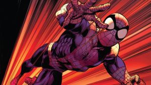
Image Courtesy of Marvel Comics -
Image courtesy of Marvel Studios