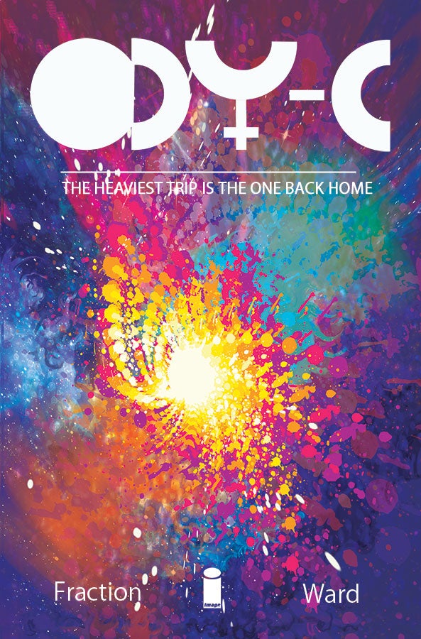
ODY-C is easily one of the most anticipated new comics to be released this year. Written by Matt Fraction and illustrated by Christian Ward, ODY-C is a masterfully psychedelic, gender-bending, space-operatic retelling of Homer’s Odyssey that is the follow up to Fraction’s stellar work on Sex Criminals, Satellite Sam, and Hawkeye, as well as Ward’s first major project since his insanely innovative work on The Infinite Vacation.
Videos by ComicBook.com
Opening with a fold-out 8 page spread and written in the same six-syllable dactylic hexameter used by Homer himself in the original Odyssey, Fraction and Ward’s ODY-C is one king-hell mammoth of an undertaking. The first issue is released this November (check out the preview here), and with the PR machine starting to gain momentum, I wanted to take advantage of the opportunity and talk with Christian Ward about his side of the project.
One of the most innovative narrative artists since J.H. Williams III, Christian Ward is a name you’ll be hearing a lot of from here on out. I sat down with Christian to pick his brain about ODY-C, his process and approach to storytelling, his design and coloring sensibilities, working with Fraction, and the other projects he has in the works. Plus, check out our EXCLUSIVE process pages from Ward after the interview.
So Christian, to start, why don’t you tell us a little bit about ODY-C for those who might not be familiar with the book?
ODY-C is a hard sci-fi gender-swapping psychedelic retelling of The Odyssey set in a burlesque universe; or it’s the story of a mother (who just happens to a smart resourceful kick ass warrior) travelling home to her family.
How did you and Matt Fraction come to work together on this project together?
It began with mutual appreciation. Matt began following me on twitter and we got to talking about the things we loved and part of that was euro -sci-fi, in particular Barbarella. From there it was only a short jump from imagining how cool it would be to create a whole new universe to actually saying ‘ lets do it!’
I’ve heard Matt talk elsewhere about the story being similarly structured to the Odyssey itself with each issue of ODY-C equalling one chapter of the original – unless I’m completely off base. Does that macro-structure influence the way that you tell each issue with your art?
That’s correct. We’ll also be jumping around a little, the poem’s not chronological so we shan’t be either. In that regard I’ll be developing visual cues (what they’ll be I’m not sure yet) so that the reader knows where and more importantly when they are. It’s important with this in mind that despite being fragmented the book feels like a whole.
I think I heard on the Let’s Talk Comics podcast that in your last book, The Infinite Vacation, you were playing around with shape symbology in the page designs where triangles represented a certain dynamic or aspect that differed from the meaning of a circle or square. Are there similar ideas and deeper graphic metaphors that you’ll be playing with in ODY-C?
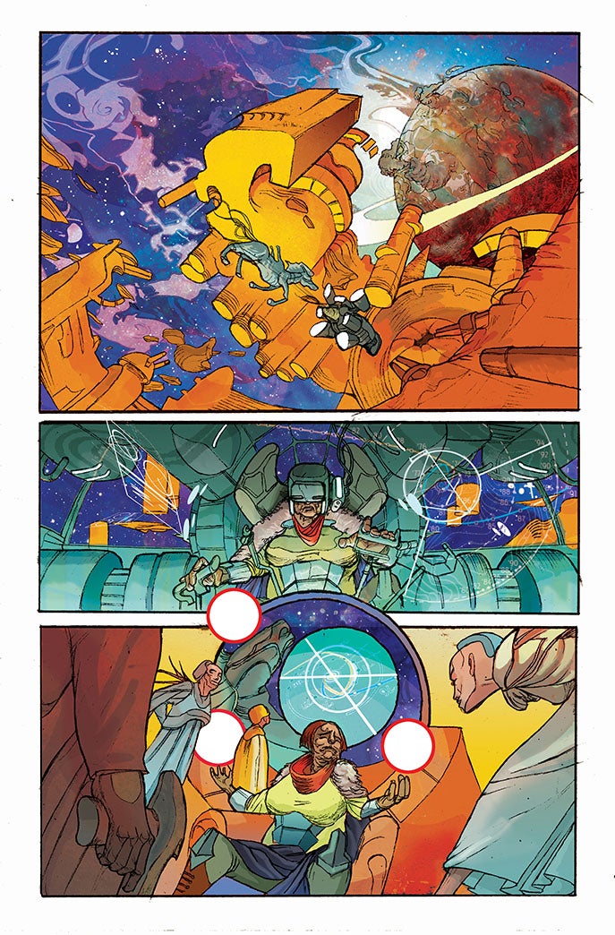
I’m not sure this is deep but the universe is our sea and as such I’m using a lot of underwater imagery. Theres going to all sorts of aquatic counterparts: cosmic jelly fish, space whales and …er, well, giant space horses. I want to have other references to the sea and the nautical as we progress.
In regards to shape symbology, absolutely. I know I want to play with circles. Circles seem right for this. Circles feel very feminine but equally they could represent planets.
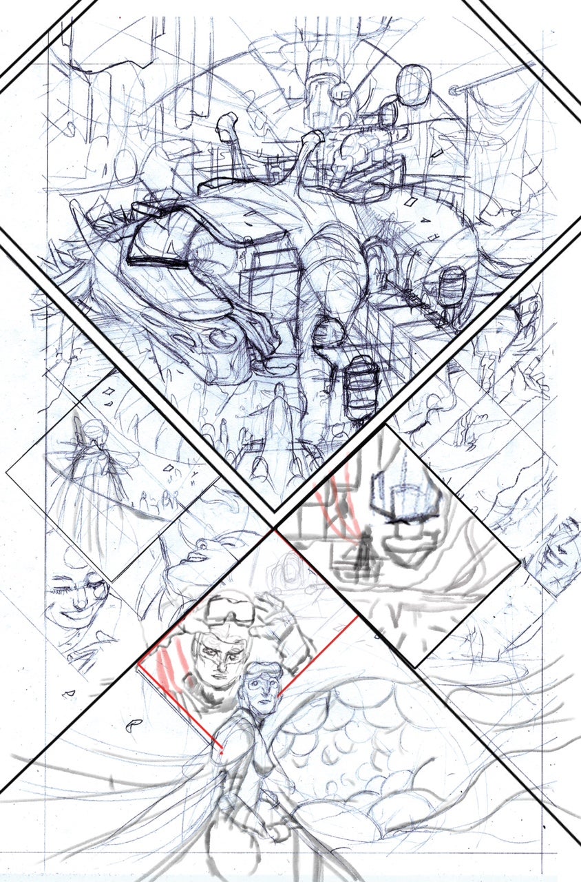
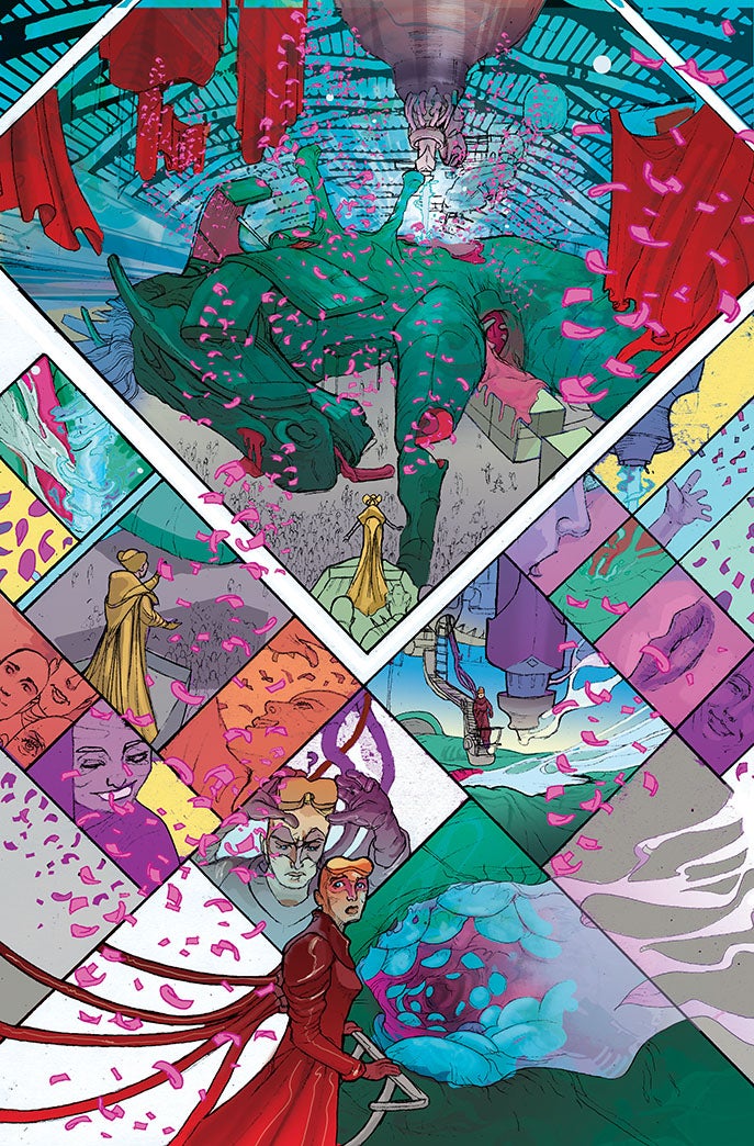
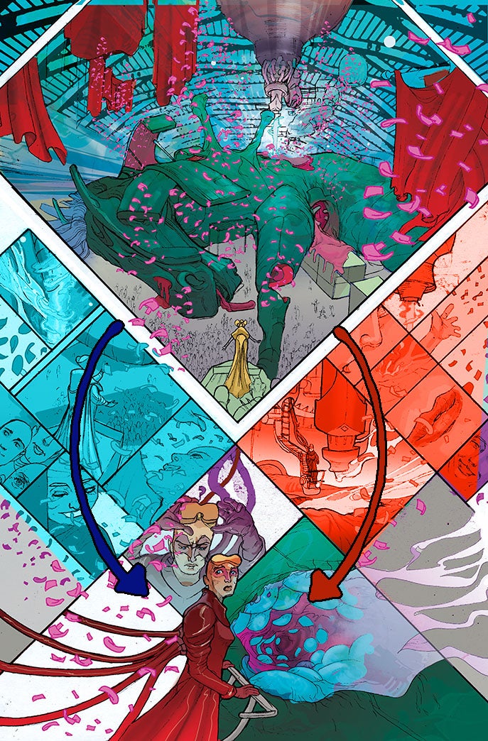
Much of what I did in IV developed as we progressed so it’d feel a little too forced to concoct what’s not there yet. With that being said, I’d quite like to play with how certain pages can be read. Matt’s spoken quite a bit about how we’re going to have these multiple stories happening simultaneously throughout ODY-C so with one of the prologue pages I wanted to see if I could show two sequences in the same space playing out at once. In the page we have the celebratory harvest of the horse and the discovery of the eggs inside of it happening at the same time, so I tried to suggest a layout that allowed the reader can choose to read down the left side of the page (the panels marked blue) or down the right side (marked red) rather than just left to right. if this was apt I’d certainly like to play with this idea more. These choice have to be organic and be there in service of the story rather than gimmicks.
What is your process like? Are you fully digital at this point or do you still do a lot on paper?
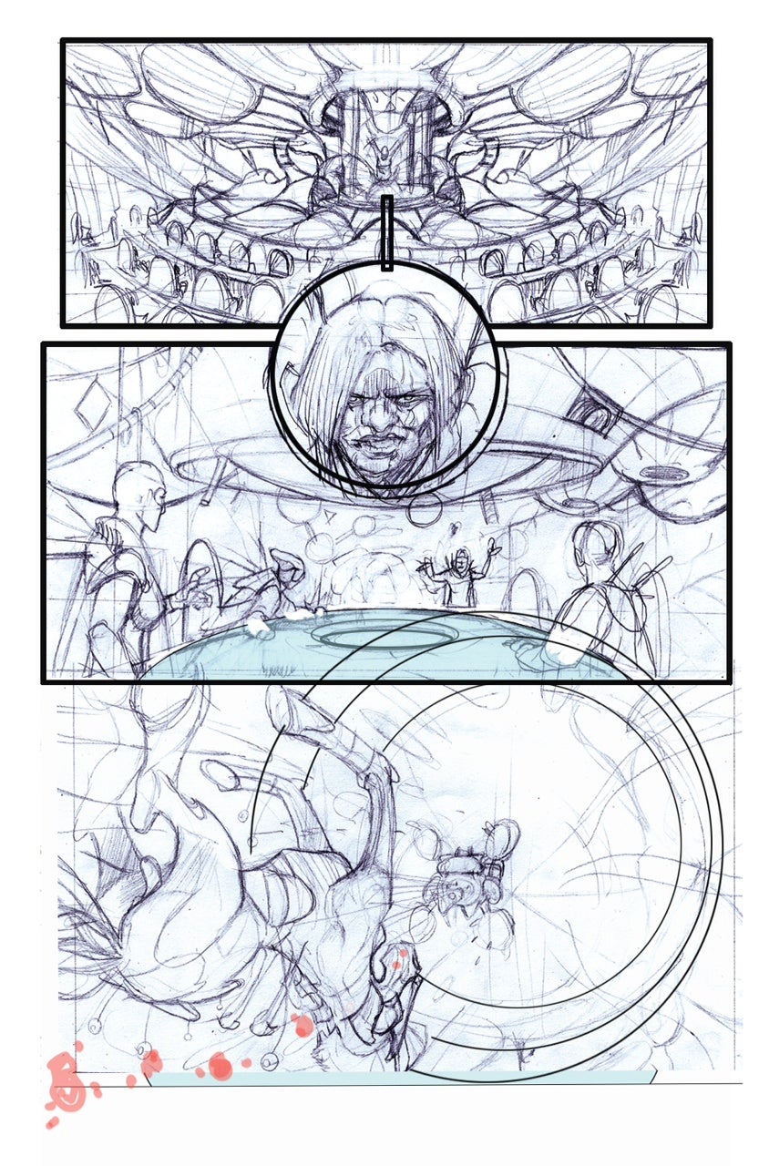
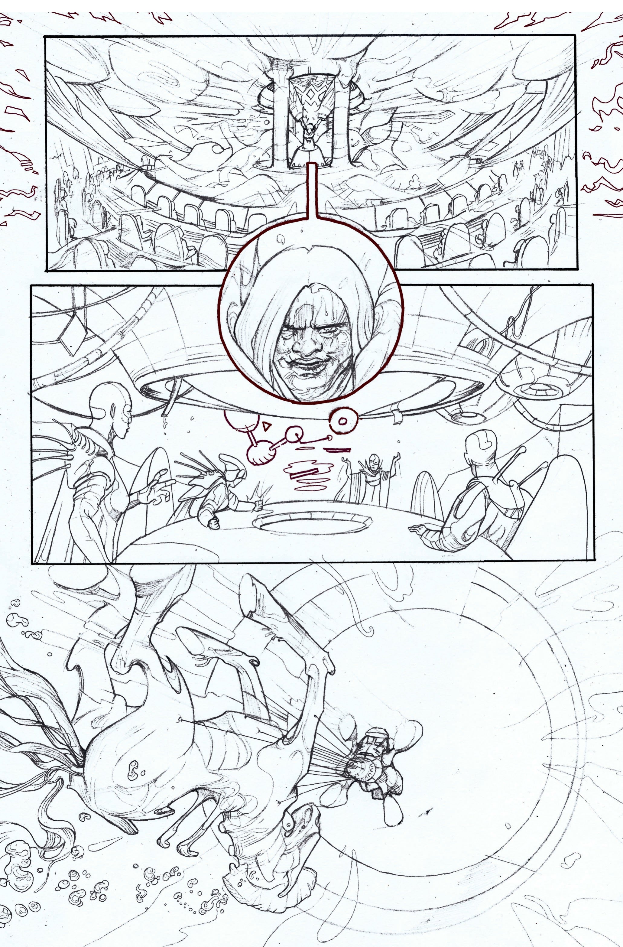
It’s half and half. I tend to do a very quick layout sketch in photoshop first. Here I’ll focus on the page’s structure and flow. It’s easy to chop and change things and see what works and what doesn’t. Then I’ll do rough pencils which I’ll scan in and digitally cut up and arrange into the chosen layout tweaking as i go before finally printing this off to light box up to final pencils. The colouring is almost all digital but I have a bank of watercolour that I create for each project that I use to give the colours a little more tension.
Are you coloring this book yourself? Your work always has an incredibly vibrant color pallet and I’m wondering if you could talk a little about the approach to color on ODY-C.
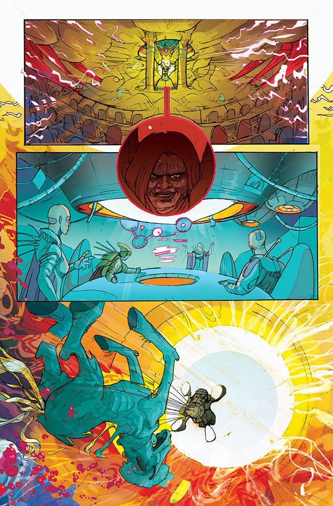
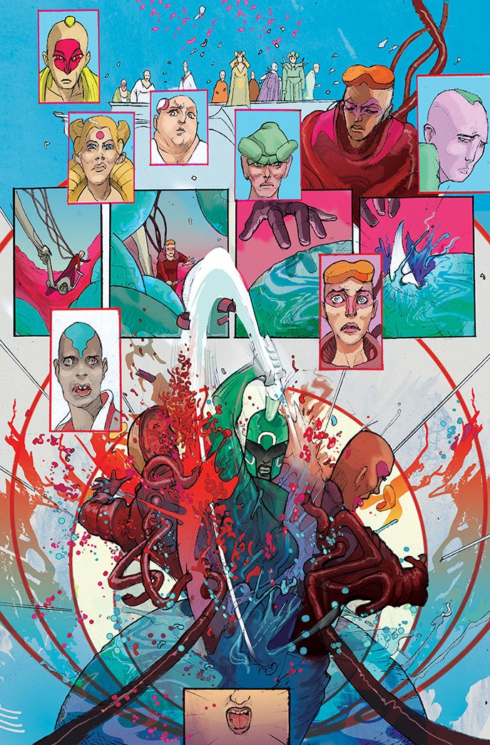
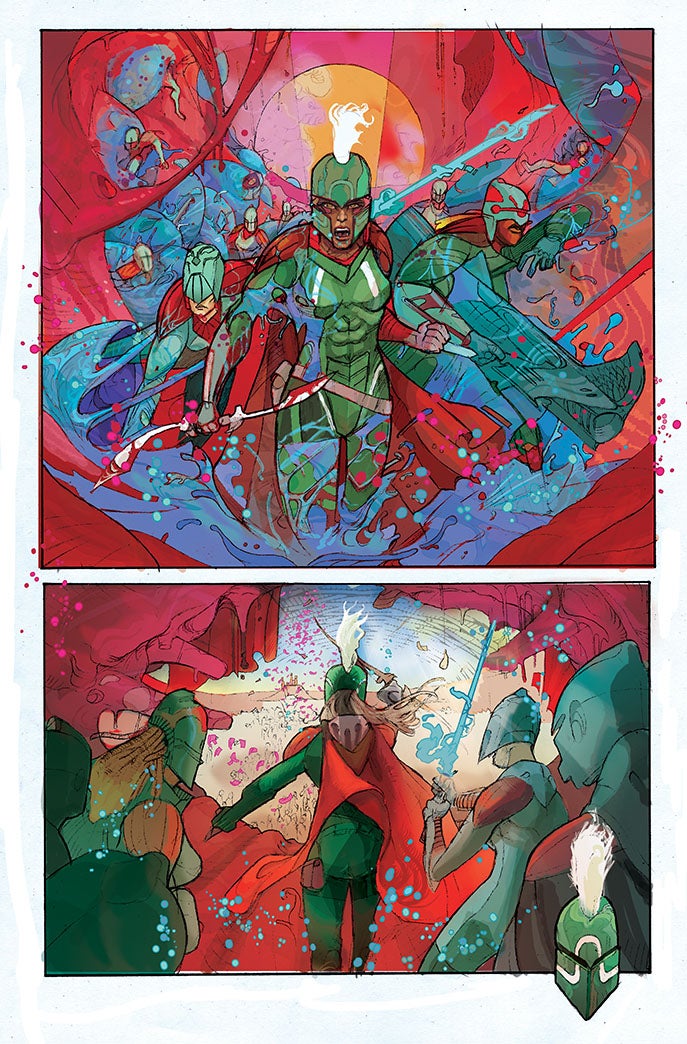
I love colour. In ODY-C I want the colour to reflect the mythological quality to the story. Give it a hyper reality. The colour turned up to 11. I looked at a lot of Hindu iconography and the depiction of the gods are so saturated by colour. I like the idea that the colour in the world of ODY-C is enhanced by the gods, as if it’s richer due to their presence in it. I’m planning on taking this even further and have the colours intensify whenever gods show up. I’m spinal tapping it. This is me going up to 11. It’ll be 1 louder than 10. There’ll be nothing subtle about these gods.
And our universe won’t be black – I want it to be the azure of the sea, full of life and colour. I want us to feel like we’re swimming in it .
I may want to play with colour coding each world in someway but this is something I’m only just exploring. Whether that means that they’ll be specific pallet for each world our hero finds herself in, or whether they’ll be a colour byline or motif featured in each I’m not sure yet. The great thing about working on this book with Matt is how it’s evolving. Even the straight gender swapping is no longer as binary as it once was and the universe it starting to have it’s own rules and logic that are its own rather than being supplanted from the original mythology
You’ve got a real talent and flair for heavily incorporating graphic design in your story telling, and I wonder, does the design sensibility or storytelling come first in your mind?
To me graphic design is the visual delivery of information, only in this case that information is required to have an emotional response. It’s important that emotional response comes first. As a reader if you don’t connect to the characters then you’re not going to care about their story no matter how ‘cool’ a layout is or striking the style might be. It’s always a balance between pushing the page to allow the structure to have something to say, to contribute to the story rather than it just muddy the water.
Who would you say are some of your favorite artists, both inside and outside of comics?
Frank Quitely, Chris Samnee and JH Williams are three of my favourite comic book artists. There’s a sheer joy of storytelling with Chris and Frank, and JH is just a master at style and layout. I love how they all push the medium. Recently I’ve been really impressed with Wes Craig’s work on Deadly Class and I think Tonci Zonjic mood setting and story telling are sublime. Outside of comics I’m a fan of James Jean (especially his fine art work). I love his combination of the beautiful and the grotesque. I too love how illustrator Tomer Hanuka handles the human form and composition.
Do you have any other projects coming up besides ODY-C coming up? I noticed you’ve been doing a bunch of Marvel covers, and there was that teased book with Ales Kot…
It has to be all about ODY-C right now. I packed the day job of 10 years in to focus on this (I used to be teacher) so I have to give ODY-C my undivided attention to ensure it’s as good as I can make it. I’ll be picking up the odd cover/illustration here and there but as far as comic making, I want to focus JUST on this for a few months until I find my groove. I hope to start writing my comics once I’ve found my routine and know where the slack is. I’m keen to have something out in 2015 which I’ve written rather than drawn.
Again the one-shot with Ales won’t see the light of day till later in 2015. It’s great concept so I just couldn’t turn it down. Right now though I’m lost in space.
Lastly, are you reading/watching/listening to these days? Anything have you especially excited?
My favourite monthly books is probably Daredevil. In my mind it’s the best superhero book on the market (unfortunately I’ve not quite been lucky enough to have Marvel ask me to do a variant cover for Daredevil yet…cough cough). Away from spandex I really really love Sixth Gun and I just finished reading the reprint of Urasawa’s Monster which was stellar. I’m also loving The Wicked and The Divine from Kieron Gillen and Jamie McKelvie, Rick Remender and Matteo Scalera’s Black Science (actually all of Rick’s creator owned stuff is just brilliant) and of course Matt’s Sex Criminals.
I’m finding Shinichiro Watanabe’s Space Dandy thrilling. Even for great anime it has such an endless amount of invention – it’s making me go back and really work hard at a lot of the design work in ODY-C. I saw Adam Wingard’s new film The Guest at the weekend, it’s a proper 80’s throwback and as a big John Carptener fan I enjoyed the hell out of it. Even had a geek out at the choice of font used used for the titles.
Current drawing soundtrack? I probably should be listening to Beyonce while I’m drawing ODY-C but I’m listening to a lot of Plaid and Bjork.

