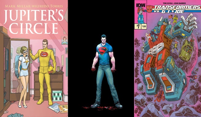
Rebirth is the name of the game for this week’s Fastball Feedback, as we look into some classic characters and stories that are receiving new life. DC Comics published one of the best Superman stories since the launch of the New 52, while IDW Publishing re-imagined two of the biggest toy franchises of all time. Image Comics, on the other hand, is fleshing out the past of Jupiter’s Legacy, one of the hottest new superhero concepts. It’s a historical week for the heroes of childhoods old and new, so let’s see how each milestone did.
Videos by ComicBook.com
Transformers Vs G.I. Joe #7
Written by Tom Scioli and John Barber
Art and Colors by Tom Scioli
Transformers Vs G.I. Joe #6 ended by revealing the entire story to be Scarlett’s psychotic break with reality. This could have turned out be a lot of things: a joke, a poor ending, or even nothing at all to be ignored. Transformers Vs G.I. Joe #7 twists and plays with that classic cop out of an ending though. Tom Scioli and John Barber dig into this concept and turns it into another incredible issue of comics.
The discovery of this issue is a large part of the excitement, so it’s best to not say too much. However, there is a rhyme and reason to everything that has been shown. It’s every bit as intelligent, over-the-top, and tonally consistent with these 80’s toy properties as what has come before. When the cause behind Scarlett’s predicament is revealed, you find yourself slapping your head with a smile and shouting “Of course!” It’s all part of this madcap combination of ideas that manage to walk a tightrope between absurd nostalgia and passionate comics craftsmanship.
That craftsmanship is still what makes Transformers Vs G.I. Joe stand out as one of the best series being published. Scioli’s love of Kirby combined with his own urge to innovate results in page after page of enthralling layouts and design elements. A page is cut in half in a spatter of color that traces the action of a scene. Maps and panels are embedded flawlessly into grander images. A duel is told in a single page with a perfect horizontal mirroring. There is not one thing to talk about with Scioli’s art, you have to talk about everything.
It’s difficult to accurately describe Transformers Vs G.I. Joe #7, which is why readers must discover the issue themselves. It is unlike anything else in comics. While it takes cues from past properties (in the title) and creators (specifically Kirby), it uses these points of inspiration to spin a brand new story. The result is a beautiful statement on everything comics have been and can be.
Grade: A
Action Comics #41
Written by Greg Pak
Art by Aaron Kuder
Colors by Tomeu Morey
Action Comics returns with a brand new status quo in June. Not only has Superman’s alter ego been exposed to the public by Lois Lane, but he has also been significantly de-powered due to events in Superman #41. It’s a big change, and a great jumping on point as Clark Kent acclimates to these changes alongside old and new readers alike.
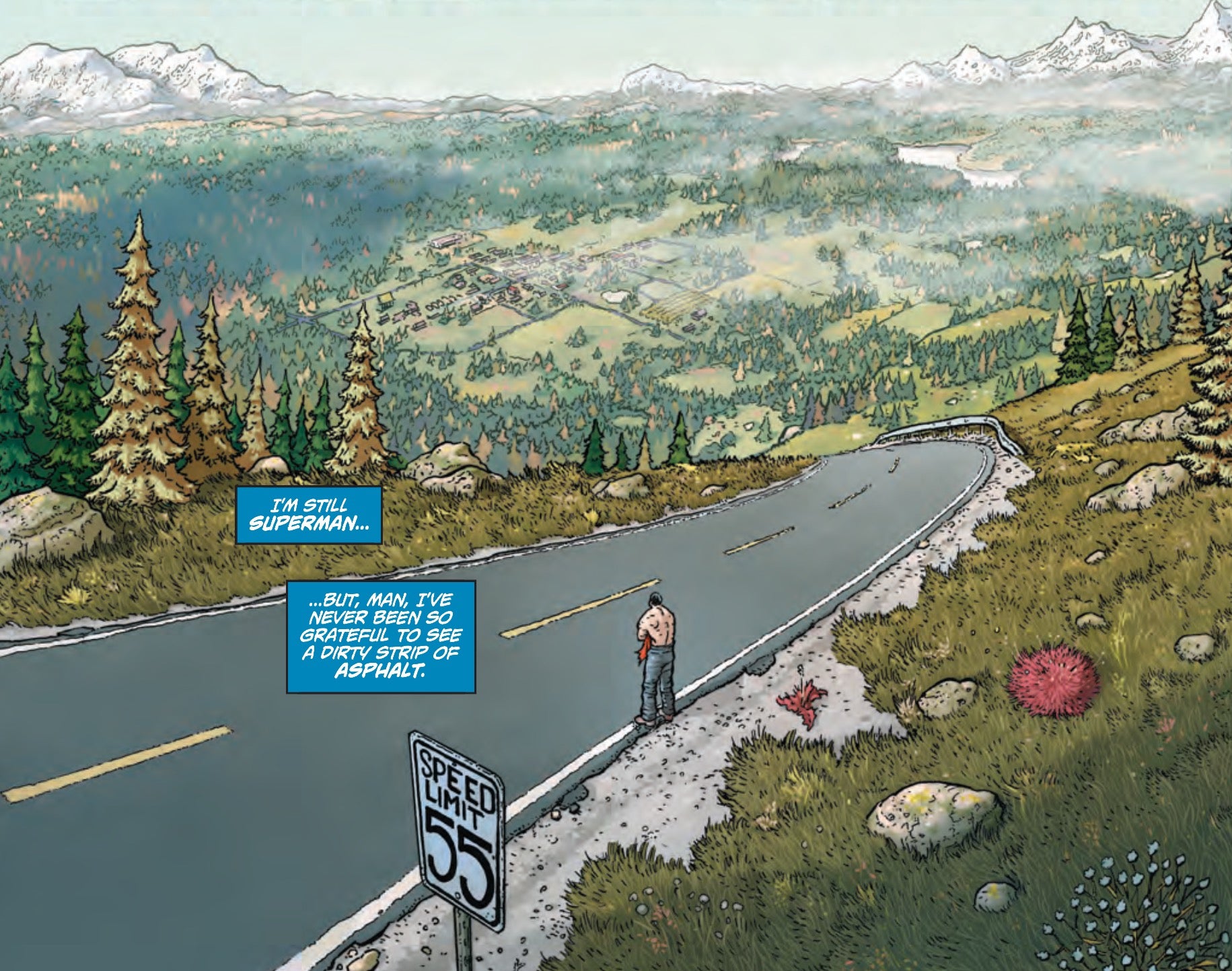
Pak squeezes the necessary exposition into Superman’s internal dialogue and never allows it to slow the pace of an jam-packed comic. Action Comics #41 is the sort of plot that many writers would pace out over several issues, but there’s no room for decompression here. Instead readers are shown Superman’s entire trip home and his acceptance of a new status quo. It’s a lot to take in, but Pak’s script makes it all read naturally. He exposes new challenges and ideas with action and exciting reveals, as well as conversations. The end result is a very satisfying twenty pages of comics.
Aaron Kuder packs these pages with plenty of information, often including 8-10 panels. His layouts may not be as flashy as Cameron Stewart’s, but he tells the story efficiently and makes every page count. The manner in which he tracks Superman’s cross country road trip in a single page fills it with detail and vibrancy through the use of focused mini-scenes. This density of story also allows for a two-page spread and splash used in separate action sequences to land with much greater impact. They feel appropriately big in comparison to the steady story rhythm that precedes them. Half-page ads disturb the pacing of two pages though, both of which are bound to look better when combined in digital and collected editions.
This may be issue 41 of Action Comics, but it’s every bit as accessible as all of the #1’s DC is putting out this week. Pak and Kuder maintain the charm and originality of their run, but also manage to provide a big new twist on the Man of Steel in a way that any superhero fan can appreciate. Action Comics #41 is a big, bold step for the series, and it looks like the future will be a lot of fun.
Grade: B+
Jupiter’s Circle #3
Written by Mark Millar
Art by Wilfredo Torres, Davide Gianfelice, and Francesco Mortarino
Colors by Ive Svorcina
The newest issue of Jupiter’s Circle, the prequel to Mark Millar and Frank Quitely’s breakout hit Jupiter’s Legacy, shifts its focus to a thus far neglected member of the team: The Flare. He’s a flying speedster with a very different set of romantic problems than those faced in previous issues. Rather than confronting discrimination, The Flare creates his own problems when he takes on a new sidekick and initiates an affair with her.
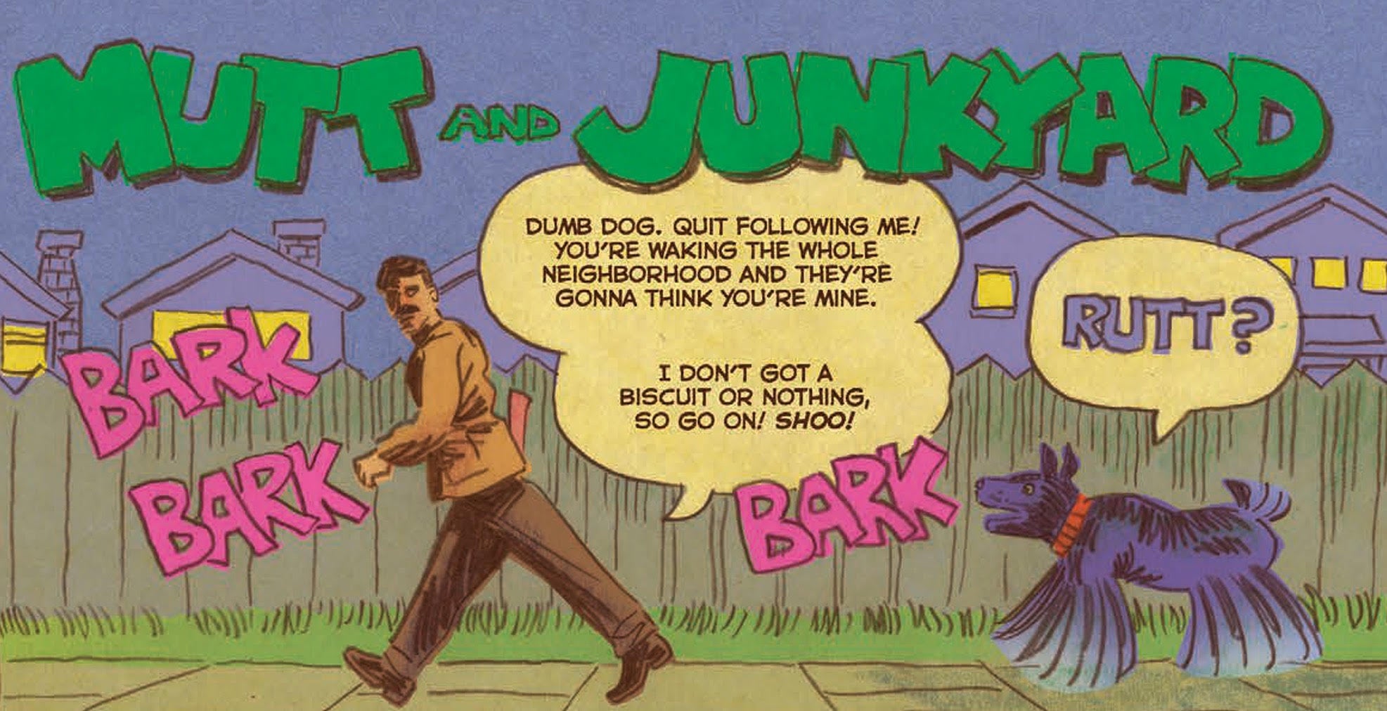
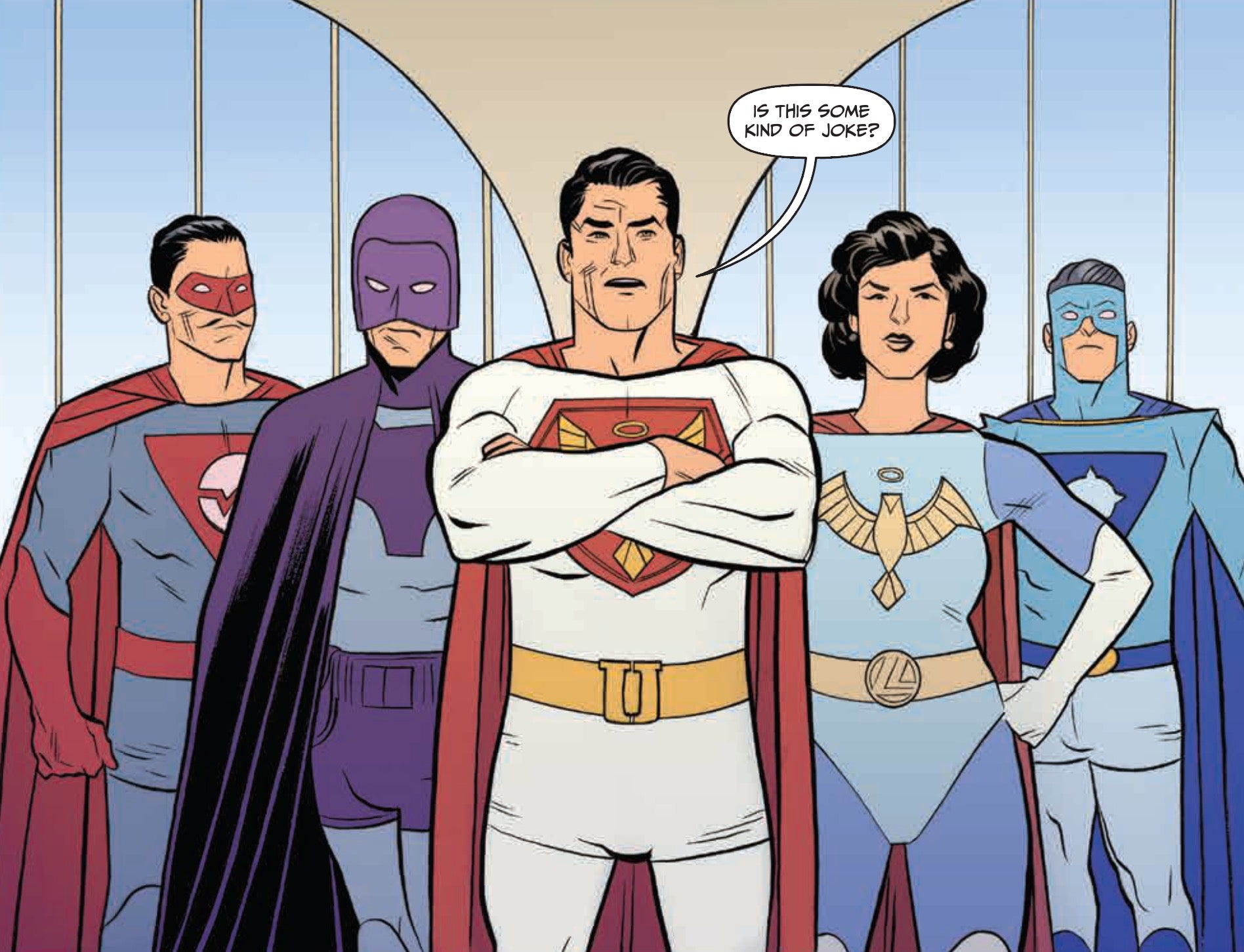
Torres’ art, like Quitely’s on Jupiter’s Legacy, is the highlight of this series. He embraces a simple, but exceedingly clear style that fits the period of Jupiter’s Circle wonderfully. It both caters to the idealistic, atomic family-based presumptions about the period, and helps undermine those same presumptions with the flaws and corruption on display. His action sequences sing on the page with the straight-forward brawling of the best silver age comics. Colorist Ive Svorcina makes The Flare’s speed effects clear in a beautiful panel where he is shown multiple times, creating a clear sense of time. Davide Gianfelice and Francesco Mortarino’s inclusion to illustrate The Flare’s home life is a unique spark. Their style almost matches Torres’, but thicker and less dramatic line work separates these two lives.
Unfortunately, Millar’s script does not back up Torres and Svorcina’s potentially subversive efforts. The self-contained story of Jupiter’s Circle #3 is a cliché playing out a series of tired tropes. Every scene is one that can be seen in dozens, if not hundreds, of stories before without anything new to contribute. Even worse is that both The Flare’s wife, Joyce, and mistress, April, lack self-determination. Their entire stories are based around what The Flare wants and decides. Even the incredibly upsetting decisions he makes are followed with minimal response by both women. They are written as props in this man’s story, where even The Flare’s son is given greater power in only two panels.
The urge to be subversive is not enough to actually subvert an idea. While Millar is backed up by an exceedingly talented team of artists, who make this issue function as well as possible, it lacks any concepts of real merit. Instead it plays out like the first act of a romantic tragedy from the very period it hopes to explore. This story might have been exciting in the 50’s, but now it’s entirely forgettable outside of its execution.
Grade: C-
What did you think of this week’s comics? Sound off in the comments below.

