Sometimes you only need to read a few pages of a comic in order to make up your mind. When a creative team nails the artwork, dialogue, colors, and every other element on the first few pages, it’s possible to fall in love pretty fast. That was how I felt when I read the first Spider-Gwen story in Edge of Spider-Verse #2 and it’s how I felt after reading the first few pages of Silk #1. This is a comic that understands itself from the very first page and dares you not to like it.
Videos by ComicBook.com
I wasn’t even inclined to like Silk either. The character never really sold me in the pages of Amazing Spider-Man or throughout “Spider-Verse”. She read just as much like a function of plot in those comics as an actual character, but this is a whole different story (for the most part at least). This is Cindy Moon (a.k.a. Silk) given an opportunity to flourish outside of a comic dedicated to Peter Parker and with Robbie Thompson’s script and Stacey Lee’s gorgeous art, she absolutely does.
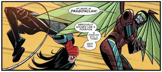
The first four pages of Silk #1 are an action sequence in which Silk faces off against a D-lister by the name of Dragonclaw. Thompson recognizes the similarities between this set up and every other Spider-Man comic ever published. He plays on that in order to distinguish Silk as her own, charismatic lead. Banter is replaced by awkward one-liners, and Silk’s inner monologue reveals a great deal about her in no time at all. It’s impossible to deny the connection to the Spider-franchise, but Thompson defines Silk as a unique, vibrant addition to the Marvel universe with only a handful of text.
As clever as Thompson’s writing may be, it is Lee’s art that sets this sequence apart. The action is fast, clear, and pops off of the page. There’s not a wasted panel in any of her compositions, and she can deftly layer a page with them. While there is an element of danger to the sequence, Thompson’s tone is much closer to the fun found in classic 70s Amazing Spider-Man issues. There is a playfulness to her work that makes the fast pacing all the more propulsive. Colorist Ian Herring enhances everything that Lee does in these pages, bringing bright colors and selecting perfect monochromatic background shades for background shots. Lee sets Silk up as a pop superhero adventure and Herring delivers on that promise 100%.
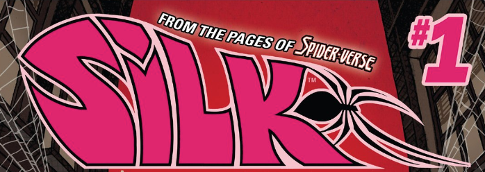
Talking with a friend I realized that my enjoyment of Silk began even earlier than this opening action sequence though. It began with the Silk logo at the top of the cover. Unlike so many titles in superhero comics, it appears to be handdrawn. An artist took the time and effort to craft this fusion of groovy 60s fashion and a curvy, spider insignia to inform readers about the book. It’s not a major part of Silk #1, but it shows the kind of love and care being put into the title, and it starts before you even open the comic.
This isn’t to say that Silk #1 isn’t without flaws. The initial flashback sequences in Silk #1 rely heavily on reader’s prior knowledge of recent Spider-Man stories, making the prologue a necessity for truly new readers. A few transitions between sequences move so quickly that a timeline is difficult to construct.
The flaws in Silk #1 are minor though and never dominate the reading experience. They are background noise getting filtered through the energy and momentum created by Thompson and Lee. The care and love they put into Silk #1 along with everyone else on the creative team creates a comic that is propulsive, fun, and really damn good looking. Silk is a fresh, invigorating take on the Spider-Man mythos and I cannot wait to see where she goes next.
Grade: B+


