Tony Stark may be one of the sharpest minds in the Marvel Universe, but even his brilliance occasionally takes a strange turn. Iron Man began his armored career out of desperation, turning a life-saving chest plate into the ultimate expression of engineering prowess and ego. What started as a necessity quickly became Stark’s obsession. His compulsive need to innovate and improve represents both his greatest strength and his most revealing weakness, as he seemingly can’t stop tinkering even when the results are, at times, questionable.
Videos by ComicBook.com
While the Hall of Armor showcases impressive technological achievements that have saved the world countless times, it also houses some truly embarrassing missteps that are better left forgotten. From the bizarre “nose armor” of the 1970s that inexplicably gave his helmet a protruding schnoz, to the roller-skating suit that had him zooming around like a weaponized disco enthusiast, Stark’s creative impulses sometimes produced results that undermined his carefully cultivated image of cool sophistication.
10. Arctic Armor
The Arctic Armor, introduced in Iron Man #318 (1995), is Tony Stark’s “I packed for the weather” suit. His regular armor already flies, generates heat, and has tank artillery, so giving it a frosty paint job to scream “special mission” feels more than a little unnecessary. While the silver-and-white color scheme offers some camouflage in snowy landscapes, any stealth advantage disappears the moment he fires a repulsor or rockets into the sky. The Arctic Armor is functional for the cold, certainly, but it’s hard not to see this as Tony cosplaying a high-end refrigerator with attitude.
9. The Gold Armor
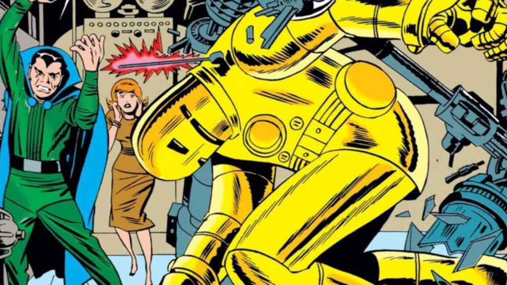
The Gold Armor was Iron Man’s first major upgrade after the gray prototype. The original gray design was bulky and intimidating, so Stark decided to give the armor a bright, heroic look to project a more positive image as a superhero. While the shift to gold was a step toward making Iron Man more iconic, the design itself left much to be desired. Its overly simplistic design lacked the sophistication that Stark’s later armors would achieve. The armor looks heavy, slow, and toyetic. Even within the fiction, you’d ditch the mirror-finish disco ball if you cared about sensors not getting blinded by your own specular reflections or about not broadcasting your position to every sniper within a mile.
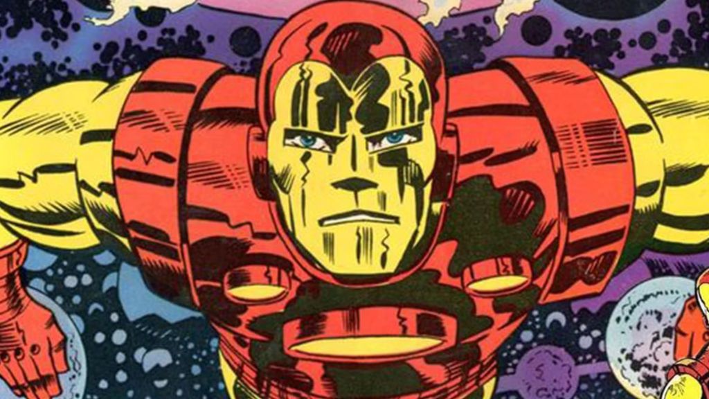
8. Thorbuster Armor
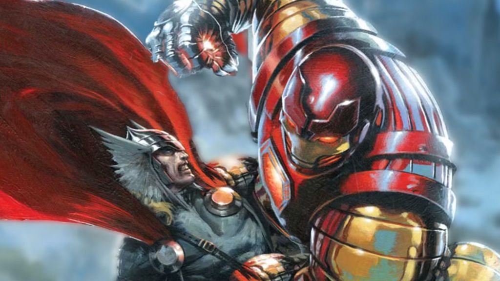
A suit designed to take on Thor sounds awesome. The Thorbuster armor was powered by an Asgardian energy source, but it ended up looking like a knockoff medieval costume. In Iron Man (Vol. 3) #64, Tony Stark donned the armor to stop Thor, who had become a near-unstoppable force after gaining the Odinforce. However, when the two clashed, the Thorbuster Armor faced its ultimate test — and ultimately fell short. Despite its impressive design and purpose, the armor was unable to withstand the full might of the God of Thunder for long. All that research, all those resources, all that betrayal of trust — and the result couldn’t even withstand a moderately annoyed Thor.
7. Mark 52 Hulkbuster Car
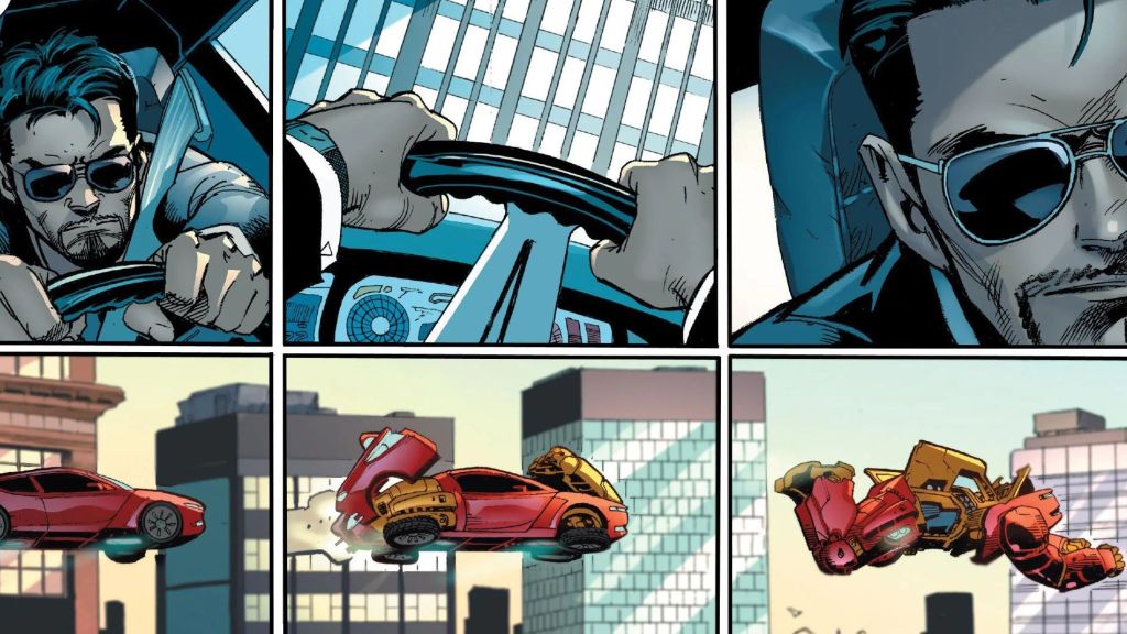
Iron Man already solved “instant armor” through remote summons, suitcase suits, and modular satellites. A sports car that transforms into a heavy brawler has its charm, but it leans into a kind of over-the-top practicality that doesn’t quite fit. Tony Stark doesn’t really need a terrestrial commute when he’s built to soar, and turning wheel hubs and folding doors into armor feels more like a novelty than an evolution. It’s not without its quirks, but the whole concept comes across as a little redundant.
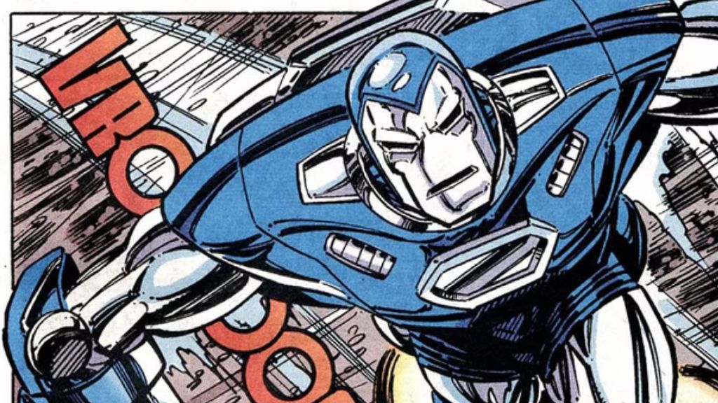
6. Silver Centurion Armor
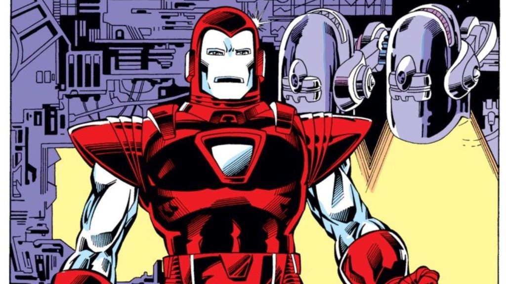
The Silver Centurion Armor made its debut in Iron Man #200 (1985) as Tony Stark’s big comeback after recovering from a brutal downward spiral caused by alcoholism. This was Tony’s “I’m back” moment, stepping out of the shadows to reclaim the mantle of Iron Man from James Rhodes (who had been filling in) and to take down his old nemesis, Obadiah Stane, once and for all. While some fans love this suit, others can’t get over its bright red and silver color scheme, which looks more like a Christmas ornament than a battle-ready weapon. Its oversized shoulder pads didn’t help either.
5. Iron Lantern Armor
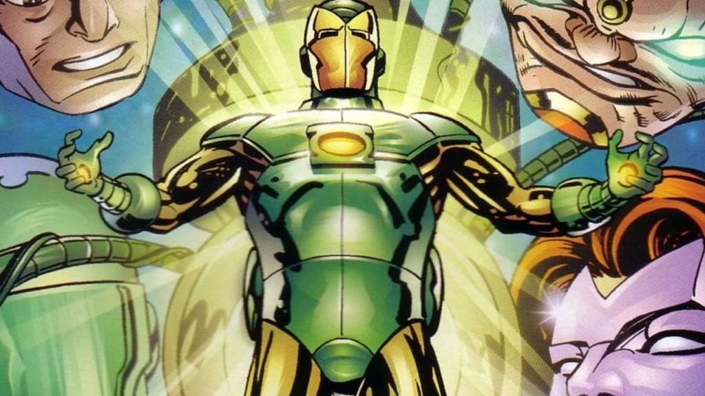
The Iron Lantern debuted in Iron Lantern #1 (1997) as part of the Amalgam Comics crossover, where Marvel and DC mashed up their characters into bizarre hybrids. In this case, they combined Iron Man and Green Lantern. The whole thing screams “’90s comic book excess,” where more was always more — even when it wasn’t. A hero who can conjure anything ends up strapped into clunky armor, while the sleek ingenuity of Iron Man is buried under the glowing theatrics of a lantern ring. The result feels overdesigned and oddly redundant – a character trying to be two things at once, but never quite committing to either.
4. Hydro Armor
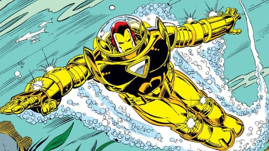
It’s hard to take Iron Man seriously when he resembles a Power Rangers villain. The Hydro armor debuted in Iron Man #218 (1987) as Tony Stark’s solution against underwater villains. While it served its purpose, the creation of an entirely new suit solely for underwater missions feels excessive, even for someone like Tony, whose “prep for anything” mindset often borders on overkill. The Hydro armor is a reminder that not all of Tony’s ideas are worth keeping on display in the Hall of Armors.
3. Stealth Armor
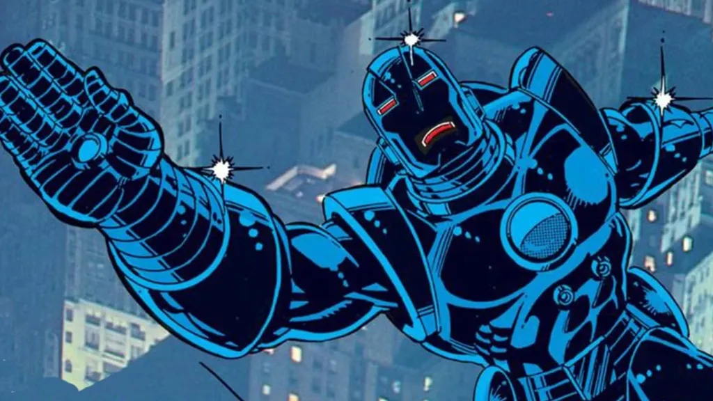
The Stealth Armor debuted in Iron Man #152. Unlike his typical suits, which emphasized power and durability, this armor was designed for evasion and covert operations. But painting the armor black and calling it “stealth” doesn’t make it any less ridiculous. It’s still a giant, 6-foot-tall, rocket-powered metal suit that blasts around with flight boosters. Instead of feeling clever or innovative, it comes off like Tony Stark trying way too hard to make his tech fit a job it clearly wasn’t designed for.
2. Roller Skates Armor
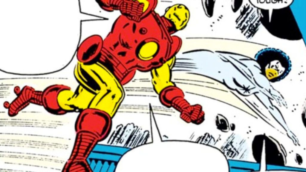
Iron Man’s Roller Skates Armor is one of those ideas that could only come from the wild creativity of comic books. Featured in stories like Tales of Suspense #45 and Secret Wars #3, the roller skates were built into the armor as a way to add mobility on the ground. In some versions, they even served a practical purpose by helping charge the suit, which sounds inventive but still feels completely unnecessary. It was introduced as a way to solve a problem Tony probably didn’t need to solve in the first place, and while it’s a fun relic of its time, it’s impossible to take seriously. Watching Tony Stark — billionaire genius, futurist, and superhero — zipping around on roller skates is about as far from “cool” as you can get.
1. Nose Armor
The infamous Nose Armor debuted in Iron Man #68 (1974) when Marvel’s editorial team decided that Iron Man’s mask looked too flat. They reportedly concluded that it didn’t make sense for Iron Man’s helmet to lack a nose indentation, as a real person wearing the armor would need space for their nose. This led to the redesign of the helmet with a pronounced nose. Fans mocked it almost immediately, and the fact that it vanished so quickly just proves what a misstep it was. It’s a strange little footnote in Iron Man’s history, but one that’s remembered for all the wrong reasons.
Which Iron Man armor do you think is the strangest? Let us know in the comments! Want to stay up to date on the biggest geek entertainment news? Add us as a preferred source in Google – HERE, and join our community over on the ComicBook Forum for deeper takes and discussions!
Most Viewed
-

Image courtesy of Paramount -

TMS Entertainment -

Image Courtesy of Lionsgate -

Image Courtesy of Disney