In the first season of American Horror Stories, fans got to experience individual stories set within the larger American Horror Story universe. While some had some very concrete ties to American Horror Story — the series’ first two episodes, as well as its season finale, were all tied to the iconic Murder House first introduced in American Horror Story‘s first season — others were unique, standalone tales that brought new terror. But, even though American Horror Stories offered something new for fans, like the main series, a major part of Stories is the look and feel of each episode, where no detail is too small in helping to bring the terror to life.
Videos by ComicBook.com
Creating the look and feel of those episodes is the job of Eve McCarney. From bringing the Murder House into the hands of new owners in “Rubber(wo)Man Part One” and “Rubber(wo)Man Part Two to building a light and airy nightmare in “Ba’al”. McCarney helped bring the series to life in her multifaceted role as production designer for the series.
“The creative side of it, which is my favorite part, is cultivating the vision for the project. Whether it’s a film or a series, I’m the one that comes up with what it’s going to look like by creating the palette (what types of colors we want to use or avoid), delving into the story through the use of visuals, colors, textures to really flesh out the environments so that they reflect the character, reflect the story and tie it all together cohesively,” McCarney told ComicBook.com. ” I do a lot working with the director within his or her vision and I also work with the director of photography on how we’re going to light these environments and how we’re going to move through them. We work together on how certain things are laid out, utilizing color and enhancing the color palette, and whether we’re doing any built-in lighting in the set. We delve into all of that together especially on Horror Stories.”
She also explained that there are quite a few things on the “business side” that fall under her responsibilities as well.
“I’m usually one of the first ones brought onto a project. The director is on at that point, but I tend to be one of the first ones brought on right after,” she said. “I hire everybody in the art department, which includes construction, paint, props, set decoration, greens and graphics. I hire the main key positions and they hire their teams below. I then manage all of those departments throughout the process (the season or the film), through budgetary means, and logistical challenges that arise.”
We sat down with McCarney and had her walk us through some of the creative processes behind the production design of American Horror Stories, from what it was like creating new worlds for each episode while staying true to the larger universe as well as some specific details about the episode “Ba’al” and some of her favorite sets from the season overall.
ComicBook.com: The American Horror Story universe, in general, is so popular and so very iconic in a lot of ways. There are a lot of things that are automatically identifiable for fans, but also American Horror Stories is kind of its own interesting things. Each episode of the regular universe is set in one place so you have a continuous feel, theme, look, palette. American Horror Stories is different each episode. How do you approach a project like American Horror Stories where it’s part of something so iconic, but also will be different at every turn?
Eve McCarney: Good question. What was nice about the series is that we started by tying into the main series – American Horror Story. Our first two episodes were based at the infamous Murder House, a throwback to season one, which gave us a template to work from. We had the house; we had the location. Our first look in the house when the family first moves in are reflective the Harmon’s house. That was the working theory, which gave us a nice baseline for what that first beat should look like. As though the house hadn’t been touched in 10 years since the they were killed inside it. The fun part was coming up with, how does the house evolve under this new family and what is their style and decor?
The teenage daughter, Scarlett, being our main character is this budding psychopath. It really enabled me to have fun and play with how her room changed from Violet’s room to her space and what that looked like. How I could play with metaphor and character development and alluding to that within her space and how that would transform it. That was a lot of fun. For the first two episodes, we had this template to follow, and we were leaning heavily on the nostalgia of season one. Once we hit episode three, it was a new ball game. Episodes three, four, five, and six were completely different stories. In episode seven, we actually went back to the Murder House, but we still had some additional new sets in the mix too.
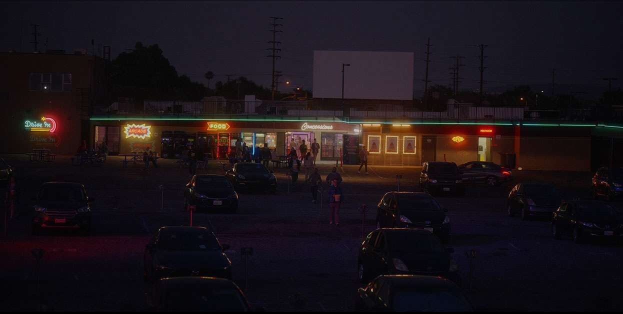
Luckily, I had done an anthology series before AHStories and I was used to the different story every episode format and knew how to manage it. You just delve into the story. I would do my mood boards and come up with ideas. “Drive In” episode, 103, we were heavily leaning into the eighties, so I utilized a primary palette. We had the drive-in location, and we really leaned on a lot of eighties nostalgia in that with the Rabbit Rabbit posters, neon, arcade games and later horror memorabilia in Bitterman’s trailer.
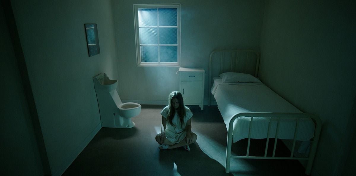
Next we had “The Naughty List”, episode 104 and that was, a story about these TikTok influencers in a mansion and a killer Santa so we had to tie in the Christmas holiday. We had to find the house, which took a while because it was such a big part of the story that it had to be perfect. We finally find it, all white with a hip retro vibe – Ryan loved it!
Then “Ba’al”, episode 105, was a completely different story, a little more mature storyline about fertility, and obviously a demon. It was in a very different palette style from the previous episodes utilizing tone on tone. “Feral”, episode 106 was based around a national park, missing people, a missing kid, a little bit of Big Foot lore and cannibals. The bone totem was my favorite thing I designed in that episode. I take my cues from the scripts and then we have a concept meeting with Ryan. He’ll give us his ideas for how he sees it and that sets our guideline. He’ll have specific ideas about certain things and give you a very specific directive and then you play within by talking with the executive producer, John Gray, and the director of the episode. Ryan is involved in how the vision shapes up from the beginning, which is really helpful.
One of the things that I really loved in general about all the episodes, but specifically “Ba’al” was sometimes the look and the feel of the episode doesn’t quite visually align right away with the story. Especially in “Ba’al”, it was almost a false sense of security, visually speaking. That storyline gets dark, but there’s such a beautiful light and airy palette to it. How do you look at a script for something with that dark fertility, demons storyline, and come back with light and airy?
They’re a young couple with means, and she’s an heiress. So, the question was, what is a young thirties couple house look like? Initially, we looked at old Spanish-style mansions, like Hummingbird Ranch, where there’s a lot of dark wood and you’ve got the terracotta floors. And Ryan instantly said, “We’re not going to do that. We’ve seen that a million times. She’s not moving into her grandfather’s place. This is her place. She has the money that she has cultivated this space.”
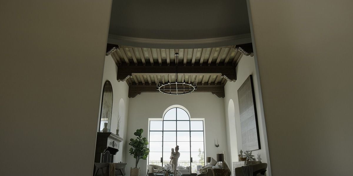
So right away, we were looking at trends in decor and fashion for this time and what we came up with was tone on tone in creams and beiges. It was something that Ryan really wanted, and it lends itself well to a contrast, whenever you see the demon or the totem. It really stood out and the scene with the ritual.
Yeah. I wouldn’t have guessed giant demon with all the light and airy and the Crate & Barrel of it all.
Exactly. That was a fun one to play around with because you’re right, it doesn’t lend itself to what you would expect. And I think that’s the goal a lot of times with this series and with the Ryan Murphy world in general. He’s always looking to push boundaries, and design is so important to that world. It is at the front of the line, so it is paramount. It’s really about design above all else. Obviously, the story’s very important, but you see it in American Horror Story as well, where everything is just very beautiful. One of my biggest challenges was just staying true to the flagship series and trying to keep that level of design active through each episode, even though each episode was unique with different locations and sets to build. We were supposed to shoot each episode in eight days but we shot one in eight days with the rest falling between nine and fifteen days; which gave me about 10 days to prep in between.
I know this is going to be like asking you to pick between your children, and I always hate when I have to ask a creative person to do this, but looking at your work on American Horror Stories and all of it just being so detailed and so incredible, is there any one thing that if I had to say, “Eve, I need you to pick a favorite and you need to do it now.” What would you say your favorite piece or set that you worked on for the series would be?
The Halloween carnival from the second episode.
And what makes that your favorite?
It was very challenging and difficult, but we pulled it off, so it’s an accomplishment. Initially, we were supposed to do a Halloween dance at a school. About three weeks out, we found out that it had changed to the best Halloween attraction in Los Angeles. That’s a pretty big pivot.
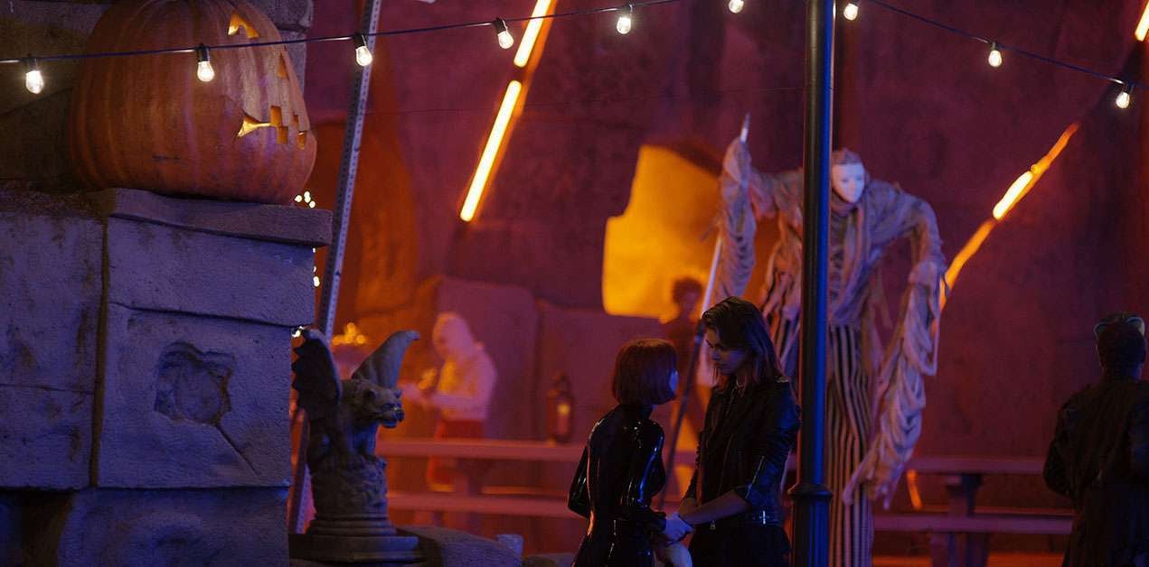
We decided on the Old Zoo at Griffith Park as the locale for the carnival – it was perfect. We built the interior maze on stage and used the rock features at the old zoo to incorporate the entrance and exit so it all tied it together. I had previously designed this big skull head to be an entrance for our maze, but since the maze is now in the old zoo caves, I used that to make a hayride entrance, and it was a perfect bookend for the event. I also designed all of these freak show vignettes. We had a 30-foot cage with fire breathers in it. We only had three days to set it all up. Actually, two days, if you’re talking about all the unloading & staging. It was a huge push for everybody on our team, but in the end it matched the concept art we did.
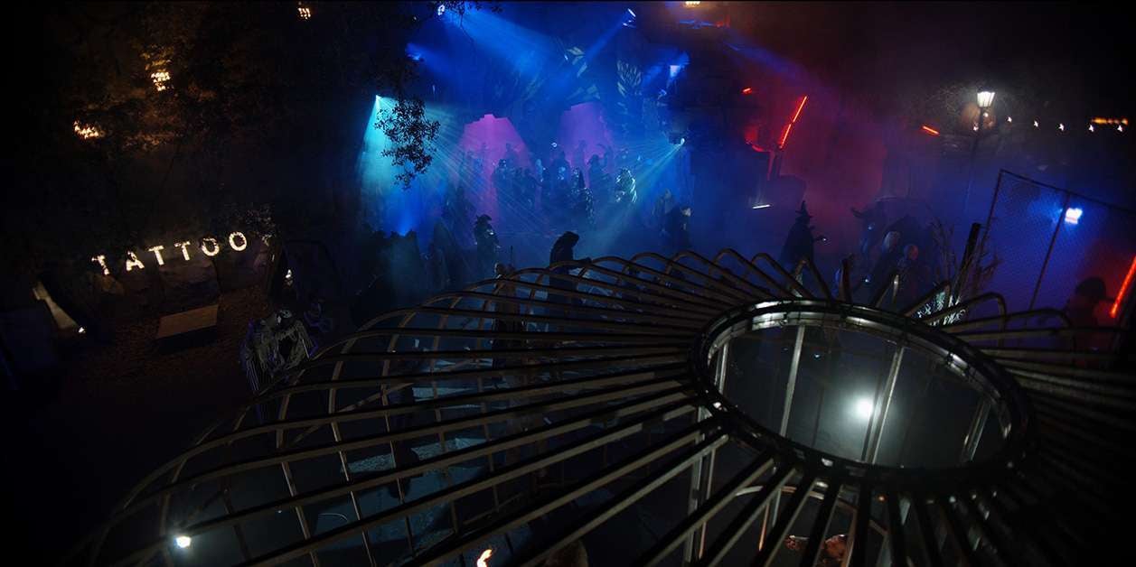
It’s interesting, because, in the final cut of episode two, you don’t see nearly as much of it as I did in the dailies. It’s always a little heartbreaking when that happens, but I was so happy with the scale, the design, the freak show performers that we were able to cultivate, and the environments that I created for them. Plus, the DP did all this really amazing lighting in the rock faces. I was very happy with it.
The maze itself was really fun to design as well. The very last scene where Ruby and Scarlett are together in that doctor’s office, is a throwback to season one’s 1929 doctor’s office at the Murder House. It’s just a little subtle tie-in. Most people probably wouldn’t make the connection, but it was really fun to create.
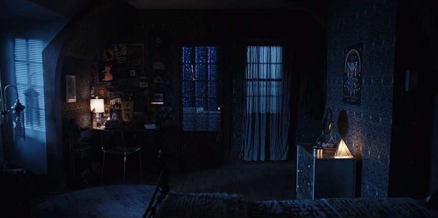
I also really love Scarlett’s Room – the second look. The wallpaper I chose has these little faces and these silver circles, it was all black and it had this texture and the silver circle felt very bondage like, and the faces felt like they could be her victims. So, I felt there was some cool layering there. Then we did a whole theme utilizing butterflies because she’s transforming and it’s a metamorphosis metaphor. Since she had this love of butterflies we carried that into the seventh episode when she moves into the condo, she unpacks a butterfly.
The drive-in transformation was such a big job. If you saw what it looked like before, you’d be like, “Oh, my God.” And I remember John Gray saying to me, “It looks like a prison, we need to come up with a concept that we can show to Ryan.” We did and we pulled it off and it looked great. The projection room we built on stage and I was thrilled with how that came out. I was so fortunate to do really great work on this series and to have a really great team. Everybody worked exceptionally hard, and we all were all in it together, which made such a difference.
American Horror Stories is now streaming on FX on Hulu.


