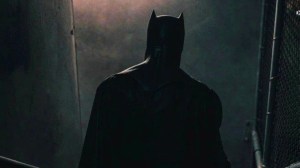
The Batman: Part II is now filming, and DC fans are looking for any clues as to what they’re going to get in the sequel. There are a lot of theories out there, most of them focused on the mystery villain (or villains) that will be featured in the sequel. Director Matt Reeves has been dropping some clues to get the fan chats churning, starting with the reveal that the sequel will be set during a snowy winter in Gotham City.
Videos by ComicBook.com
Snow in the Batman Universe? The weather conditions certainly lend credit to certain theories about which villain from Batman’s Rogues’ Gallery we’ll see in the film, and a lot of fans will probably embrace that theory even more after the latest reveal from The Batman 2‘s set.
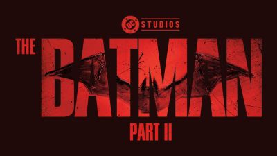
The Batman: Part II‘s Official Logo Has Been Revealed (On Set)
Various outlets are keeping a careful eye (and lens) on The Batman: Part II as it films in Liverpool, England, again. The city/borough served as the backdrop for Gotham City in the first film, so it’s only logical that Reeves returns to film the sequel there to maintain aesthetic consistency.
However, any diehard film fan knows that once a high-profile production starts shooting in exterior locations, all kinds of secrets are going to leak from the set. Today is no exception, as eagle-eyed industry analysts quickly spotted a very new detail in The Batman: Part II’s branding: A whole new logo for the film.
As Complex and other outlets point out, the new logo for The Batman: Part II looks much sleeker and more polished than the first film. Robert Pattinson’s Bruce Wayne/Batman took a much more practical approach, making his chest insignia an actual metallic Batarang that he can pull loose and hurl at foes, while also acting as a reinforced metallic armoring for the vital areas in his chest. The overall aesthetic of Pattinson’s Batman costume fell in line with what an amateur engineer, with a whole lot of resources, could build on his own. It was rough around the edges and felt somewhat jagged in its look.
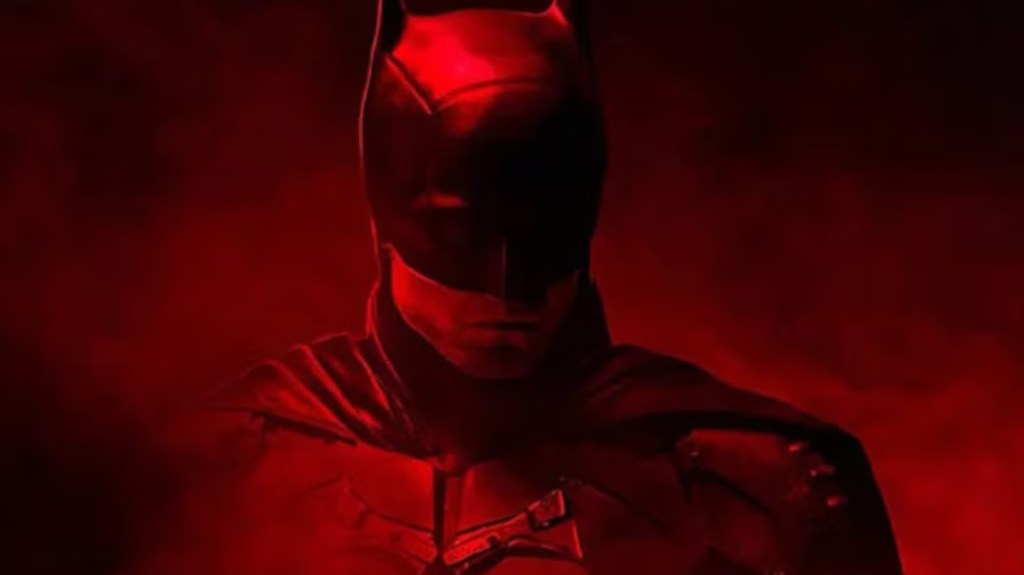
“Jagged” is definitely not a word that anyone is going to use when it comes to the looks of the logo for The Batman: Part II. However, the biggest change is in the background color: The first film had all of its marketing dripping in a deep shade of red, including the now-iconic promotional posters and images for the film. The sequel is making a big switch to this blue color, and that once-rugged Batman insignia is looking far more polished and clean and Silver Age classic than what came before. Other marketing materials for the sequel have also featured this blue color scheme, which means it’s definitely relevant to the film, for whatever reason.
What Does The Batman 2‘s New Blue Logo Mean?
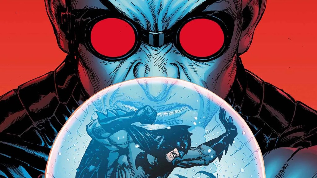
As stated, this blue-colored logo for The Batman: Part II will only fuel the theories that the sequel film is going to feature Mr. Freeze as its main villain. Between the blue coloring and winter setting, the evidence of Mr. Freeze’s involvement seems obvious and overwhelming – but then again, that’s how good red herrings work.
There have been just as many theories about the Court of Owls (a cabal comprised of Gotham’s wealthy, elite, and powerful families) being the main antagonists of the sequel. The blue, white, and gray color scheme would fit with the Court just as well as someone can associate those colors with Mr. Freeze.
What do you think: Discuss the villains of The Batman: Part II on the ComicBook Forum!
Most Viewed
-

Image Courtesy of Warner Bros. -
Sony- Columbia Pictures -
Image Courtesy of Netflix