Star Trek: Picard has run its course with the show’s third and final season streaming on Paramount+ earlier this year. While the Star Trek: Picard – Season Three has been available for a while, Star Trek: Picard The Legacy Collection, offers Star Trek fans the opportunity to own Jean-Luc Picard’s entire Star Trek story in one high-end set that collection every episode of Star Trek: The Next Generation and Star Trek: Picard, as well as the four Star Trek films featuring the TNG cast, plus bonus collectibles like a magnetic set of Picard’s badges, Chateau Picard drink coasters, The Wisdom of Picard book, and more.
Videos by ComicBook.com
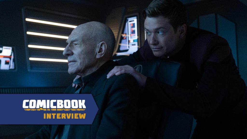
Production designer David Blass played a large role in crafting Jean-Luc Picard’s final chapter. Working on Star Trek: Picard Seasons 2 and 3, Blass led the design team that created the look of the new U.S.S. and U.S.S. , the planet M’Talas Prime, the fearsome Shrike, and more. To coincide with the release of Star Trek: Picard The Legacy Collection, ComicBook.com had the opportunity to talk to Blass about his work modernizing the aesthetic of TNG-era Star Trek and what might remain on his Star Trek project wishlist. Here’s what he shared with us:
I know you were a Star Trek fan before working on the show, and that you had hoped to get the opportunity to work on the franchise. How did this experience working on Star Trek compare to what you thought it might be like when you were coming up in the industry?
David Blass: Way more painful, and I think Terry Matalas, the showrunner, would agree with me. You have this idea that you’re going to achieve this goal, and it’s going to be so much fun because you’re finally doing what you set out to do and whatever. And I remember going up to him, he’s shooting on the bridge of the Enterprise-D with the cast and everything, and our heads are exploding because you’re in the moment and you’re like, “There’s nothing worse than achieving your lifetime goal of doing something and then failing miserably at it.”
It’s like, all of a sudden, the pressure of the world, we’re like, “Oh, okay, great, create a brand-new starship, make it look cool.” And so, again, you’re like, “But what if it sucks? What if everyone hates it?” It’s saying, “What if?” and then getting into it, and then realizing the pressure to do it and to deal with everything that the other designers throughout history had done with it. It’s like, “Oh, you want to do a planet? You have no money. You want to do this great ship? We have no money.” And then you see that the reasons for the decisions that they made for certain things were because “We have no time. We have no money. This is what you got. Deal with it, dude.”
You got to do a lot of exciting stuff on Star Trek: Picard. Is there anything left on Star Trek wishlist that you didn’t get to do that you’d still like a shot at?
I wanted to do more. I wanted to do the engine room on the ship, something like that, or I think I would have loved to do more Klingons and to have Michael Dorn there in full regalia as Worf. But I’m a huge fan of the Star Trek novel The Final Reflection, which is all Klingon-based, and I would have loved to design a Klingon vessel and to design one that is iconic, whether it’s a Bird-of-Prey or a classic D7 cruiser or something like that. I would have loved to have done that.
But again, in a perfect world, you look back at The Next Generation, and they had seven seasons of 20-something episodes. I had two seasons of 10 episodes. It’s not even one full season of what they had to do and the room that they had to play with and everything. And also, Season 2 was so different from Season 1, and Season 2 is so different from Season 3. It wasn’t one of these things that get carried over from one thing or another.
A big part of these seasons of Picard was modernizing the look, starting with that Next Gen aesthetic and modernizing it. What did it mean for you to modernize that? Was there storytelling going on in your head about how that culture has changed? Or was it just starting with what the show needed and somebody else can fill in the blanks? What was that process like?
We started with the modernizing it. That’s a tough word to play with because you run into the idea of modernizing it, to upgrade it to what we could do today. So things like, we have the transparent OLED screens because they look like holograms, but they’re actually a real functioning piece of glass that has graphics on it. You’re like, “How cool is that, and to use that technology?” So, for me, that’s kind of modernizing the set.
But what I didn’t want to do was to make it look like a different version of just, “Hey, I’m going to redo Star Trek and make it look like whatever I think will be new and cool for our modern audience.” So, specifically for Season 3, we looked at Voyager, which was Voyager, and kind of the Enterprise-E, and we said, “Okay, this is kind of our guide of what Star Trek looks like, and we want to just evolve it a little bit.” It’s like, “What does an elevator look like today? What did it look like 20 years ago?” Same thing. That’s why turbolift should look the way turbolift should look like.
We actually included, in the hallways, the big octagon door. “Why does that door look the way it does?” Because in the Star Trek future, it made sense. A door is still a door. A door 20 years ago looks like a door today. That’s what a door looks like. We went with that idea of trying to evolve it. We studied those sets and just said, “We’re not here to put our stamp on things. We’re here to make it look like Star Trek: The Next Generation.”
Something I saw in one of the featurettes was you talking about “space crate,” that ubiquitous background material. That’s one of those things that never occurred to me but now that you’ve pointed it out, it’s like a bell going off in my mind. Were there any other cool little details that you feel like only a production designer or somebody truly obsessive about Star Trek would notice, that you latched onto and tried to work further into Picard, that maybe other people still haven’t picked up on?
Space crate was a fun thing, and I can just use that as an idea for, “Okay, we don’t have enough money to do things. We got to find cool textures and ways to do things.” And this is how they solve that problem in Next Generation, and you’ll see it if you go back and watch anything in the ’90s. It was a common thing, because there was this one prop house that had a ton of it, and you would just go to the prop house and rent it, and we used it in Roger Corman movies and everything. Everyone used it at the time. And then the prop house went out of business, and with it, the stuff got sold and whatever.
When we started Season 2, I’m like, “Okay, find me some of that for the Stargazer,” and no one could find it, because I went with the prop house. “No. No one has it.” I’m like, “Okay, but it was something before it was a prop. What was it?” And everyone’s like, “Oh, it’s custom this and that.” And then it wasn’t until Season 2 that Liz Kloczkowski, I gave her the same mission, and she came back a day later, and she’s like, “Oh, it’s freezer spacers. They use it in freezer pallets.” I’m like, “Can we still get it?” And then she’s like, “Yeah, they’re only 60 bucks a piece.” I’m like, “Buy them all. We’ll use them.”
And then everyone’s like, “Okay, but we use this in the last set.” I go, “We’re going to use it in every set.” And then people just got it. They’re like, “You stick it on the wall, you stick it on the ceiling, you stick it on the floor, you just keep using it, and it gives the look of Star Trek.” And once you establish that, “Oh, that’s a thing,” everyone buys into it. And then especially now that audiences have seen it, they’re like, “Oh, okay, yeah.” And then the cinematographers were like, “Wow, it works really good with light.” But the first time we brought it up, they’re like, “Oh, we’re going to do a camera test because we don’t know how this is going to look on camera.” And I go, “Have you seen this show called Star Trek?” And they would cut up, and they’d make tables out of it, and they did tons of stuff. But we took that and, again, used that for everything.
We used the graded plexiglass in sickbay and the transporter room, that type of thing. I would have loved to have done an updated holodeck. We had designs at one point where we were going to do that, the holodeck-off version with the grid lights and everything like that. That was going to be a fun version, but we never got around to it.
You’ve built on Star Trek: The Next Generation as a base, but then you’ve added things wholesale. The Shrike is this brand-new ship design. Did you find it was more of a challenge to add something wholesale to that Star Trek tapestry? Or was it more challenging to try to extrapolate from what was already there, if that makes sense?
I think equal, because the Shrike was a challenge. Someone said, “Oh, we did like 80 versions.” I go, “No, we did one version of the Shrike. We just did 79 versions that weren’t the Shrike.” And that was the thing. Terry knew what he wanted, and a lot of times, it’s just that we want the vibe. And you look at something like the Bird-of-Prey, and that just comes on the screen, and you’re like, “Damn, look at that. That’s cool. That’s cool.”
It’s the idea of creating something, and we really worked hard on that, but I think the idea of doing that, and then also, the Stargazer, which was a completely brand-new design and the most updated look. The Titan in Season 3 really owes a lot to the Stargazer because the Stargazer had been defined, it set the tone, and that was actually harder because the idea of going, okay, we can do a saucer again. We don’t have to do, “Which version of nostalgia and tone do we go with?”
We went with kind of the idea of the Dodge Charger, the new version. You look at it, it looks like the 1960s Dodge Charger, but it’s upgraded. We went with that classic look. I think what Andy Probert and Herman Zimmerman did with the Enterprise-D is phenomenal. It’s just a completely different thing, and it’s exactly what it needed to be and everything. We just were in a little bit of a different world because we were battling all the different versions of what it could be, so learning what it should be was hard.
We never find out where the Shrike came from, do we? Do you know the ship’s origin story within the universe?
We went with the idea that if you’re going to go rob a bank, you don’t use your own car. “Where did the Shrike come from?” It came from the people in the places and whatever. They got the ship, but it’s not going to be a Dominion ship because then it’s telling that, “Oh, this is who’s doing all the sketchy stuff.” It was the idea that they had the ship that they had bought, stolen, ordered, whatever, from the bad-guy, ships-are-us depot. That was the thing. But again, I think we had six or seven different designers working on that design, and it was a collaboration of everyone coming together to finally make that, and bring that to life.
Modern sci-fi shows and movies look much different than they did back a couple of decades ago. A lot of that, I think, has to do with that there’s now decades worth of sci-fi that you can look back on. Did anything outside of Star Trek stand out in your mind as being an influence on your approach to Star Trek: Picard? For example, to me, M’Talas Prime has a little Blade Runner-y look. I don’t know if that’s intentional or not.
Oh, yeah, 100%. When we looked at the M’Talas Prime, our directing producer, Doug [Aarniokoski], had said there was a video clip on YouTube of the pitch that they had done for the new Blade Runner, and it’s Dave Bautista in these little teeny alleyways with neon. We had also done, in Season 2 of Picard, this Okinawa alley when we were in the bad alt universe when we introduced Elnor and Raffi, and they’re in this very similar Blade Runner-y type of world. And we did that whole street, and we did that whole scene, and everyone was just blown away by how cool it was, and it was for one teeny tiny scene. So we did this amazing set and it’s like, “Wow, that was a waste of all this cool stuff.” And then when we came back for Season 3, Terry was like, “Yeah, do that, but just bigger.” And that was kind of the idea of it.
But I think it’s impossible nowadays to run away from the dystopian vision that Blade Runner has given us. I think Altered Carbon does a nice version of it, and then a lot of different people do different things. It’s a cost-effective way to do alien, cool, futurey stuff without doing slick and shiny because slick and shiny costs a lot of money. The dystopian, “Oh, put some neon in the background and put some smoke in there” is a lot more cost-effective to do.
Watching some of the commentary tracks and the special features and stuff, it comes up a few times that you and your team really littered those sets and those backgrounds with little touches, and some of them don’t even necessarily get a big shot where they come through on-screen.Iis there something that you were proud of in one of those sets that didn’t necessarily get a lot of screen time or a lot of focus that you wish had a bigger moment to shine?
Yeah, I would say the Picard Chateau, his library. Tim Stepeck, who was the decorator in Season 2, just did a phenomenal job layering it. There was like 82,000 layers of Picard’s history in there. In Season 1, Picard goes to the archives to pull up his stuff, and he walks into this darkened, very empty room where he has all his memorabilia. It really bothered me when I saw that. I was like, “Okay, I get it from the storyteller’s thing,” but Picard has always been that guy where he has his history around him, and he has the tapestry and the flute, and it’s all on his desk. And I said, “He would have that stuff at his house.” I mean, why wouldn’t you? Why would I have to go to someplace and sign into my thing to see the Picard Day banner?
It worked perfectly for the storytelling, but I said, “Well, let’s bring all that stuff, all the gold models and the things back to his house.” And the library was actually two stories. There was a spiral staircase that went up to a whole upper deck that was completely decked out with more stuff, and every bookshelf had details and things from his past and all this stuff, and we barely saw it because there were so many different timeframes. We start out in the Prime timeline with Picard and Laris, and they’re having this conversation and looking for a book, and then, all of a sudden, we’re onto an alternate version of Picard with Q and the skulls and things. Then I’m like, “Oh, so we never saw the old upper stairs. We never saw this. We never saw the kitchen. We never saw the hallway.” And everything was totally detailed out. It was a phenomenal set.
Star Trek: Picard The Legacy Collection is on sale now. You can order the ultimate Picard Blu-ray box set here on Amazon and here at Walmart


![Spider-Man: Brand New Day Trailer: Watch Every Clip Released So Far [Updating]](https://comicbook.com/wp-content/uploads/sites/4/2026/03/Spider-Man-Clips.jpg?w=300)
