If you enjoy Netflix’s current user interface (UI) we have some bad news for you. Last month, the streamer’s Chief Product Officer Eunice Kim, Netflix’s Chief Product Officer, and Elizabeth Stone, Netflix’s Chief Technology Officer, announced the platform’s latest overhaul. The new UI will include a TV user interface, updates to the mobile app which include a TikTok-like vertical scroll, and a new search function utilizing AI for more complex searches. The catch? Despite Netflix’s claims that the new UI will be more intuitive and “fun”, those who have been testing the new interface prefer to old one.
Videos by ComicBook.com
During a call with press in May, Kim and Stone unveiled the changes to Netflix’s now famous home screen. Kim told reporters, “The new Netflix TV experience is still the one you know and love — just better.” However, the largest complaint from consumers is Netflix’s revamped homepage with a more “clean and modern design.” Whereas currently when one logs into Netflix they can view a row of seven posters, in the new design, it’s now more like 3 to 4 due to the new UI’s auto-expanding boxes and auto-playing preview clips.
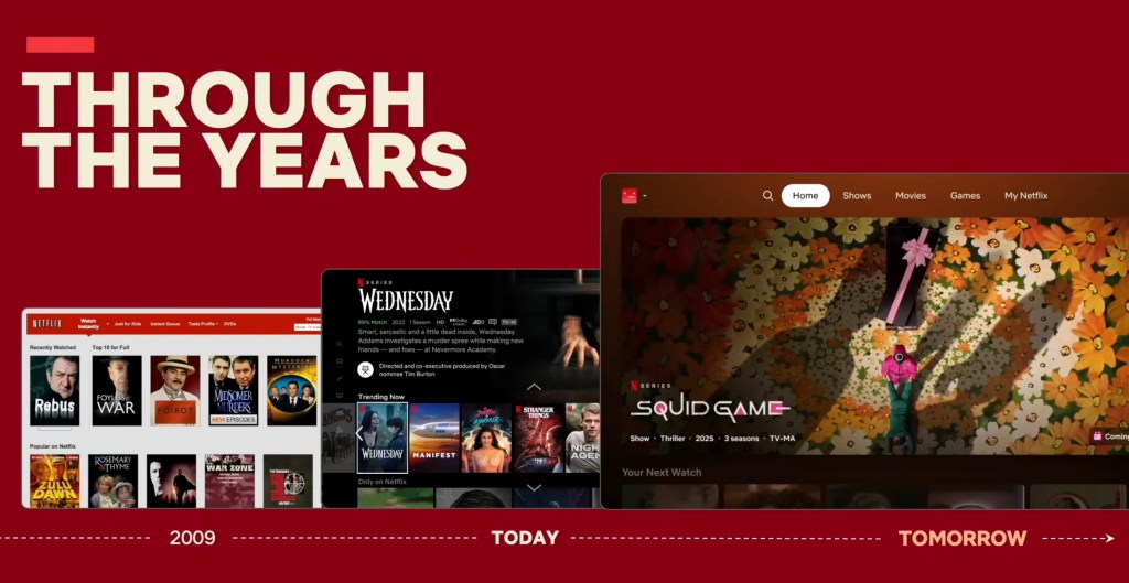
The streamer notes that this new look is more in line with “elevated experience you’ve come to expect on Netflix.” Consumers, however, are frustrated by the lack of options when they sign onto the platform, and aren’t being shy about it.
RELATED: Netflix Is Getting Overhauled With TikTok Style Videos and AI
Subscribers Angry Over New Home Screen, Lack of Categories, and Repetitive Pages
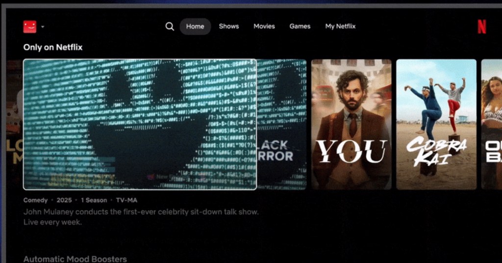
In addition to the widespread rejection of the new design of the Netflix homepage, which was designed for a larger array of devices like gaming consoles, users are also complaining about how both the New & Popular tab has been removed, along with the Categories tab. Furthermore, many subscribers report that the My Netflix and Home tabs on the platform are now virtually identical.
One user on X wrote: “Netflix has an awful ux/ui for displaying their movie catalog unless I’m using it wrong but wow it’s actually making me mad cos I can only browse in categories???”
Many subscribers have also threatened to cancel the service, if they haven’t already.
“Good lord, netflix updated their UI and its freaking terrible. this may finally be the thing that makes me unsub,” wrote one unsatisfied subscriber.
“This new @netflix layout is the worst app design I think I’ve ever seen and they paid someone hundreds of thousands to come up with it,” added another. “Had to use the phone app just to look through my list. Cancelling this sh-t in disgust.”
Though the dissent online has been loud and plentiful, it’s hard to tell how much of the subscriber base they make up. Netflix is notoriously precious with their data and according to Variety, as of April 2025, the platform boasts 301.6 million paid subscribers globally.
“[We’re] very excited about the feedback we’ve seen from members who do tell us that they prefer the new experience,” Kim said in May. “We’ve done a lot to optimize it and make sure that it’s working well for our members along the way, and so we’re excited to bring it to everyone across the world in the next weeks and months.”
One would think with all the testing that’s been run and time invested into the overhaul, that surely the new Netflix UI would be praised and not viciously trolled online. Yet without any hard data, it’s impossible to tell if Netflix is truly taking in feedback, or if the only haters are merely an impassioned minority of subscribers.
Have you experienced the new Netflix UI? Let us know your thoughts in the comments below.
Most Viewed
-

Image Courtesy of Disney -

Image courtesy of Paramount