Batwoman, DC Comics - The New 52: Reviewing Comics on the Nook

Following last month's surprise announcement that DC Entertainment was finally bringing its [...]

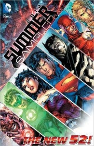
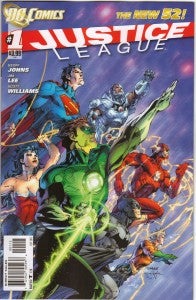
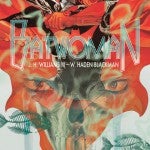
Following last month's surprise announcement that DC Entertainment was finally bringing its graphic novels and collected editions to Barnes & Noble's Nook Color and Nook Tablet devices, it seemed an ideal time to take a look at a couple of DC's recent releases, to see how well they interface with Nook and, by extension, how well they interact with digital readers in general. The answer, of course, is that there are some very nice features on Nook, but that not everything works the way you would hope. One particular problem is that since it's formatted as a book reader, and doesn't take the visual nature of comics into account, double-page spreads present a problem. That's particularly problematic in one of the two books I bought—Batwoman vol. 1: Hydrology, featuring the stunning art of J.H. Williams III, which gets pretty badly beaten up in the Nook edition of the book since it's got more double-page spreads than just about any other comic in the mainstream superhero market. The thing that inspired me to buy Batwoman, though (a title we'll talk more about shortly) was the sampler book that DC and Barnes & Noble put together for Nook: DC ComicsThe New 52 Summer Sampler, featuring the first issues of Justice League, Justice League International, Animal Man, Catwoman and Batman. It's an interesting choice of titles, certainly, particularly in that it leaves off the mega-hit Action Comics and includes Justice League International, which of course will no longer exist after the second trade paperback. Justice League #1, written by Geoff Johns and drawn by Jim Lee and Scott Williams, was not only the launch title for The New 52 but is also the first thing you see when you open up your sampler on the Nook. And that was, right away, something that caused a little bit of a headache. Like ComiXology digital copies, the trade paperback collections include variant covers—or at least the ones printed in the trade paperbacks and hardcover collected editions. In the case of the New 52 titles, that means there are an awful lot of the "digital edition variants" and "second printing variants" at the top of each chapter.  In the case of the summer sampler it isn't particularly disruptive to the flow of the story, although I can see how it might be, particularly on a title like Justice League where as time wore on almost every issue had variants on top of variants. Still, if the double-page spreads were handled correctly in the digital collected editions, then it would be nice to know that there's content in place to space the pages out properly if need be.

However, that was the first thing I noticed when reading the summer sampler; that very first two-page spread of Batman leaping through gunfire in Justice League #1 is split up onto separate pages, meaning that the first page you turn to, you get Batman's butt and not much else. The ZoomView feature on the Nook, which mirrors ComiXology's GuidedView in many ways, does nothing to alleviate the situation, as it merely zooms on the word balloons and SFX behind his butt, never giving the reader a chance to pan out to the full image. It does, at least, guide you from panel to panel so that you don't end up trying to read that first page and then move onto the second half of the splash on the following page. In the context of the Summer Sampler, that was a pretty unique phenomenon. The other books chosen had a less widescreen approach to the art and as a result there were no seriously glaring problems with the pages, excepting that the "magazine interview" at the front of Animal Man should probably have been scanned with optical character recognition. While zooming in on the art improves the look and feel of the comics, zooming in on a static page of text a few paragraphs at a time just makes it look fuzzy and cheap. (Oh, and I keep meaning to ask this—has anyone seen Travel Foreman address whether the pink-shirted doctor with the Raggedy Ann haircut in Animal Man #1 was intended to be Perry Cox, John C. McGinley's character from Scrubs? It looks like him, and if it isn't, it's a very oddly specific look for a throwaway character. If it was Cox, though, Foreman joins The Perhapanauts' Craig Rousseau in the roster of artists to use Sacred Heart Hospital staff as background characters.)

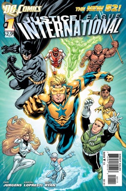
Certain moments were actually really enhanced by reading the issues digitally: in Batman #1, the two-page splash of the Batcave was actually enhanced by it, because with no dialogue to force your eye around the page a bunch of times, your page turn simply forces the "camera" to pan around the Dark Knight's redesigned headquarters. Similarly, that first big money shot of Booster Gold arriving at the Hall of Justice in Justice League International #1 comes off more dramatic and exciting digitally than it did on the page. That might have been intentional, as during the course of our regular conversations with Dan Jurgens we've discussed in the past his attention to the digital format since the launch of the New 52. The inclusion of Catwoman—which has been a divisive title and which is frankly, to my eyes, not on the level of the other four books in the Sampler, is an interesting choice; presumably, it was chosen because of the character's significance in The Dark Knight Rises and her mainstream media presence outside of just the small circle of regular comic book readers. If that's the goal, though, the first relaunched issue, which features on-panel rough sex with Batman, is an interesting choice and certainly pushes the entire book up into T+ category simply by its inclusion (although, really, Animal Man does that on its own, but in a different way). Either way, it's an odd page to go out on. The issue with the double-page spread, though, really stuck in my craw. Perhaps because double-page spreads are intended to be the ultimate in "holy cow, look at that!" moments, or perhaps just because it happened so soon in the first chapter of the first book that a lot of people will buy for their Nook (its cover price is $6.79, but I got it for $1.99 by buying it the day it was released).

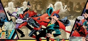
Either way, that was enough to send me hunting for Batwoman. It works out nicely, in fact, because I wanted to get a copy of Batwoman anyway, and couldn't see myself spending $25 on a hardcover, although frankly the book is so beautiful and the art is so badly treated in the digital presentation that I may elect to go that way anyhow eventually. I knew that the double-page spread was a major weapon in the Blackman/Williams III arsenal, and wanted to see how the book stacked up when viewed on a device that didn't embrace the concept easily. The answer, of course, is "not particularly well." But not as bad as I thought, either. While double-page spreads are commonplace in Batwoman, and we don't get nearly enough of a chance to see their full effect in the digital translations, one thing that's interesting about reading in this way is the realization that often, the ethereal and disorienting way that the panels are laid out in this title means it's not absolutely essential to read them in the order you would if you were to just glance at the page and decide an order.

While the art itself suffered from the presentation, there were few (if any; I can't remember a specific one) occasions when the story became muddled or incoherent as a result of the effect. Part of that is that the guided view makes sure to take you from the correct panel to the next, even if that means going back and forth between pages, and part of it was the scripting—which is of course what's at issue here. The emotional, visceral and artistic impact of double-page spreads is well-known among comics readers and critics (and, more practically, most of us understand the value of such big, beautiful pieces of work on the original art market), but when you've got a growing segment of your audience reading on these devices, it may become necessary to make concessions to the format. It's rare, if ever, that you see a triple-gatefold just because that's how the artist saw it in their head, at least in mainstream superhero comics. That would be a perfectly legitimate approach from an artistic standpoint (and it's arguably unfortunate that the commercial realities of mass-published comics make it impossible to do more often), but it's a concession that writers and artists make every day because they understand the medium that they're working in. It would be a perfectly legitimate approach artistically to do 47 panels on every page, with a ton of dialogue in each panel, if one could figure out how to draw that. But when the page size was reduced for publication, no one would be able to read it, and so that's not something that writers and artists do, because they understand the presentation their audience will have in their hands. Sometimes even the most gifted artists have to step back and evaluate who their audience is and what the needs and expectations of the market are. While so far, Marvel and DC haven't been reining in artists in a big way to accommodate digital, it seems likely that it's only a matter of time. Certainliy when we start to see digital-only publishers like Monkeybrain publishing their first collected editions, the hope will be that those books don't have some wacky formatting that "works better on paper."

It should be noted that as a reader, I buy mostly digital comics and that many of the problems explored in this article are not confined to the Nook or their ZoomView reading. They're common problems on ComiXology, at least when you read it on the iPhone as opposed to your laptop. It's perhaps less common and less disruptive in releases that have come since the advent of digital (New 52 titles and AvX material), but the GuidedView technology has been a total catastrophe on some of the smaller, older titles that were put online to appeal to a cult base or multimedia readers. The Chuck series collected by WildStorm, for example, was nearly impossible to read without turning the function off. It also isn't specific to DC. While the launch of the New 52 graphic novels on Nook is a perfect time to stop and take stock of the products being sold, items from Marvel's back catalog that have been available on Nook for a while now—such as, for example, The Infinity Gauntlet, the smash-hit crossover story that has seen a massive sales resurgence since it became clear that it might influence the second Avengers movie—have similar issues. Hopefully, that's something that will be fixed in future builds of ZoomView, because frankly there's something more fluid and better-looking about the way the Nook does it to me in many other ways. Not least of all, I appreciate the fact that it doesn't simply take you panel-by-panel, but pulls a piece of the page with consecutive panels that's kind of an ideal reading size and brings you there. It allows you to keep the feeling of a comic book, with more than one panel onscreen at a time, which is something that GuidedView from ComiXology does not; you abandon the traditional comics page in order to get a higher-quality, higher-resolution image. Your mileage may vary as to which you prefer, but for me there's something really appealing about having a beautifully-rendered comic book page in front of me on my tablet.

0comments