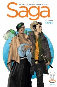
As one of the most anticipated new #1 issues of 2012, it seems likely that Brian K. Vaughan and Fiona Staples’ sold-out Saga #1 is going to be on the receiving end of a lot of biased reviews, both for and against the title. I’ll admit up front that my instinct was to be a bit against.Vaughan is undisputably a great creator, having written not just the much-loved Y: The Last Man and Ex Machina series but also The Escapists, one of the best standalone stories in the last fifteen years of mainstream American comics. He’s also one of the creative minds behind some of Lost’s best seasons and worked on the fan-favorite Buffy the Vampire Slayer: Season 8. His collaborator, Fiona Staples, has built for herself a short but distinguished career, drawing things like North 40 and Monster Society in the five or so years that she’s been active, and a handful of terrific fill-ins and covers along the way. So my hesitation, of course, had little to do with the creators.It was, instead, the content. There are those who would say that regarding a book with suspicion simply because it seems to trade in light, fantasy-inspired imagery is shallow. To those, I would say, ‘Yeah–but that character has ram horns. On his head!”Of course, I would be wrong. Saga is one of the best new ongoing series to come down the pike in a while, right up there along with the equally fantasy-inspired Memorial from IDW. The series also combines elements of science fiction and a kind of Shakespearean vein that sees an intergalactic civil war casting a shadow over (and threatening to end) the young lovers (and their infant daughter) who reside at the heart of the series. The idea of taking Shakespeare intergalactic isn’t exactly an original one, but it’s done far better here than it has been in recent memory–and the characters themselves are so believable and relatable that it renders that literary gimmick somewhat extraneous; it’s just something that adds flavor as opposed to, say, the entire premise of the work.The art is beautiful; Staples manages the fantasy-like beauty and the weirdness of Star Wars with a confident line that makes all of the strange visuals (and there are many) feel more grounded in reality. For those unfamiliar with her work, imagine a cross between Jim Califiore and Cliff Chiang, with a heavy emphasis on the latter. Her faces are expressive and unique, and the more surreal concepts that Vaughan has her drawing look entirely at home. When a government agent with an old tube TV set for a head bursts through the door looking for our heroes, it feels just as real and dangerous as other, equally odd-looking villains of the past who have managed to impress on first impression, from The Joker and Darth Vader to the jolly English fox hunters of Grant Morrison’s The Invisibles.The oddest part of the whole look is the lettering, provided by Fonografiks. While the word balloons themselves are filled with mountains of small, often difficult-to-read text that makes the title feel a bit like it’s maybe just this side of “too indie,” other experiments with the lettering pan out far better. Ultimately one is left more with the impression that the lettering is part of the overall look and feel of the book, which may adjust to perfection as it goes.If you can still get your hands on this gem, give it a read. It’s as rewarding and clever as it is dense with mythology and imagery that rewards close attention. Or don’t. After all, I’m biased.

